Over the past decade Stan- W Decker has become one of heavy metal’s most seen album cover artists. He’s designed well over 100 covers with a growing list of big name bands, in the world of hard rock & heavy metal. In the past 2 years alone he’s created covers for such acts as Stryper, Last In Line, Jorn [Lande], Black Swan, and most notably and recently – Blue Oyster Cult. It was the eye catching cover for the new fantastic BOC album that had me look him up, and realized just how many albums I have that he designed, including all the live releases from BOC over 2020! Stan answers questions on his career, his art, and his recent works on latest 5 BOC album releases.

You can check out more of Stan-W Decker’s album covers at: http://www.stanwdartworks.com/ Or to contact, email: stanwdecker@gmail.com
What did you start out doing and how did you get in to making album covers? What else do you do, aside from album covers as a graphic designer?
SD- After studying advertising and studying fine arts, I was hired in a well-known communication agency where I started as a graphic designer and then art director. I stayed 12 years in this job. At the same time, I designed demos and albums for my friends’ bands, then for friends of friends, then for national bands. I was spotted by an Italian Metal magazine to do the cover of one of their publications and I was put in contact with a big label thanks to all this.
It’s been my only activity for 8 years now. I also make some logos, designs, posters, T-shirts and other communication tools related to the world of Rock/Metal music.
Are you a big heavy metal fan? [as many of your album covers are from this genre] Any favorite bands or albums to listen to regularly?
Yes, I’m a big fan of Heavy Metal, but my tastes in music are very eclectic. I listen to grindcore as well as 70’ prog’ and film scores. I have a collection of CDs and vinyl LPs (about 1700 CDs and 800 vinyl LPs), 95% are Rock/Metal and progressive, the 5% are pop/rock which I consider of good quality.
I’m a fan of Faith No More, Maiden, Depressive Age, Coroner, BOC, Megadeth, Love/Hate and so many others… I just named the first ones I could think of!
Right now, I’m listening a lot to Riot City’s album and the first Eternal Champion’s album.
Were you a fan of album artwork prior to getting in to it? And who would be some of your favorite album cover artists?
It was the Maiden Killers cover art I saw on a neighbor’s T-shirt that blew my mind. I was very young but I remember it very well. A little later, I saw Somewhere in Time’s poster and I was blown away again! So it’s easy to say that the first artist who influenced me was Derek Riggs. But, I must not forget Roger Dean (Yes and Psygnosis game covers), Dave McKean (Shades of God from Paradise Lost, for example), Paul Romano (Mastodon), Giger…
What is the process you go through when given an album project to design – from the time you get the album title to time it is turned in for use?
There are no specific rules. Sometimes it’s a directive brief, sometimes it’s just a line. I don’t always get the title of the album before I start work. Sometimes I validate a simple sketch – ugly but effective. Sometimes I push the concept and show a black and white illustration to validate. Sometimes, I present an illustration that I consider to be definitive and keep my fingers crossed.
In designing covers, would you normally meet the band [or any members] to discuss an idea or get to hear some of the music ahead of time?
I’m in contact by e-mail 99% of the time. I discuss with the management, the label or the artist to define the directions to take. These exchanges are very often essential to understand the goal to be reached, more than the music itself (for confidentiality reasons, I very rarely have sound to listen to…).
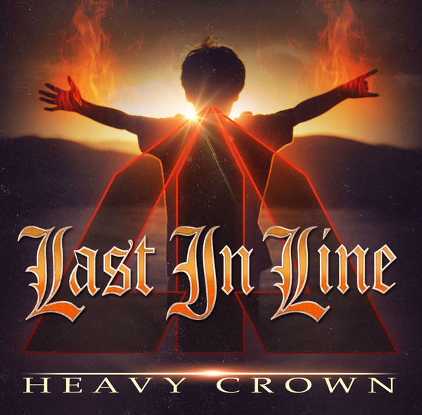
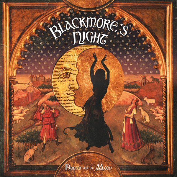
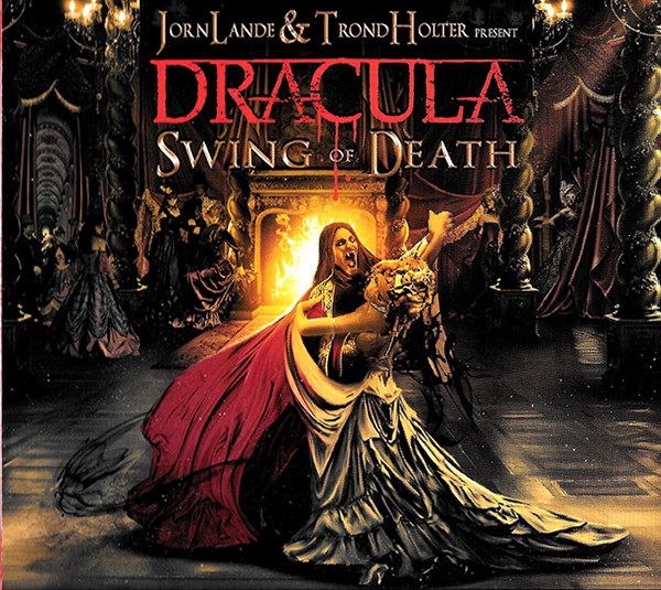
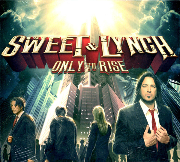
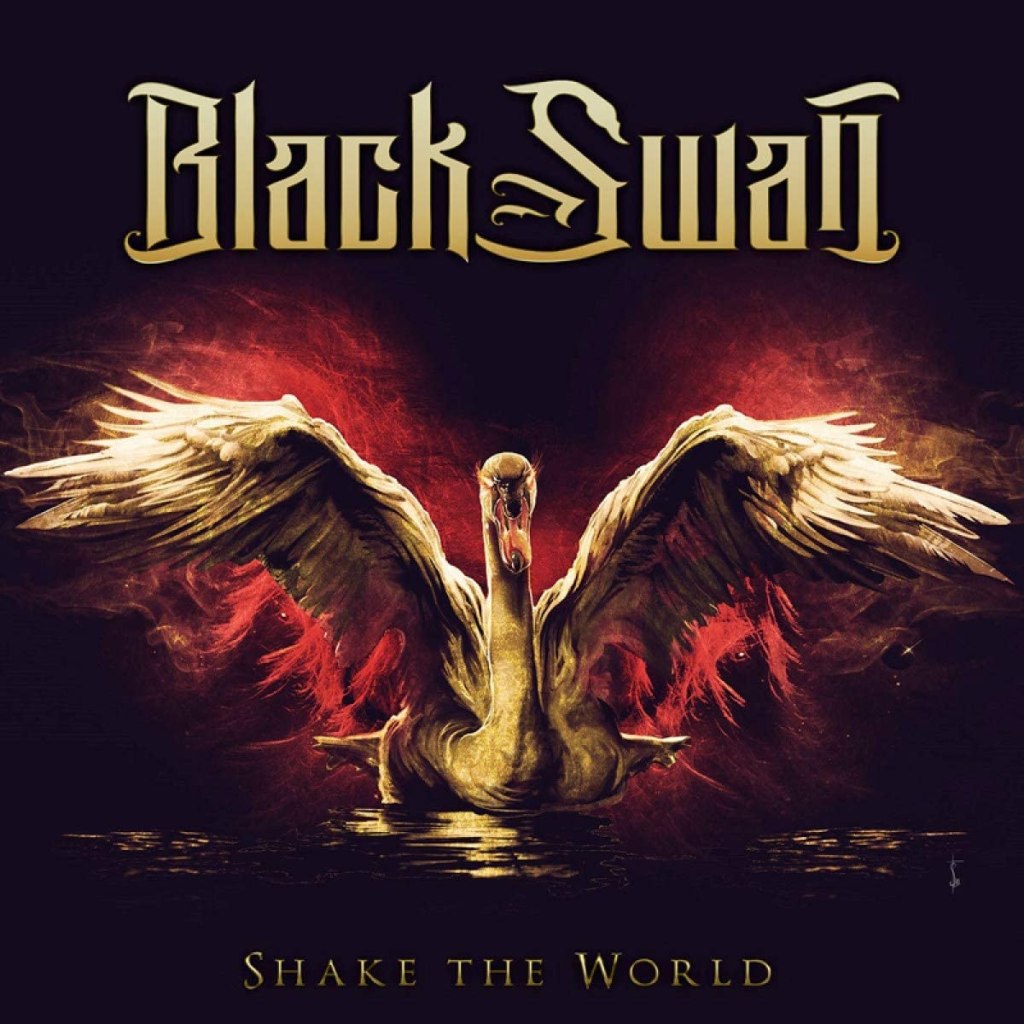
I realized while going through your list of covers that i have a number of these. Could you share a few stories or any recollections on a few of these covers – Sweet & Lynch [1st], Last In Line [1st], Blackmore’s Night [Dancer And The Moon], Jorn Lande & Trond Holter [Dracula], Black Swan ? Any personal favorite covers you’ve designed?
Sweet & Lynch: I had worked with Stryper in the past and have a good friendly relationship with Michael Sweet.
Blackmore’s Night [Dancer And The Moon]: I especially have a great memory of receiving the email asking me if I wanted to work for Blackmore’s Night. It was my 3rd or 4th big project.
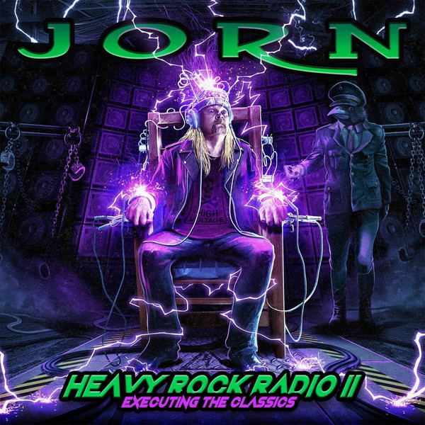
Jorn Lande & Trond Holter [Dracula]: I strangely designed this illustration very quickly, certainly because the concept was clear.
Black Swan: Some people didn’t understand the concept of the Black Swan cover (inspired by the movie, the hidden dark side). On the other hand Mister Mc Auley loved it and it seems to me that the artwork is hung (in large) in his living room.
… and I don’t really have favorites. I find it hard to judge my own work.
As for Blue Oyster Cult – This has been a huge year for BOC releases, and you designed all 4 live album covers, as well as the brand new album “The Symbol Remains”. How did that whole offer of designing 5 covers come to you?
I work very regularly for Frontiers Records and they knew I love Blue Öyster Cult. They simply proposed to me to make 1 or 2 live covers, then the album, then 3 more live covers (another one has just been announced 😉 ). I must say that I thought I was dreaming when I was offered to work for them.
I’m familiar with BÖC’s universe, it’s Hermeticism, and I played with the band’s symbols. However, I kept in mind the fact that we are in 2020 and that the band did not want to remain stuck at the end of the 20th century. I had to find a balance and also find the resources not to propose artworks that looked alike. I have to say that it was not very easy and that I was stressed (I’m a human, I think, haha, maybe not).
How familiar with BOC were you prior to the album covers coming up? Any favorite BOC records or album covers from the 70s?
Yes, I’ve been listening to Blue Öyster Cult since 1992. Before that, I was too young to appreciate and especially understand this kind of music (was listening to Heavy, Thrash and “in your face” music). BÖC needs to be tamed and you need to listen to several albums before diving into their universe.
Cultosaurus Erectus was a beautiful cover but I think Fire of Unknown Origin remains my favorite even if the graphics of the first 2 albums are superb and intriguing. I almost forgot Extraterrestrial Live !!!
Regarding the 4 live BOC album covers – how did you approach those, were they your own ideas, or did you get suggestions and feedback from the band?
I was given carte blanche to design these album covers. Of course, I did ask the management if they had any special requests, but I was mostly inspired by the tracklistings for the live shows and the concepts for the concerts.
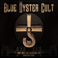
Can you give me a line or 2 about each of the 4 BOC live album covers – what you drew ideas from and how you put it down?
– Hard Rock Live : Cleveland 2014 : I was especially inspired by Tyranny And Mutation to create this artwork. It’s the first design I made for the band and I preferred to make it a simple artwork.
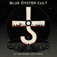
– 45th Anniversary – Live in London : Of course, it’s a tribute to the first album. The doors of perception are here replaced by the escalators of the London “Tube”, archetypes in bowler hats being spectators of the BÖC. My first version was in black and white and I was asked to add a bit of color.
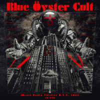
– iHeartRadio Theater – New York City 2012 : Well, for this one, there’s another version (which I keep preciously) that features Godzilla instead of the astronaut but I was a bit stupid to think that there wouldn’t be copyright problems, haha! This illustration was used as a front page for the French edition of ROCK HARD.
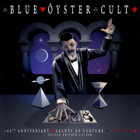
– 40Th Anniversary – Agents Of Fortune – Live 2016 : The concept was already found and I tried to go back to the original illustration to make a kind of sequel, as if the scene had been captured a few seconds later. It wasn’t very easy to copy the style of the original and bring something new but I’m proud of the result.
– The fifth one is in the pipes 😀
The Symbol Remains is a very catchy and bold cover, I really like it. [Again] , was this your own concept or did you get ideas from anyone else?
Actually, there were several proposals, 4 in all, which were all really very different. 2 were following a concept proposed by the management and in consultation with the band, the 2 others were extrapolated by me from the album title. Everything was done in parallel and one of these extrapolations was chosen by the management and the label.
Can you explain a bit about the concept of the Symbol Remains front cover? as well as the tablet design on the back cover?
You have to look at it in 2 senses. It seems that many people see the cross of Cronos crushing ruins. To have the real interpretation, you have to own the album. The symbol is in fact exhumed and mutated into an extraterrestrial bright hologram. I still want the interpretation to leave a part of imagination and for everyone to see the signs they want to see (thanks M. Night Shyamalan!).
About the tablet, it’s actually a reinterpretation of the other concept I had proposed. Some musicians liked the initial idea, so I integrated it in a different way.
The initial idea was to make the symbol look like a work of art, so it had it’s place in a museum. In addition to the main cover, which would have been a painting of the symbol exhibited in a museum of modern art, I had made several paintings of the symbol in different styles in order to display them in the pages of the booklet.
So the idea is that the symbol exists in different forms but always remains.
I assume you’ve heard the album – any thoughts or favorite songs on it? 🙂
Well, I must say I haven’t! I still watched and loved the singles released on Youtube but I haven’t received my copies yet and I’m looking forward to discovering the tracks from the album in tracklisting order, quietly, with great sound quality. This album is a great event that must be respected and I don’t want to spoil my pleasure.
What other covers are you currently working on [if you can share names or details]?
For confidentiality reasons, I can’t give names but I have some great opportunities for bands I’m also a fan of.
Do you have an online shop where people might be able to buy any prints of album covers?
No, I don’t have an online shop. Above all, I wish to devote myself to bands and to the job of illustrator devoted to the cause of Rock!. I know it’s a bit presumptuous but I’m still a dreamer and collaborating with legendary artists is the greatest satisfaction. For the moment, I manage to live this way… I still have in mind to exhibit different personal works but this remains one of my many projects!
KJJ. 10/20

He is super talented. A ton of great covers and I didn’t realize they were all his. Great interview.
LikeLiked by 1 person
Great interview.
LikeLike