Prior to becoming well known over the past few decades for his work in comics, Artist Dean Motter worked on numerous album covers, particularly plenty of classic Canadian albums throughout the ’80s. In this exchange, he touches on his early career and some of the album covers he designed or had a major part in.
Can you give me a bit of background as to how you wound up being in Toronto and working on so many covers for Canadian acts in the late 70s?
I went to college at Fanshawe in London Ontario and studied Creative Electronics and Recording under Radio Caroline’s Tom Lodge, Marshall McLuhan’s son/collaborator Eric, John Mills-Cockell, neon sculptor Michael Hayden. My thesis for my commercial art course was my first published comic, ANDROMEDA I mounted two multimedia shows and married my lead actress. We moved to Toronto where I worked in children’s books and animation. I did work for the Silver Snail comic shop. I also worked as art director/production artist for CPI’s Cheap Thrills magazine. That led to being art director at CBS Records Canada for 3 years. When I left CBS and struck off on my own I retained them as a client, and picked up Capitol, Attic, RCA, WEA, Ready records and others.
Did you have much an album collection growing up? favorite bands? Favorite album covers [or artists]?
I listened to a lot of music growing up. In high school I had a sizable record collection that continued to grow over the years. Moody Blues, ELP, Yes, Pink Floyd, CSNY. I later blossomed into jazz like Weather Report, Pat Metheny etc. These had my favorite covers especially Yes and Pink Floyd.
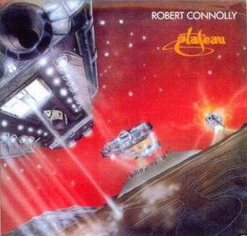
The first album you did was Robert Connelly ‘Plateau’. This one came with a comic book. How did you come about on this band and what was the concept behind the story and comic?
Connelly came to me via the Andromeda comic book (vol 2) published by the Silver Snail. It was a Chariots of the Gods themed illustration. One of my first airbrush pieces. I didn’t do the comic but was friends with its creator Nick Powlieko.
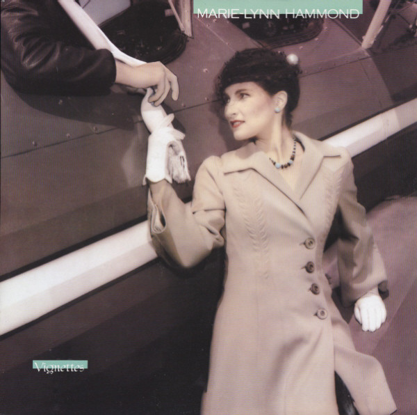
Marie Lynn Hammond – did you do her first album [?]
I didn’t do Marie’s first cover I did her second, Vignettes. It featured a hand colored Deborah Samuel photo taken on a vintage biplane. It was subtle but one of my favorites.
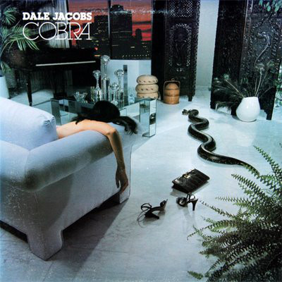
Dale Jacobs Cobra (my first as art director at CBS Canada) – quite the cover shot, with the snake and arm hanging over the couch. Did you come up with the photo concept, and was it inspired by anyone or anything? Was the snake real?
This was indeed my concept. The snake was real, but it was a python. A live cobra was out of the question, due to its fatal venom and scarcity of antidotes, not to mention insurance. One serviceman wrote me years later. He had spent time in India and was annoyed at the substitution.
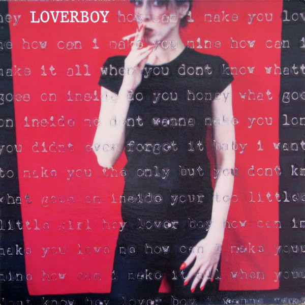
Loverboy – this was a huge album. What do you recall of the idea behind the cover? the photo shoot? and what are the words typed over the front cover?
I became fiends with the photographer fine artist Barbara Astman. She had a show of her work -Polaroid photos of herself that she fed through a typewriter. When I saw them I thought a love letter or Dear John letter would be a good idea for the Loverboy assignment I just received.
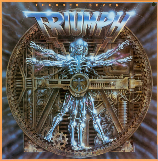
Triumph – Thunder Seven – This cover was connected to the music, correct? Can you explain a bit where that image came from and how closely you worked with the band on this. The other 2 Triumph albums you did were very different – any quick recall on them?
Thunder Seven. I confess I never quite got the title, so the image had more to do with the hard rock trio, Yes I illustrated it. I was influenced by the work of Alien’s HR Giger. I didn’t work much with the band, more with the management this time. The others- Never Surrender was my concept illustrated by studio mate Ken Steacy, Surveillance was also my concept illustrated by another studio mate Paul Rivoche.
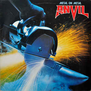
Anvil – Metal On Metal, Forged In Fire [also did Hard N Heavy, Pound For Pound, Past & Present Live] ?
What can I say about Anvil? They were a favorite act of mine, They were so sincere about the music and addressed me as Mr. Motter even though I was only 30 something. But they were always there, visiting my studio with ideas.
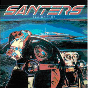
Santers – Racing Time [also did Shot Down In Flames, Mayday EP] ?
This was a photo taken on a runway on Toronto Island. It was then filtered and posterized.
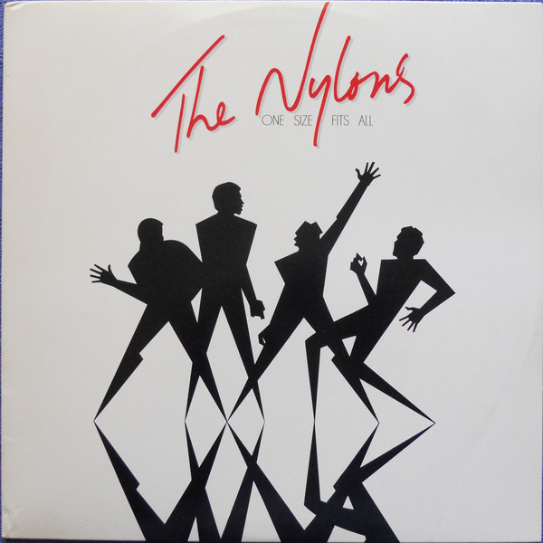
The Nylons – One Size Fits All, Seamless [did others] On One Size Fits All, who’s idea and where did it come from – the shadow figures posing? very cool.
One Size Fits All was my idea and design, it was derived from the work I was doing on Mister X at the time. Seamless had two alternate covers. One was illustrated by Jeff Jackson, the other photographed by Deborah Samuel. It was pieced together mechanically.
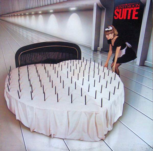
Honeymoon Suite – HMS – Where was the cover photo taken?
Originally this cover was a variation on my rejected concept for Helix No Rest For The Wicked. We set it up in a furniture store. A new background was airbrushed in.
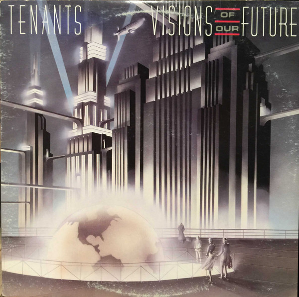
The Tenants – Visions of Our Future – Was this drawing based on or inspired by any place in particular?
This drawing was based on the lobby of the New York News and the art of Hugh Ferris. If you look closely you can see Mister X in the background..
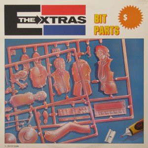
The Extras – Bit Parts – Did this come from the old model kit boxes?
This was indeed based on old model kit boxes. I drew and airbrushed the image.
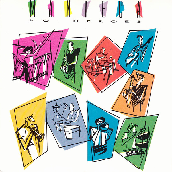
Manteca – No Heroes – this one reminds me of the Nylon covers.
These came from sitting in the Bamboo Club on Queen Street watching the band and drawing them in napkins.
During your time in Toronto, were you involved in the music scene as far as going to shows, meeting up with bands? Any favorite bands from back then or lasting friendships?
I loved being part of the music scene back then. My studio did posters, concert ads, concert programs etc. But as desktop publishing (design) became more common more companies could afford to put art directors on staff and the need for us diminished. I became friends with many of the clients and musicians from the time The Nylons were the closest. But also Matt Zimbel from Manteca. The whole of the Diodes . I even did an album of my music with Jeffrey Morgan soon to be released at last on Bongo records
You eventually moved on from album art / covers? Can you touch on what you went in to [comics] and where people might recognize your work most from?
I wrote and illustrated The Prisoner based on Patrick McGoohan’s TV series, and my own Mister X. went on to be an art director at DC Comics for three years, plus the graphic novel Batman: Nine Lives.
For more on Dean Motter’s art and career, album covers and comics, check out his official site.
Dean Motter | Discography | Discogs
KJ, 07 / ’21

Great stuff KJ. Loved Dean’s work on the Triumph and Santers cover. Those covers stand up well today even.
LikeLiked by 1 person
yeah, he did a lot of great covers, love the Triumph ones, Anvil, and Santers!
LikeLiked by 1 person
So cool. The main reason to buy vinyl is the cover art and these are some great ones and I have a few those albums as well.
LikeLike