
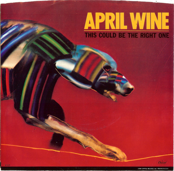
April Wine’s 1984 album Animal Grace was the band’s final album as the ‘classic’ 5-piece line-up. The band broke up after a farewell tour following Animal Grace’s release. The album saw a couple of singles, but clearly the band was not supporting it, playing only 1 song from it in their live set. Animal Grace would also be the first April Wine album cover not to be designed by Aquarius Records’ Bob Lemm – who had designed pretty much every cover since 1973, nor would it feature the band’s logo that had been used on every release since 1978. Instead American designer John O’Brien was given the task to create the follow up to 1982’s Powerplay. Like every April Wine cover, it was a completely new design, and new look, suitable for the times.. John O’Brien has done numerous album covers throughout his career, notably for Tina Turner, Billy Squier, and Great White’s 2 biggest releases. In this exchange John details coming up with and creating the cover for Animal Grace, as well as his background, and touches on a few other covers he did. I’ve included a few of John’s other covers, as well as links to his work at the end.

How did you get in to album cover art design? Can you give a bit of your background?
Growing up I always had a love for Album Cover art and music, it seemed to be the perfect creative vehicle – visual and sonic delivery, it stimulated my senses. I graduated from Cal State Fullerton in 1981 with a Masters in Art, with Design focus. I freelanced at various design studios that specialized in entertainment in Los Angles my last year of school, and continued up to1983 after graduation. After working and showing my portfolio for 2 years, I received a call from the Creative Director at EMI Records, Bill Burks that there was an opening at Capitol Records for a designer. He recommended me, I interviewed with the Art Director, Roy Kohara and received the position. From 1983-1989 I worked in the Art Department on all aspects of an assigned project, from Cover Deign, Advertising, Marketing to Promotional Materials. Depending on the specific project I was responsible for concepts, logo design, hiring outside illustrators, typographers and building the final mechanicals, as in those days they were built by hand.
Am I correct to assume you worked for Capitol Records (seeing most of your credits on Capitol), and is that how the April Wine cover came about?
Yes, from 1983-1989 as stated I worked on staff. After 1989 work with various labels. Being a staff designer projects required different approaches. Some had art attached, logos and cover art concepts supplied by the artist and management, others needed a full exploration.
I was assigned the project which needed a cover concept for April Wine with the title Animal Grace. From this point I was responsible for coming up with ideas to represent the concept for presentation to artists, management and marketing.
Were you familiar with the band and/or their music?
I had not previously followed the band but was aware of their music.
You are credited with design, and there are (2) art directors credited – Can you tell me how much of the whole album package was your design – back, front, lettering…?
I cannot recall what transpired at the time that 2 Art Directors were credited, perhaps one was on vacation and the other filled in for presentations and sign off of final art approval and budget as that was the process. As the designer on this specific project I was responsible for the creative, but I did not have direct contact with the band or management.
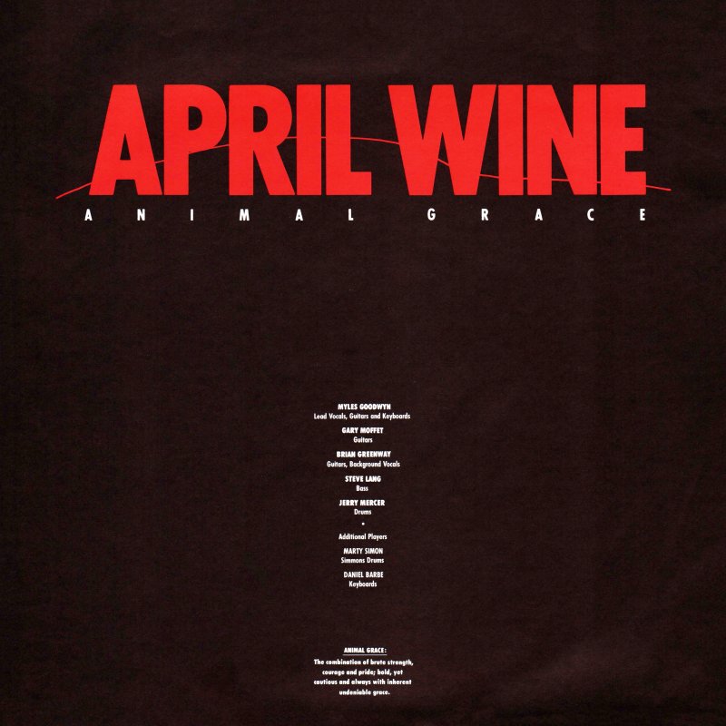
I was responsible for completing all packaging for the project (logo, cover, back cover, insert) as well as any campaign ads for marketing and poster. All layouts and final mechanicals were done by me in house at Capitol.
As almost all previous April Wine covers were designed by Aquarius’ Bob Lemm – who also designed their logo, is that why the logo (from the band’s previous 4 albums was not used?
There was no mandatory that a previous logo be utilized. I selected a bold font and introduced a fine line to reflect the nature of the art, without competing with the art. The cleaner logo created
did not battle the art work and maximized the visual impact of the artwork illustration.
Did you have much contact / input from the band (or specific members) management? and did you ever listen to the album?
On this project, I had no direct contact from the band or management. Communications filtered internally down from the Creative Director to Art Director to Designer.
Can you tell me a bit what inspired / influenced this cover piece, and how it was achieved?
While coming up with concepts I searched various illustration promotional pieces and periodicals as well, and found a captivating image by Marshall Arisman that fit the title with perfection. Bold and powerful, elegant and graceful, the image was compelling. At this point it was comped up with a few other ideas, but this was the strongest image.
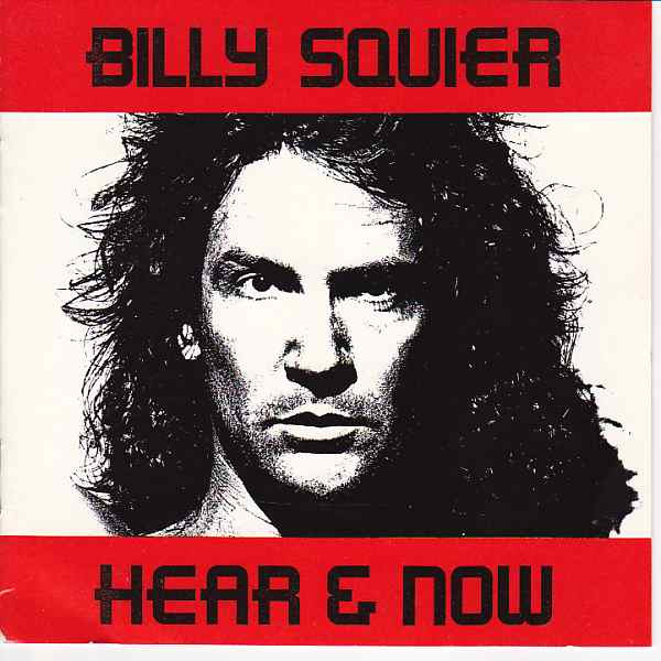
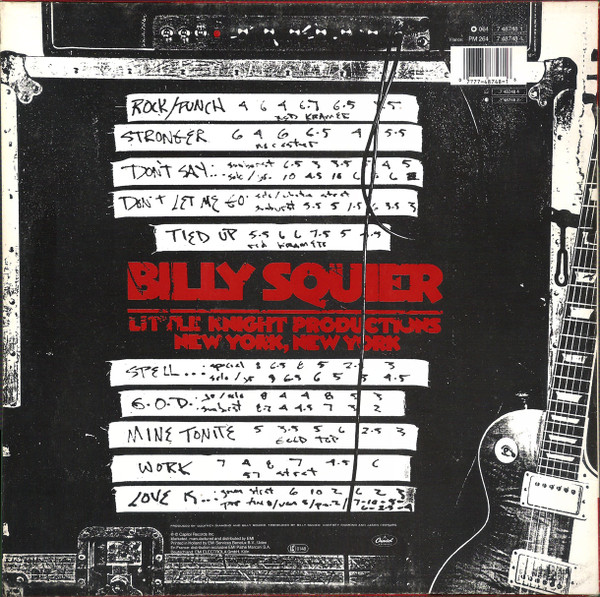
You also did Billy Squier’s Hear & Now album. Recall much from creating that?
In this case, I was assigned the project and it had very definitive parameters. Art elements were supplied specifically and indicated for the cover. Billy and the Art Director, Tommy Steele
had a very clear concept of the desired look. The cover was built to specifications and I designed the rest of the package reflecting the look of the cover to follow the feel.
Any favorites and/or most successful album covers you’ve designed?
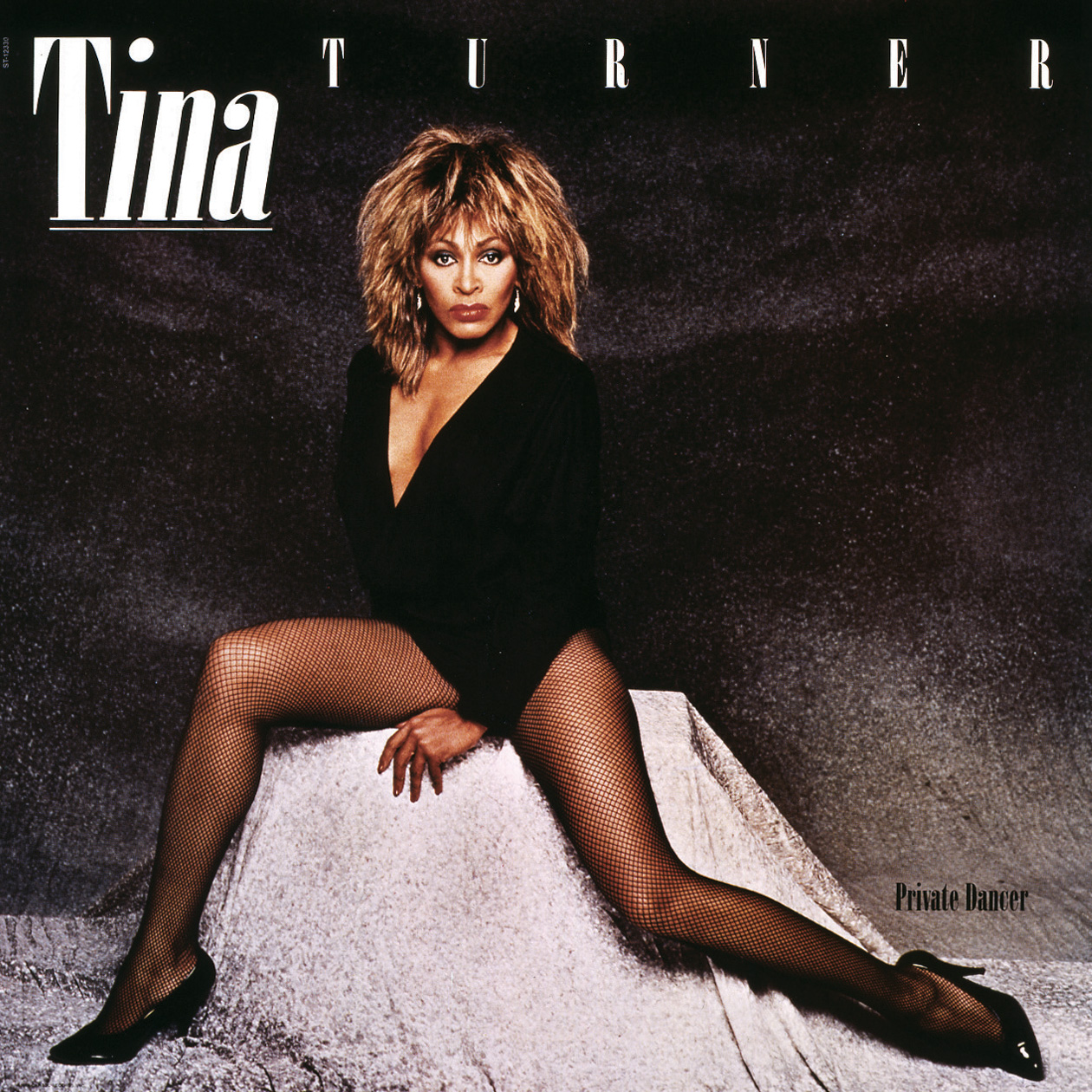
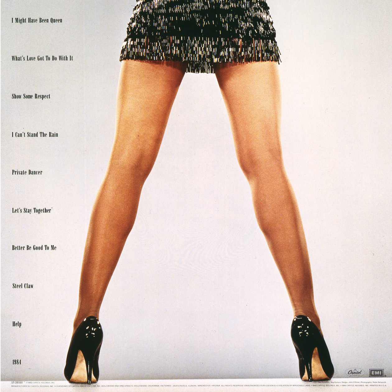
My favorite project was ‘Private Dancer’, by Tina Turner. I was going on vacation but cancelled it when the opportunity came up to work on this release. In this case I was involved with the Producer, John Carter and Management, Roger Davies on all aspects of the release. From coming up with the logo, all packaging including the double cover release – they needed one layout that worked with 2 separate cover images. I designed all domestic singles, advertising, marketing elements, standees, promotional items for over a year. A fantastic opportunity, amazing people… and Tina who had an undeniable presence that filled anywhere she was with the brightest light.
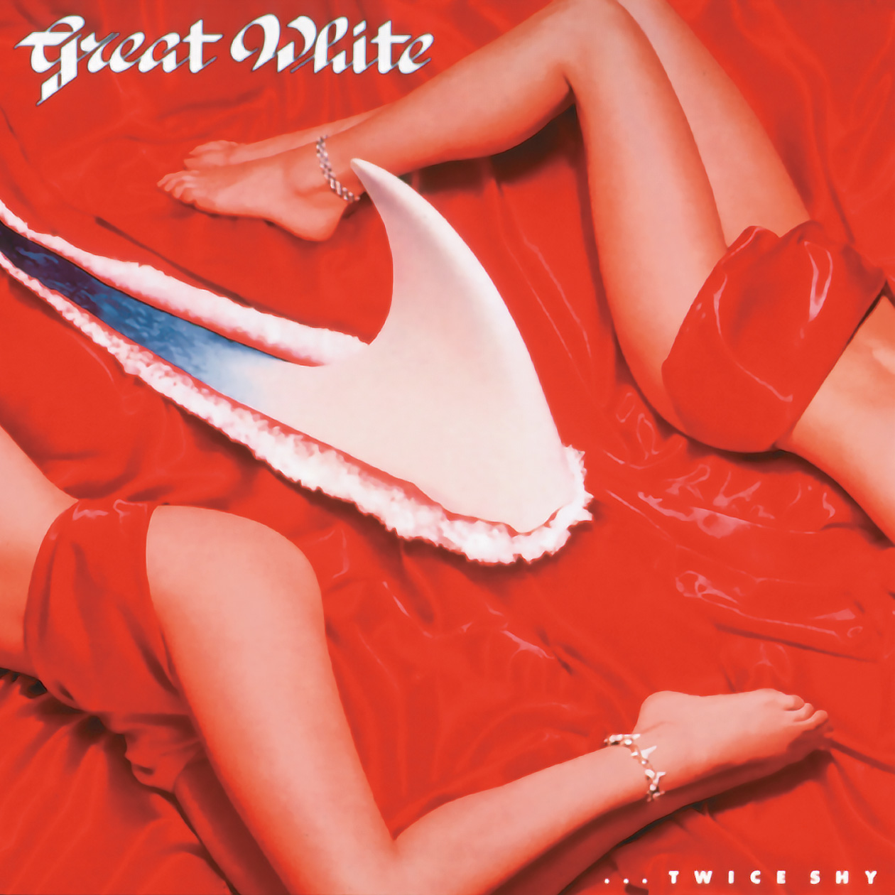
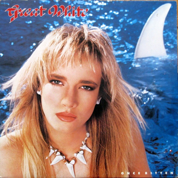
Another was the Great White project, ‘Once Bitten Twice Shy’ with Alan Niven. Another long inclusive creative project with many singles and advertising elements. A lot of fun with compelling visual elements with Alans inspiration.
Are you still creating any album covers? If not, what else have you been up to in the art world?
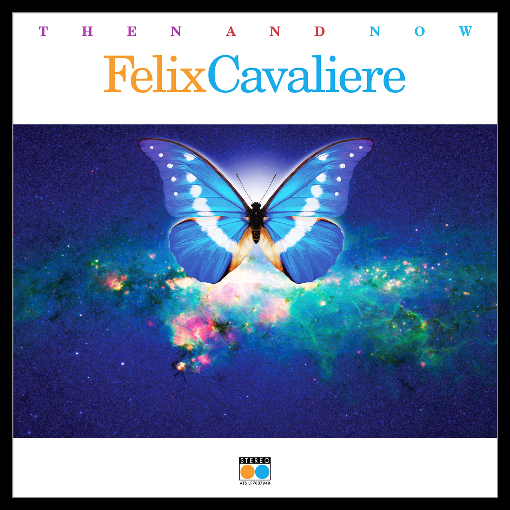
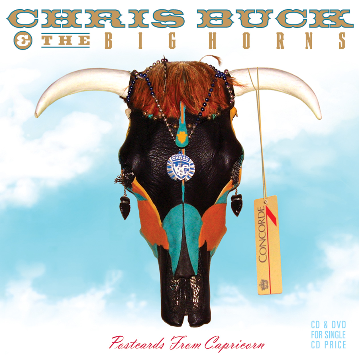
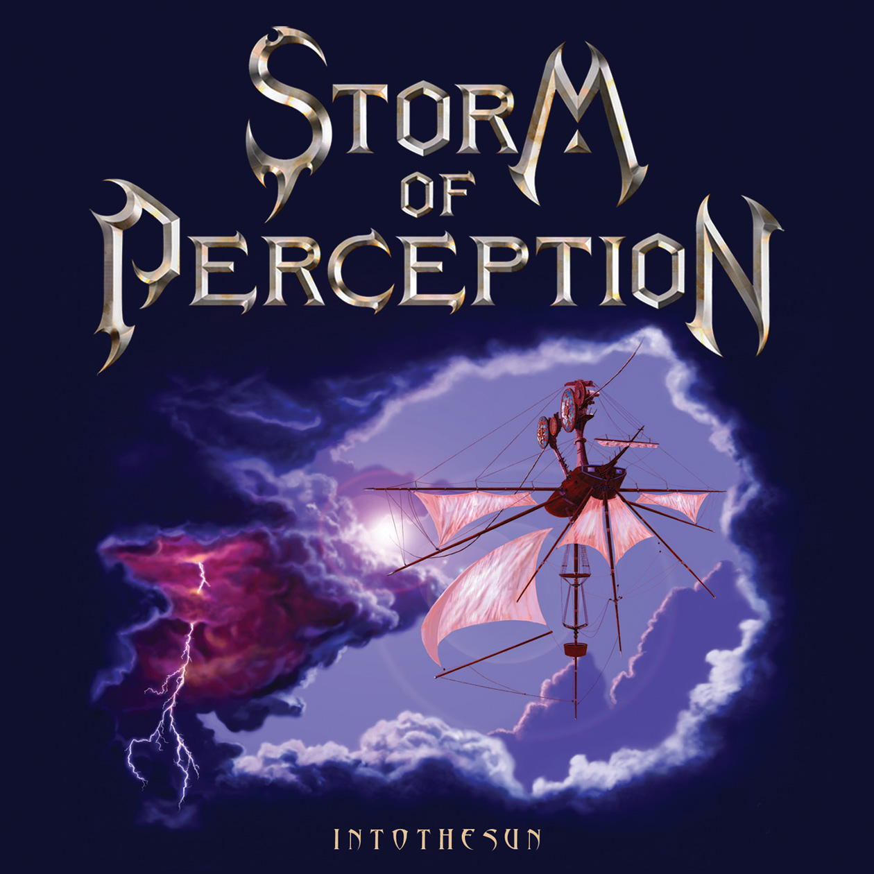
A few elaborate CD/DVD projects done for Alan Niven’s Tru-B-Dor Management a few years back, Storm of Perception and Chris Buck and The Big Horns. An album project for John Klages, Fabulous Twilight on Danbury Fair Records. A recently completed project for Felix Cavaliere (The Rascals), ‘Then And Now’. A fun project with a great musician and great management team. Hopefully a new one for Mark Farner’s American Band upcoming.
LINKS:
Select Company Overview: http://www.artministry.com
Music packaging on: https://www.discogs.com/artist/1841967-Artministry-Inc
