
California artist Spencer Caligiuri has created the artwork for Wings Of Steel’s debut EP as well as their fist full album Gates Of Twilight, released earlier this year. Both covers are fantastic and give the band a theme and cool logo from cover to cover. In this episode of Story Behind The Album Cover, Spencer Caligiuri details his art & early days, as well as a few of his favorite album covers, And his creating and work on the Wings Of Steel covers. WOS are fairly new hard-rock / metal band from LA, who will play big ’80s influenced rock, for fans of Whitesnake, Dokken, Michael Schenker Group, Great White, and numerous others. Check them out! For more on Spencer Caligiuri’s work, check out the links at the end, You can find a review and interview on Wings Of Steel elsewhere at this site.
What is your art background, and have you done any other album covers or artwork for bands?
Going back into the past, I’ve been an artist of some sort for as long as I can remember. I started by drawing of course. Doodling animals as a child, trying to copy exactly as they looked, encouraged by my mom, aunts and grandmother. My grandma was a landscape oil painter. I think seeing her paintings hanging around the house was something that made painting feel within reach, and not just something produced by the great masters. I continued this for all of childhood through highschool. I studied portrait and figure drawing late high school at a local art school before doing a brief, unsuccessful attempt at the Art Institute of CA for graphic/animation. This was stunted by my overwhelming urge to choose partying and drugs over getting serious about my future. But I got back on my feet, albeit taking me multiple years of falling on my face, and got very into writing and oil painting in 2009. I gravitated toward anything with water, and the weirder and more psychedelic the better. Painting was all I cared about until l found tattooing which is a long story in itself. But that is my life now. For the last 10 years I tattoo 5 days a week so most of my extracurricular artistic passions have taken a back seat.
I’ve done a few album covers. Buffalo Trance is an incredibly talented 3 piece progressive rock band from Ventura, CA. I grew up with these guys and they’ve been killing their respective instruments since we were in early high school. The other cover is a 36” X 36” physical oil painting I did for a San Diego reggae band called Burning Wave.

How did you get connected/involved with Wings Of Steel?
I started working with WOS through an email they sent me inquiring my help bringing their EP cover to life. I was instantly intrigued. these dudes knew exactly what they wanted and as soon as they sent me their demo I was fucking blown away. We instantly set up a meeting at the tattoo shop and we’re off and running. I really couldn’t believe two young musicians in their mid/early 20’s were writing music like this. The first track I heard was their self titled track “wings of steel.” As soon as I heard Parker’s guitar sound I knew I was in. if that wasn’t enough, Leo’s vocals and lyrics hit and I was instantly a fan, determined to be part of what they were channeling.

Can you tell me about the design for their new album — what inspired it, did anyone in the band offer ideas, etc..
Their new album “Gates of Twilight” was definitely riffing on the concept of the EP. the two stallions which would seem to be a recurring fixture of their image and representation of Leo and Parker. The dark and light, for sure present in their opposing dark and light hair. At least this is my interpretation. Leo and Parker both knew exactly what they wanted to see in this and were super clear on their thought process for it. I tried to bring what I had from the EP into this, yet incorporating the Gates of Twilight, represented by a towering staircase flanked by columns, and silhouetted by the heavens. I thought the standard wrought iron gate has been done so many times and might get lost in the background noise. There’s Some darker tones in this album as well, reflected in many of Leo’s lyrics and song titles, hence the apocalyptic landscape of collapse, fire, and decay. But still punctuated by the contrast of the ever-prevailing light. A true heaven and hell landscape and motif that will never die.
Did you hear the Wings Of Steel music beforehand, and did that have a part in the cover design?
When I started the concept for their EP they sent me their demo which I blasted constantly while drawing for that one. The same went for the full length. this time even more fueled after seeing them deliver such a powerful live performance. Their first ever as Wings of Steel. It absolutely drove my hand to bring the same fever, melodies and aggression their music does.

Can you tell me a few of your own favorite albums and album covers? bands and album artists you liked? (maybe a short list of each)
Oh boy, this is a tough one. A tough question for anyone who loves music especially with so much easily at our fingertips now.
Let’s start with Tool. One of the first bands that helped me discover music in my formative years of the mid/early 90’s. Still all of them making my list of favorite albums and covers to this day.
Both of these albums have a completely interactive covers or jewel cases. Aenima was like a hologram when you moved it the eyeballs would waver in and out.
The Lateralus cover was composed of like 6 clear pages that you could scroll through to see the individual layers, that when it was fully closed you could see the full image here.
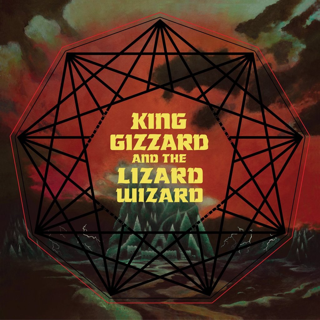
King Gizzard and the Lizard Wizard: Nonagon Infinity, All them Witches: Baker’s Dozen


Any other album covers or projects you’re currently working on and links you’d like to share?
I am a full time Tattooer and oil painter. You can find Me on Instagram at @artofspencer @artofspencerfinearts and artofspencer.com
