Tag Archives: album covers

10 Classic Band Photo Album Covers (Part 2)

A follow up to my previous list of album covers featuring a band photo. Again, an actual photo, not a drawing or seperate photos of bandmembers. A lesser few known gems in here. If you’ve got any favorites that aren’t here, please put it in the comments.

SLADE – In Flame
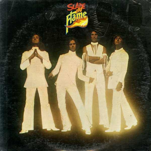
This one features the classic shot of SLADE by rock British photographer and art director Gered Mankowitz. Mankowitz did a lot of work with Slade, as well as the Rolling Stones, the Strawbs and various other throughout the 60s, 70s and 80s. In Flame was from 1974, when Slade were at their peak in the UK (not so much over here). There’s a bit of info on this pic at his website – https://mankowitz.com/galleries/the-70s-gallery/page/1/?view=carousel&start=1156

ALICE COOPER – Easy Action
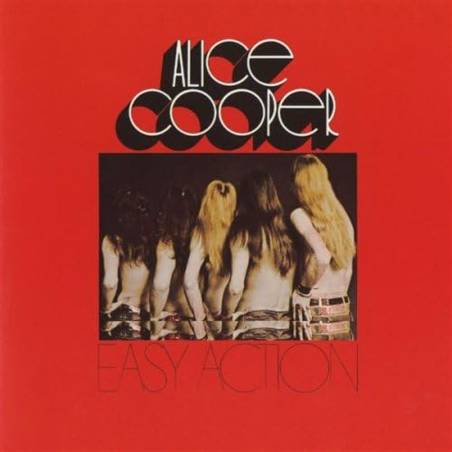
One of the album covers that inspired me to do such lists. This being Alice Cooper’s (the band) 2nd album. From 1970, with the band photographed from the back – on the front cover, with the photo of the band from the front – on the back. There’s also black and white shots of bandmembers on the inner gatefold. According to Discogs, Easy Action was the first album cover to feature the photography of Lorrie Sullivan, who went on to work with numerous bands and covers, including Grand Funk, Jo Jo Gunne, Joe Walsh, Tommy Bolin…. Cool packaging for the time, and being on a smaller label.

APRIL WINE – Stand Back
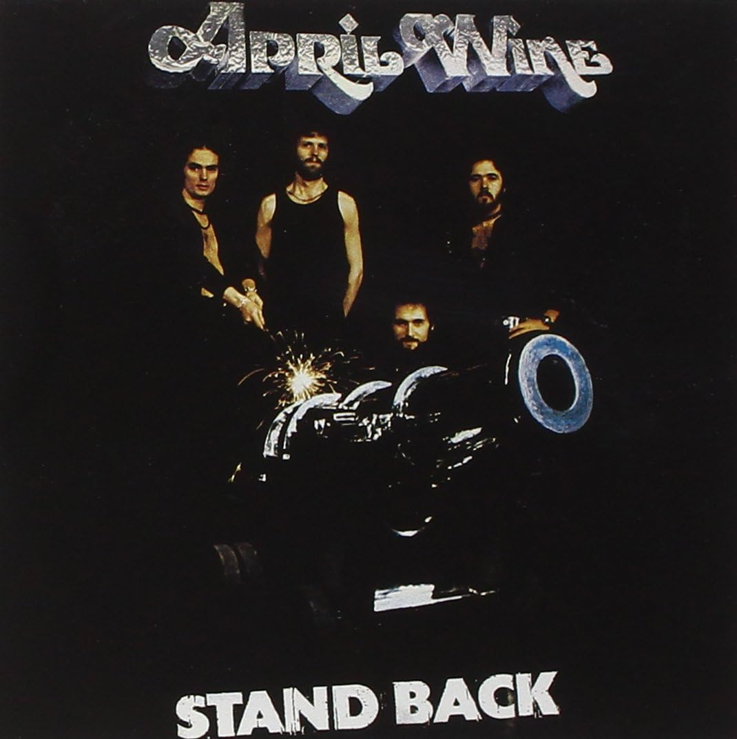
This album was big in Canada, in 1975. April Wine’s 4th studio album. The band (new line up) posed around a canon. The canon would become part of the band’s stage show for that tour, a tour which became the highest grossing tour in Canada by a Canuck band back then. Photos by Graham Fowler, who worked alongside Bob Lemme on many Aquarius Records’ covers.

YESTERDAY & TODAY – Struck Down
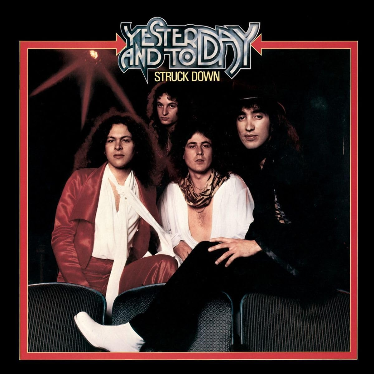
The 2nd album by LA’s Yesterday & Today, which would be shortened to Y & T by the next album. Struck Down features a cool band shot on front, framed, and individual band member photos on the back. From 1978. Lacking some credits on the album sleeve (if anyone knows who took this photo?)

WIRELESS – Positively Human, Relatively Sane
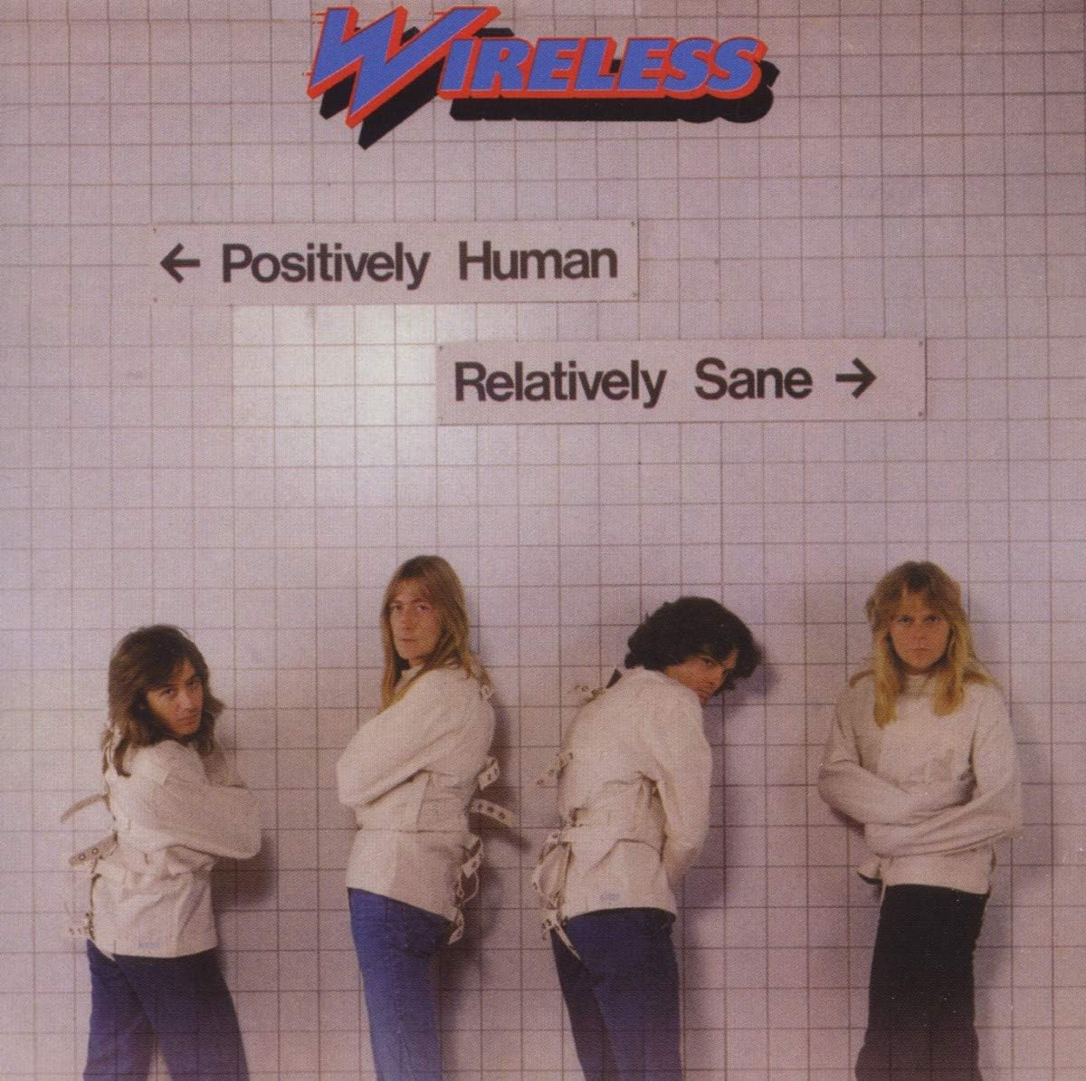
The 2nd of 3 albums from Canadian band WIRELESS, released in 1979. This is a great cover, with the band in straight jackets on the front. The back features individual live shots. Cover designed by Paul Hodgson, who also did Max Webster’s A Million Vacations, cover photo by John J Wood.

SCORPIONS – Virgin Killer
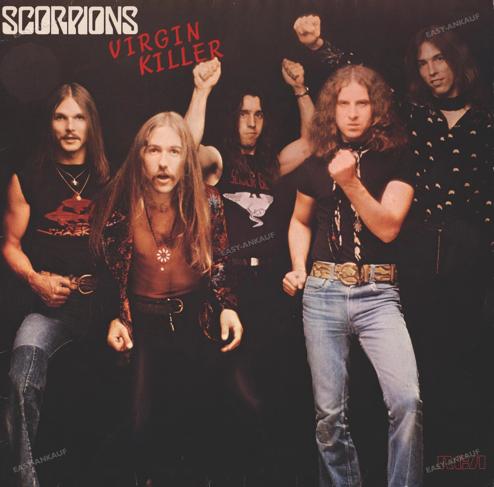
One of those album covers that was a replacement for a cover that was too controversial. And this wasn’t the last time The Scorpions were required to change an album cover, either for the censors or the record company. This photo of bandmembers, oddly posing, was taken by German photographer Michael von Gimbut, 1976. https://www.pickledpriest.com/single-post/album-cover-story-5-do-the-scorpions-shock-you-like-a-hurricane-or-merit-a-total-blackout

AEROSMITH – Get Your Wings
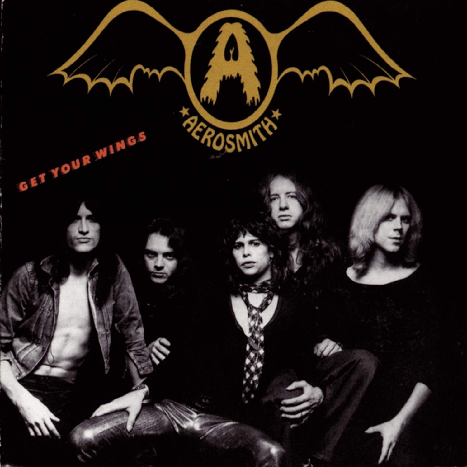
The band’s 2nd album, from 1974, and 2nd to feature a shot of the band on the cover. This one was improved – the cover and the music. With Jack Douglas brought in to produce, Get Your Wings would be the band’s breakout album, with multiple singles, and regarded by many fans as their best . The band photo on a black cover, and that early logo designed by their former guitarist Raymond Tabano, made for a pretty decent cover. https://www.goldminemag.com/features/aerosmith-explored-many-album-cover-options-with-designer-ernie-cefalu

MOTORHEAD – Ace Of Spades
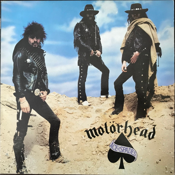
MOTORHEAD’s 5th album, released in 1980, and titled after what would become their most famous song. This one, art directed by Martin Poole, who was also designing covers for URIAH HEEP and MANFRED MANN’s EARTHBAND that same year, featured a band photo taken by Alan Ballard. The band appearing in some desert scenery, with leather and hats, like outlaws. But the shot was taken in England, and below is a link to the story about it. Back cover features a photo of the band sitting around a table.

https://www.behindthecovers.com/covers/ace-of-spades

TWISTED SISTER – Under The Blade
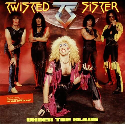
The debut from New York’s TWISTER SISTER, in 1982. The band all dressed up in make up, rags, leather, etc… I’m sure this cover shot taken by legendary photographers Fin Costello drew lots of attention. Design (outfits, make up…) by Dee Snider’s wife Suzette, who would go on to design most of their album sleeves afterwards. When Under The Blade was remixed & reissued in ’85, it used a different photo on the front (same shoot), and changed the lettering type and color.

YES – The Yes Album
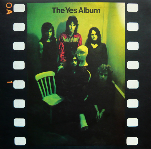
The 3rd YES album, the first to feature Steve Howe, and the one to feature the band on the front prior to Roger Dean getting invovled and doing the artwork for most of their covers onward. Cover photo of the band, looks to be in a closet or something, green lighting, a nice gatefold, designed by Jon Goodchild, with cover photo taken by Phil Franks and more photos by Barry Wentzell.
https://www.ibiblio.org/mal/MO/philm/yes

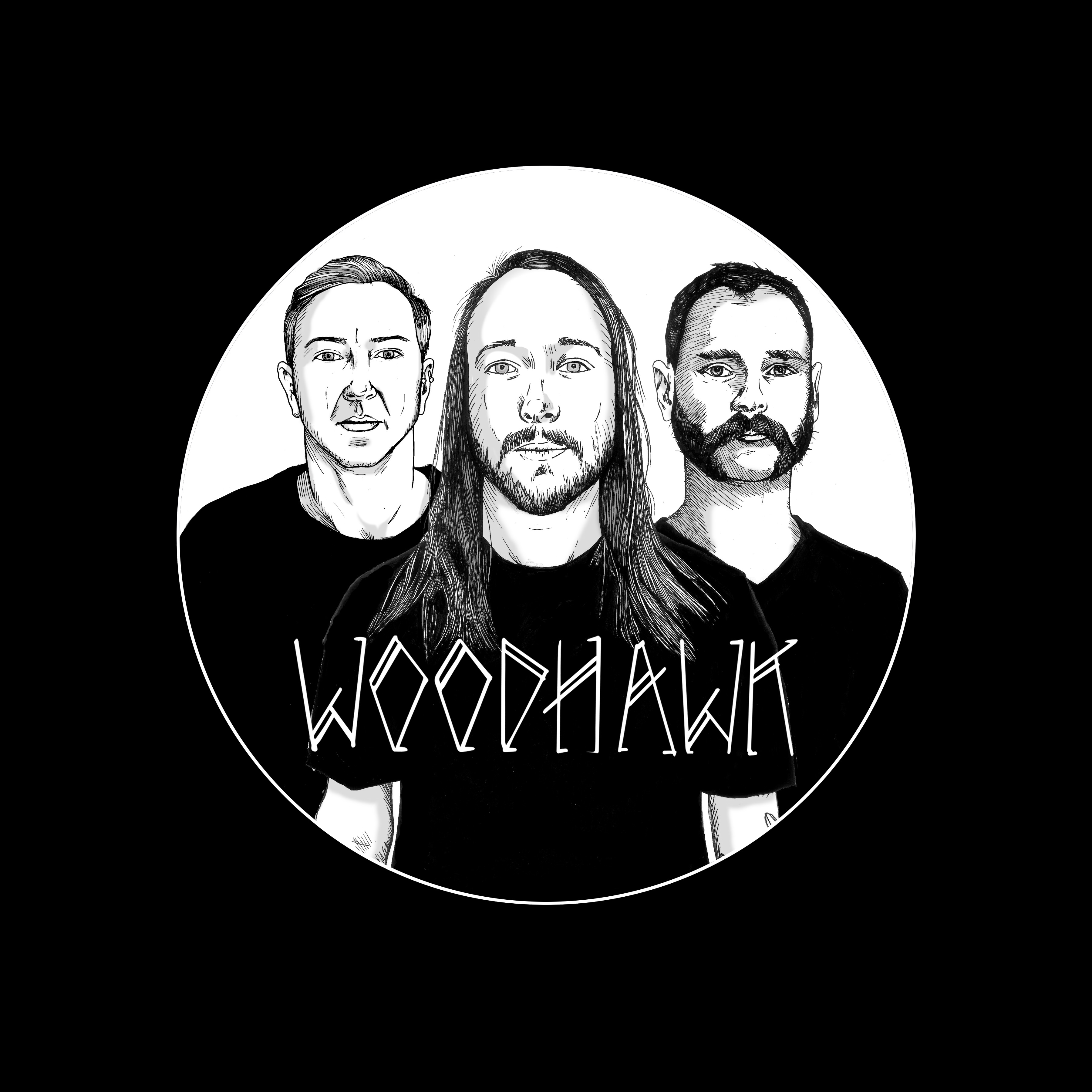
The Story Behind The Album Covers: An interview with Mark Kowalchuk on WOODHAWK

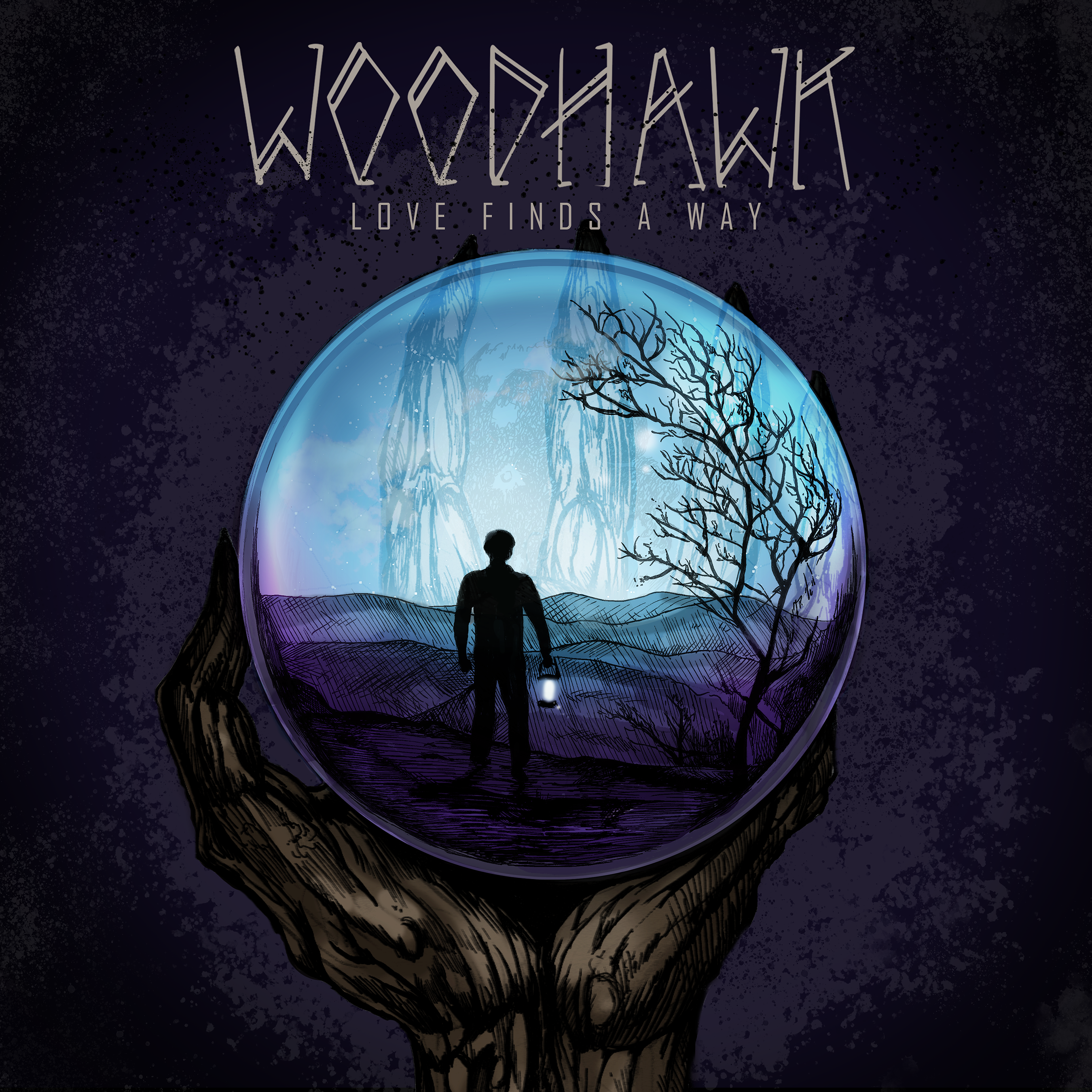
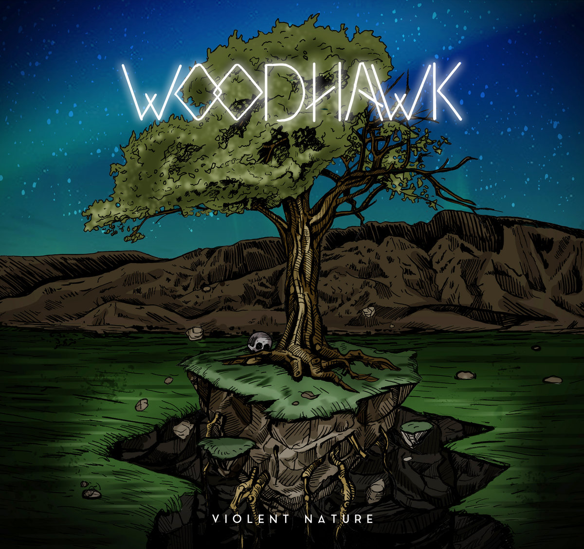
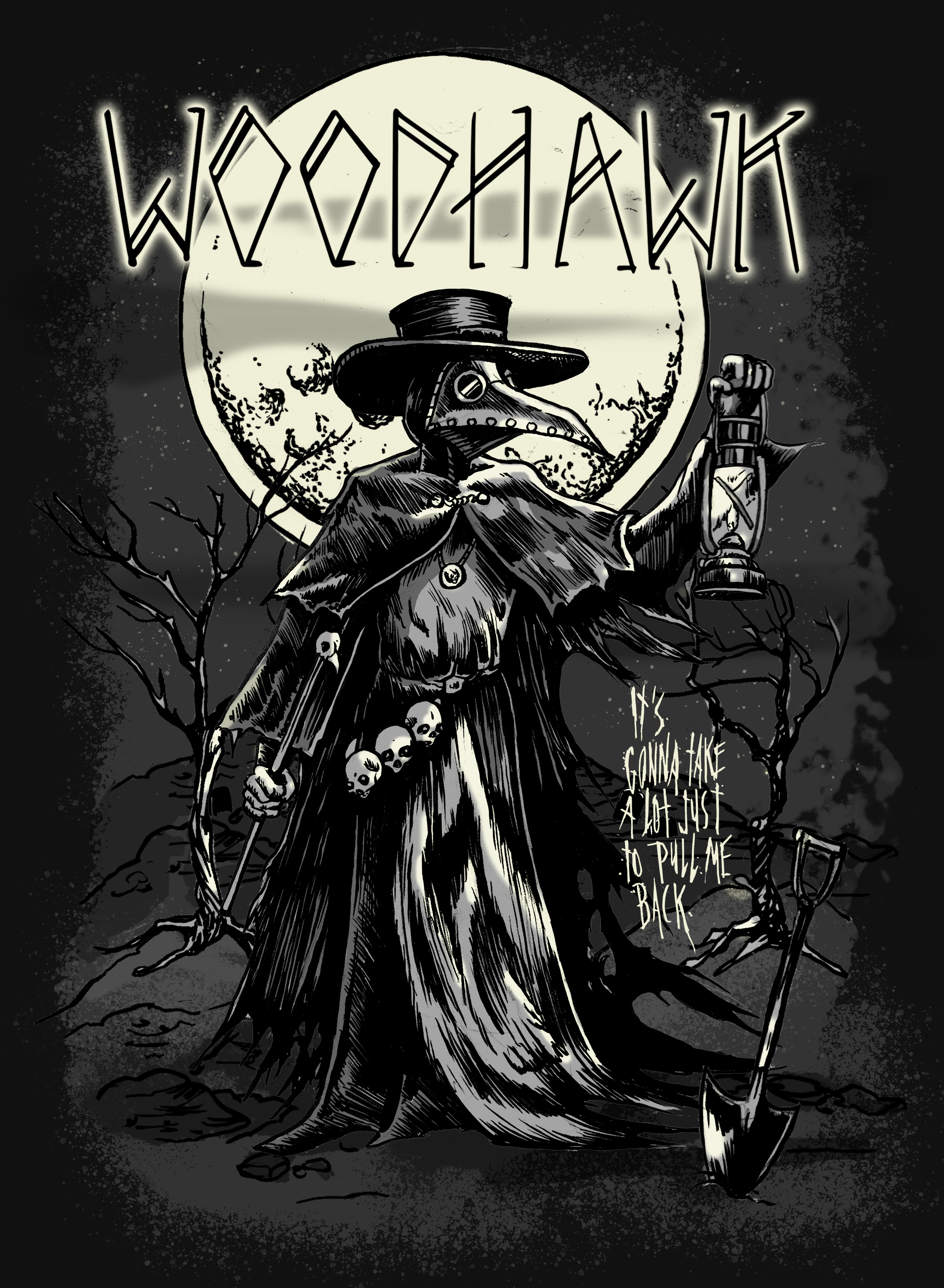
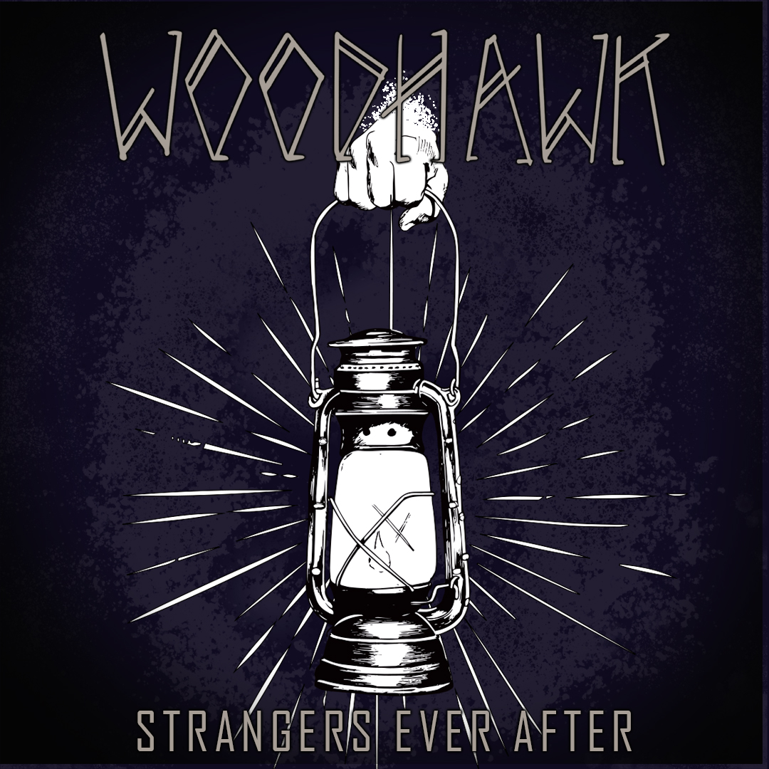
Canadian artist Mark Kowalchuk has created the 3 album covers for Canuck stoner-rock band WOODHAWK, from Calgary. The latest design from Mark is the brand new Woodhawk album Love Fins A Way. All 3 Woodhawk covers are eye catching and creative, and each has a story to them. I recently swapped questions and answers with Mark regarding these album covers, as well as what else he is up to creatively in the rock music field. Check it out below, along with images of Mark’s work, and check out the new Woodhawk album!

As an artist, what is your ‘field’? Who do you design for—concertgoers, advertising, album covers, or other media?

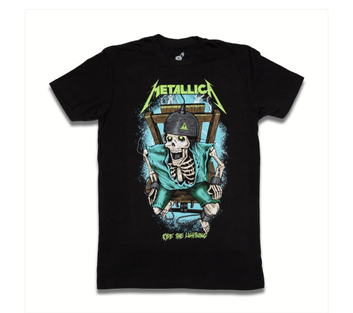
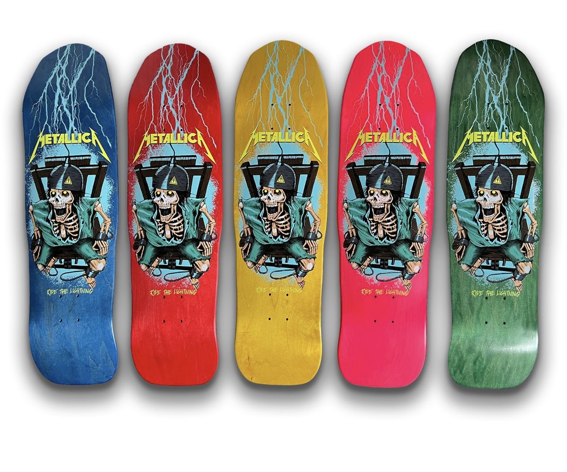
Most of the work I do is for the skateboard and snowboard world. I only create art for a few select bands: Metallica, In Flames, Souls of Mischief, and Woodhawk. Most of what I do for these bands is merchandise design. I create album art for Woodhawk, but generally, people hire me for apparel design, as that’s where I’m most experienced.

You’ve done the three Woodhawk album covers. How did you get involved with them? What’s the connection?

Working with Woodhawk happened quite organically, actually. I was doing artwork for another friend’s band at the time Chron Goblin (I used to skateboard with those guys a lot back then) and I met the Woodhawk guys at a show where they played alongside Chron Goblin. They liked the work I had done for Chron Goblin and asked me to do a few designs for them, which eventually led to a lot more collaboration.

Each of the Woodhawk covers suits the title well. Can you share the idea or story behind each of them? Did the band members contribute input or suggestions?

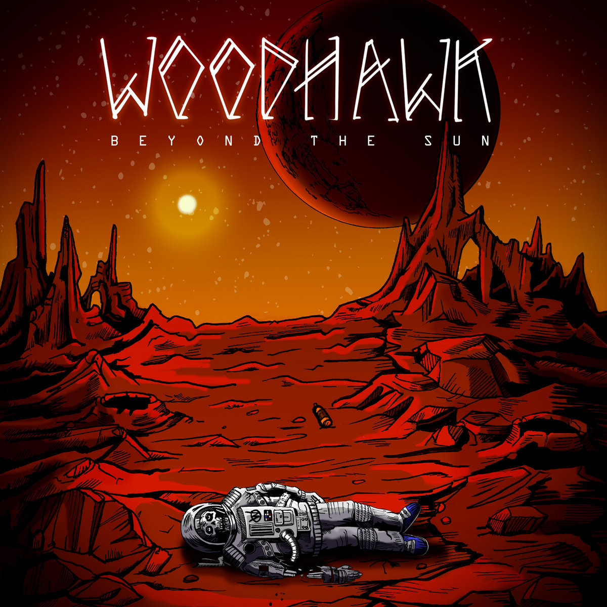
For Beyond the Sun, we went with the concept of an astronaut who’s been forgotten on a planet far from Earth. My personal interpretation is that he’s ventured too far, and that ends up being his demise.

Violent Nature is full of symbolism. There’s a lot of yin and yang imagery, the tree is fruitful on one side and decaying on the other.

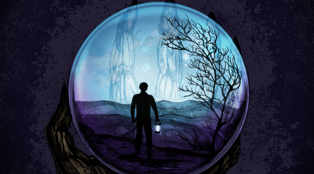
For Love Finds a Way, the main character is lost in a strange land he doesn’t recognize and is trying to find his way. He’s being watched by a ominous creature larger than him, though that part is left open to the viewer’s interpretation.

The band has a lot of input into their look and designs. We usually meet up over some tasty wings and beers and talk about what the album is about and the direction they want to go in. Each album has a different mood, and they’re good at providing me with examples and mood boards to convey the vibe they’re after. They trust me to bring something extra to the artwork and allow me to incorporate my own interpretation as well.

For example, they wanted the wanderer on Love Finds a Way to be holding a lantern. I felt the lantern had strong symbolic weight, so I focused on emphasizing that element. One thing I will say is that we work well together in blending their ideas with mine.

I presume you hear some of the music before each album is finished? Does that influence what you create?

Absolutely. It’s essential for me to hear the music, it’s mandatory to create the proper visuals.

Are any of the landscapes based on real places or perhaps photos you’ve come across, or are they purely imagination?
All of them come fully from my imagination, they’re not based on real places. For Beyond the Sun, I imagined he might be on Mars since the album has a red theme, but I didn’t look at any actual Martian landscapes or reference photos. It was all from my head.

What’s your method for creating artwork? (Drawing, painting, digital, etc.) Can you walk us through the process of designing Love Finds a Way?
I’ve got my process dialed in,kind of like baking a cake, really. First, I sketch out 3 to 5 rough concepts in my sketchbook. Then I usually meet up with the guys (over delicious beer and wings, which I mentioned early). They give me feedback, and I take notes to move into a second round of sketches.

Once we settle on a final concept, I do the clean inking. I scan the linework and color it digitally. I always keep the original ink work as-is—I don’t redraw it digitally because I think it keeps that personal, hand-drawn feel intact.

Are you doing any other pieces for the latest Woodhawk release—posters, singles, shirt designs?
I just finished a few new merch designs for them, which you’ll be seeing shortly. The guys usually call me as they need me, so your guess is as good as mine. The magic eight ball says: “Chances are good.”

Who are some of your favorite album artists or covers (besides your own)?
I’ve always loved the work of Alex Pardee, his art for A Sense of Purpose by In Flames is awesome. I’m also a big fan of some of Mastodon’s covers, especially Cold Dark Place, and my friend Skinner did Once More ‘Round the Sun, which is killer. Tool’s album art has been a huge part of my upbringing as well.

Do you have any favorite songs from the latest Woodhawk album?
My top pick is White Crosses, with Killing Time coming in second, and I’ll explain why.
The lyrics in White Crosses about going to hell alone really resonated with me at the time. I was going through a dark period in my life, and it felt like the song was mirroring exactly what I was experiencing. From my perspective, it might be the darkest song Woodhawk has ever written.

Killing Time is also powerful, what a way to close the album. It feels like slamming the door behind you as you walk out. There’s a real sense of pain and loneliness in that track. Art evokes emotion, and that one nailed it for me.

Have you worked on any other album covers besides the ones for Woodhawk?
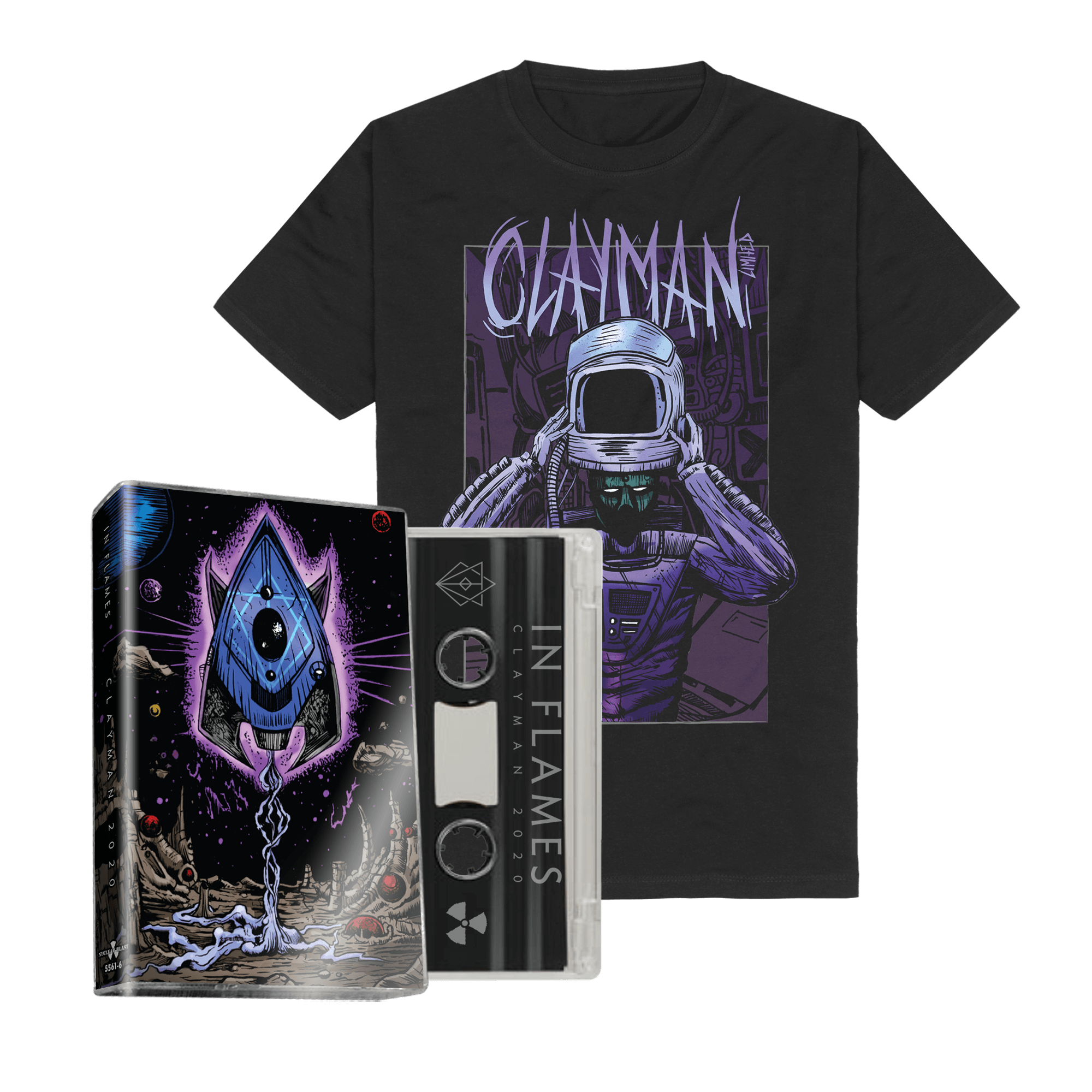
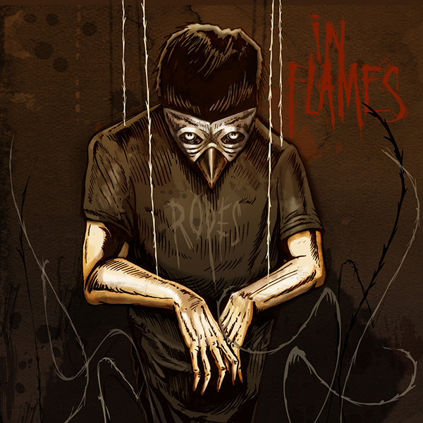
Yes, I’ve done two projects for In Flames in the past. I did the single artwork for Ropes and the fold-out cassette design for Clayman 2020.

Where can people find more of your artwork, album covers, or prints?
I’ve been too busy with projects lately to focus on prints or a dedicated website, but you can see all my artwork on my Instagram: @mark_kowalchuk

LINKS:

https://www.facebook.com/MarkKowalchukArt

https://woodhawk.bandcamp.com/album/love-finds-a-way

Story Behind The Album Cover – RAVEN’s All Hell’s Breaking Loose, with Andrej Bartulović

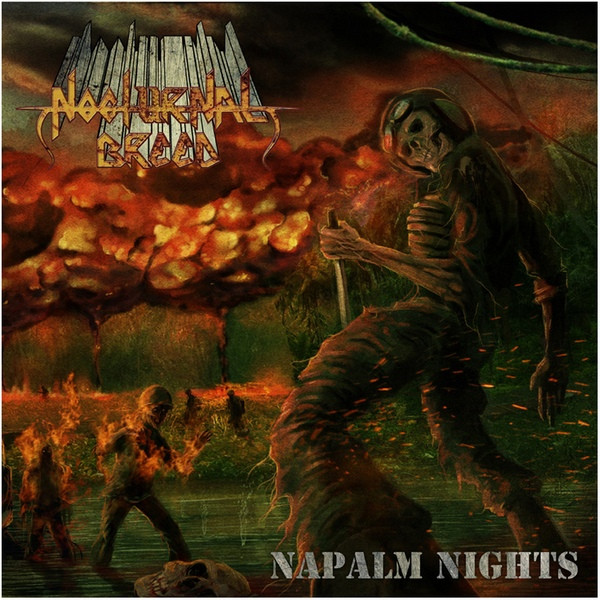
In this latest post of Story Behind The Album Cover, artist Andrej Bartulović (All Things Rotten) discusses the cover art for the brand new RAVEN album All Hell’s Breaking Loose. Andrej has done numerous album covers for the likes of Mortis, Nocturnal Breed, and the latest from Alcatrazz! Enjoy the read, and check out the links below for more on Andrej Bartulović’s work.


First, can you give me a bit of background on yourself, how you got into art (different media’s) and in particular, album art? 

I got into art while I was practically a kid. Got more involved into band stuff in high school and started working for bands around 2000. – the great time of MySpace. Awesome times!

Do you have favorite artists, and particular rock album artists, any favorite album covers (by other artists) from your youth? 

Always loved Ed Repka, we all grew up with his covers. But artists I admired were regular metal fanboy list artists, starting with Giger then Cappullo. Grew up with Italian comics, not American. Dylan Dog was my fave comic and for many years Corrado Roi was my fave artist back then. Today I worship Riccardo Federici, an absolute beast and God (for me at least).

You’ve done the latest Raven album (did you happen to do the previous one?)  Can you tell me a bit about your connection to the band? 

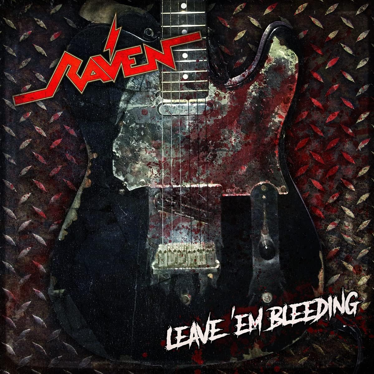
If you are referring to “Metal City” as the previous one, then no. I didn’t do that. I did their “Leave ’em Bleeding” EP. I started working for the band years before on some shirts. I think Mike Heller just posted on Facebook that he needed artsy/graphic guy and I answered. He checked  my page and I think that’s how it all started, that was years before. Working with Mike since. We toss ideas around, I do sketches, brothers are deciding is it a go or no. They’re all cool guys. I’m honored for a chance to work with them.

What inspired the whole idea and drawing for the All Hell’s Breaking Loose cover? Were there ideas put forth from the band or drawn from the music? 

I think the idea came from the album directly, it’s actually all hell’s breaking loose on that record. It’s mayhem of an album (in a good way). Guys wanted madness, monsters, basically Metal City on steroids on steroids on steroids (yes, I wrote that 3 times haha).

Can you detail how you created the artwork for AHBL – techniques, materials,… It is a very detailed piece. Excellent 

Thank you for your kind words, appreciated! It was hand drawn on tablet, colored and textured too. There were many changes concerning poses and faces, kinda tricky to pull those out. I used reference photos, of course. Monsters were the easy part haha. Also drew the logo by hand to fit the aesthetics of the cover and get more comic book feel. And yes, would use this opportunity (thank you again) to say loud and not so proud – bass guitar has 2 extra tuning machines. It’s a honest mistake we’ve all overseen. Super weird! But we were busy adding all those laser spiders.  So yeah, shit does happen but I think it doesn’t ruin anything, just adding bit of charm. 

Anything else you can tell about this cover, and how well it turned out? 

The answer is below the previous answer, basically. But I’m happy how it turned out, guys love it and people seem to dig it too. So it’s win-win-win.

You’ve done a number of other covers, notably the last 2 Alcatrazz albums. What are some of your favorite covers you designed, with a line or 2 about them? 

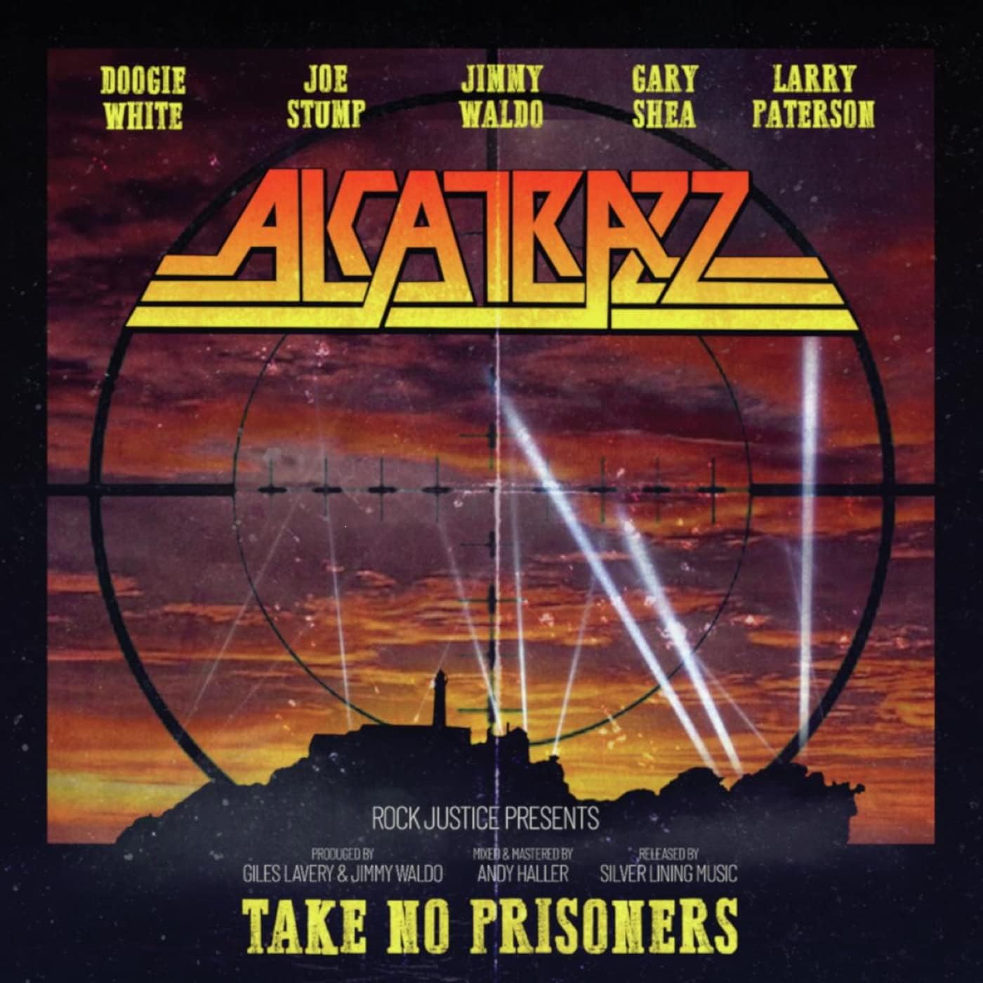
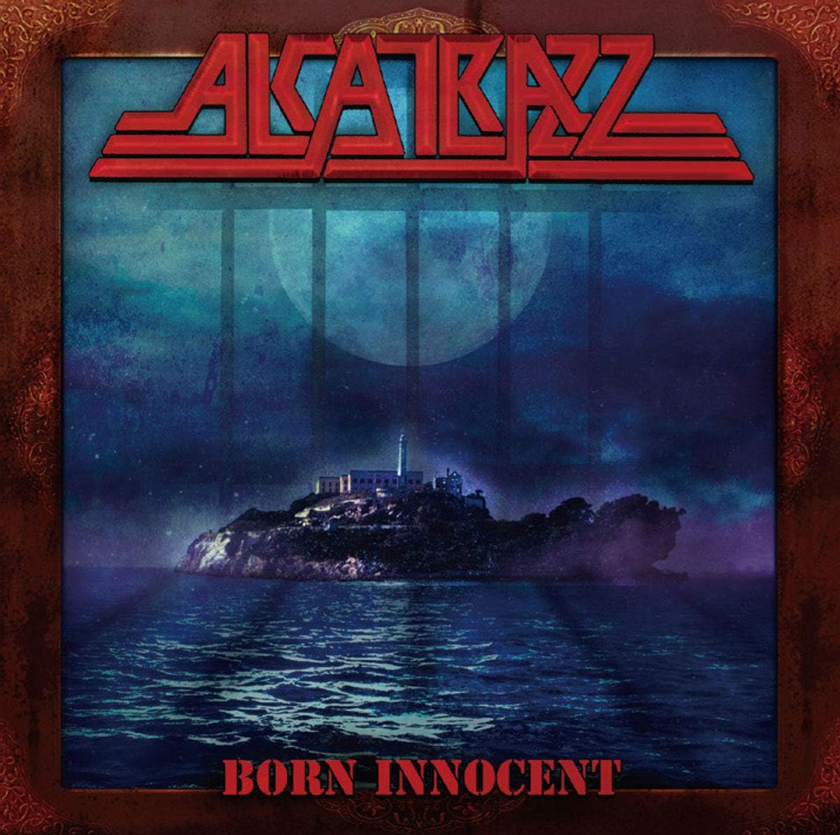
Yes, I did the last 2 Alcatrazz covers, gotta thanks to Giles (for the opportunity and trust) and Silver Lining Music for patience. Some of my faves? Bah, I always think the last thing is the best thing. I’m super critical about stuff I do so I really can’t decide about faves. I like the last Nocturnal Breed stuff I did.

What sort of music do you listen to? And any favorite tracks from the new Raven album?

At this exact moment as I write this I have Dissection playing through the speakers. It’s usually death and black metal, but I also love Arjen Lucassen stuff too… weird heavy stuff like Lost Horizon, Laibach, EMF, ABBA…hahah. Last few years I’m mad about video game soundtracks… nostalgia all the way.
My fave Raven track from the new album would proly be “The Far Side”, but the whole album is absolute batshit crazy and young bands should take some notes.

What other projects are you working on (music related or otherwise)? 

Just finished some book cover illustrations; but generally it’s more or less about music – shirt designs, banners, whatever the band needs. But whenever someone needs any art done I’m around, like a sleazy weirdo hiding in the bushes.

LINKS:

https://www.facebook.com/AllThingsRottenOfficial

https://www.instagram.com/maggotmeister79/?hl=en

https://www.discogs.com/artist/3746421-Andrej-Bartulovic