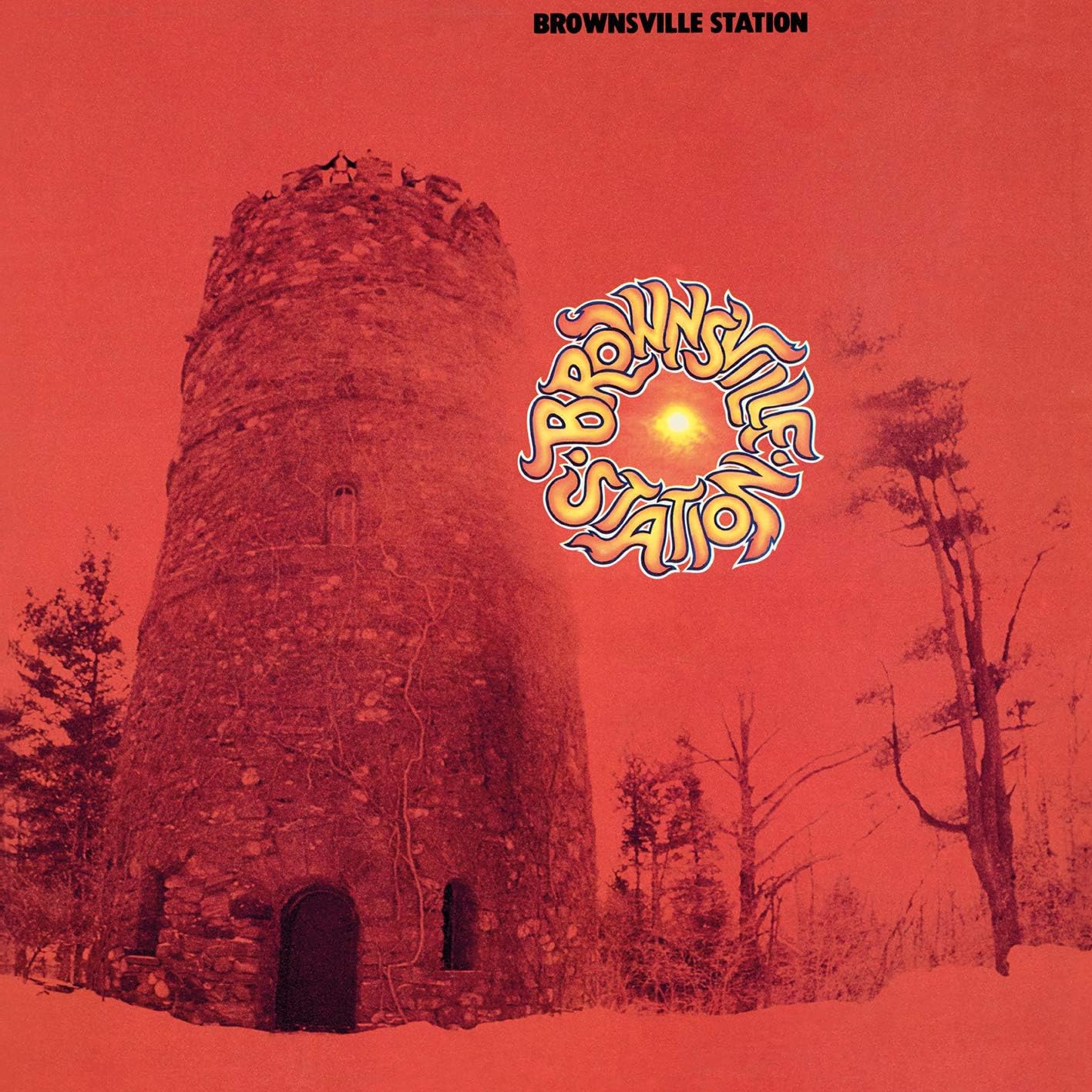
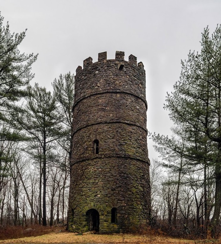
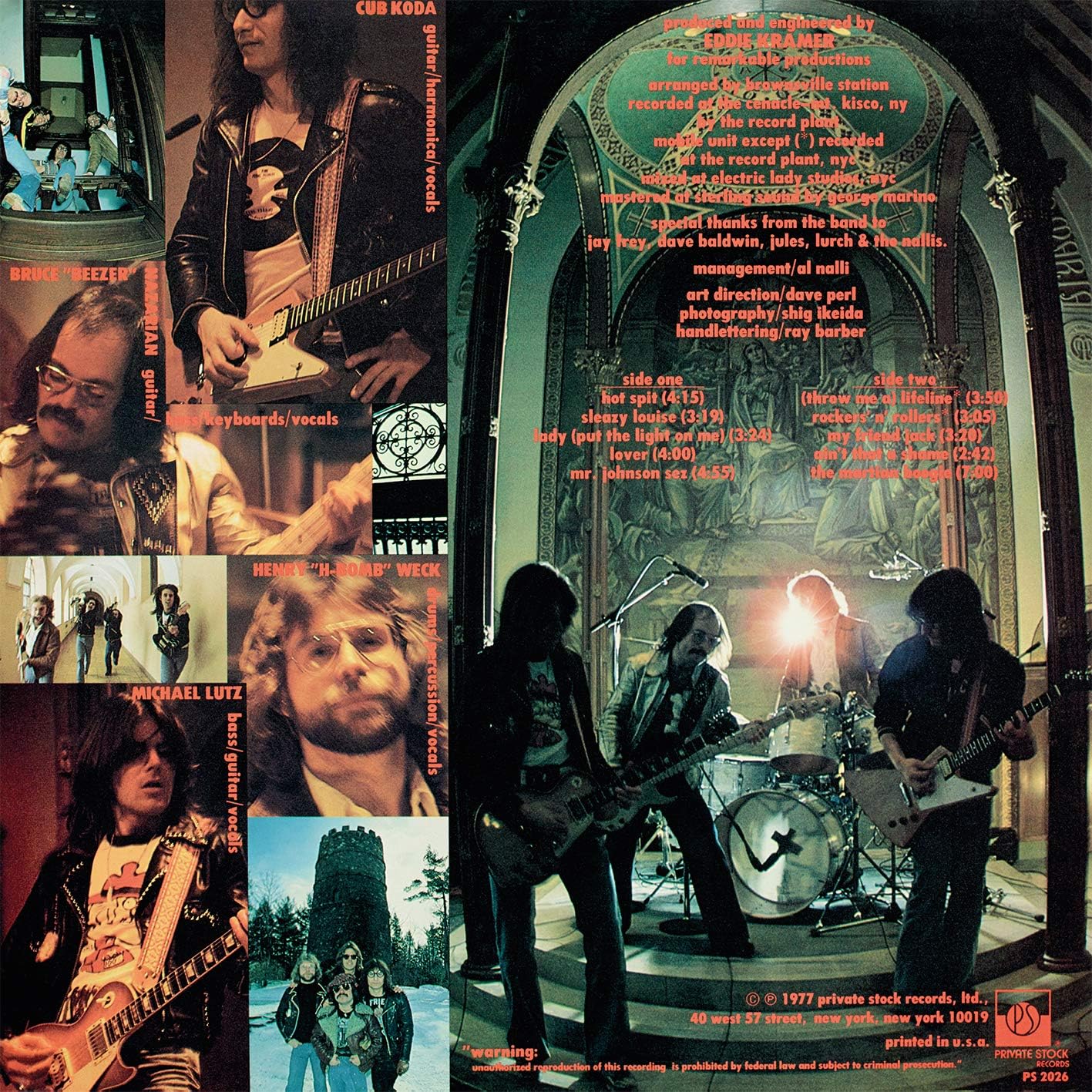
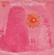
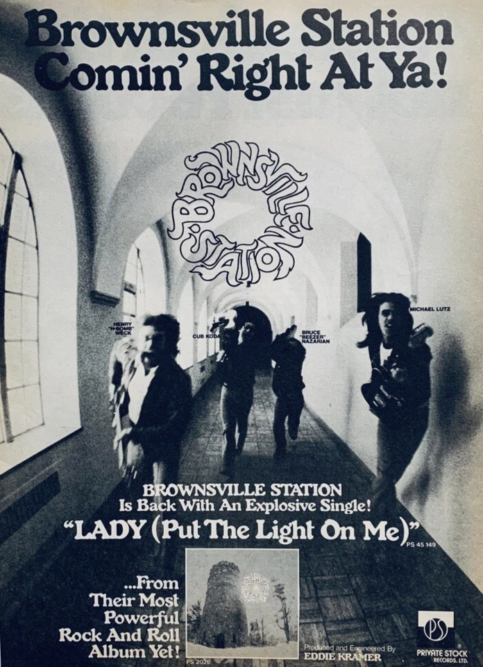
After a long delay, a line-up change, and signing to the Private Stock label (another small label), BROWNSVILLE STATION released what many consider to be the band’s best album in the spring of 1977. It’s their self-titled album, often dubbed the ‘red album’ for it’s cover (also referred to as the band’s ‘lost’ album being the only one not given a proper CD release). After the excellent Motor City Connection album, the band added Bruce “Beezer” Nazarian on guitar, keyboards, and vocals. Nazarian had previously guested on the track “You Know Better”, from MCC. (Now) legendary producer Eddie Kramer was brought in to produce the album. A busy year for Kramer, as he was also involved with such bands as Led Zeppelin, The Rolling Stones, Kiss, Bad Company, and Angel (among others) throughout the year. Recorded largely at The Cenacle of Mount Kisco, NY, a former convent (abandoned and demolished in 2019), also known where Aerosmith recorded their Draw The Line album, also released later in ’77. The cover for the red album was taken on the property by Shig Ikeda (legendary photographer, better known for his photos of Blondie).
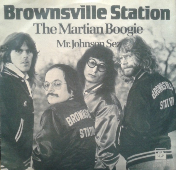
The band took on a more harder edged sound, heavier on the guitar and stories. Cuts like “Sleazy Louise”, “Hot Spit”, and “Rockers n Rollers”. The band also took on a more commercial (or radio friendly) approach with songs like “Lover”, “Throw Me A Lifeline”, and the hit single “Lady (Put The Light On Me)”, a song co-written by British producer/songwriter – Phil Wainman & Brotherhood Of Man’s John Goodison. BS also featured a rockin’ updated cover of Fats Domino’s “Ain’t That A Shame” (this was a year prior to Cheap Trick’s live version, which became a hit single for them). Another highlight is the southern blues of “Mr Johnson Sez”, a tribute, in which the band include legendary delta blues player Robert Johnson in the writing credits. Also included is the band’s nod to Jack Daniels via the country sounding story “My Friend Jack”. Last up is the band’s legendary late-night bizarre sci-fi tale of “The Martian Boogie”. This one would feature on the Dr Demento radio show, and was issued as a single, becoming another minor hit. “The Martian Boogie” is also the next most likely Brownsville Station song (after “Smokin’ In The Boys Room”) that one might still here on FM radio.
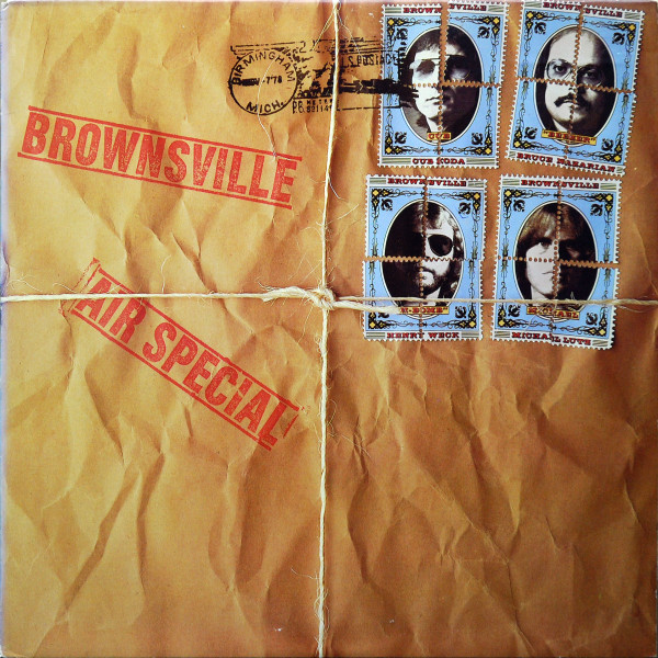
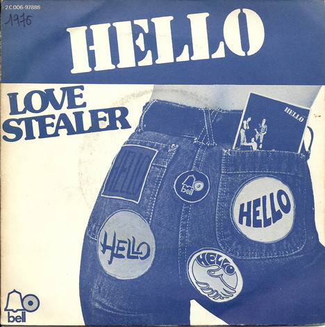
Though Brownsville Station boasted 2 minor hit singles, the album didn’t do as well, but this line-up stayed together for one more album. In 1978, then signed to Epic, the band altered their name to just ‘Brownsville’, and released Air Special. Produced by Tom Werman, longtime producer for Ted Nugent, as well as Cheap Trick, Molly Hatchet, and later ’80s metal acts like Twisted Sister and Dokken. Werman seemed to help attempt to make the band more straight ahead hard rock and commercially appealing, but to me this album was a bit of let down after the 1977 album. It featured the single “Love Stealer” (another Phil Wainman track), but it did not chart. The band broke up soon after.
Although there’s been no proper CD release of Brownsville Station, Music On Vinyl did release limited edition red and white vinyl (separately) copies of this album in 2019.
BROWNSVILLE STATION (Private Stock 149) Lady (Put The Light On Me) (3:24) (Utopia/Dejamus – ASCAP) (Wainman, Goodison) A soulful vocal chorus lifts this record above the norm of hard rock offerings, but make no mistake, this is rock at its most unrefined. A definite audience participation number. Any pop stations won’t be able to resist this re- emergence on a new label. (CashBox, 05/77)
BROWNSVILLE STATION (Private Stock 167) The Martian Boogie (4:20) (Ainal) (Lutz, Weck, Koda, Nazarian) This edit of the LP version still combines the best of talking blues, science fiction and passages reminiscent of Blue Oyster Cult. The band isn’t self-conscious about it’s somewhat juvenile sense of humor, brought forth with an alien squeak and eerie music reminding one of “One Step Beyond.” – CashBox, 08/77.
BROWNSVILLE STATION – Brownsville Station – Private Stock OGPS-2026 – Producer: Eddie Kramer – List: 6.98 Tight. brash and uncompromising rock and roll is their forte and they promise not to make you think, get involved or become spiritual. But if you like it loud, sassy and simple, this quartet has just the right sound to test your stereo equipment. No punk rockers these guys, Brownsville Station gets the point across without drowning it in over -amplification. For top 40 and AOR playlists. (CashBox, 1977-04-30)
*Michael Lutz, lead singer for Brownsville Station, has become the first rock musician (as far as we can tell) to qualify for the 26+ miles of the Boston Marathon (the Brownsville Station LP is due out on Private Stock at the end of the month) .. (CashBox, 04/77)
This pop/rock gem was originally penned by songwriters Phil Wainman and Richard Myhill, and first recorded by British glam band HELLO. The song was soon picked up and recorded by a number of other varied acts, particularly in just a few year span. A single for many, though I don’t see that it was a huge hit for anyone after Hello.
“Hello was the first, they were rehearsing it within days of us writing it.”, recalls Wainman. “Richard Myhill and I wrote together over a couple of years, he was great fun to work with.”
Asked about his biggest hit as a writer, Wainman replies – “Probably “Give A Little Love”, Bay City Rollers, number one in the UK. I would not call myself a prolific writer there are so many real writers… I’m more of a producer that writes and can fix other people’s songs, that’s what I enjoyed most.”
Phil had produced a lot of early Sweet recordings, but by the time “Love Stealer” came about, Sweet had largely moved on to recording their own material. – “I never thought of offering it to Sweet as they started to write their own songs.” Richard Myhill had a career as a singer as well, releasing a few solo albums, as well as work on various soundtracks.
Richard Myhill (demo)
I found this on Youtube, according to Phil Wainman – “That sounds like the demo Richard Myhill sung, not me! That’s an EMI label, it was never released like that.”
Hello – 1976
Back in the days of of British Glan scene, HELLO released a few albums, and a number of singles, including their version of Russ Ballard’s “New York Groove”.
Cliff Richard – 1983
the last track on Cliff Richard’s Silver album. Not bad at all! Kinda loud and heavy (musically), and very 80s.
Ian Lloyd – 1979
From Ian Lloyd’s (Stories) 1979 solo LP Goose Bumps A very likeable poppy version. Goose Bumps featured songs by a number of writers (Rod Argent, Russ Ballard, Bryan Adams & Jim Vallance, Ric Ocasek…), as well as an impressive list of players and guests. Also, this version was a single.
Brownsville Station – 1978
Perhaps my favorite version of this song, American band Brownsville Station recorded it for their 1978 album Air Special, their last. The band had recorded another Wainman song on their previous album (self-titled, red album) – “Lady (Put The Light On Me)”. Both Brownsville covers were issued as singles.
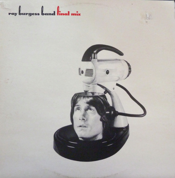
Ray Burgess Band – 1978
Australian musician Ray Burgess, from the lone Ray Burgess Band album, Final Mix. A lighter, but very good version of this song..
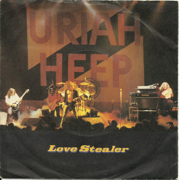
Uriah Heep – 1980
Somewhat of a controversial choice for Heep (being as it was recorded not long after their Conquest album). Although it’s not a bad version, it was an odd move at the time. Singer John Sloman was not happy about recording it, and it would be the last recording to feature keyboardist Ken Hensley, who left soon after.
Richard T Bear – 1979
American singer (pianist, writer, producer) who released a few albums in the late 70s and 80s. This is from his 2nd album Bear, which included a number of name players such as Bob Kulick, Ian Thomas, Mark Clarke. Co-produced by Jack Richardson. A bit of rock, pop, funk, blues….
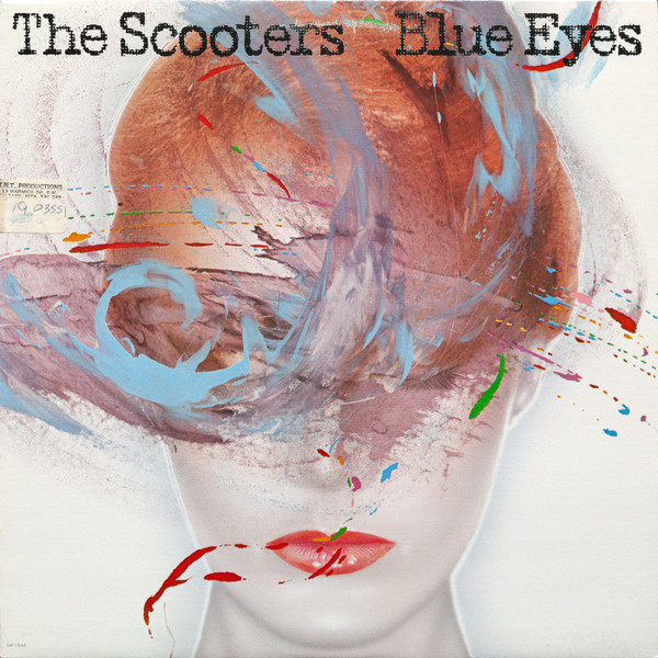
The Scooters – 1981
From The Scooters 2nd LP Blue Eyes, produced by Phil Wainman. This was also released as a single. The Scooters, a power-pop band, based in England included American Larry Lee, who went on to play and produce several acts, notably the late Joey Molland (Badfinger, the 80s) Mr Big (produce), and Roger Daltrey.
BoysVoice – 1990
German hard-rock/metal band that released 3 albums. This is from their self-titled debut album; also released as a single.
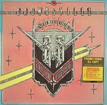
American Artist Michael Doret is known for his letterform and image designing, and over the years he has created a number of rock album covers, with his most famous clients being Kiss, he also worked on covers by James Brown, The Blue Hawaiians and The Squirrel Nut Zippers. In 1975 though he was hired to create the cover for Brownsville Stations’ Motor City Connection album. The album was released in August of ’75 and would be the band’s last for Big Tree Records. It would also be their last as the classic trio of Cub Koda, Michael Lutz and Henry “H-Bomb” Weck, as guest Bruce Nazarian would join the band soon after on guitars. The album didn’t fare so well in comparison to the band’s earlier releases, part of which might’ve had to do with their being no single release from it. Motor City Connection is a great harder rockin’ album from Brownsville Station, featuring such favorites as “Automatic Heartbreak”, “Give It To Get It”, “Self Abuse”, and “They Call Me Rock ‘N’ Roll”; an album (like most of the band’s catalogue) which is long overdue for a CD (and vinyl) reissue! Certainly, one of Brownsville Stations’ best, and their most eye-catching cover from Michael Doret who talks about how he created this album’s front cover (the back cover features the logo again, along with credits and band photos; see comments). He also talks about some of this other album covers, notably the 2 he did for Kiss, and other aspects of his career.
Your background in art and your connection to the music world early on?
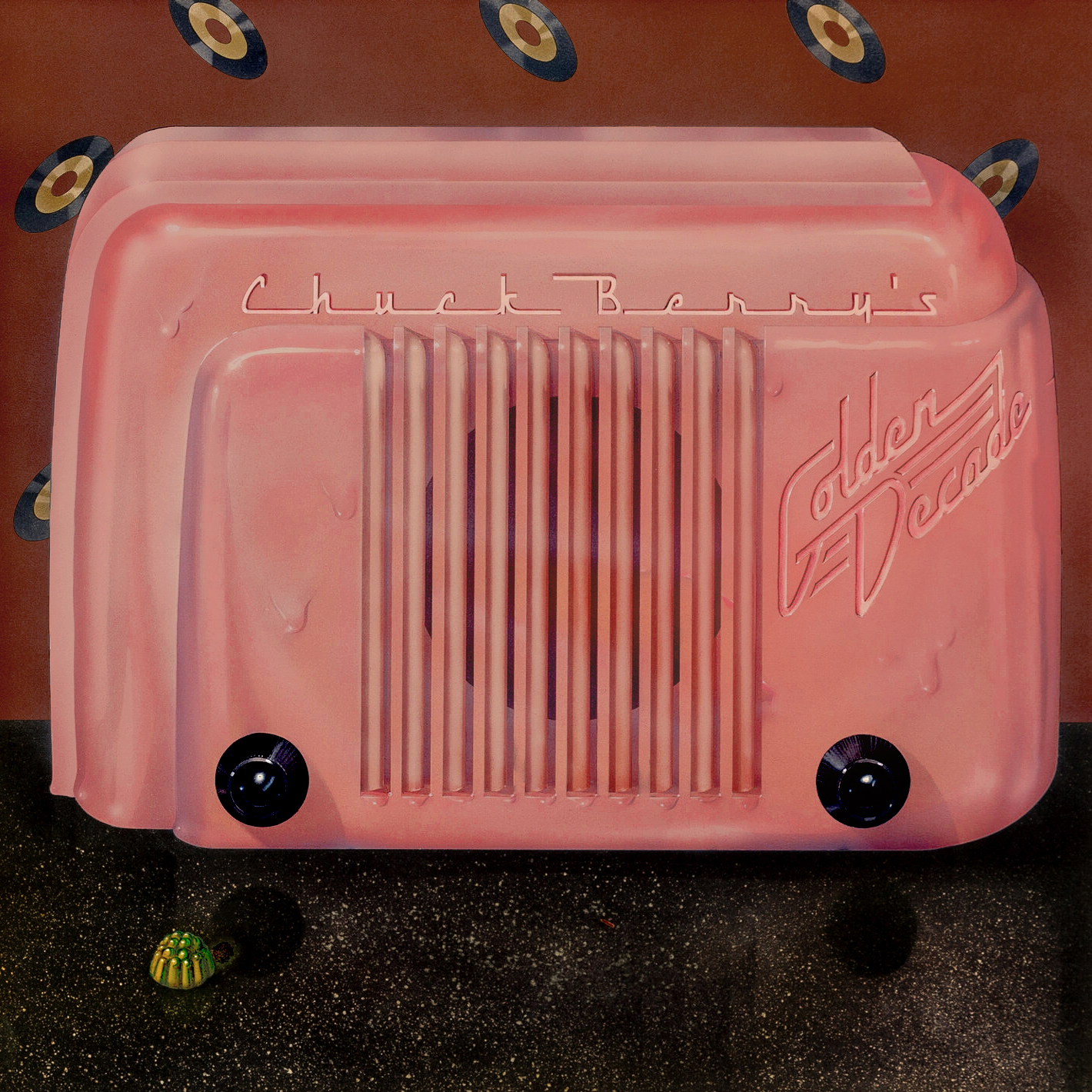
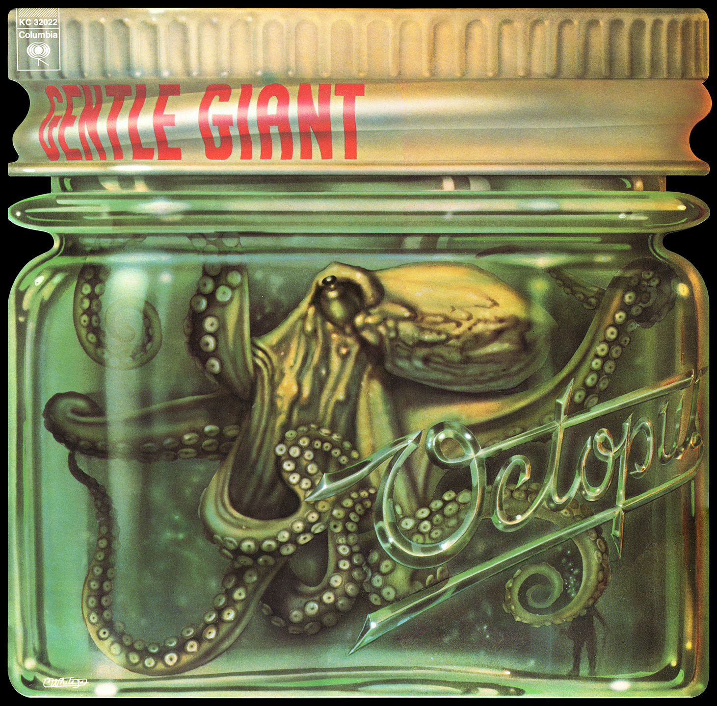
My background was that I attended The Cooper Union School of Art and Architecture. I thought I would become a fine artist of some sort, but I ended up falling in love with graphic design, realizing that I wasn’t cut out to be a painter or a sculptor. After graduation I held a series of staff positions in the design departments of various companies before going out on my own as a freelance graphic designer. At that point I hooked up with the preeminent airbrush artist of the 1970s—Charles White III. We collaborated on many projects including several album covers, among which were “Chuck Berry’s Golden Decade”, “Chubby Checker—Greatest Hits”, and “Gentle Giant—Octopus”..
How did Motor City Connection for Brownsville Station in 1975 come about?
That was so long ago that it’s hard to remember all the details . . . but I was contacted by Paula Scher from Atlantic Records who had recently become familiar with my work and asked me to design and create art for this cover. There’s really not much more to this story than that. As a young freelance designer, I wasn’t looking to work in any one particular area, but was interested in all kinds of projects from movie title treatments to posters to book jackets to advertising, etc. As I became more and more known in the design field, I got more and more assignments to solve all kinds of different design problems. Record jacket design was just one area of design for which I was lucky enough to get hired.
Familiar with the band? How did you approach putting that cover drawing together -where the idea came from? Any band input?
Honestly, I wasn’t familiar with the band, but that really didn’t matter. What is important is that a designer should be able to approach any design project, make themselves familiar with the subject, and be sensitive to what the client wants to project. I was never a big fan of heavy metal, but that really didn’t matter in this situation. What was important was that I create a cover that would call to people from across the record store aisles and attract attention to itself while telling the story that the band wanted to tell. I had absolutely no input from the band (no contact with them either), so I had to rely on what Paula told me about them (there wasn’t much), and my own intuition.
My thoughts on the cover design were pretty basic: design a cover that pulled together some of my favorite elements of automobilia into one cohesive design that spelled out the name of the album and the group: elements like car badges, chrome ornament, monograms, rockets, reflectors, etc. Color was also important to me, and I incorporated the colors of the 1955 Nash Rambler that was my parents’ first car. Combining all these elements was a challenge—but was also a lot of fun for me. So, the idea was to create sort of a collage of automotive elements that together formed (in my mind) the ultimate car statement.
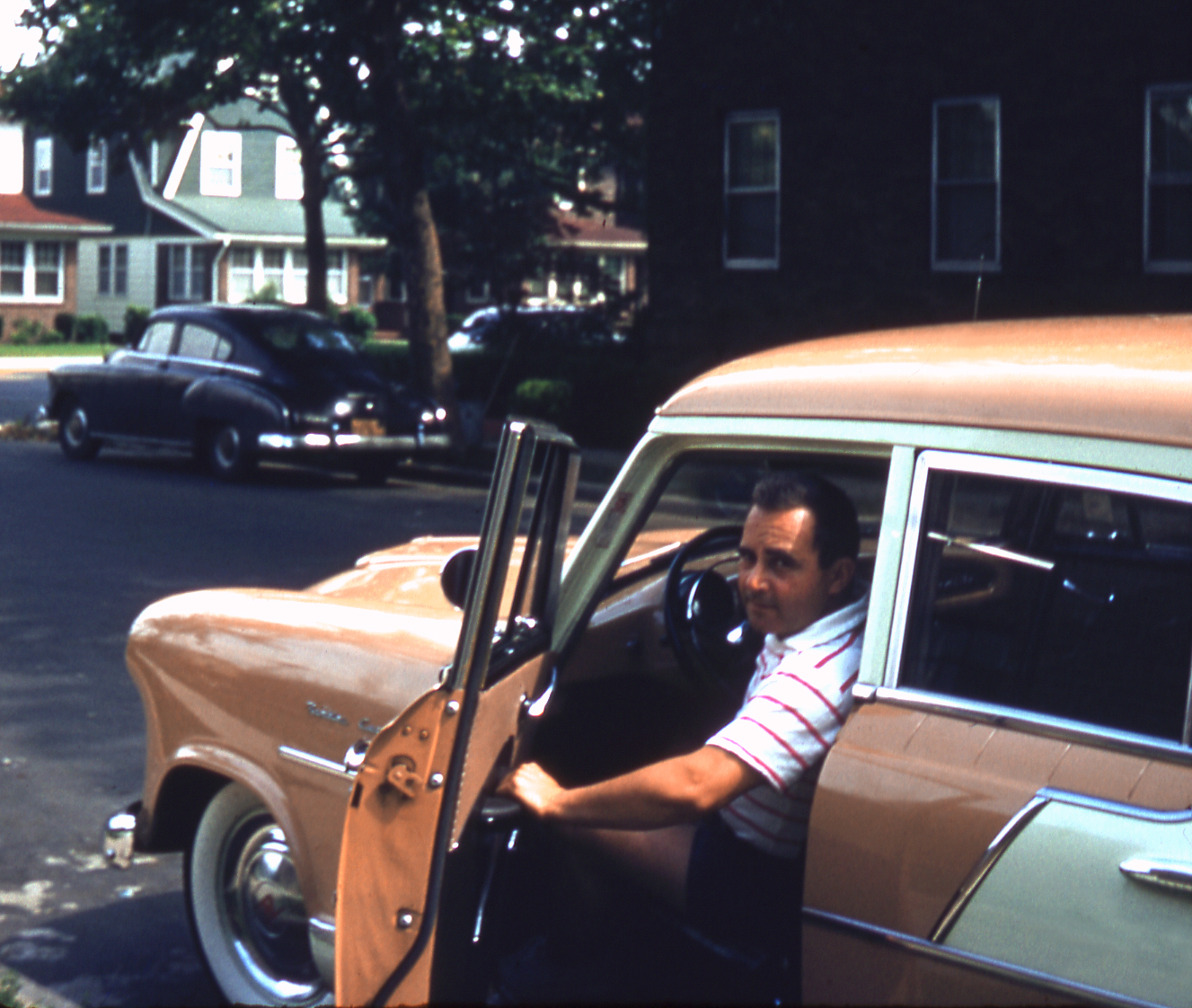
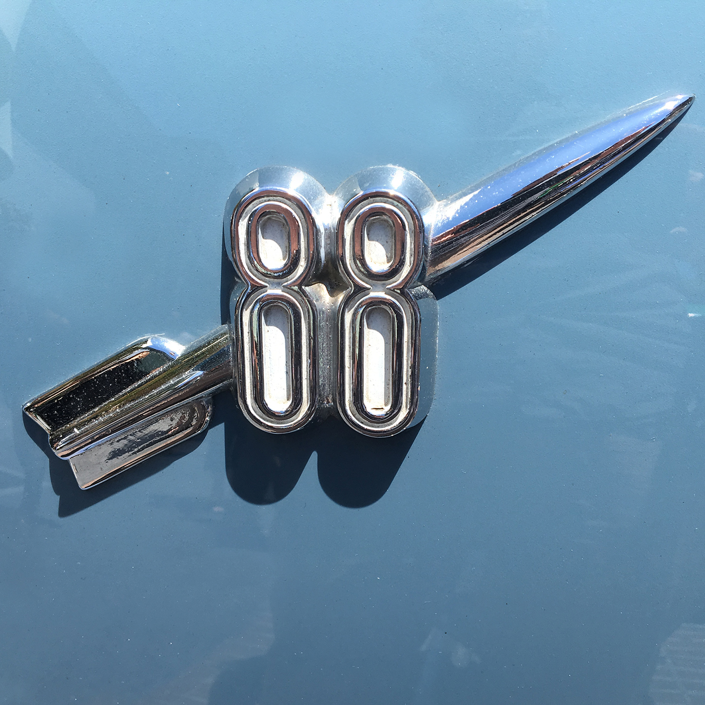
[*Pics below: 1. Michael: “My Dad in our 1955 Nash Rambler. I loved the color of this 2-Tone car and used it for reference for the album cover. 2. Michael: “The “88” photo is one I took of an Oldsmobile ornament, one of the pieces of automobilia used for inspiration on the cover.” 3. Editor: MCC promo w/ hype sticker
A bit about how the cover was done – how long it took, etc.
Today this cover would have been a lot easier to do than it was back in 1975. Today I could have done this cover digitally, and it would have only taken a fraction of the time that it actually took me. Back then it was a laborious process which involved inking all the black linework, and then using colored adhesive films to fill in the color.
Any feedback from the band or label?
Sorry—I really can’t remember. But I can tell you it was one of my favorite pieces at the time (and it still is).
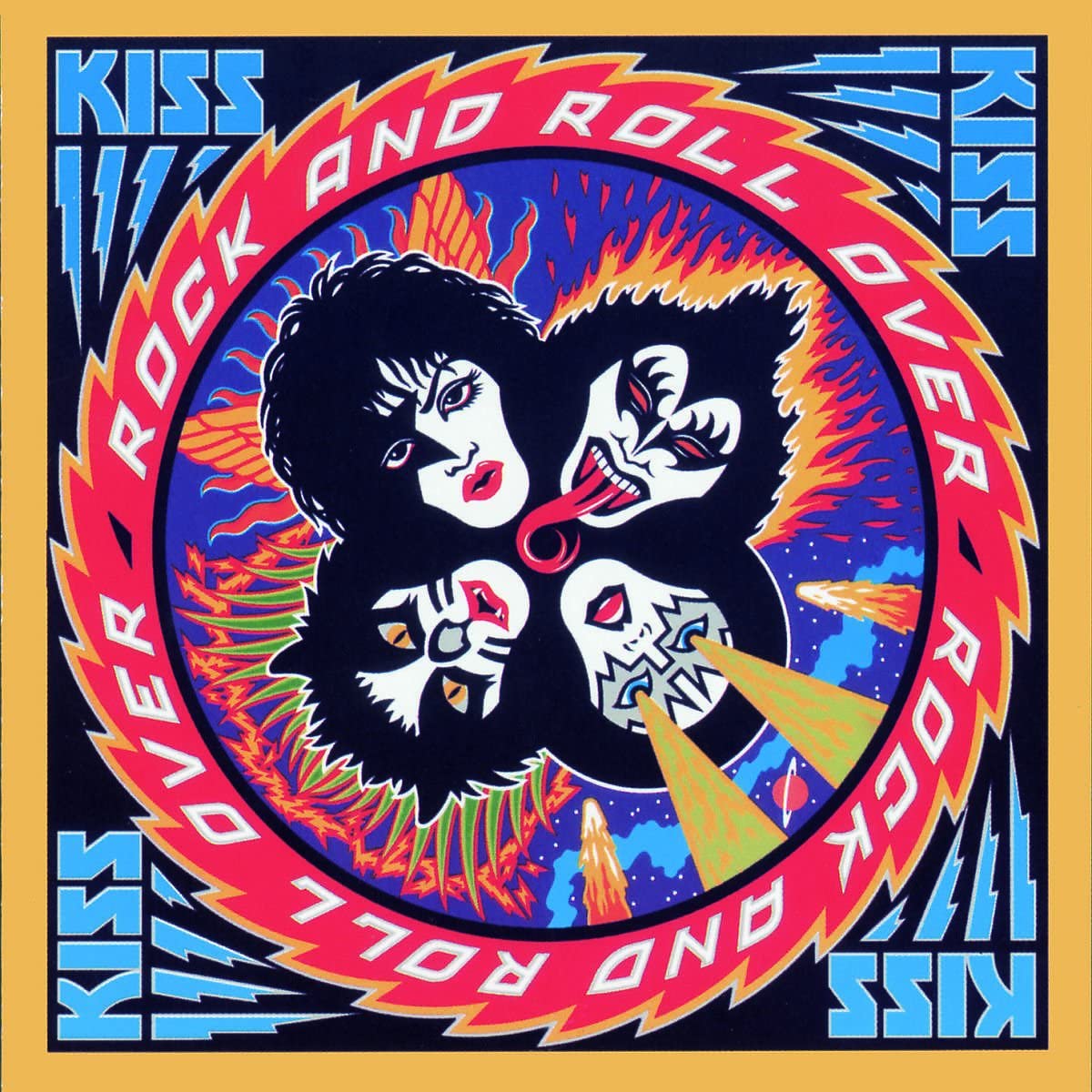
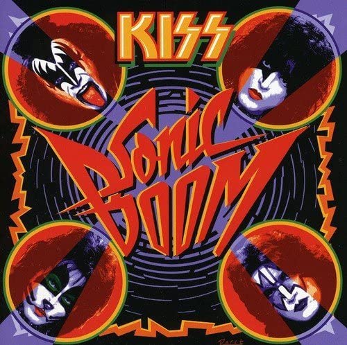
You went on to do Kiss’ Rock n Roll Over — presumably your best-known album cover? Recollections on coming up with that drawing? As well as reconnecting with them for the Sonic Boom cover after so many years?
Well, I guess the decision as to which is my best-known cover has been made for me. I don’t think Rock and Roll Over is any better than Motor City Connection—or better than any of my other covers. I just think that Rock and Roll Over just got seen a lot more. At the time I did that cover I was pretty much able to get away with doing whatever I wanted. The kind of art I was creating (letterform-centric) was something people hadn’t seen before, and so it was difficult for most people to know how to criticize it. The only changes I was asked to make were minor ones—Gene and Paul had some comments about the details of how I drew their faces—but that was the extent of it. Years later (2009) Paul contacted me, asking if I would be interested in doing another album cover for Kiss. They felt that Rock and Roll Over had become so iconic for them, that they wanted to do something similar for Sonic Boom. One thing I wasn’t crazy about was that this time they did not want me to illustrate their faces as I did on Rock and Roll Over (you know what sensitive egos performers have)—which meant I had to somehow use existing photography because they did not want to do a photoshoot for this album cover. They had Tommy Thayer in charge of their photo archives, so he and I went over all the photos that were available, and I picked a few that I thought could work. When I say “work” I mean that I could mess around with the photos so that they became less photographic and more just plain graphic. I didn’t want to just repeat Rock and Roll Over, so I designed the cover so that it was more or less Rock and Roll Over turned inside-out so that the album name was exploding outward from the center, and the faces were now on the outside perimeter. They loved the new cover, but you know how fans are . . . there was a lot of “Rock and Roll Over was the greatest album cover, but this cover is shit”. Everybody’s got an opinion.
Were you ‘into’ much of the music you created cover art for?
As I mentioned earlier, I never was a big fan of heavy metal. If I was creating a cover for a book, nobody would expect me to be a fan of the book or the author. What’s expected of a designer is to understand the client’s needs and to create something appropriate and which communicates what they want to say.
You did a number of covers – what are some of your favorites (any stories with)?
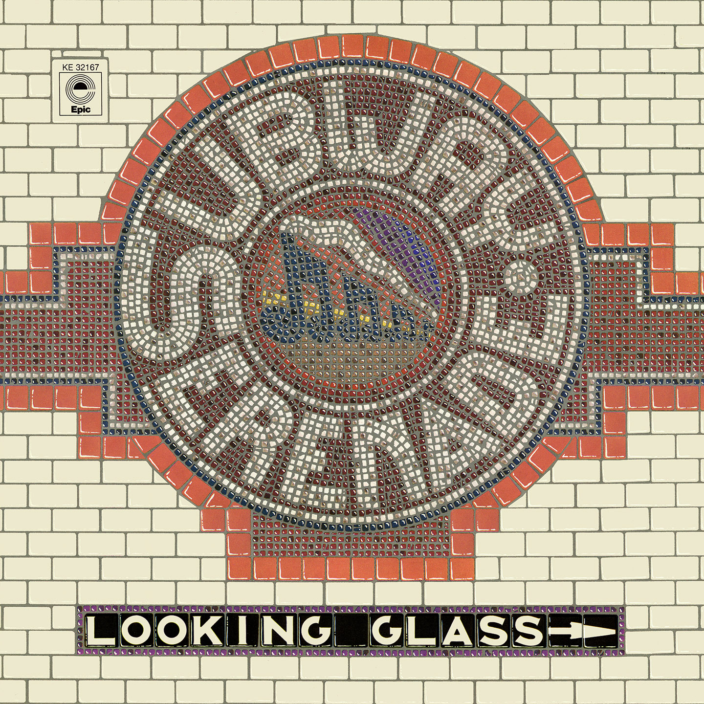
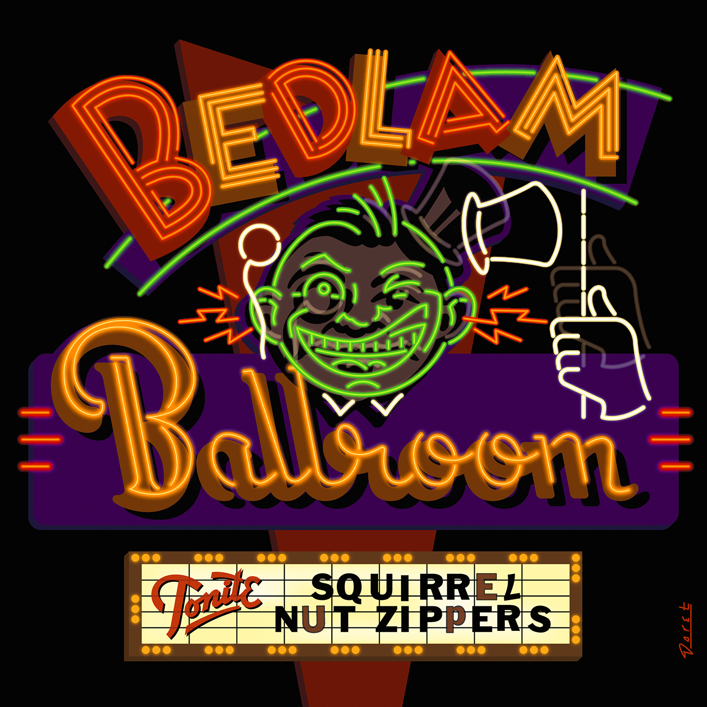
I mentioned the covers I created with Charles White III—those were done in collaboration with him. But (as with Rock and Roll Over and Motor City Connection) I went on to create more than a few covers on my own. Of all the album covers I’ve done I’d have to say my favorite is “Bedlam Ballroom” for Squirrel Nut Zippers. That one was by far the most difficult to create—and the most rewarding. And that art was nominated for a Grammy (didn’t win). Then there were covers such as “Subway Serenade” for Looking Glass, and two comedy album covers: “The Monty Python Matching Tie & Handkerchief” and “Saturday Night Live”.
You did the lettering (only) for the US/Canada release of Gentle Giant’s Octopus!?
Yes—I designed the glass jar lettering and the lid lettering for that cover, and Charlie did the illustration. That was at the very beginning of my career, and I was quite happy to be involved in such a high-profile cover because I did not yet have the “gravitas” to get that kind of project on my own.
Album covers have only been a part of your career, what else have you worked on that people might recognize your work from?
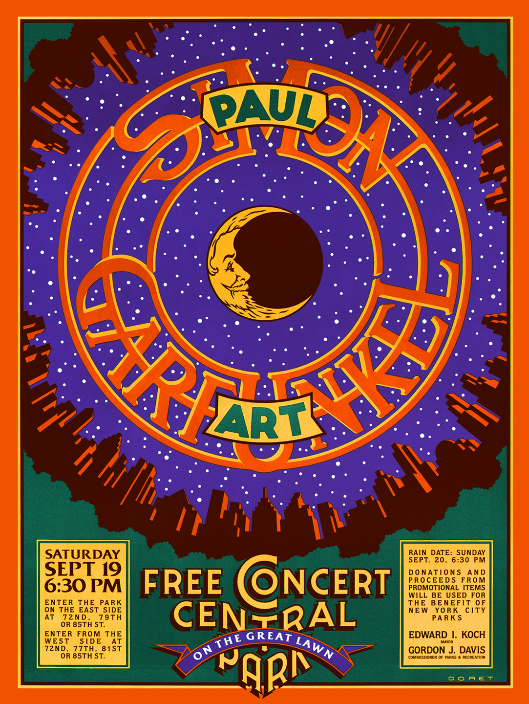
Well, there was the poster I created for Simon and Garfunkel’s Concert in the Park—which I am very proud of. Lately there’s been a lot of interest in that piece, and I’ve been reprinting and selling that poster. Some people might recognize the logo I designed for the New York Knicks, and others might be familiar with the title treatment I created for Disney’s Wreck-It Ralph. And then there were the covers I created for TIME Magazine.