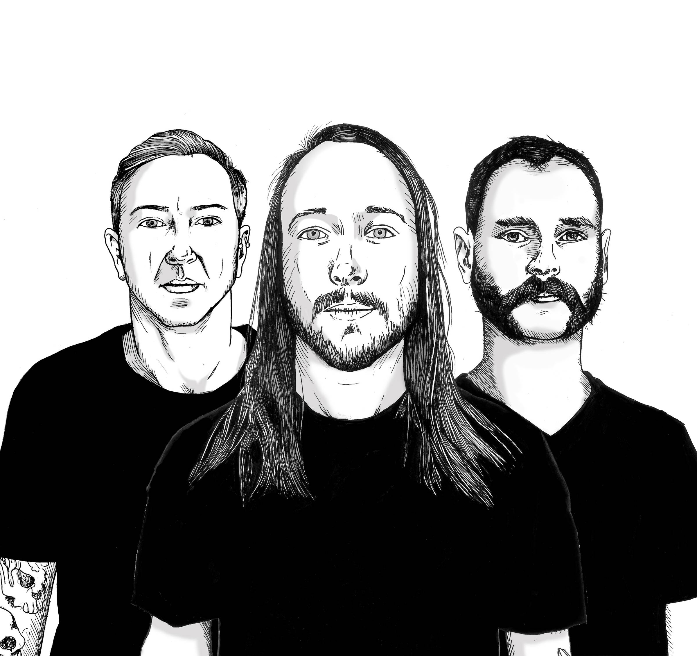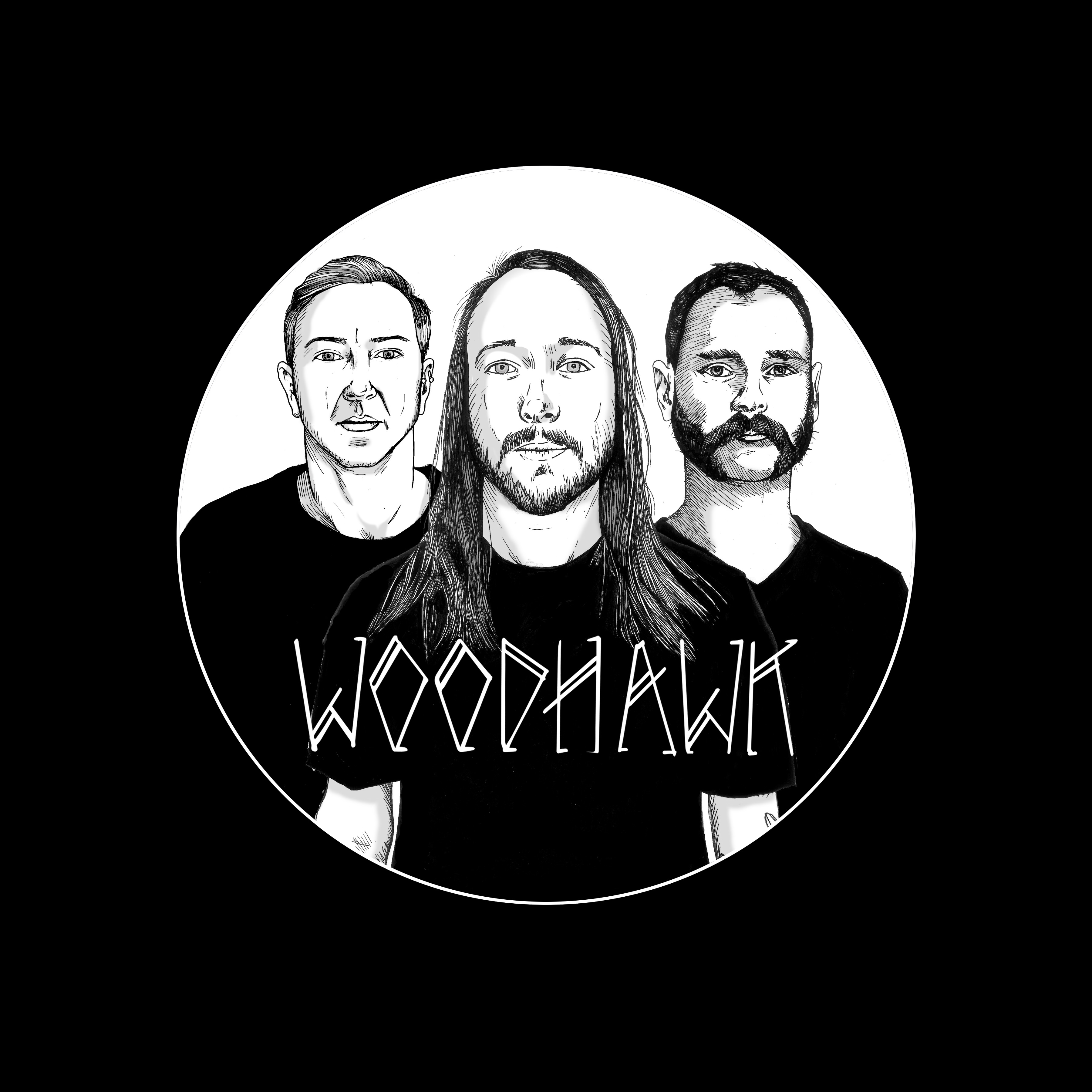
Canadian artist Mark Kowalchuk has created the 3 album covers for Canuck stoner-rock band WOODHAWK, from Calgary. The latest design from Mark is the brand new Woodhawk album Love Fins A Way. All 3 Woodhawk covers are eye catching and creative, and each has a story to them. I recently swapped questions and answers with Mark regarding these album covers, as well as what else he is up to creatively in the rock music field. Check it out below, along with images of Mark’s work, and check out the new Woodhawk album!
As an artist, what is your ‘field’? Who do you design for—concertgoers, advertising, album covers, or other media?
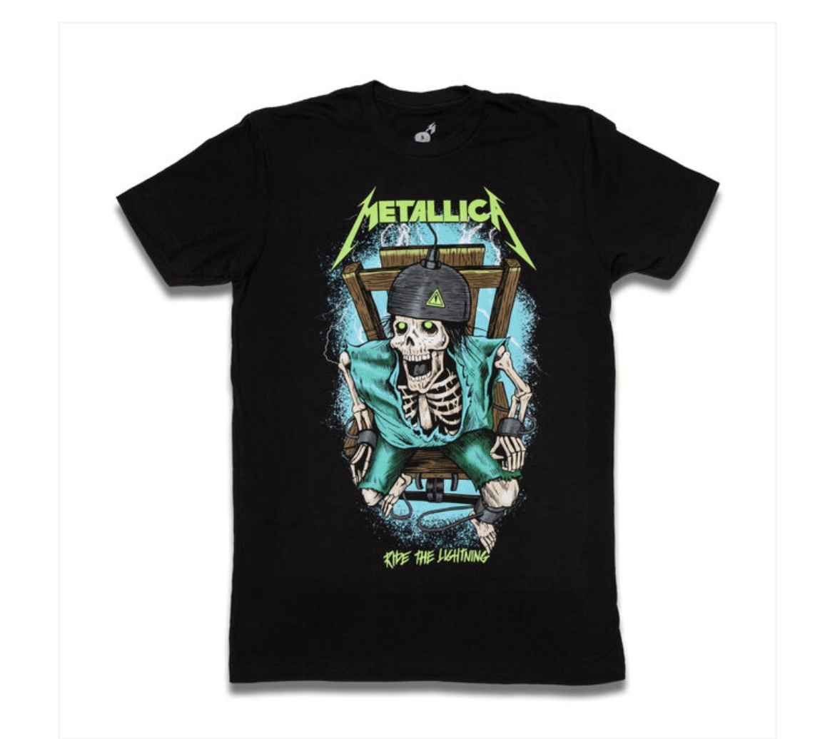
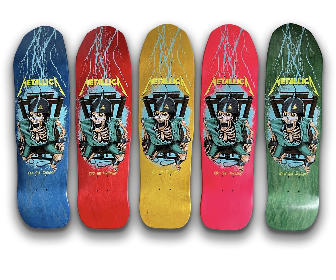
Most of the work I do is for the skateboard and snowboard world. I only create art for a few select bands: Metallica, In Flames, Souls of Mischief, and Woodhawk. Most of what I do for these bands is merchandise design. I create album art for Woodhawk, but generally, people hire me for apparel design, as that’s where I’m most experienced.
You’ve done the three Woodhawk album covers. How did you get involved with them? What’s the connection?
Working with Woodhawk happened quite organically, actually. I was doing artwork for another friend’s band at the time Chron Goblin (I used to skateboard with those guys a lot back then) and I met the Woodhawk guys at a show where they played alongside Chron Goblin. They liked the work I had done for Chron Goblin and asked me to do a few designs for them, which eventually led to a lot more collaboration.
Each of the Woodhawk covers suits the title well. Can you share the idea or story behind each of them? Did the band members contribute input or suggestions?
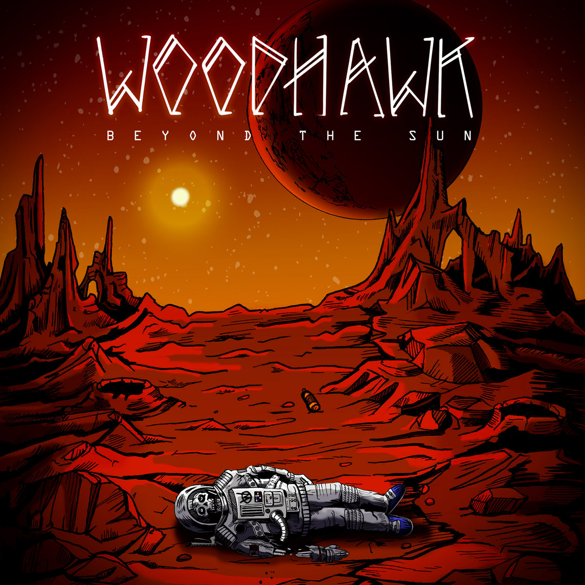
For Beyond the Sun, we went with the concept of an astronaut who’s been forgotten on a planet far from Earth. My personal interpretation is that he’s ventured too far, and that ends up being his demise.
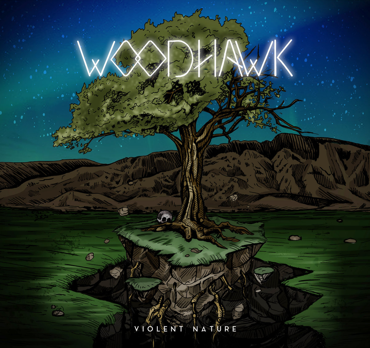
Violent Nature is full of symbolism. There’s a lot of yin and yang imagery, the tree is fruitful on one side and decaying on the other.
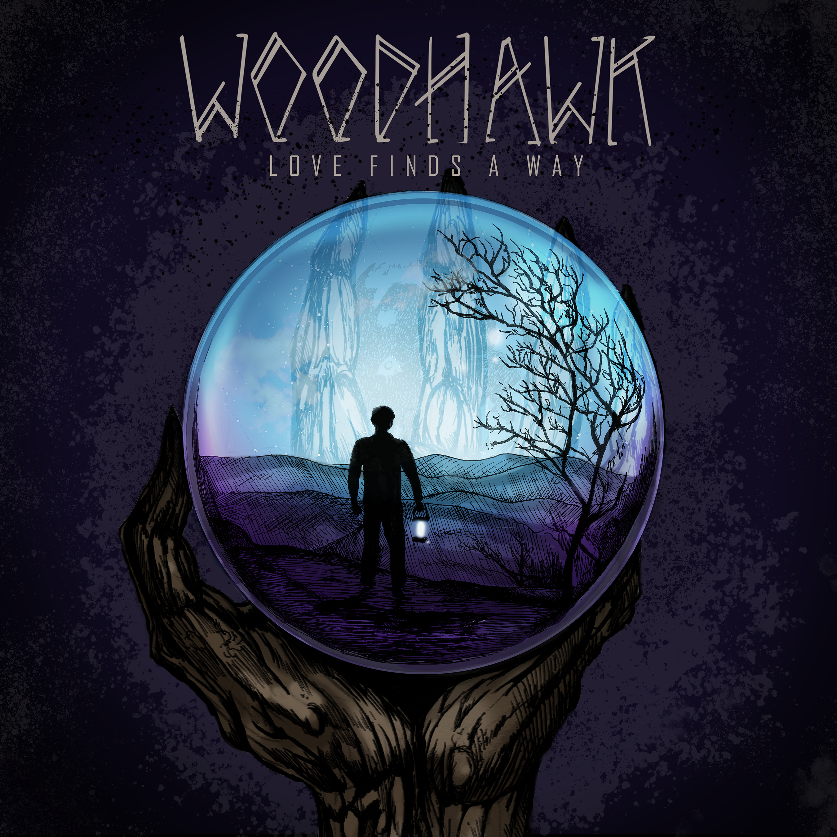
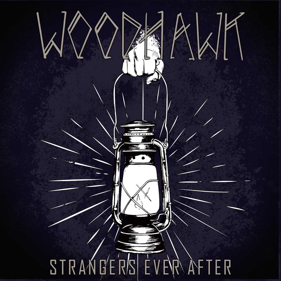
For Love Finds a Way, the main character is lost in a strange land he doesn’t recognize and is trying to find his way. He’s being watched by a ominous creature larger than him, though that part is left open to the viewer’s interpretation.
The band has a lot of input into their look and designs. We usually meet up over some tasty wings and beers and talk about what the album is about and the direction they want to go in. Each album has a different mood, and they’re good at providing me with examples and mood boards to convey the vibe they’re after. They trust me to bring something extra to the artwork and allow me to incorporate my own interpretation as well.
For example, they wanted the wanderer on Love Finds a Way to be holding a lantern. I felt the lantern had strong symbolic weight, so I focused on emphasizing that element. One thing I will say is that we work well together in blending their ideas with mine.
I presume you hear some of the music before each album is finished? Does that influence what you create?
Absolutely. It’s essential for me to hear the music, it’s mandatory to create the proper visuals.
Are any of the landscapes based on real places or perhaps photos you’ve come across, or are they purely imagination?
All of them come fully from my imagination, they’re not based on real places. For Beyond the Sun, I imagined he might be on Mars since the album has a red theme, but I didn’t look at any actual Martian landscapes or reference photos. It was all from my head.
What’s your method for creating artwork? (Drawing, painting, digital, etc.) Can you walk us through the process of designing Love Finds a Way?
I’ve got my process dialed in,kind of like baking a cake, really. First, I sketch out 3 to 5 rough concepts in my sketchbook. Then I usually meet up with the guys (over delicious beer and wings, which I mentioned early). They give me feedback, and I take notes to move into a second round of sketches.
Once we settle on a final concept, I do the clean inking. I scan the linework and color it digitally. I always keep the original ink work as-is—I don’t redraw it digitally because I think it keeps that personal, hand-drawn feel intact.
Are you doing any other pieces for the latest Woodhawk release—posters, singles, shirt designs?
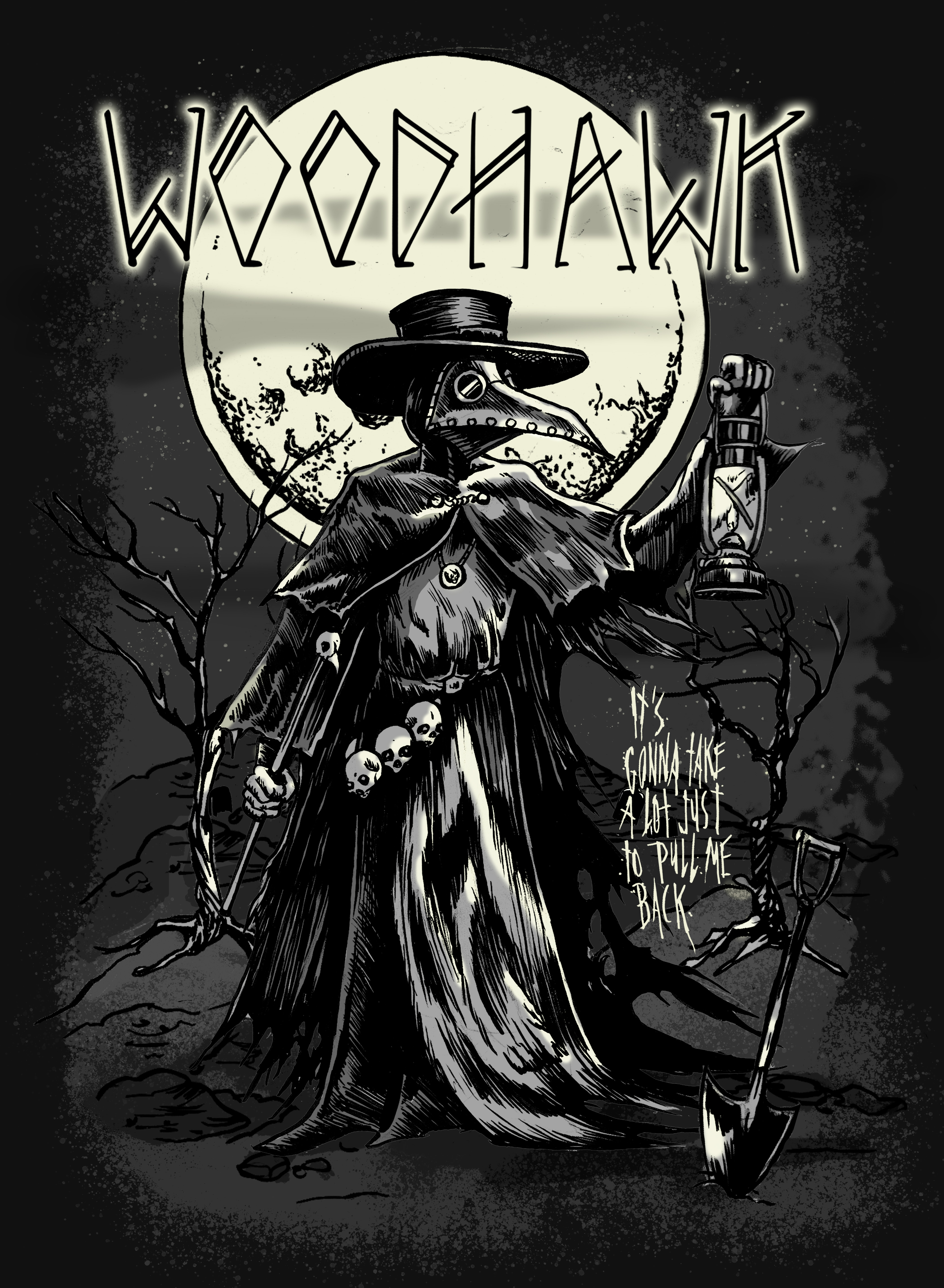
I just finished a few new merch designs for them, which you’ll be seeing shortly. The guys usually call me as they need me, so your guess is as good as mine. The magic eight ball says: “Chances are good.”
Who are some of your favorite album artists or covers (besides your own)?
I’ve always loved the work of Alex Pardee, his art for A Sense of Purpose by In Flames is awesome. I’m also a big fan of some of Mastodon’s covers, especially Cold Dark Place, and my friend Skinner did Once More ‘Round the Sun, which is killer. Tool’s album art has been a huge part of my upbringing as well.
Do you have any favorite songs from the latest Woodhawk album?
My top pick is White Crosses, with Killing Time coming in second, and I’ll explain why.
The lyrics in White Crosses about going to hell alone really resonated with me at the time. I was going through a dark period in my life, and it felt like the song was mirroring exactly what I was experiencing. From my perspective, it might be the darkest song Woodhawk has ever written.
Killing Time is also powerful, what a way to close the album. It feels like slamming the door behind you as you walk out. There’s a real sense of pain and loneliness in that track. Art evokes emotion, and that one nailed it for me.
Have you worked on any other album covers besides the ones for Woodhawk?
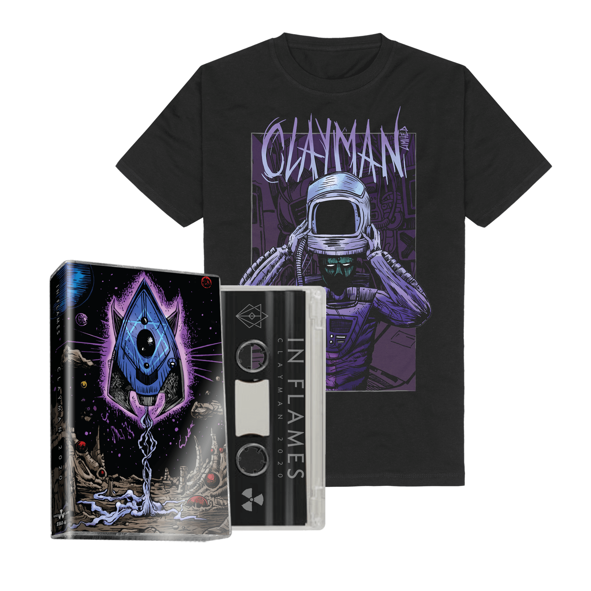
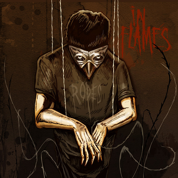
Yes, I’ve done two projects for In Flames in the past. I did the single artwork for Ropes and the fold-out cassette design for Clayman 2020.
Where can people find more of your artwork, album covers, or prints?
I’ve been too busy with projects lately to focus on prints or a dedicated website, but you can see all my artwork on my Instagram: @mark_kowalchuk
LINKS: