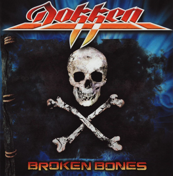
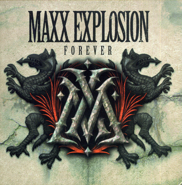
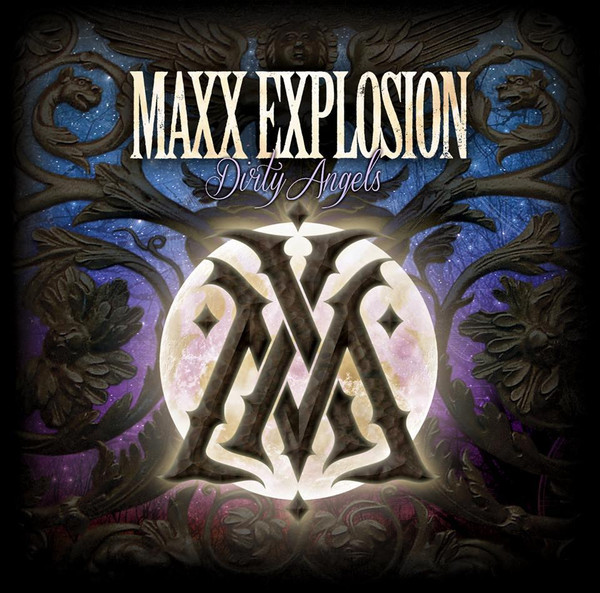
DOKKEN’s latest album Heaven Comes Down features the eye-catching cover art created by the band’s bass player Chris McCarvill. Chris has also designed the cover for the band’s 2012 album Broken Bones, as well as his other band Maxx Explosion. In our exchange below Chris details the album’s artwork, as well as his other art and covers he’s designed (also see links below).

You are known more so as a musician, and member of Dokken, but can you tell me a bit about your art work, how you got in to that, and what you do as far as professionally and as hobby/interest in it?
I’ve been a professional graphic artist for 30 years, mainly in screenprinting. I now co-own a screenprinting company, Savin Rock Printing. I’ve always been interested in art; my dad and younger brother are great artists, and my mother was pretty good too. I’m not trained or schooled; I just like it.
You’re credited with the cover art on the new (and previous) Dokken album. Can you tell how the album cover idea / inspiration for Heaven Comes Down came about? was the cover your idea / design, and/or input and suggestions from other bandmembers?
I had visited Don’s house in Beverly Hills in 2016 when we were playing the Whiskey, and he had an Asian wooden griffin statue that caught my attention. He said that was the first piece of art he had bought when the band had started making money. It’s not restored, it looks very old and it’s quite large. Dokken cover art features a phoenix sometimes and this piece seemed to just fit, it’s the right style, its heavy metal looking, but also artistic and classy. I’d mentioned to Don that the griffin was my vote for an album cover more than once.
That said, it’s in a very static, boring, standing position which is not exciting for an album cover. I looked at a lot of pictures of mainly lions jumping and based the dynamics on that but used the head, features, and details of the griffin.
Is there a story behind the cover in terms of a meaning relating to Dokken or any of the songs?
It’s more of a symbol of Don and how he rises in the face of many difficulties.
What all did you do on the Heaven Comes Down cover (as you are not the only one credited)? And can you explain a bit of how it was done (technique used, drawing?, computer?, lay out, etc…)
This started as a good old pencil sketch. I did 2 sketches. Don thought the first one was too skinny, so version 2 was more muscular. I decided to make most of the griffon vector, or object based, meaning I could move elements around as I figured there would be many changes – and there were. Illustrating it this way allowed me to move and re-proportion things without having to completely redraw, and I could use the objects as masks in photoshop, like how an airbrush artist uses stencils. So, I sketched it, did a lot of color work, then Hiro (I think he works with Silver Lining – our record label) did better hands than mine, and a couple other details. He also did an entirely different griffon, in different colors, but we ended up going with mine. I had thought the art was approved, Don liked it, and we were sent a final version that had been photoshopped with different colors and different backgrounds. I thought it looked great, though I don’t know who did that final coloring/layering. So, this cover was a bit of a group effort.
You’ve done a few other album covers, any you wish to touch on (or elaborate on a bit) and were particularly happy with?
I’m never super happy with my own work. Out of the few I’ve done I probably like the Maxx Explosion records. I’m sure you’ll see the Hugh Syme influence. I’ve never pursued art the way I’ve pursued music. I think I’m ok at it, but I’m definitely not in the same category as my influences.
Were you a fan of album covers growing up? any favorite album cover artists and a perhaps top 5-10 list of favorite album covers?
Oh yeah. Growing up for me was pre-internet, so album covers felt like a window into the world of the band. I liked Hugh Syme’s covers a lot, I had the Whitesnake 1987 album. I constantly wondered what the brass logo icon was or if it did something, like was it some sort of portal, or lock, or gateway? Hugh’s concrete and marble textures always gave the music a sort of classy mystery. His concepts are usually breathtaking as well (look at Dream Theater’s Distance Over Time). I love Doug Johnson’s Judas Priest covers (Screaming for Vengeance / Defenders of the Faith / Turbo). They have a glossy, stylized, almost surreal look that’s instantly recognizable. Hipgnosis also did great stuff like Black Sabbath’s Technical Ecstasy cover, Storm Thorgurson’s Pink Floyd Division Bell, Muse’s Absolution. I also like Mark Norton’s work with the Rolling Stones very much. Roger Dean’s fantasy landscapes always captured my imagination too.
As for the new Dokken album, any favorite songs and ones you look forward to playing live?
We haven’t played much of the record live yet, so I’m not super sure, but I like Just Like a Rose, Fugitive, and Gypsy. I’m not sure that we’ll ever do it, but I love the song, Santa Fe. Having known Don for a little while now I know he writes very sincerely and that one is so him.
LINKS: