Andrew Barnum has worked on a number of different album covers over his career, and more recently having been checking out KANSAS’ 80s records, I wanted to find out more about 1982’s Vinyl Confessions. It was an album that saw a few changes for the band – singer, sound, and cover art! A very different cover than the band’s previous ones. Andrew gives us some great insight to the Vinyl Confessions artwork and period of the band, as well as a bit about other aspects of his career and covers he’s done. *Check out the links at the end, and the galleries of Andrew’s work.
How did working on the Kansas cover come about? Had you done many album covers prior to this? How did you get involved? And were you familiar with the band?
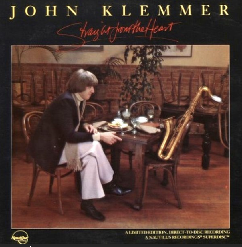
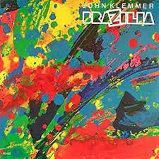
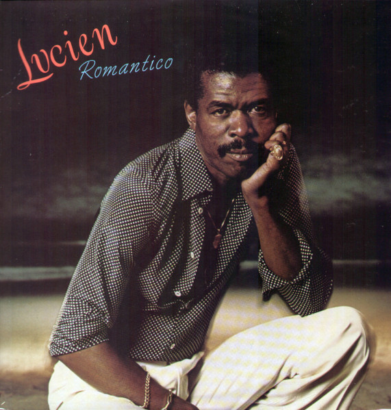
As an American born Australian, I returned to the USA from Sydney in 1977 as a freelance graphic designer, and aspiring singer-songwriter. Designing by day, performing music by night. After freelancing for 3 years, I landed a real job at a company called Print, Film and Tape in Burbank (Movies, Music, Arts) that lasted a year, which led to joining Tom Drennon. I can’t remember how it happened; Tom was all music business design work, from covers, to promo campaigns, and tour identity collateral. Here’s Tom’s covers: https://bit.ly/4mp2Gpw . I’d only done a few of album covers as a freelancer both by saxophonist John Klemmer (Brazilia, Straight to the heart) and jazz singer Jon Lucien. By 1980 I’d met my soulmate, art director, and music partner Lissa Mendelsohn and formed our post-punk band ‘Live Nude Girl.’ Our freelance designing was with Macy Lipman Music Marketing, and Larry Vallon Concert Promotions. I was familiar with Kansas by reputation only, and that Tom had done numerous covers for the band, and other Epic Records artists.
Can you explain the whole idea behind the cover, your contributions, how it was all put together?
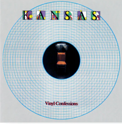
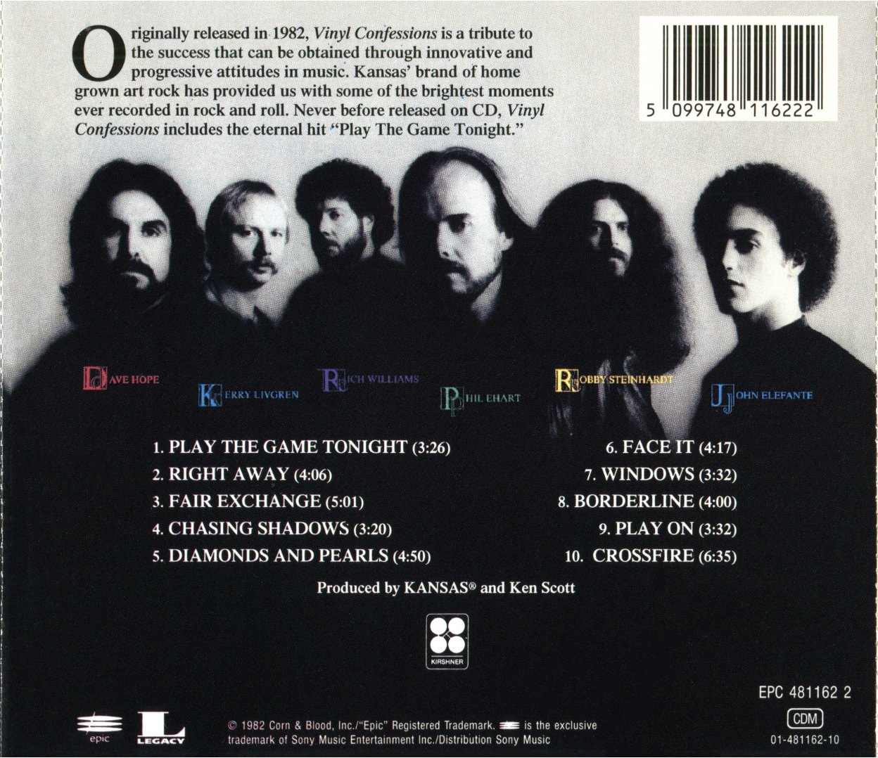
This album was a monumental change for the band because a change of lead singer. Tom recounted after the concept meeting at the studio, that the band felt under intense scrutiny because of the line-up change, under a microscope so to speak. Tom’s key image idea was the interrogation chair. That began the process of designing a package that was looking at the band in minute detail during this re-invention. Hence the stripped back blue-print imagery. The design was also influenced by the 80s post-modern design shift that had begun in LA. The new cover was breaking with the past Kansas tradition of earthy, painted imagery. This was achieved by both the chair photo, and the striking B&W band photo, and primary colours in the logotype, and band names on the photo. Pre-digital, all the assets were hand drawn, typeset, and composed on full size paste-up boards.
Can you explain your technique used for this cover?
Drawn, or re-touched B&W bromide film elements (typesetting, image) pasted in position for CMYK print film colour separations. Very standard pre-digital print production. An assembly of visual assets.
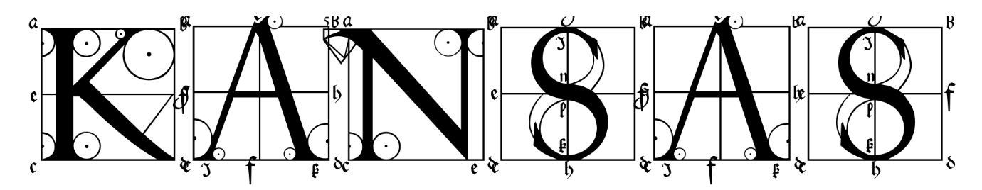
Did you also happen to do the lettering on the front cover? Any idea why the band’s logo (on all previous album covers) was not used?
The logo brief was to create something new for Kansas, while creating continuity with their classic forms on previous covers. This led to researching typefaces in the trusty (copyright free) reference of the time, Dover books. We found ‘the sixteenth-century German artist Albrecht Durer’s instructional treatise on the geometric construction of Roman capitals, with precise directions for each letter and general directions for Gothic capitals and miniscules, Of the Just Shaping of Lettersby Albrecht Dürer.’ (Google books) The roman titling we found which contained both capital and lowercase outlines served the purpose of detail, scrutiny, and classicism. We added the bright colour set within the letter forms.
Was Kansas a band you listened to? Any recall listening to this album?
Not really on our post-punk radar at the time. But fully aware of their impressive stature and sales.
Did you do any other album covers beyond Vinyl Confessions? And what do you do now?
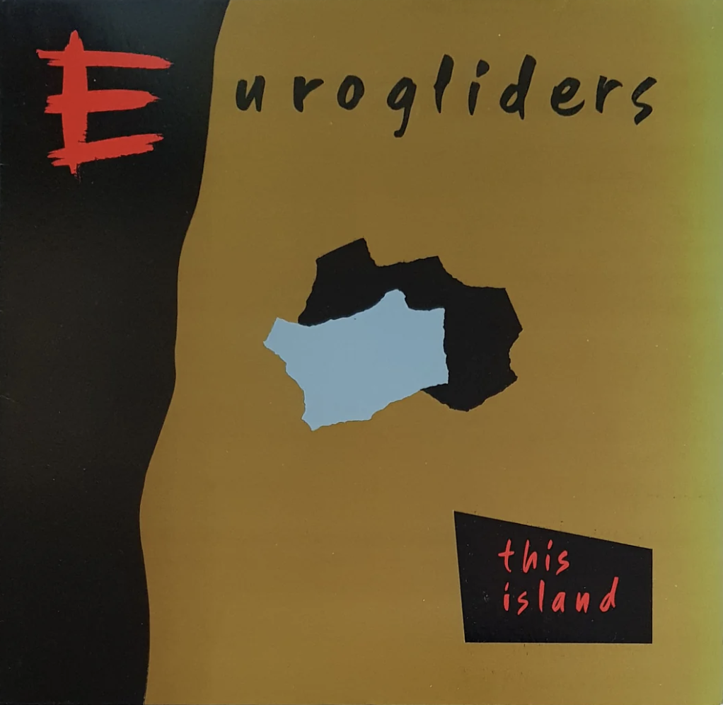
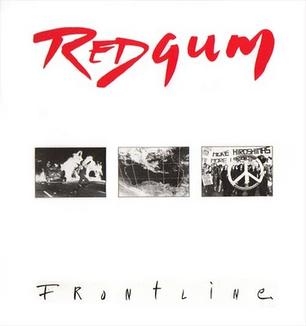
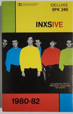
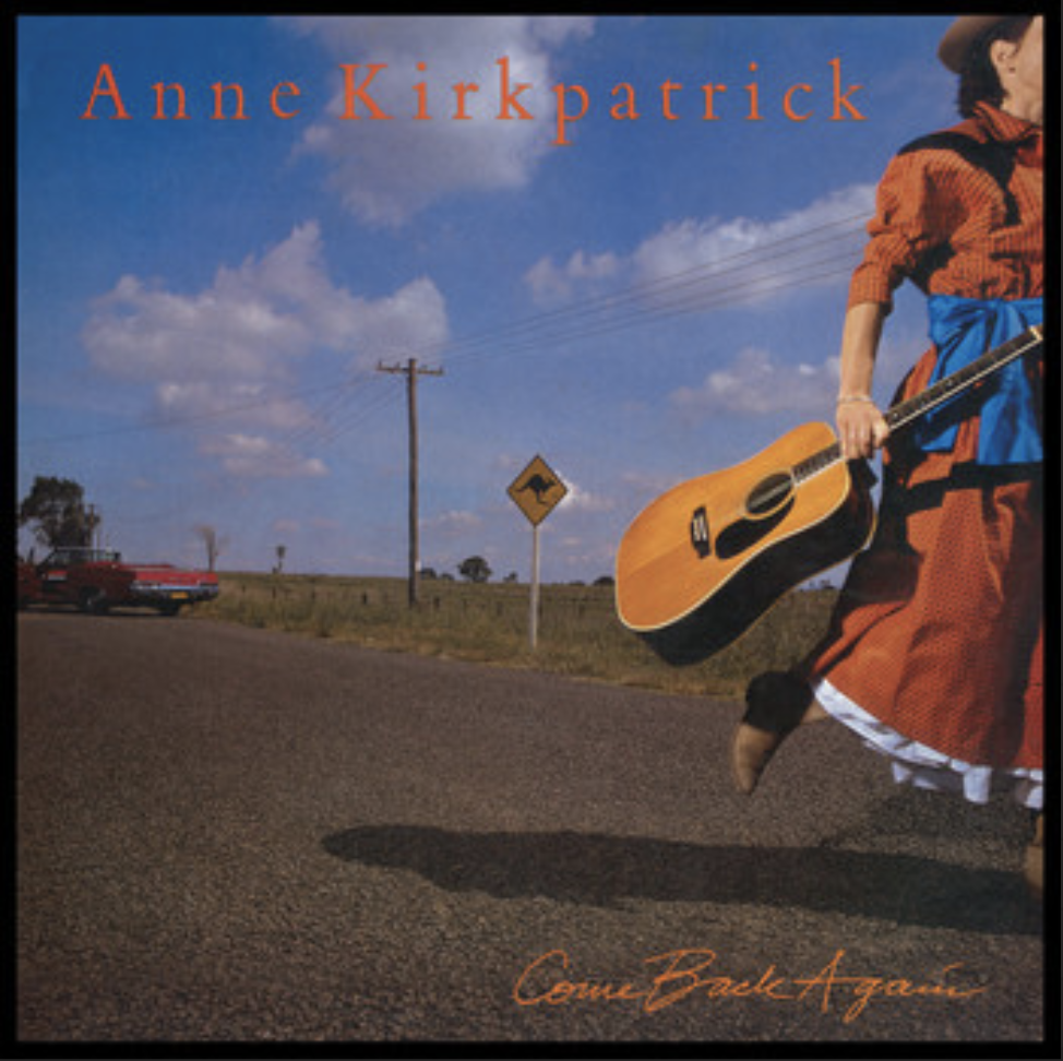
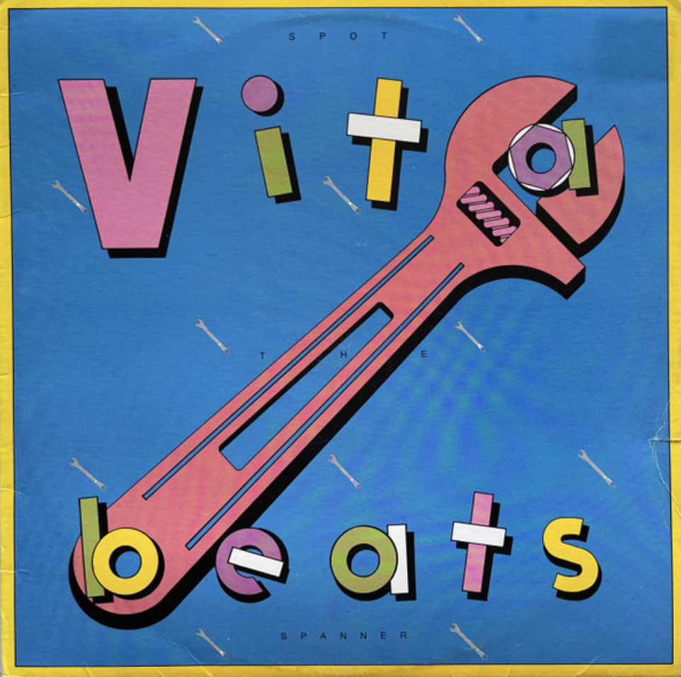
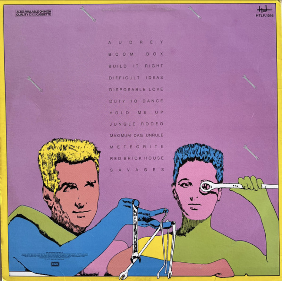
(Well, since then, in the art world) After Lissa and I were married in LA in 1981, all roads started leading back to Sydney after a honeymoon trip, we reconnected with design and music in Sydney which led to a new freelance life as A&L Barnum Design, and our ‘Live Nude Girl’ demos being heard by local producer Mark Moffat at Festival Records. By easter 1982 we’d sold up our chattels, and moved to Sydney. Again, design by day, and music by night, sometimes vice-versa.And a new band name for our new duo ‘Vitabeats.’We’ve designed covers for Inxs, Eurogliders, Redgum, Anne Kirkpatrick, Mary Jo Starr, Mark Callaghan (Gangajang) and Java Quartet. And Vitabeats and my 8 solo albums (see atbarnum.bandcamp). We are both exhibiting artists. Mexico City born Lissa’s Aus-Mex paintings, and my more conceptual minimalist works. barnumgroup.biz/art
Have you ever seen the Uriah Heep album cover for ‘Equator’ (1985)? (check it out)
I note the similarity to ‘Confessions.’ Also a progressive hard rock band re-defining itself with graphic impact for the mid 80s. The image looks a slice through the earth at the equator. Global warning anyone?
Andrew & Lissa Barnum links:
https://www.barnumgroup.biz/ https://atbarnum.bandcamp.com/ https://mysoundposter.blog/vitabeats-the-whole-story/
Vitabeats Videos: https://bit.ly/438zDNONeo-Vitabeats post 2023: https://bit.ly/3S3ELhn
