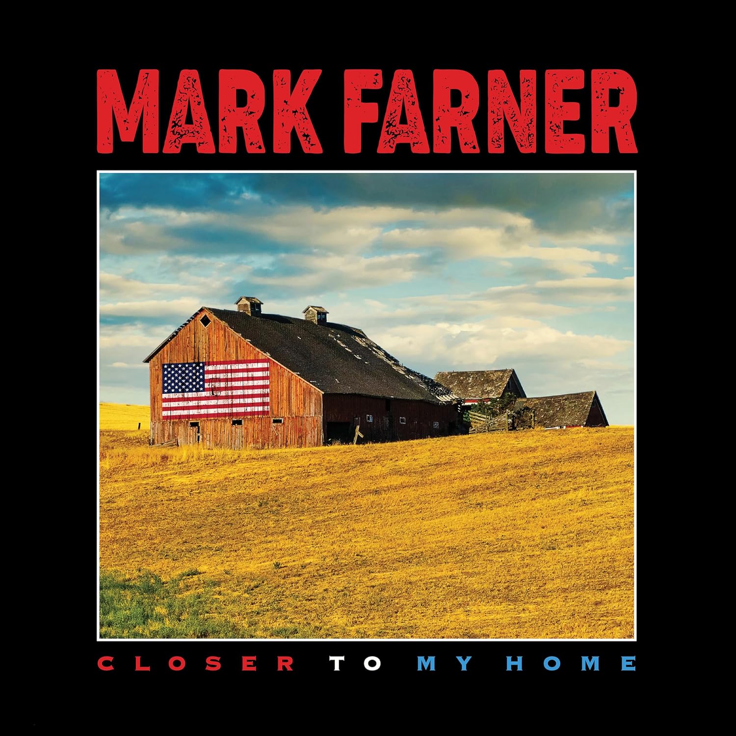
Here is another album cover, which was created by American artist John O’Brien. I’d featured John a few years ago discussing an April Wine cover, and again a few weeks ago, discussing the 2 Great White covers he was responsible for. Somewhere in there John mentioned a Mark Farner cover. And silly me for not even knowing Mark released an album in 2024, titled Closer To My Home. I loved Grand Funk, got the LPs, put together a little newsletter at some point in the 90s, and featured one of their album covers in a previous post a few years ago. So, upon John mentioning this latest album, I got a day later, and it is a great listen, and highly recommended to any Grand Funk fans; after all Mark wrote and sang most of the band’s greatest material in the 70s. *Check out John’s details of the Closer To My Home cover art, as well as the links below. *Thanks again to John for his time (and images) discussing his work and an excellent cover.
More recently you did the cover for Mark Farner’s Closer To My Home. How did that one come about?
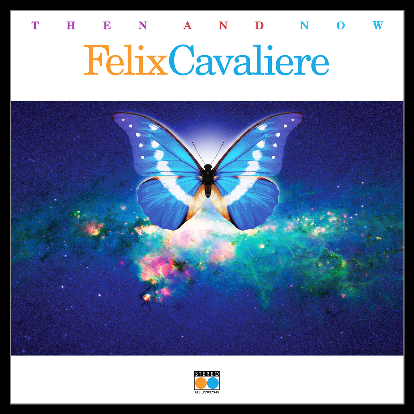
Marks manager, Obi Steinman recommended me for review. The previous year I completed a project with Obi for Felix Cavaliere, “THEN AND NOW”, it went quite smoothly from concept to completion. So thankfully he had faith in my creative process and final product, since we had never met personally.
Can you tell anything about the photo chosen for the front cover? Do you where it was taken, significance?
The image was based on the heritage of Marks roots in the Midwest to be a part of the communication.
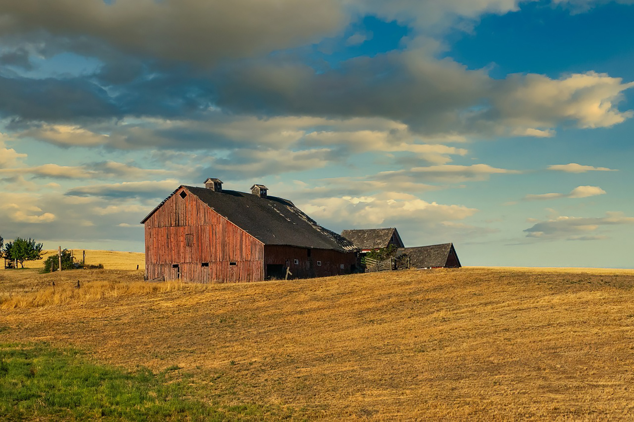
I spent a lot of time researching the perfect barn and location which I could add the American Flag which was one of my concepts. I finally found it online in a series of personal images by Ken Heins. The barn angle was perfect and the sky went from an uplifting blue to having an overhanging ominous darker presence. While not being a professional photographer, he captured the location, mood and angle that I needed to modify and portray the communication. It is great to go direct to a photographer, especially someone who shoots for personal reasons. He was great to deal with on securing the image and all usage rights.
I love the big bright lettering of Mark’s name, the layout… a very patriotic cover. Did Mark have a lot of input or suggestions?
Like many things the simplest direct communication is the best. In one sentence Obi stated the project was to reflect “Marks Heritage, Origin, Rock & Roll Legacy, Values and American Pride”. He is a true Rock & Roll Patriot. A variety of comps were proposed for discussion but, as discussed previously the Barn image with the flag summed it up visually. As far as typography chosen, I wanted to play off of Marks history and Rock & Roll energy. Some solutions related to GF to closely, but he gritty red type communicated the power and intensity he delivers. “Midwest American Rock & Roll” to be sure.
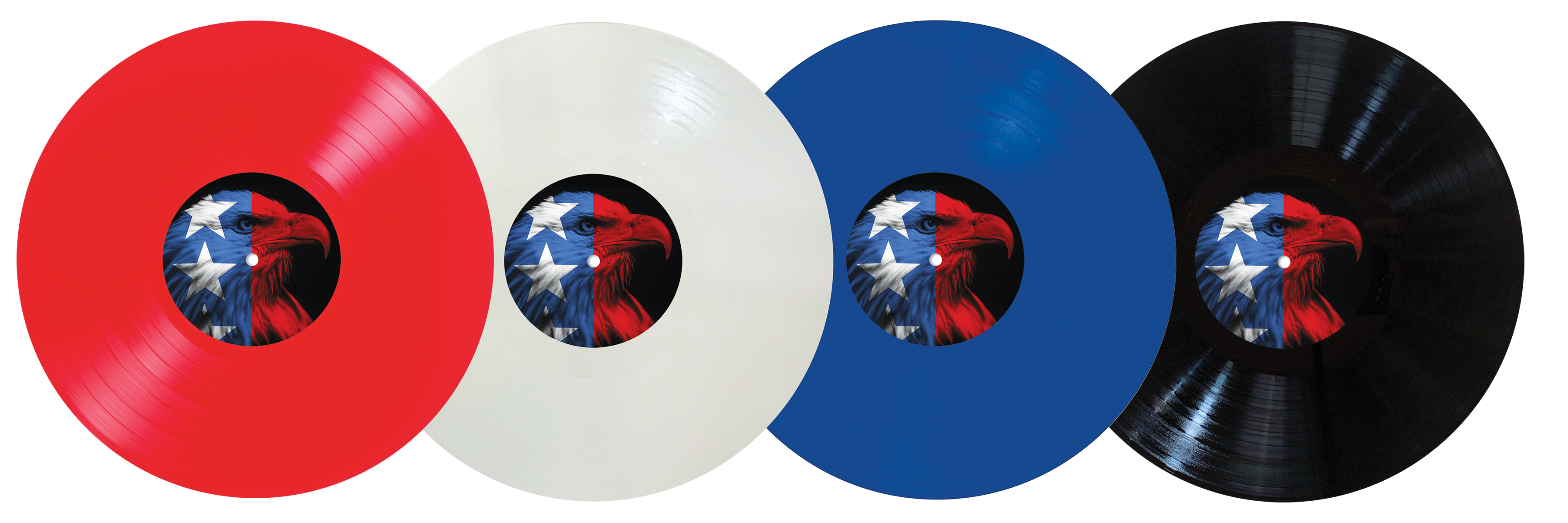
The American Eagle was used for some comps as well as for the record label direction. It was determined that it would best be utilized on the back cover as well as a label on one side of the album.
I submitted suggestions for limited release of the album in Red, White & Blue as well as classic Black.
The initial release is Red Vinyl and some were signed by Mark personally, which were available on his website listed below.
I assume this is the only Farner (Grand Funk) cover you’ve done(?)
Yes, the only one. Who would have thought I would get to work on Marks first solo studio album in 18 years, featuring the 55th Anniversary re-recording of “I’m Your Captain (Closer To Home). The project produced, engineered, mixed and mastered by Mark Slaughter, and co-produced by Mark Farner. A definite alignment in the stars for me to contribute to the visual communication.
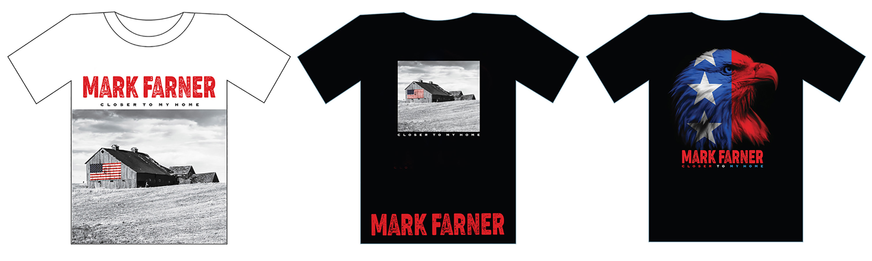
It is also fun as I get to submit comps for merch such as T-Shirts for consideration. These are but a few versions with regard to the printing process of 3-5 Color for pricing considerations.
How familiar were you with him (and Grand Funk)?
Any teenager in the 70’s was aware, as everyone was at the time of GF. Blasting “Grand Funk Live” in my bedroom and hearing various songs played live by cover bands at Junior High School dances. It was a very loud year in 1970 when that album released. Ironically, it was released on Capitol Records, the future company I was to work for from 1983-1989 in the Art Department. Some synchronicity to be sure.
A special thank you to Obi Steinman for his support on projects.
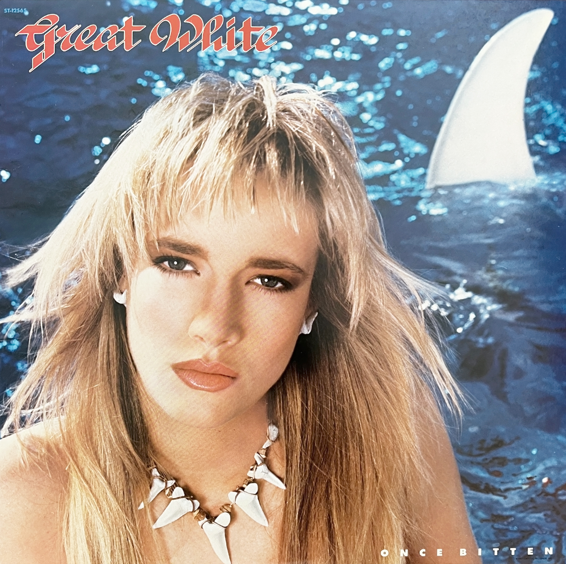
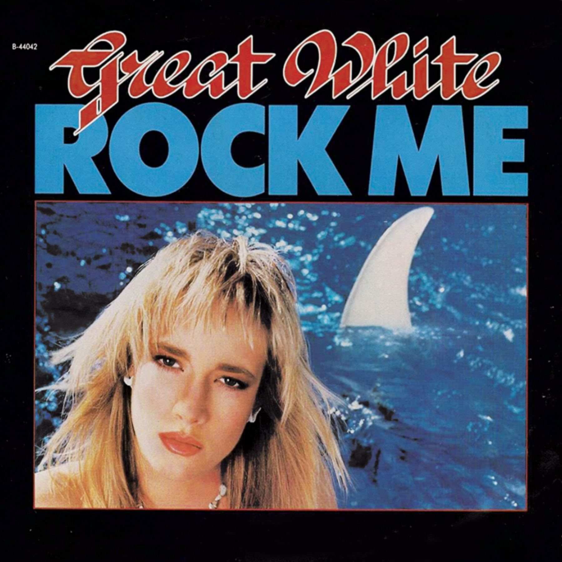
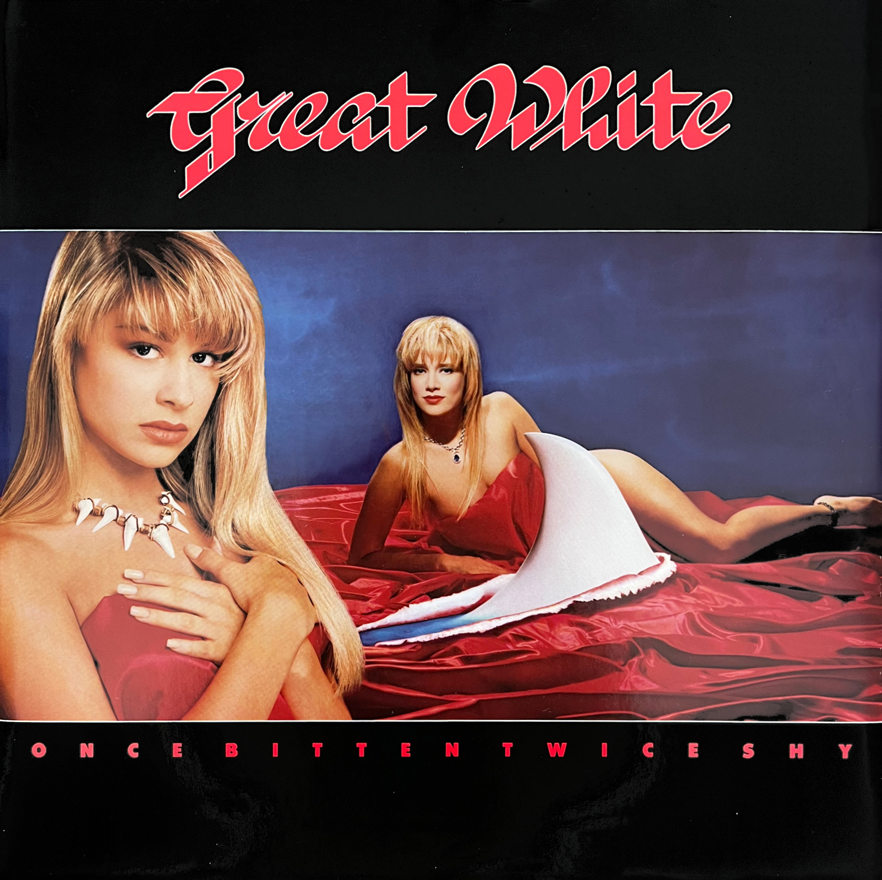
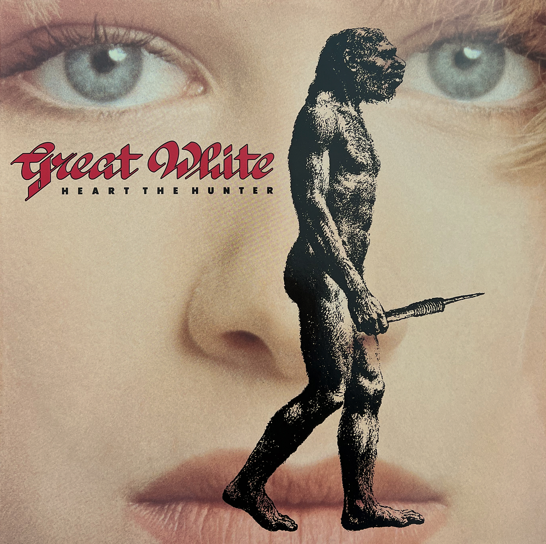
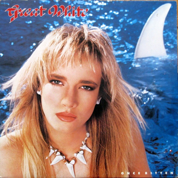
A couple of years back I featured John O’Brien’s cover art for April Wine’s 1984 album Animal Grace, as well as touching on a few other covers John created. Recently I reconnected with John to get his recollections of a classic pair of 80s albums by GREAT WHITE – 1987’s Once Bitten, and 1989’s …Twice Shy. This was the band at their peak with hits and favorite cuts like “Rock Me”, “Lady Red Light”, “Heart The Hunter”, “Save Your Love”, and the hit singles – a cover of Ian Hunter’s “Once Bitten Twice Shy” and the ballad “Angel Song”. Once Bitten would be a top 30 album in the US and Twice Shy making the top 10. I had these on cassette when they came out and played the hell out of them! I also recall that a few of these songs were in high rotation at any peeler back then. The late 80s were better than I thought, I guess.
Below John has provided details on these album covers that he worked on. John was also kind enough to provide images included. (Thanks to John & Alan Niven) *Check out the links below.
John: My responses mandate some additional memorable and illuminating recollections by Alan Niven (NIV) (Great White Manager, Writer, Producer)
You were at Capitol during the period of Great White’s Once Bitten and …Twice Shy albums.
I was at Capitol for the first album Once Bitten and due to Alan’s trust I worked on …Twice Shy after I left Capitol to form a company that designed packaging as well as creating Movie Advertising Key Art.
What/who was your intro to the band or Alan Niven?
Being on staff at Capitol the designers were assigned at random to projects by the Art Director at the time, Roy Kohara. We worked on a variety of artists on the roster who worked with the internal art department. One lucky dayI was assigned Great White. I remember Alan showing up in the art department at my office door one day with all his unique grace and charm…fortunately he trusted me.
NIV: Yeah …me being nosey … who is who and who actually does the work.
NIV: An internal art department is less expensive, and if one can form a relationship within the department one has a chance of doing better than if one hires, at great expense, outside ‘experts’ all full of their rationalities. You had a great energy. A sense of humor. That was enough for me.
Were you brought in to work on the cover well before the album was done?
Projects began after the titles of the albums were settled.
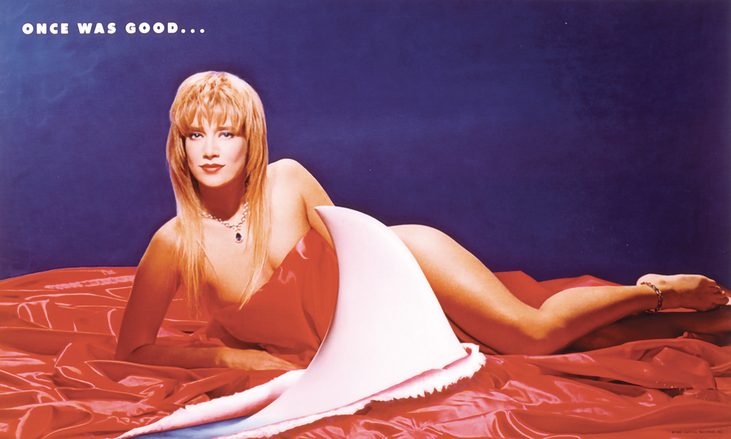
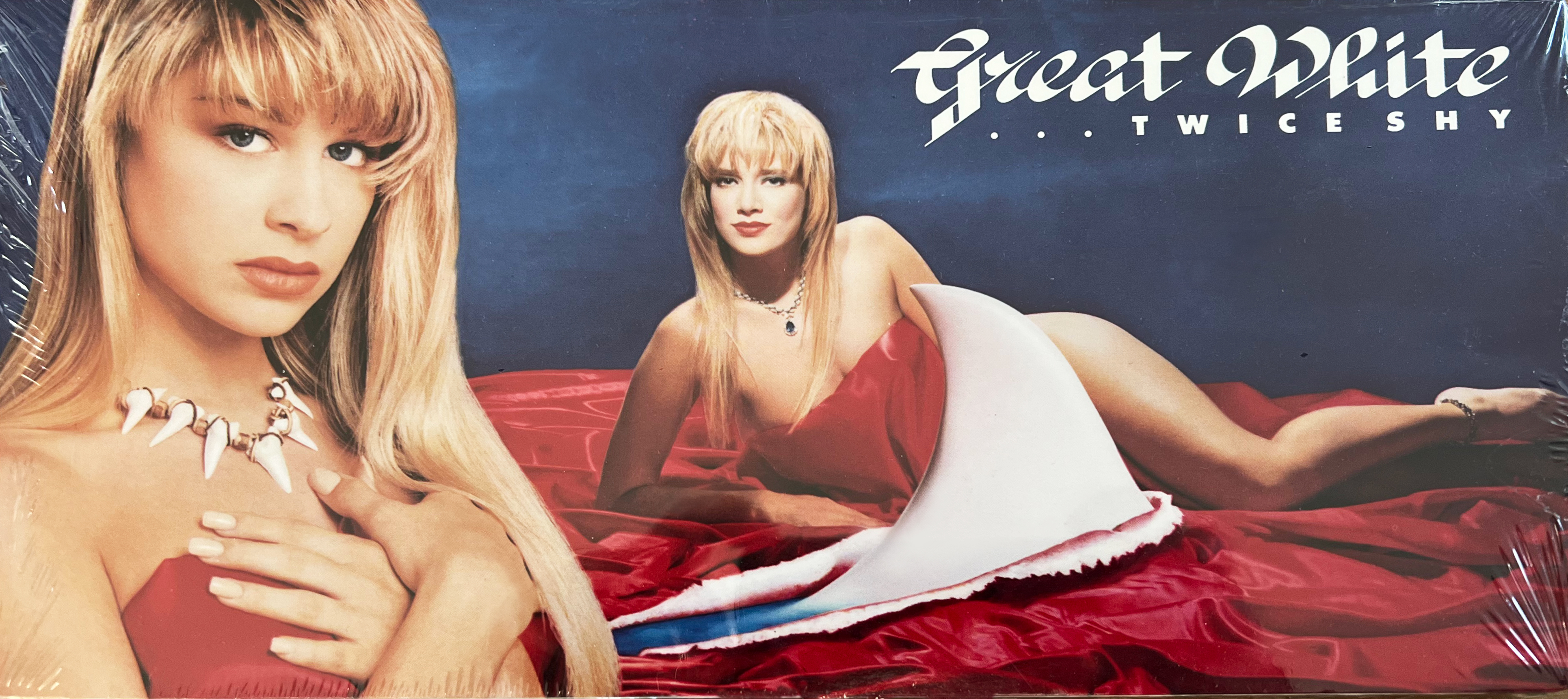
On Once Bitten you were credited with the concept and layout.So, does that mean the entire idea (the model posing in the water with the shark fin) yours’?And can you tell a bit about that whole concept / idea came from?
I was credited with cover concept and layout credit – but Alan was specific with the idea of having a beautiful woman (Traci) with the specific direction of the primal necklace to be constructed and worn. I followed Alans direction and submitted the concept utilizing the model, water and shark fin background.
NIV: Yeah. Much of the album material was about dysfunctional relationships that were mostly formed by primal urges.
How was that first covered achieved? Was it one photo or a couple overlayed?
Once Bitten cover was shot in camera. The photographer was known for his talent in composing and capturing images, lighting and mood. Photographer Ron Slenzak, 3 years previously shot Purple Rain Poster art.
To find Traci (Cover Model) we had a well attended open casting call held in the Tower conference room to search for the specific representative we needed for the cover.
NIV: Traci came to the casting at the Tower. All were dressed. No swim suits. We are, after all, gentlemen.
With …Twice Shy, were you well aware ahead of time that they’d be using that title?
I was made aware after the title was chosen, before the concept for the cover began. Alan always had marketing in mind when working his projects, his choice of covering Ian Hunters song “Once Bitten, Twice Shy” on the album seemed like a great marketing idea.
NIV: The idea was to have a link between the first Capitol album and the next. There was no guarantee that Once would be a best seller, and having the titles link might help in the marketing of Twice Shy. Notice, “OBTS” was the last track on side two of TS and was there to facilitate the marketing connection. Of course, it helped that it’s a great song and ours was a definitive version. The fact it sold a mill as a single makes it debatable whether it was good for the long term or not.
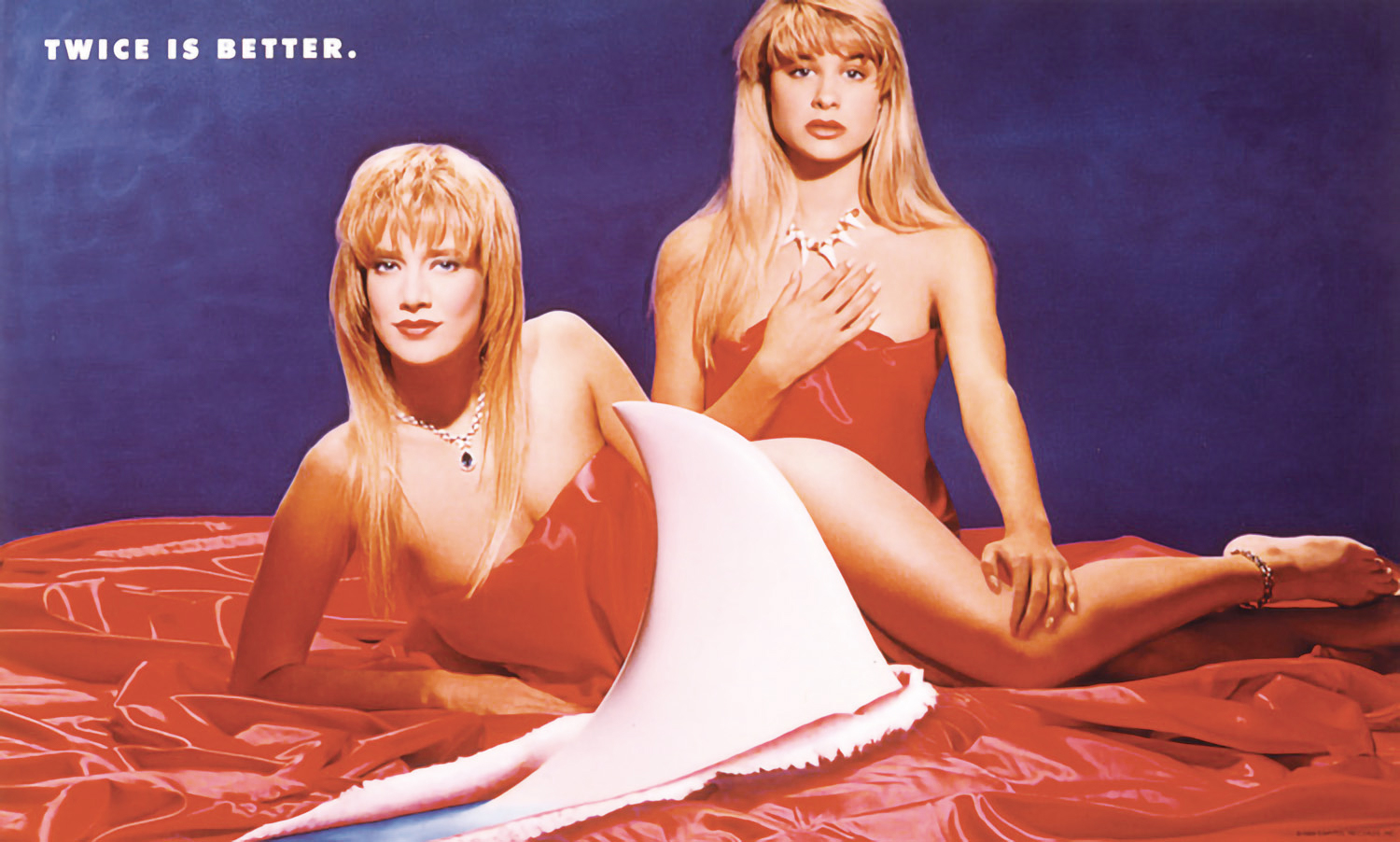
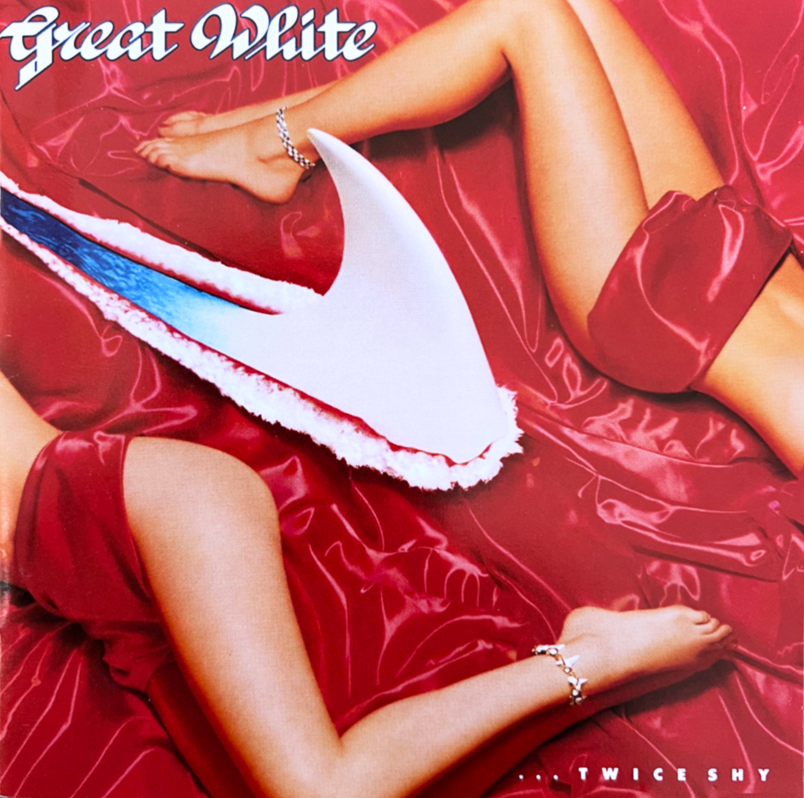
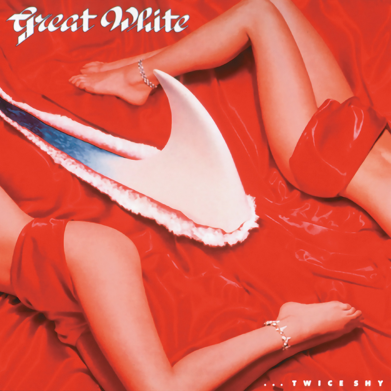
On …Twice Shy, you were credited with art direction/design, and Alan Niven was credited with the concept. Can you describe the idea behind this one?
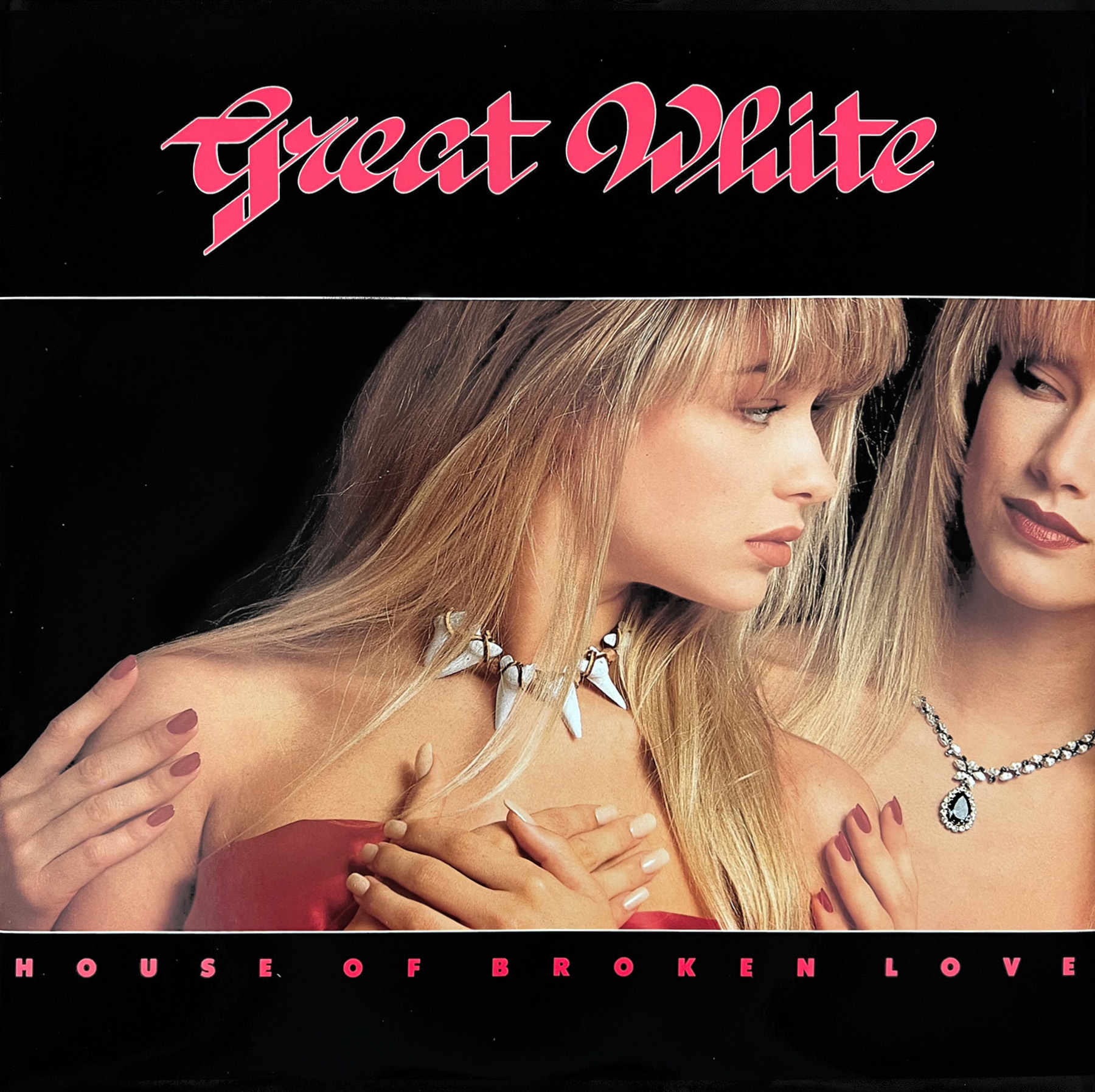
…Twice Shy was the genesis of wanting two girls on the cover representing the concept. I thought a more surreal landscape would be interesting, rather than a literal version of water, with the red satin and the shark fin ripping threw it. We did a vast coverage of images, from singles to combinations anticipating usage on multiple applications. Douglas Hyun was the photographer and was tasked with the multitude of coverage as well as constructing the set with red satin and the fabricated shark fin ripping through the fabric. A long fun day and night. With various combinations of images possible, that were used in montages and in all cases the water was added to the rip by retouching.
The new girl Bobbie, showed up at my new office in Burbank one day, pre chosen for review… No recollection of her origin, but she fit the bill.
NIV:Twice Shy? Now two girls. One sophisticated, the other primal. It’s a comment about the nature of LA relationships – about The Sophisticate teaching The Primal the art of manipulation. As Zsa Zsa said “I am a good housekeeper. Every time I divorce I keep the house.” And the jewels.
There were a lot of similarities between these 2 albums – musically, the title connection, and the covers – such as with the back cover lettering and lay out. Was that back cover layout and lettering idea yours?
Musically the band had further developed, and the title I was given was an obvious extension and connection. I designed the first album typography to define that specific project. I continued on the with the second album as it was a stylistic connection of the previous. As the two were related, the typographical treatments seemed appropriate.
The similarities between the 2 are obviously deliberate, making a fine pair of albums (though they didn’t use the same model), but you weren’t around for the next album (Hooked) even though it shared a bit of similarity on the front. Is that because you’d left Capitol or just weren’t asked? (The 3 albums, to me, are the highlights in the band’s catalogue)
Once Bitten and …Twice Shy are obviously similar due to a title “continuation” and the concept of the 2 different girls on the cover, Alan’s vision of the symbolic relationship of the two. The first model, Tracy was used on both, firstly with the shark tooth jewelry and secondarily with the emerald jewelry, and Bobbie now added with the same shark jewelry. As Alan previously stated “The Sophisticate teaching The Primal the art of manipulation”.
I was not involved with Hooked as another Art Director had joined Capitol and he utilized his contacts to create most appropriate art for the project.
Can you talk about the extra pieces that you would’ve designed for the Once Bitten and …Twice Shy period, such as promo posters, adverts, and the various singles? (Were you responsible for all picture sleeve singles at home and overseas?)
Important to remember in those days packaging came in multiple formats; LP, CD, CD Long Box, and Cassette so all items designed in house. For fun I designed …Twice Shy CD with a double cover. If you flip the insert over you have a different version of the cover displaying both models in an alternate pose.
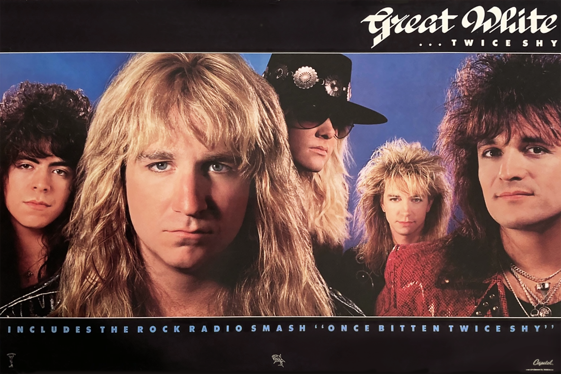
The photo of the band for …Twice Shy was composed of individual images and stripped together C Print and retouched. A more striking image of the band rather than a single posed image. It was certainly a more confrontational and direct image of Jack.
I was, as all in-house designers, responsible for all campaign art & design for domestic product; Ads, Promo Items, Singles, Posters, Marketing Materials for both projects for continuity. I do have more items for …Twice Shy for examples as it was a broader campaign designed for playing on the title, specific imagery and sizing, as well as to keep the project compelling.
In many cases, such as Great White, were you a fan of the music much? Was it something you would’ve been into at the time?
I was introduced to GW when I was assigned the project. Alan supplied a promo cassette of the songs for inspiration.
And if you recall, did you have any ‘favorite’ tracks from either of these albums or any kind of appearances or social calls with the band?
“Save Your Love” and “Rock Me” from Once Bitten and “Heart the Hunter” and “House of Broken Love” from …Twice Shy seemed to resonate with me.
My contact was with Alan on both projects. That seemed to keep me focused on my creative and deliverables. Any call, biz or social with Alan is memorable. I had no direct interaction with the band.
(Alan, thank you again for your additional responses. My memory needed a fact check.)
LINKS:
Get it direct: Alan Niven Discussing Origin of Great White Covers!
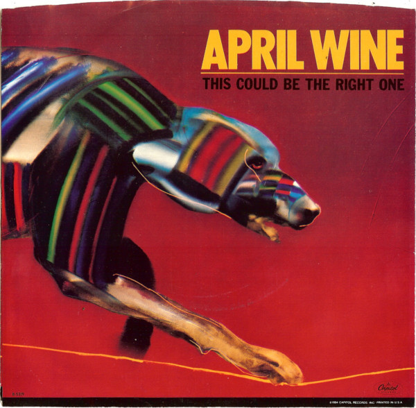
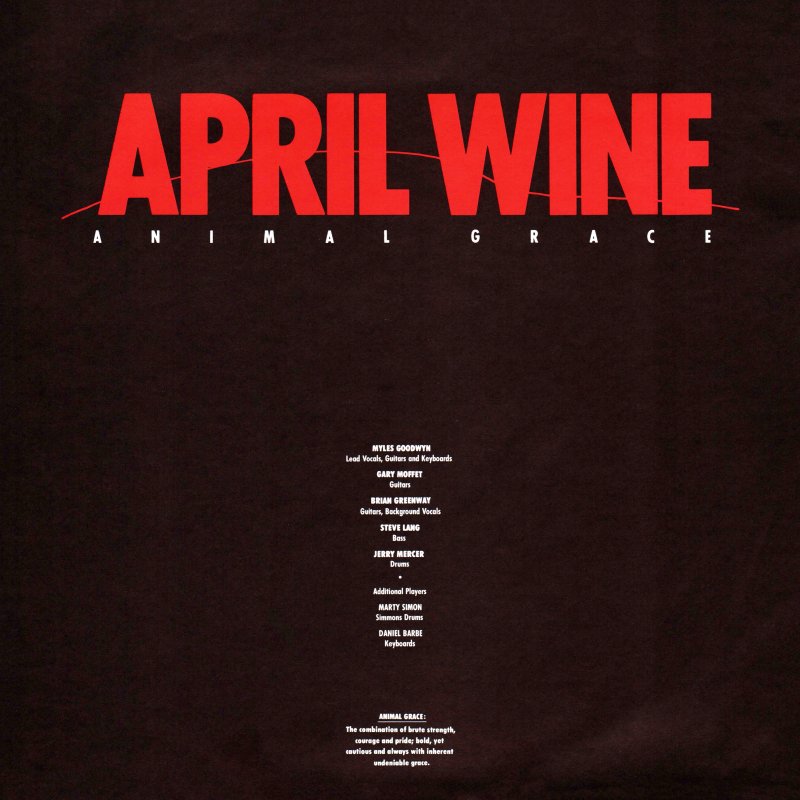
April Wine’s 1984 album Animal Grace was the band’s final album as the ‘classic’ 5-piece line-up. The band broke up after a farewell tour following Animal Grace’s release. The album saw a couple of singles, but clearly the band was not supporting it, playing only 1 song from it in their live set. Animal Grace would also be the first April Wine album cover not to be designed by Aquarius Records’ Bob Lemm – who had designed pretty much every cover since 1973, nor would it feature the band’s logo that had been used on every release since 1978. Instead American designer John O’Brien was given the task to create the follow up to 1982’s Powerplay. Like every April Wine cover, it was a completely new design, and new look, suitable for the times.. John O’Brien has done numerous album covers throughout his career, notably for Tina Turner, Billy Squier, and Great White’s 2 biggest releases. In this exchange John details coming up with and creating the cover for Animal Grace, as well as his background, and touches on a few other covers he did. I’ve included a few of John’s other covers, as well as links to his work at the end.
How did you get in to album cover art design? Can you give a bit of your background?
Growing up I always had a love for Album Cover art and music, it seemed to be the perfect creative vehicle – visual and sonic delivery, it stimulated my senses. I graduated from Cal State Fullerton in 1981 with a Masters in Art, with Design focus. I freelanced at various design studios that specialized in entertainment in Los Angles my last year of school, and continued up to1983 after graduation. After working and showing my portfolio for 2 years, I received a call from the Creative Director at EMI Records, Bill Burks that there was an opening at Capitol Records for a designer. He recommended me, I interviewed with the Art Director, Roy Kohara and received the position. From 1983-1989 I worked in the Art Department on all aspects of an assigned project, from Cover Deign, Advertising, Marketing to Promotional Materials. Depending on the specific project I was responsible for concepts, logo design, hiring outside illustrators, typographers and building the final mechanicals, as in those days they were built by hand.
Am I correct to assume you worked for Capitol Records (seeing most of your credits on Capitol), and is that how the April Wine cover came about?
Yes, from 1983-1989 as stated I worked on staff. After 1989 work with various labels. Being a staff designer projects required different approaches. Some had art attached, logos and cover art concepts supplied by the artist and management, others needed a full exploration. I was assigned the project which needed a cover concept for April Wine with the title Animal Grace. From this point I was responsible for coming up with ideas to represent the concept for presentation to artists, management and marketing.
Were you familiar with the band and/or their music?
I had not previously followed the band but was aware of their music.
You are credited with design, and there are (2) art directors credited – Can you tell me how much of the whole album package was your design – back, front, lettering…?
I cannot recall what transpired at the time that 2 Art Directors were credited, perhaps one was on vacation and the other filled in for presentations and sign off of final art approval and budget as that was the process. As the designer on this specific project I was responsible for the creative, but I did not have direct contact with the band or management.
I was responsible for completing all packaging for the project (logo, cover, back cover, insert) as well as any campaign ads for marketing and poster. All layouts and final mechanicals were done by me in house at Capitol.
As almost all previous April Wine covers were designed by Aquarius’ Bob Lemm – who also designed their logo, is that why the logo (from the band’s previous 4 albums was not used?
There was no mandatory that a previous logo be utilized. I selected a bold font and introduced a fine line to reflect the nature of the art, without competing with the art. The cleaner logo created did not battle the art work and maximized the visual impact of the artwork illustration.
Did you have much contact / input from the band (or specific members) management? and did you ever listen to the album?
On this project, I had no direct contact from the band or management. Communications filtered internally down from the Creative Director to Art Director to Designer.
Can you tell me a bit what inspired / influenced this cover piece, and how it was achieved?
While coming up with concepts I searched various illustration promotional pieces and periodicals as well, and found a captivating image by Marshall Arisman that fit the title with perfection. Bold and powerful, elegant and graceful, the image was compelling. At this point it was comped up with a few other ideas, but this was the strongest image.
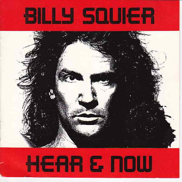
You also did Billy Squier’s Hear & Now album. Recall much from creating that?
In this case, I was assigned the project and it had very definitive parameters. Art elements were supplied specifically and indicated for the cover. Billy and the Art Director, Tommy Steele had a very clear concept of the desired look. The cover was built to specifications and I designed the rest of the package reflecting the look of the cover to follow the feel.
Any favorites and/or most successful album covers you’ve designed?
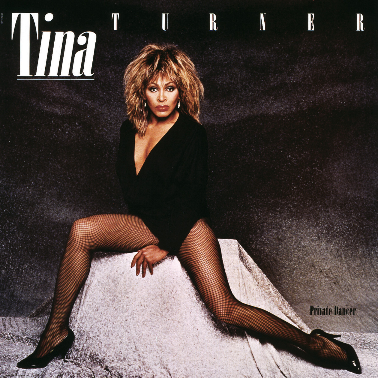
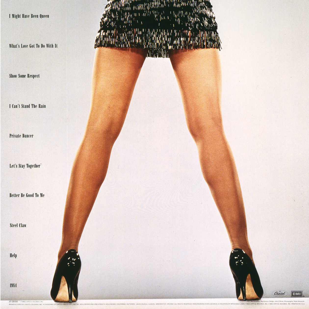
My favorite project was ‘Private Dancer’, by Tina Turner. I was going on vacation but cancelled it when the opportunity came up to work on this release. In this case I was involved with the Producer, John Carter and Management, Roger Davies on all aspects of the release. From coming up with the logo, all packaging including the double cover release – they needed one layout that worked with 2 separate cover images. I designed all domestic singles, advertising, marketing elements, standees, promotional items for over a year. A fantastic opportunity, amazing people… and Tina who had an undeniable presence that filled anywhere she was with the brightest light.
Another was the Great White project, ‘Once Bitten Twice Shy’ with Alan Niven. Another long inclusive creative project with many singles and advertising elements. A lot of fun with compelling visual elements with Alans inspiration.
Are you still creating any album covers? If not, what else have you been up to in the art world?
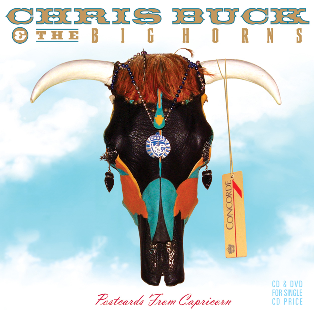
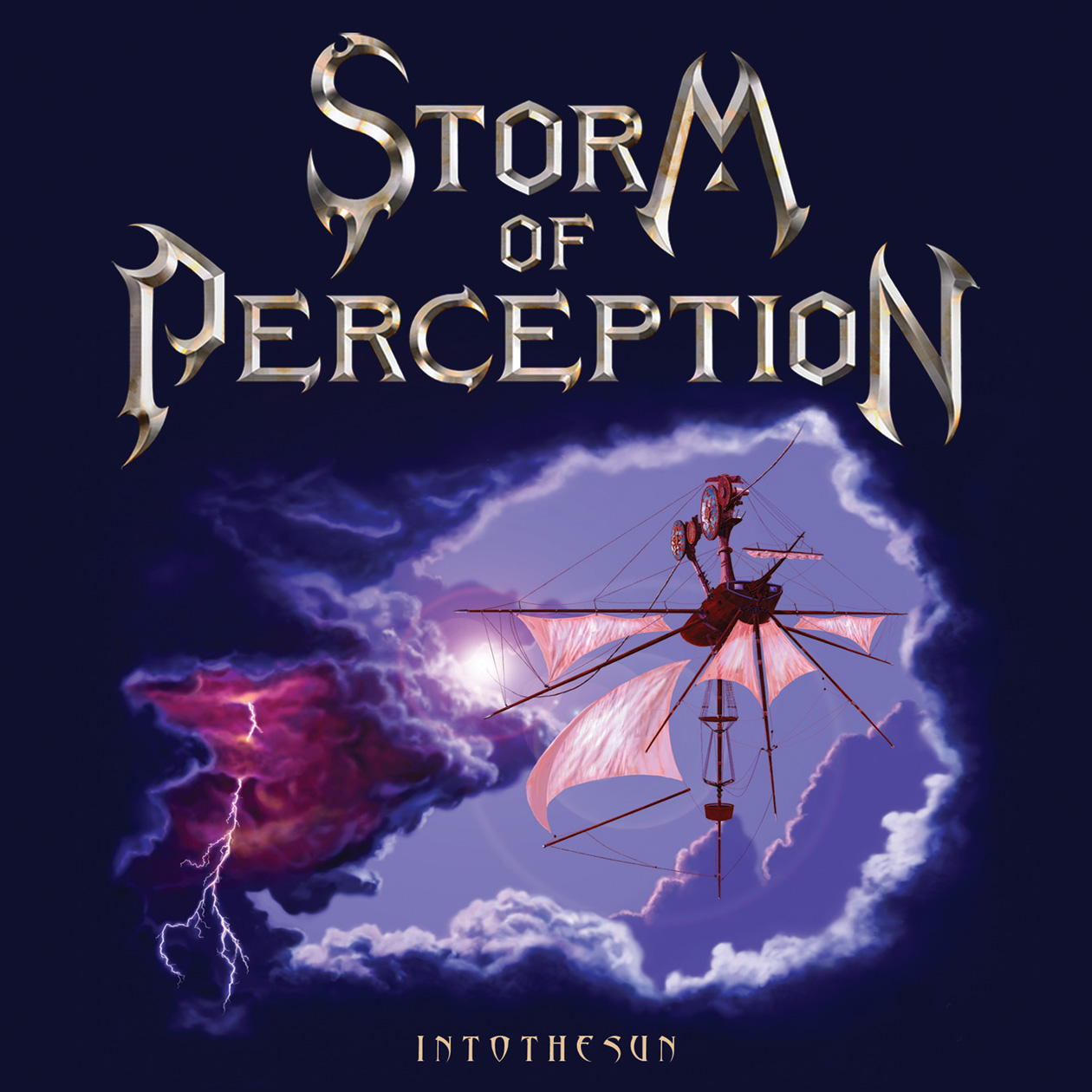
A few elaborate CD/DVD projects done for Alan Niven’s Tru-B-Dor Management a few years back, Storm of Perception and Chris Buck and The Big Horns. An album project for John Klages, Fabulous Twilight on Danbury Fair Records. A recently completed project for Felix Cavaliere (The Rascals), ‘Then And Now’. A fun project with a great musician and great management team. Hopefully a new one for Mark Farner’s American Band upcoming.