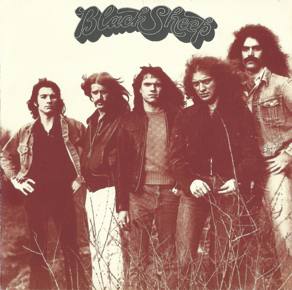
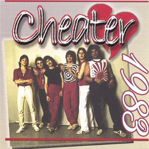
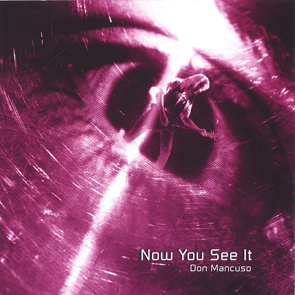
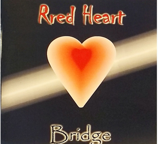
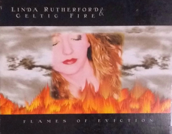
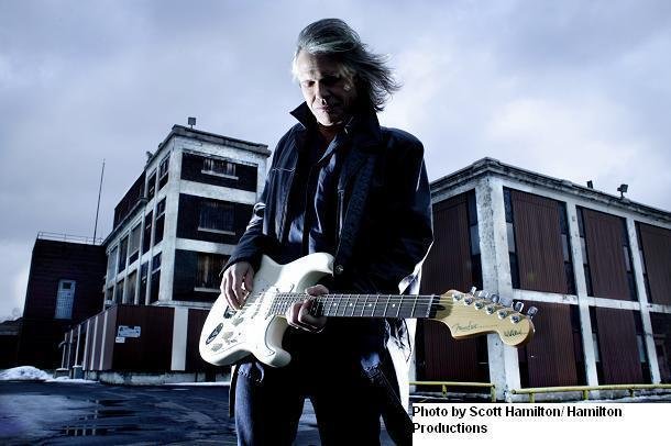
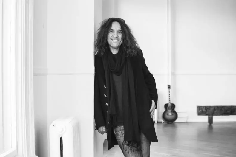
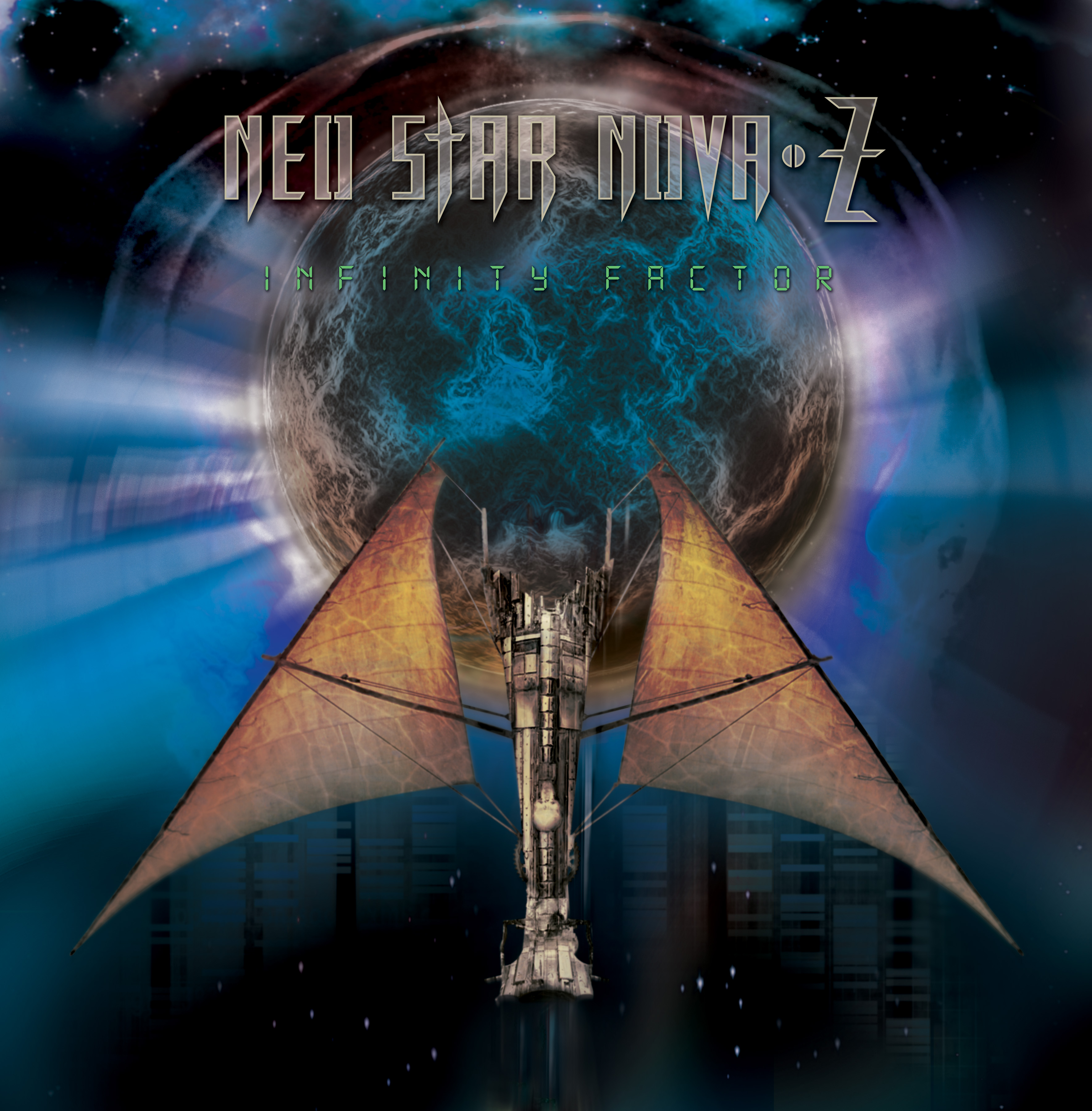
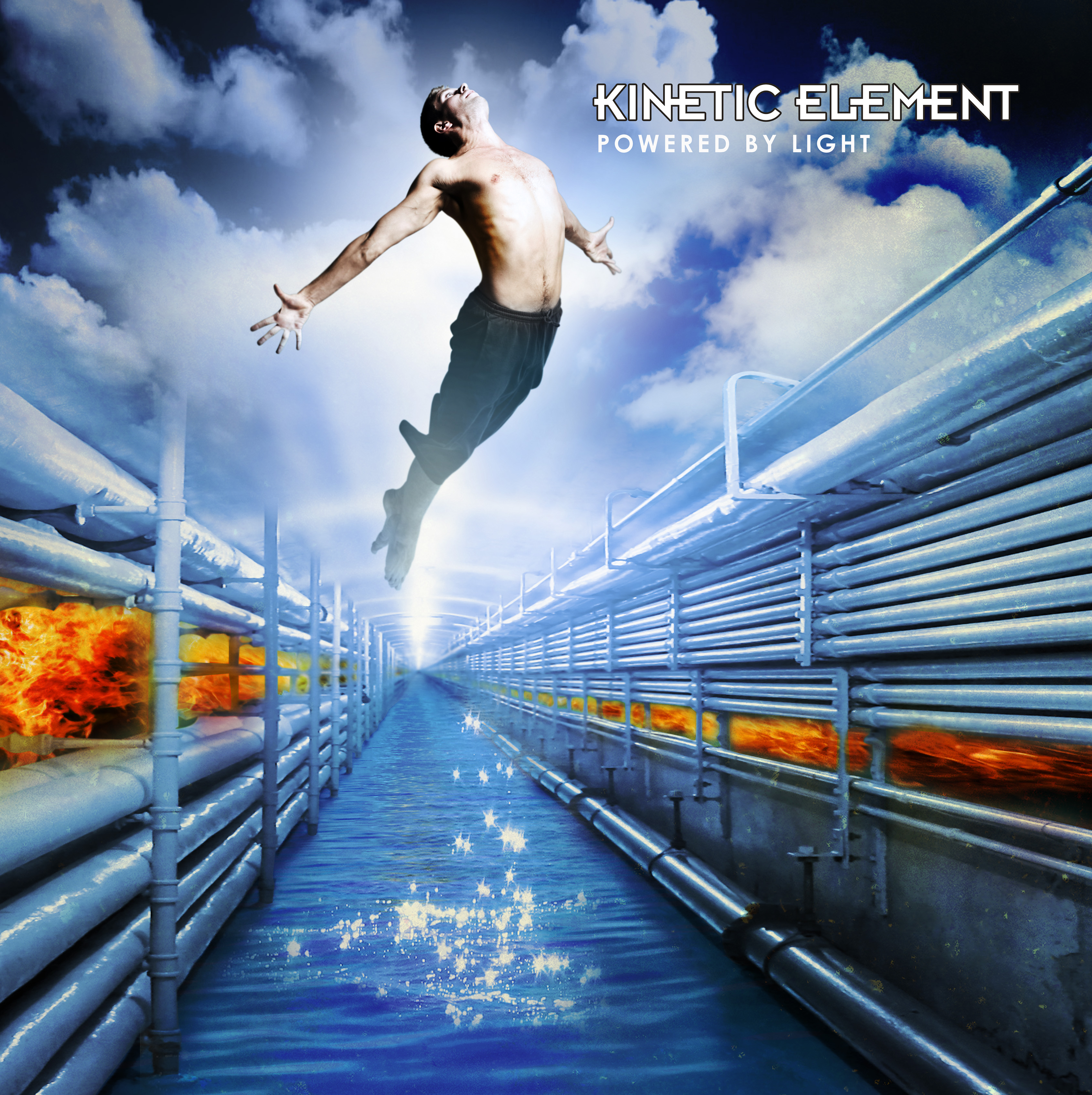
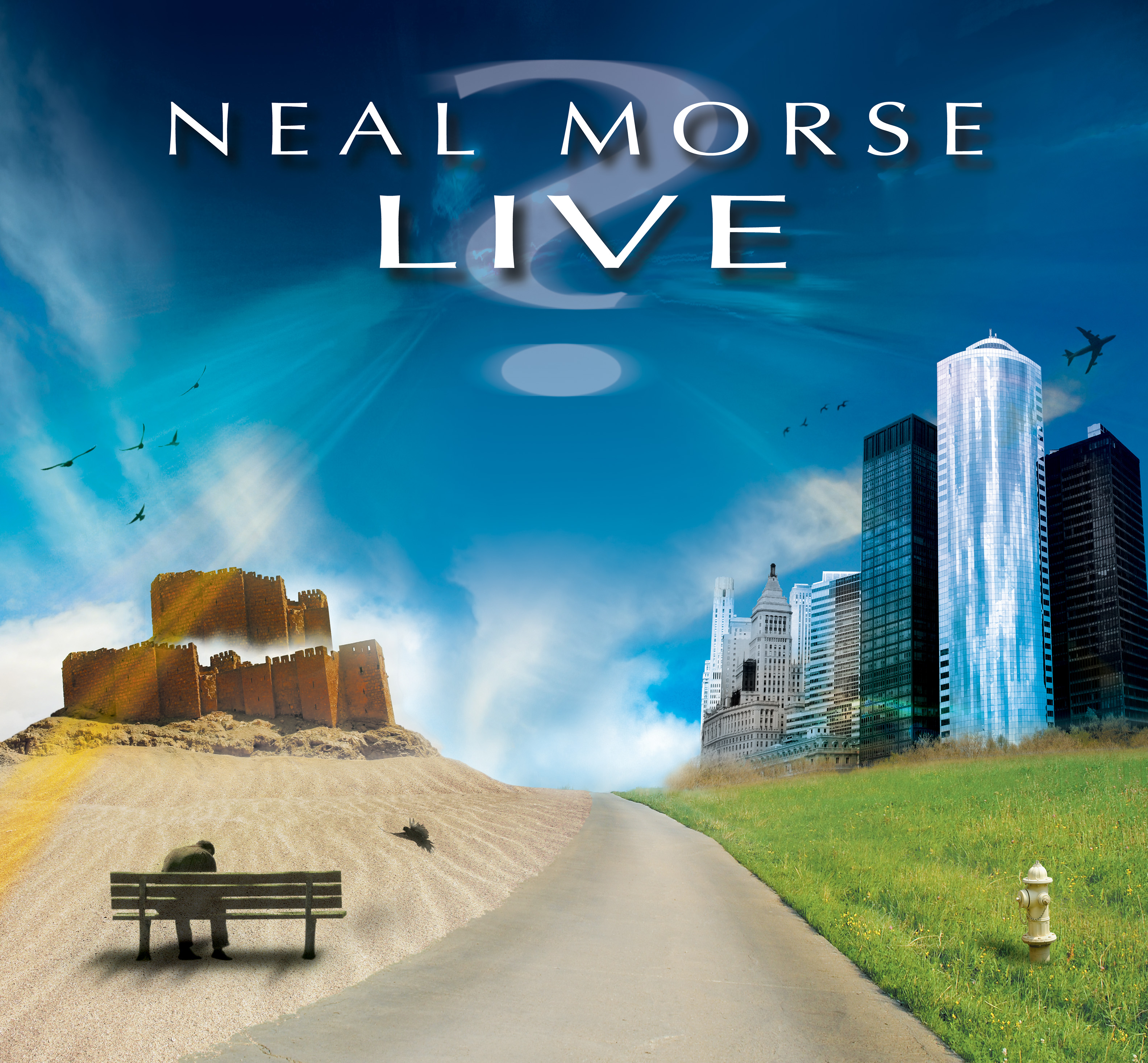
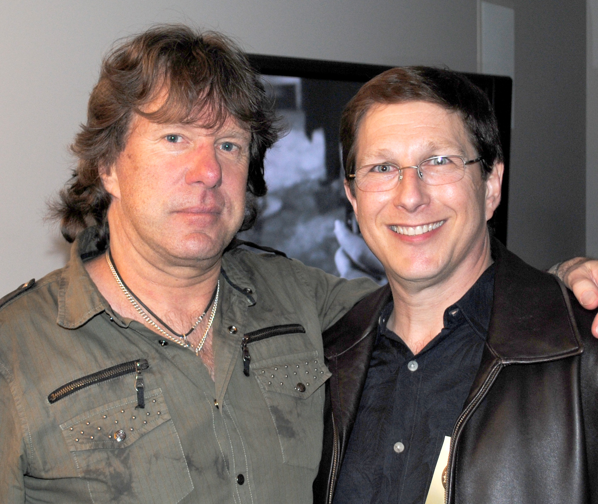
The new album from New York area band LIPS TURN BLUE features an eye catching cover created by artist Martin Kornick, aka Man In The Mountain. Martin has designed numerous album covers over the past 2 decades, notably for prog artists like Neal Morse, Mike Portnoy, Keith Emerson, and Kinetic Element. Admittedly, when I looked in to Martin’s work intending just to inquire about the LTB cover, I found a lot more of his work that I couldn’t avoid asking about! In this interview Martin details how he created the LTB cover, as well as a few others, such as those by John Wetton & District 97 and Keith Emerson, as well as his lengthy working relationship with Neal Morse. He also shares his background in the business and future plans. I’ve included images of some of Martin’s covers as well as pics of him with a few of those he’s worked for (all provided by Martin). *For more on his work as an artist, and various projects check out Martin’s site – http://www.maninthemountain.com (see more links below)
Can you give me a bit of background as to how you started in doing album covers (aside from your other works)?
I got my start doing album covers thanks to Neal Morse back when he was in Spock’s Beard – the ’90’s era progressive rock band that I was quite smitten with upon discovery. Floored really. I couldn’t believe the interweaving keyboards and lush prog arrangements I was hearing spinning “The Doorway” on my stereo. I quickly became obsessed with the band. I distinctly remember getting their newest album Day For Night and being entranced by the cover art by German artist Thomas Ewerhard, which had a strong Pink Floyd Hipgnosis vibe to it. As I examined it further it struck me that Thomas was using a lot of Photoshop techniques that I was already experimenting with in my personal art. I thought, “I can do that! How can I do something like that for Spock’s Beard? I must find a way!”
Shorty after I was thrilled to see Spock’s Beard were playing at Martyrs’, a Chicago area nightclub. It was such a magical night, as anyone who was anyone in the Chicago prog scene was there in attendance. I truly made several long-lasting friendships with people I met there that night. But what then happened is at the start of the show, Neal Morse ran out on stage with a video camera, then leaned over and gave me (randomly) the camera to continue filming the show. And honestly, I am the most insane prog fan/bootleg collector you could ever give a video camera too. Haha! After the show, I had to somehow get a copy of this concert video. So, I contacted Neal by email to ask for a copy, and we hit off a friendship talking about old Genesis and Gentle Giant Bootlegs. We even traded a few things. During our correspondence over the next few months, I mentioned to Neal that I was a graphic artist and hit him up if needed any art for a CD project. Nothing became of it until one more time I asked and by chance he was working on a fan club CD. He asked me to shoot him some ideas for it. And I ended up working for Neal for the next 20 years. How is that for fate? And of course, led to doing artwork for other bands as well.
Growing up – what were some of your favorite bands, albums, and album cover artists? [Any artists influence your own work? ]
Looking back at my youth, I did have an affinity for bands that had cool artwork and graphics. I easily fell for KISS who were the most graphic art-oriented band ever, from the face paint, the photos, to the album art. KISS were super easy to the draw, and I even made my own KISS comic books. I had a sort of musical awakening when I went to see the movie The Song Remains The Same and watched Jimmy Page make all these otherworldly sounds with a cello bow, while he turned into a wizard and drew an electric rainbow across the sky. My tastes then shifted to Led Zeppelin and bands like RUSH and Styx who also explored more cinematic musical landscapes and science fiction. RUSH used all that dystopian Hugh Syme artwork like A Farewell To Kings, Permanent Waves – two of my all-time favs. Bands like Judas Priest started attracting me because they were operatic in style and had gothic album art like a Sad Wings of Destiny and Sin After Sin. Plus the logos… AC/CD, Van Halen, Def Leppard, Styx, Judas Priest, all of them… which sharpened my skills by duplicating the logos all over my high school desk. They didn’t understand, that WAS my schooling!
After graduating high school in 1981, instead of listening to the popular music of the times, the hair metal and MTV, I fell in love with older music from the ’60’s and all the ’70’s progressive rock music like YES, ELP, Pink Floyd, Genesis, and Rick Wakeman. And certainly, that artwork delved deeper artistically into fantasy, science fiction, and mind-altering photo manipulation from Hipgnosis. Off the top of my head, artwork for albums like Wish You Were Here, Yessongs, The Myth & Legends of King Arthur, ELP’s Trilogy and Brain Salad Surgery… were among my favorites. It’s a world I’ve been in artistically ever since. Roger Dean made a huge impression on me, and I started covering my apartment walls with his work. All of this was my school, my formative training

You’ve done a lot of covers for Neal Morse, as well as Transatlantic and Mike Portnoy. – can you tell me a bit about where ideas come from and how much collaboration [or input] there is from the musical artists when designing a cover?
Typically, there is little “idea” input from the musicians, but not in every case. I usually draw from the album title and maybe some lyrics. Sometimes I’m given the raw music to get a feel of what the music sounds like. I’ll listen to it over and over while creating images in my mind. No matter what I am fed at the start, my artwork is always developed organically in a stream of consciousness. I do not create my art in a formally trained manner, as I do not make sketches or roughs. I hit the digital canvas and go where it takes me. I keep fishing about until I see something good forming, and then tighten it up to a viable well developed idea that I can present to the client.

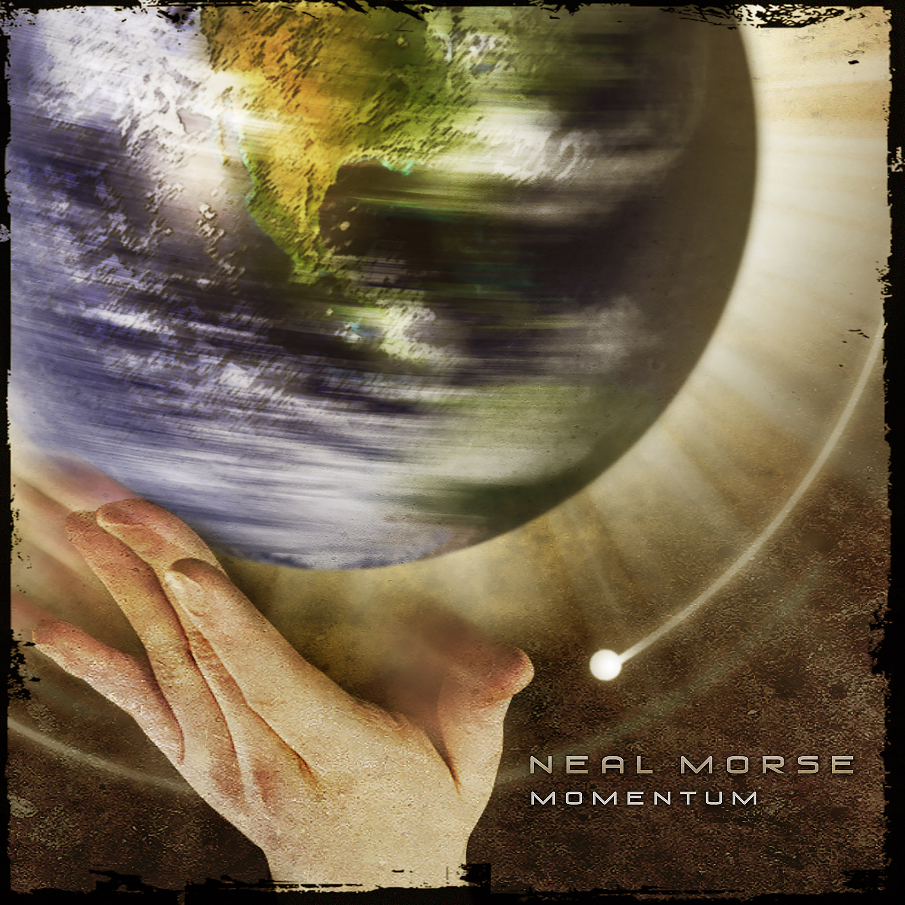
Collaborating with Neal Morse was fantastic, he has a certain aura about him, that’s hard to explain, it’s a unique energy. We had such a great symbiotic relationship in that we could read each well for any project that came before us. Neal allowed me tons of freedom, letting me develop ideas, but sometimes he suggested ideas too. With Neal becoming a Christian artist, I had to work within a more spiritual mindset, which could take me out of my comfort zone. God spinning the Earth on the cover of Momentum was an idea Neal suggested after he didn’t feel my attempts were hitting it. But how I created the cover from that suggestion, was all from my imagination. So, when talking about collaboration, to me it’s more about listening to the artists and their needs, rather than shooting ideas at each other or watching me every step of the way. It’s important to be responsive with artists and very reliable professionally. At the end of the day, you need to deliver on time, and not have a plethora of errors coming from the printing plant, that’s when you’ll get a call to do more.
Working for Mike Portnoy is always so fun. He’s hilarious and has an M family like I do (all names starting with an M), so we M’s get on great. Seeing my artwork end up on his drumhead is surreal to say the least. Mike is a terrific guy, who is inspiring to work with because he continues to be excited like a child when working on his music projects. He cares a lot about his fans.
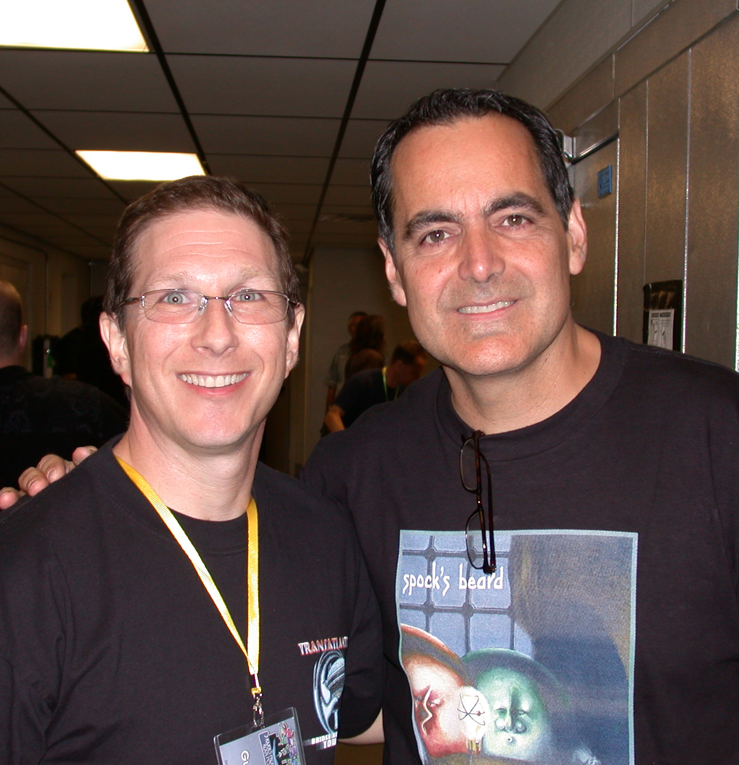
One cover of your’s I really like is the Keith Emerson Band album from 2008. Any recall on creating that and working with Keith?
Thank you, that’s nice to hear. Yeah, how much room do you have in this interview? Let’s just say Keith Emerson was extremely excited about this release. He saw it as a return to form after not having any significant output for years. His desire was to have the type of cover artwork he loved from the ’70’s. Detailed enough to keep you looking at a vinyl copy for years. That’s what attracted Keith to my work. I do recall having a bit of a false start on ideas for the album which Keith was initially planning on calling “Ganton 7” about a distant planet. He did however let me do my thing, with Keith explaining that “there was a cow’s arse on the cover of a Pink Floyd album, so anything is possible.” – That’s a direct quote. Marc Bonilla was also involved with the album art, and I had many long conversations with Marc on development.

Eventually, Keith liked a piece I had already completed that was displayed on MySpace (of all places) depicting a Mellotron rusting in the desert under a red sky. Keith suggested changing the Mellotron to a Hammond B3, feeling this image represented the state of his music career, but also somehow wanting to show it as a rebirth. Along with Marc, we batted around a few ideas until I came up with igniting the organ on fire. That was the moment – I had nailed it! If you look closely, the fire is restoring the organ to its former glory. Keith pointed out to me that the opening section of the track “Miles Away” is based on my cover art. He had the art hanging in the studio. If you look at the cover while playing that intro, the synergy is strikingly clear. Keith was an amazing person to work for, with an unarming humbleness that made you feel comfortable to even disagree with him. He also had no problems calling me on the phone to discuss the album, which is rare – most everyone sticks to email. Nothing can top getting an unlisted phone call, picking it up and hearing in a British accent, “Hello Martin, this is Keith!” I miss him so much.
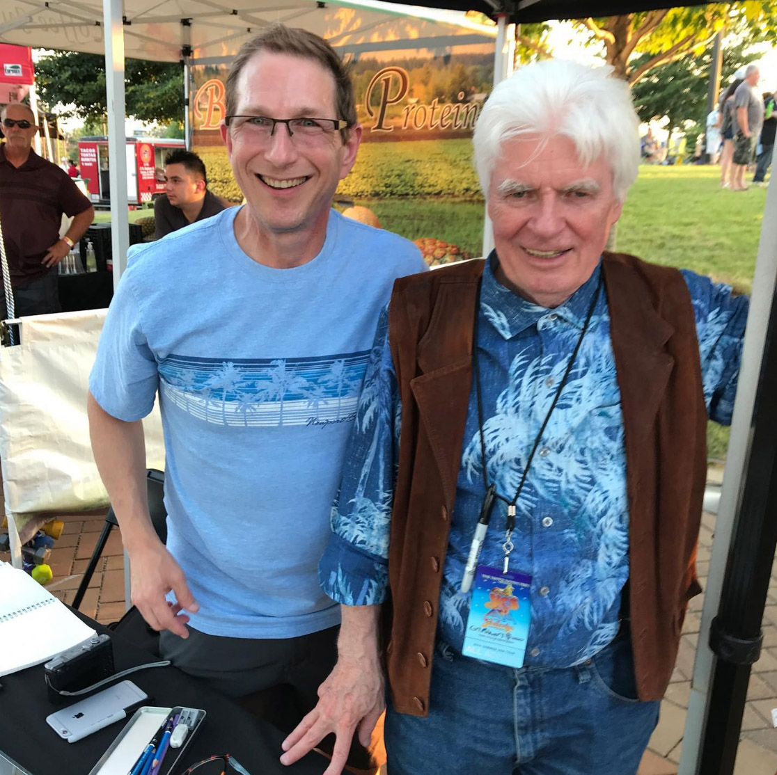
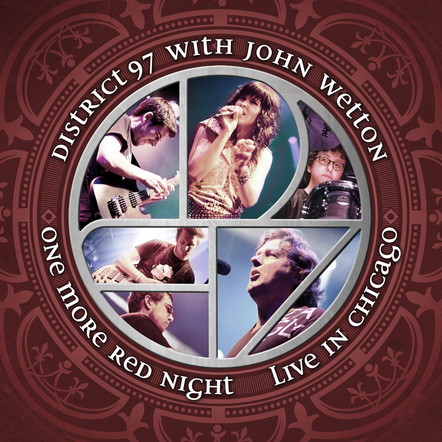
As a fan of the late John Wetton, can you recall working with him in creating the cover for the live album with District 97? [They are from Chicago!?] Also, were you at that show and have any favorite albums with JW?
District 97 is a Chicago area prog band that caught my attention with their 2010 debut album “Hybrid Child.” They had a youthful energy and a remarkably proficient singer, Leslie Hunt, that set them apart from most other prog acts at the time. Being local to Chicago, I thought I would introduce myself to the band’s founder & drummer Jonathan Schang and offer my design services. Jonathan was quick to take me up on that and hired me to design show posters and on-line promotions. Soon afterwards, John Wetton also became a fan of District 97 and started to collaborate with the band. A tour was then planned to have D97 play the music of King Crimson with none other than John Wetton on vocals. Because I was their tour poster guy, I was lucky enough to have the opportunity make the graphics to accompany the tour, which later turned into a live CD package. I can’t say I worked directly with Wetton, but was Cc’ed among conversations regarding the artwork. I do recall Wetton being indecisive about what photo of him we could use, insisting the CD color be red, and that the title of the album be changed from “One More Red Nightmare” to “One More Red Night.” Which probably was a good call! I didn’t catch the Chicago show that was recorded, but I caught them earlier up in Milwaukee. The CD is fantastic, don’t you think? I might say it’s my favorite Wetton album! I do love the first Asia album, Crimson’s Red, and Night After Night with UK is on top of my list. “Rendezvous 6:02” is my favorite song featuring John Wetton.
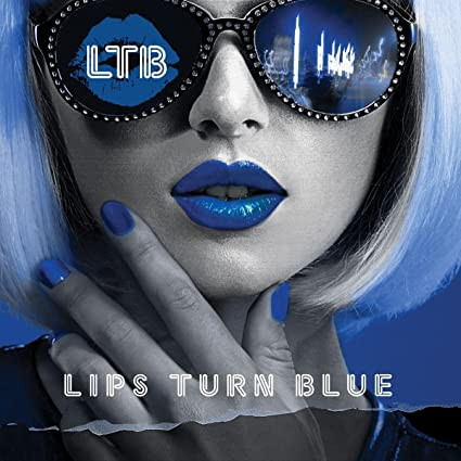
Your latest cover is the Lips Turn Blue cover, and its real eye catching. How did you wind up with this project? Were you familiar with any of the band?
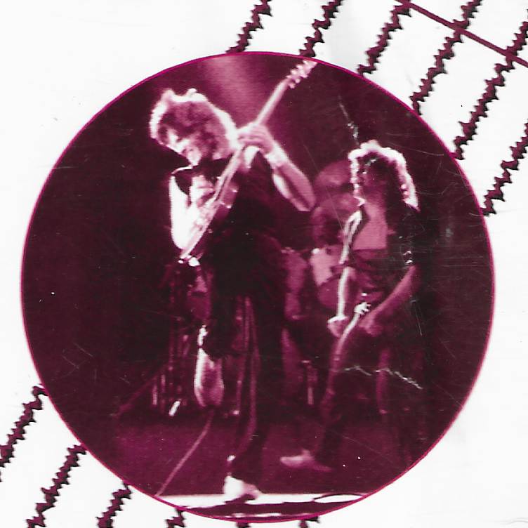
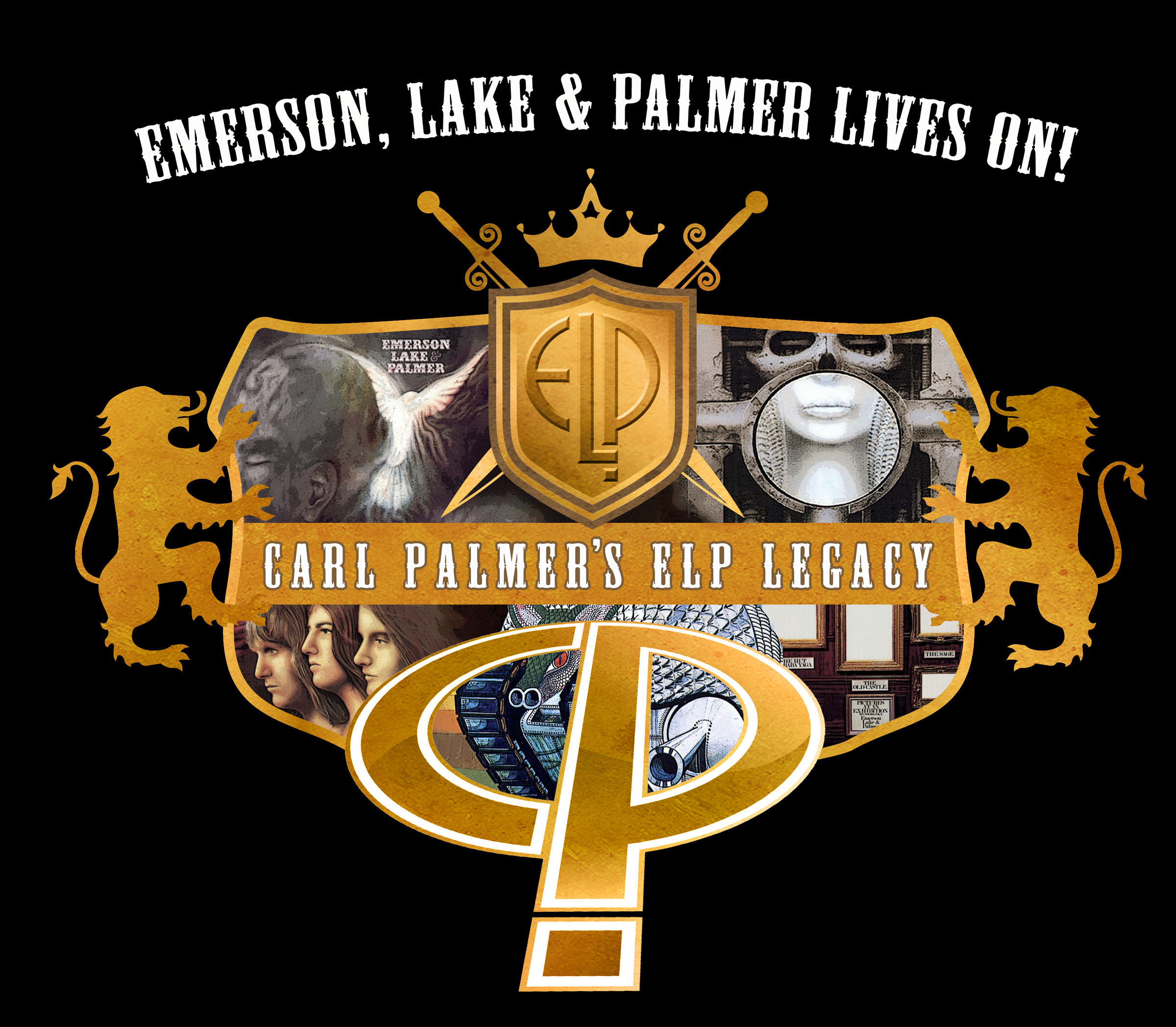
Thank you! I was asked to do the project by the band’s manager, Bruce Pilato. Bruce and I have known each other for many years working with The Carl Palmer Band. I’ve designed many of Carl’s t-shirts and DVD covers, as well the “ELP Lives On” logo that Carl uses on the huge stage backdrop. When Bruce asked me about working on LTB, I was familiar with Phil Naro and the band Talas. The other players had strong resumes as well, so it sounded like a hot project to take on.

Where did the idea for the cover shot come from? Can you give us details on the photo and how you transformed it into the final piece of art [including the logo and the city scene in the girl’s glasses]?
I’m not sure who in the band came up with the idea, but Bruce described in detail what they were looking for. A beautiful female face, similar to those in the Robert Palmer video “Addicted to Love”, with a silver painted face and bright blue lips. That’s very descript. Selecting the particular model and just the right pose, with her hand on her chin, was entirely my call. People see a face, but it’s really about shapes working together in balance, and the selection and framing of those shapes is key to it’s strength. The city lights in the glasses were my way of adding some extra flash and depth to the image – putting the model in a place rather than just a flat image. The logo played off that, with neon lettering. With CD artwork now reduced to tiny icons on the internet, I needed to create a simple bold image to draw attention. The contrasting silver/blue color scheme worked well to that effect. Another interesting part of the development of the cover were instructions to put photos of all the band members at the bottom of the woman’s face. I did that, but then ending up having a disagreement over it. When I removed the band photos, Bruce argued that without them, people would think the woman is the recording artist on the CD. I reminded him that many male bands used a woman on the cover, like The Cars and Roxy Music. So, in that spirit, I guess I won out! I was also told Phil Naro approved the final artwork just before he passed, so that’s quite nice to think my artwork was among his last images on Earth.
Do you have any favorite tracks from the LTD album? and might we see you work on the next LTB cover?
All the tracks are consistently strong. “Pray For Tomorrow” is quite nice. And I love “Blood Moon”. Probably because it has a prog feel to it with prominent organ and synths, and I’m a synth player myself so I dig that. I’m certainly open to another LTB cover, but I think their current plans are for a tour.
Any upcoming album art you are working on [or will be] ?
I’m open for business. So, if Rick Wakeman or Peter Gabriel want to drop me a line, I’m ready and available! I appreciate you taking the time to talk with me, Kevin. There are many modern-day cover artists like myself that don’t get enough recognition because everyone seems fixated on the classic artist. So, good on you and Outsider-Rock for spending the time with me.
Links:
https://www.facebook.com/Man-In-The-Mountain-152600104751871
https://www.instagram.com/maninthemountain/
https://www.youtube.com/user/maninthemountain
https://powerofprog.com/tag/martin-kornick/
06/’22