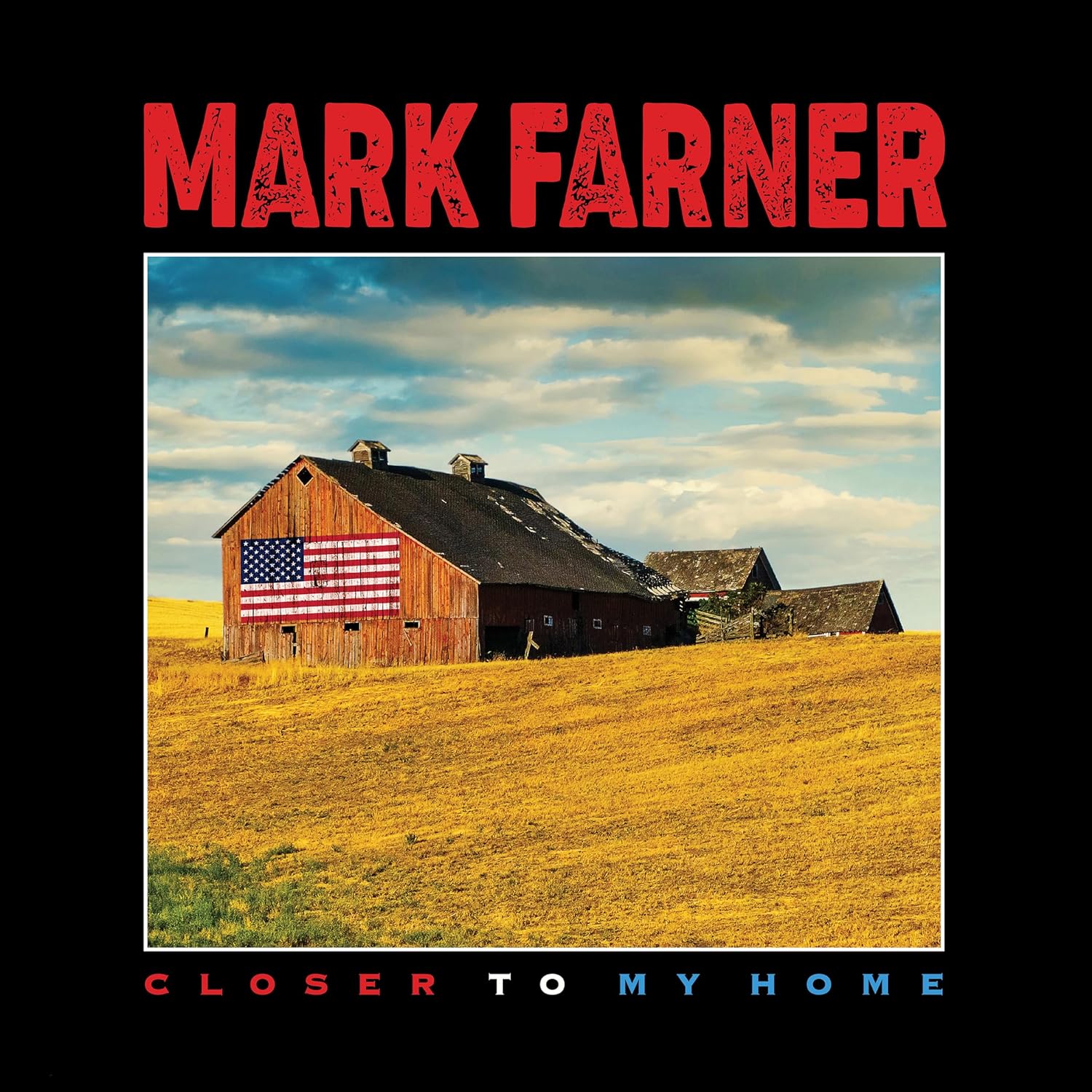
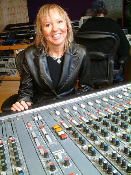
Here is another album cover, which was created by American artist John O’Brien. I’d featured John a few years ago discussing an April Wine cover, and again a few weeks ago, discussing the 2 Great White covers he was responsible for. Somewhere in there John mentioned a Mark Farner cover. And silly me for not even knowing Mark released an album in 2024, titled Closer To My Home. I loved Grand Funk, got the LPs, put together a little newsletter at some point in the 90s, and featured one of their album covers in a previous post a few years ago. So, upon John mentioning this latest album, I got a day later, and it is a great listen, and highly recommended to any Grand Funk fans; after all Mark wrote and sang most of the band’s greatest material in the 70s. *Check out John’s details of the Closer To My Home cover art, as well as the links below. *Thanks again to John for his time (and images) discussing his work and an excellent cover.
More recently you did the cover for Mark Farner’s Closer To My Home. How did that one come about?
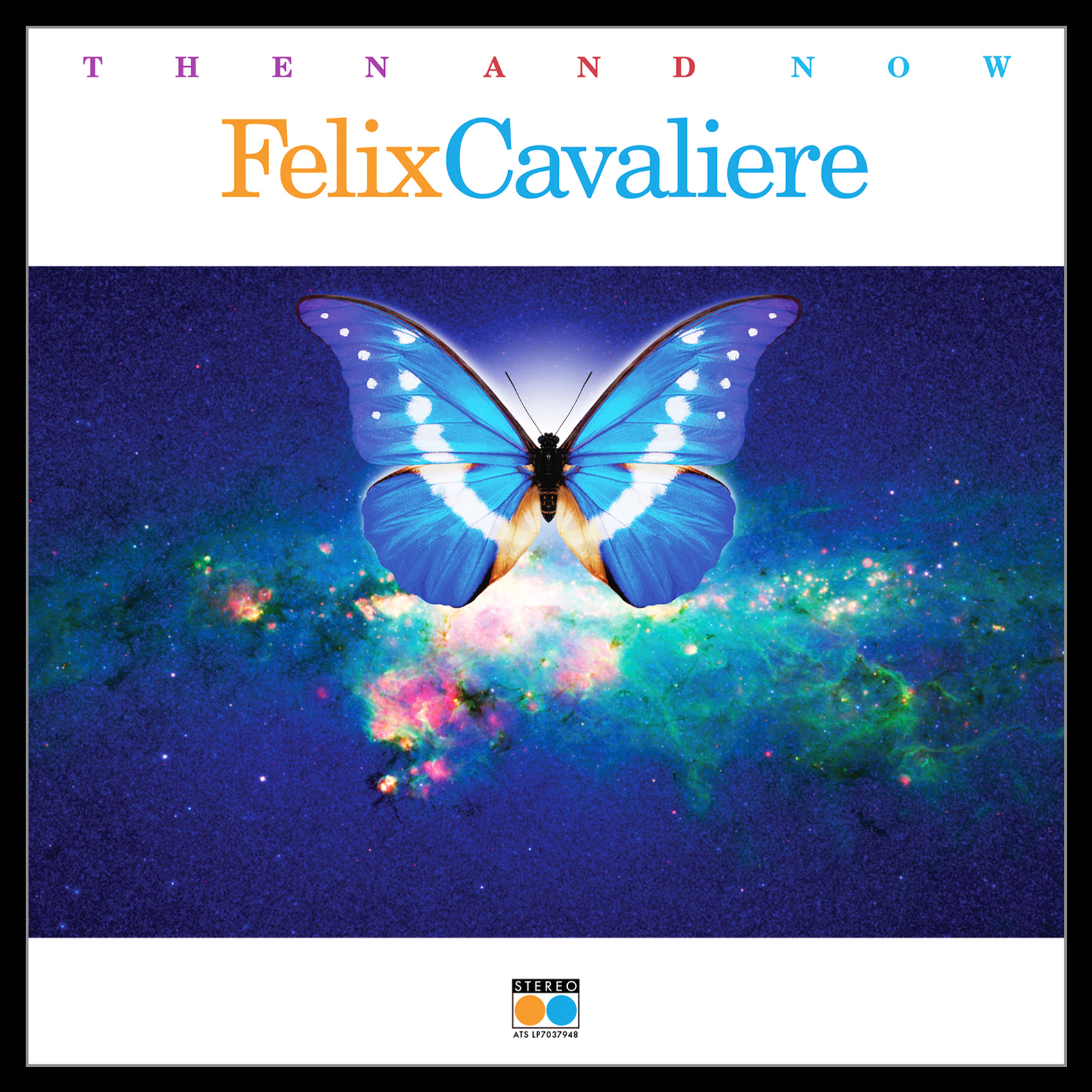
Marks manager, Obi Steinman recommended me for review. The previous year I completed a project with Obi for Felix Cavaliere, “THEN AND NOW”, it went quite smoothly from concept to completion. So thankfully he had faith in my creative process and final product, since we had never met personally.
Can you tell anything about the photo chosen for the front cover? Do you where it was taken, significance?
The image was based on the heritage of Marks roots in the Midwest to be a part of the communication.
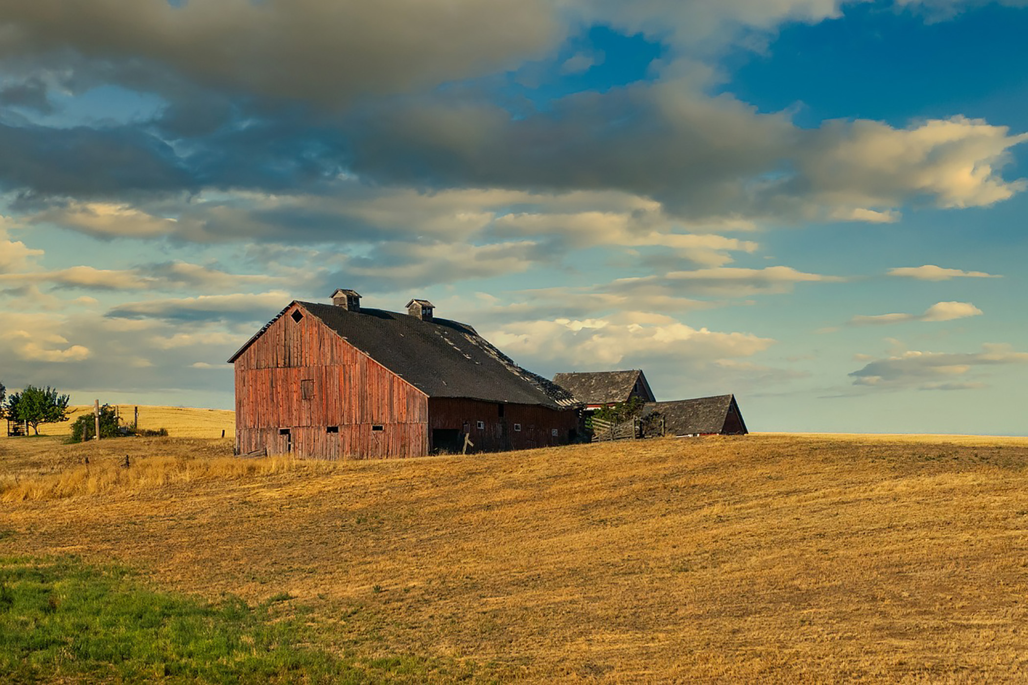
I spent a lot of time researching the perfect barn and location which I could add the American Flag which was one of my concepts. I finally found it online in a series of personal images by Ken Heins. The barn angle was perfect and the sky went from an uplifting blue to having an overhanging ominous darker presence. While not being a professional photographer, he captured the location, mood and angle that I needed to modify and portray the communication. It is great to go direct to a photographer, especially someone who shoots for personal reasons. He was great to deal with on securing the image and all usage rights.
I love the big bright lettering of Mark’s name, the layout… a very patriotic cover. Did Mark have a lot of input or suggestions?
Like many things the simplest direct communication is the best. In one sentence Obi stated the project was to reflect “Marks Heritage, Origin, Rock & Roll Legacy, Values and American Pride”. He is a true Rock & Roll Patriot. A variety of comps were proposed for discussion but, as discussed previously the Barn image with the flag summed it up visually. As far as typography chosen, I wanted to play off of Marks history and Rock & Roll energy. Some solutions related to GF to closely, but he gritty red type communicated the power and intensity he delivers. “Midwest American Rock & Roll” to be sure.
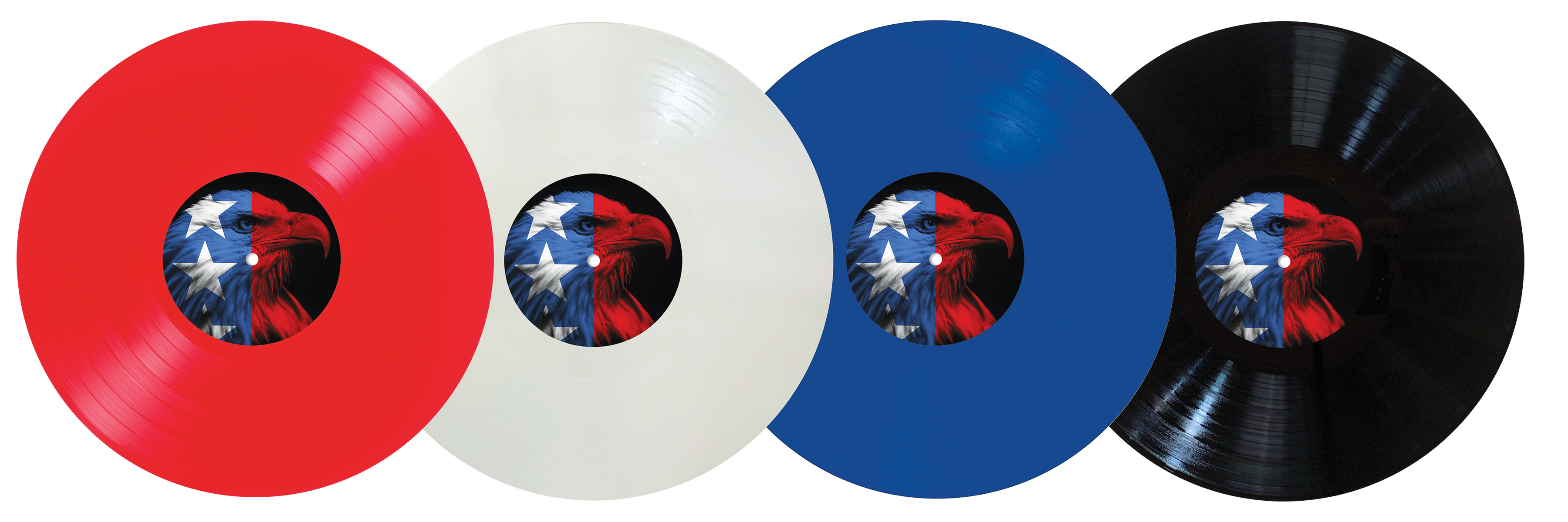
The American Eagle was used for some comps as well as for the record label direction. It was determined that it would best be utilized on the back cover as well as a label on one side of the album.
I submitted suggestions for limited release of the album in Red, White & Blue as well as classic Black.
The initial release is Red Vinyl and some were signed by Mark personally, which were available on his website listed below.
I assume this is the only Farner (Grand Funk) cover you’ve done(?)
Yes, the only one. Who would have thought I would get to work on Marks first solo studio album in 18 years, featuring the 55th Anniversary re-recording of “I’m Your Captain (Closer To Home). The project produced, engineered, mixed and mastered by Mark Slaughter, and co-produced by Mark Farner. A definite alignment in the stars for me to contribute to the visual communication.
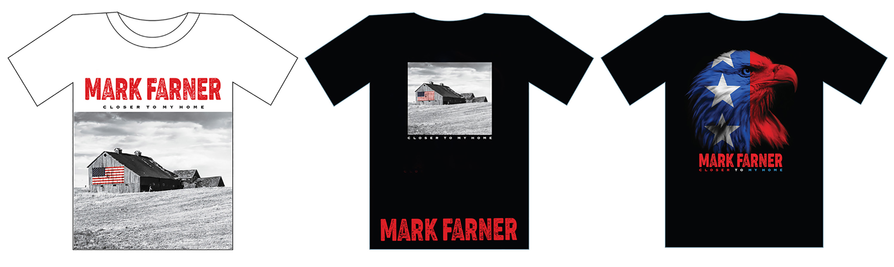
It is also fun as I get to submit comps for merch such as T-Shirts for consideration. These are but a few versions with regard to the printing process of 3-5 Color for pricing considerations.
How familiar were you with him (and Grand Funk)?
Any teenager in the 70’s was aware, as everyone was at the time of GF. Blasting “Grand Funk Live” in my bedroom and hearing various songs played live by cover bands at Junior High School dances. It was a very loud year in 1970 when that album released. Ironically, it was released on Capitol Records, the future company I was to work for from 1983-1989 in the Art Department. Some synchronicity to be sure.
A special thank you to Obi Steinman for his support on projects.
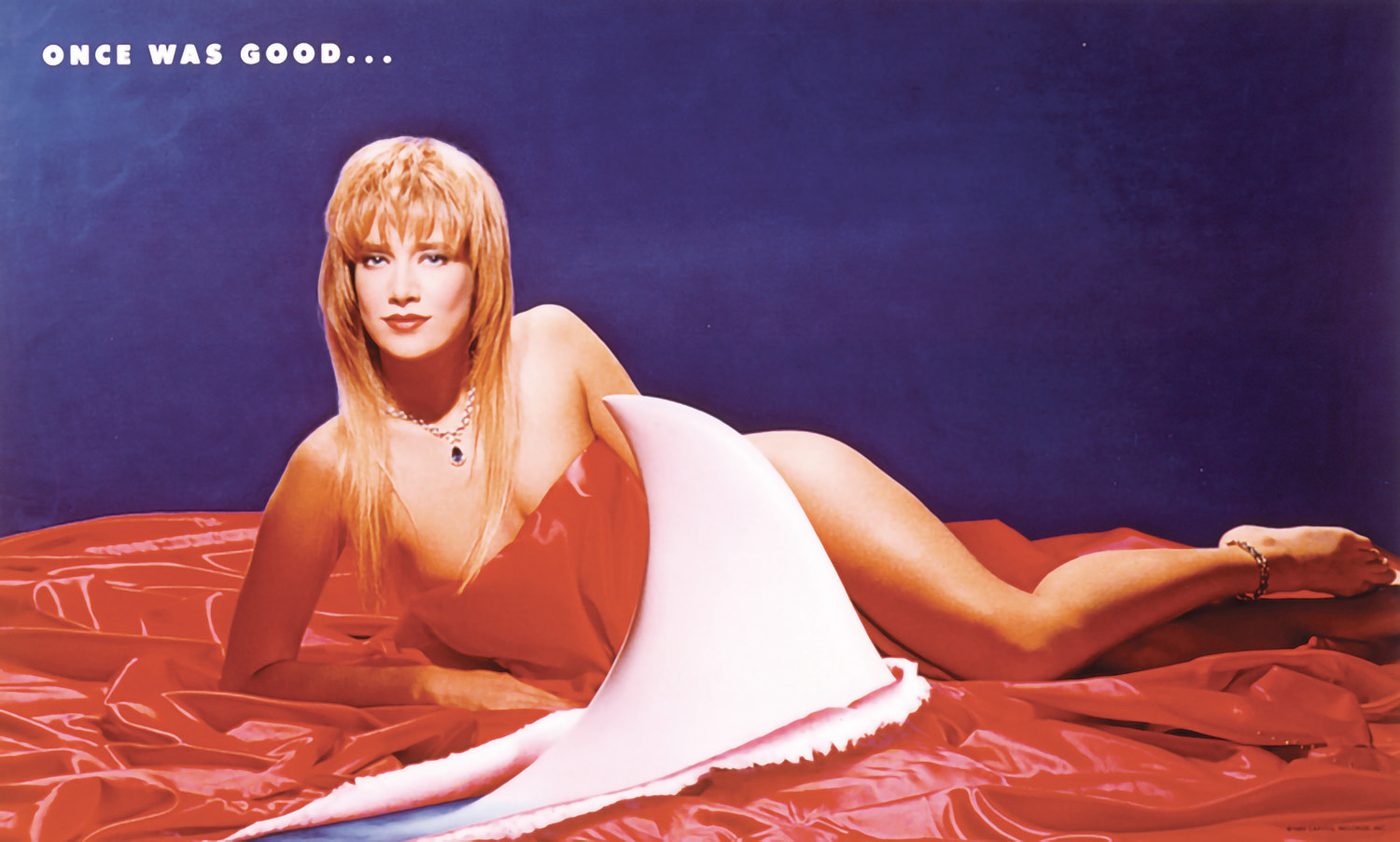
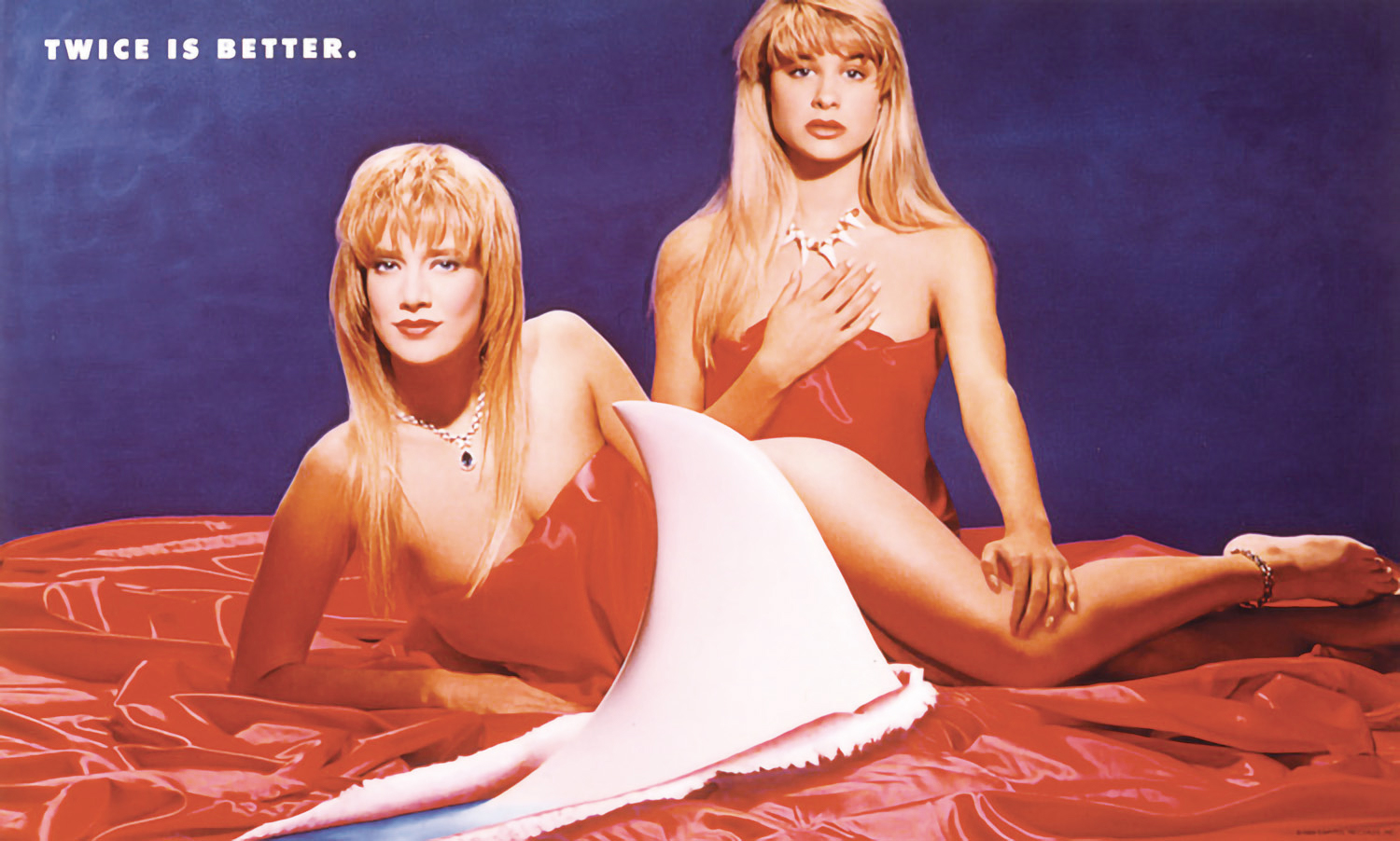
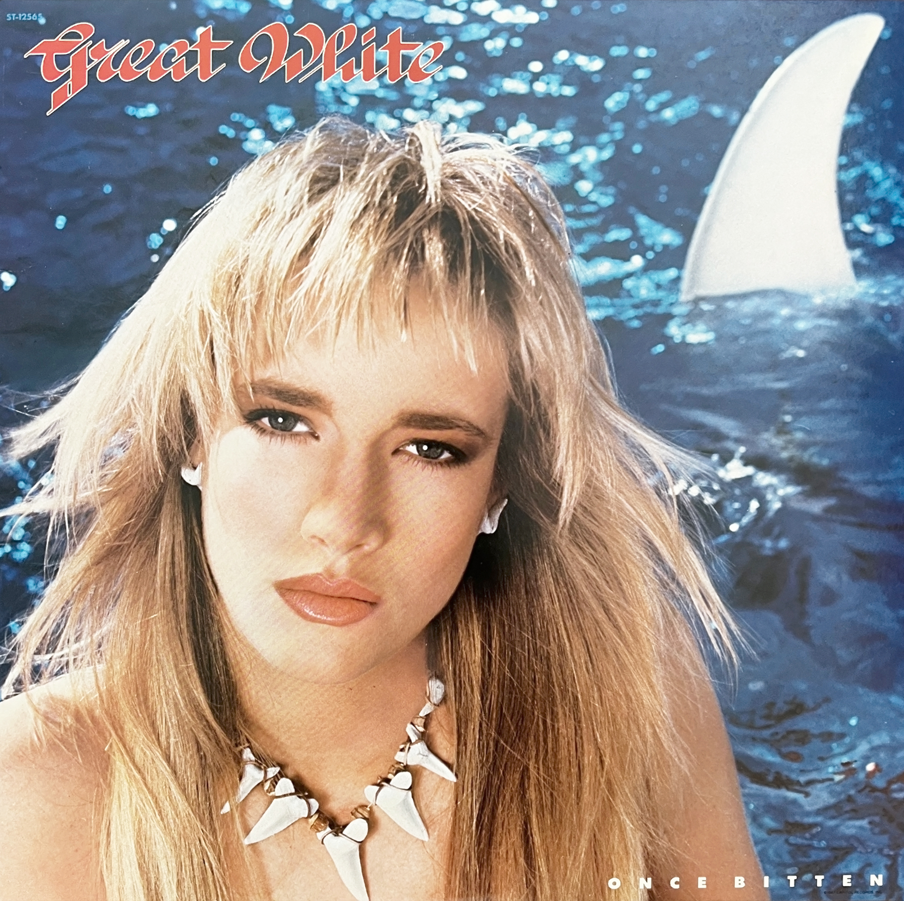
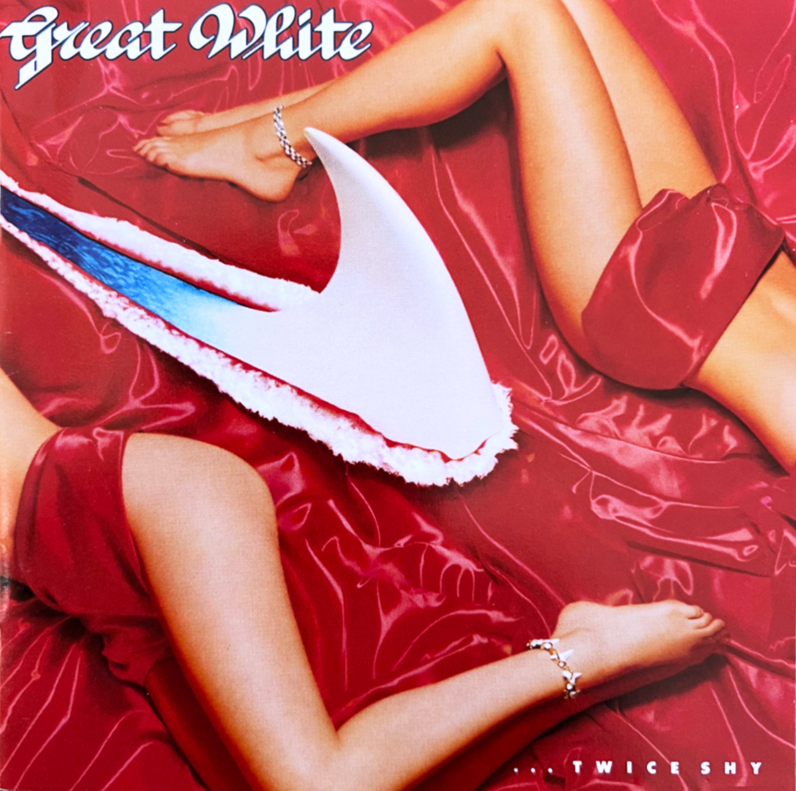
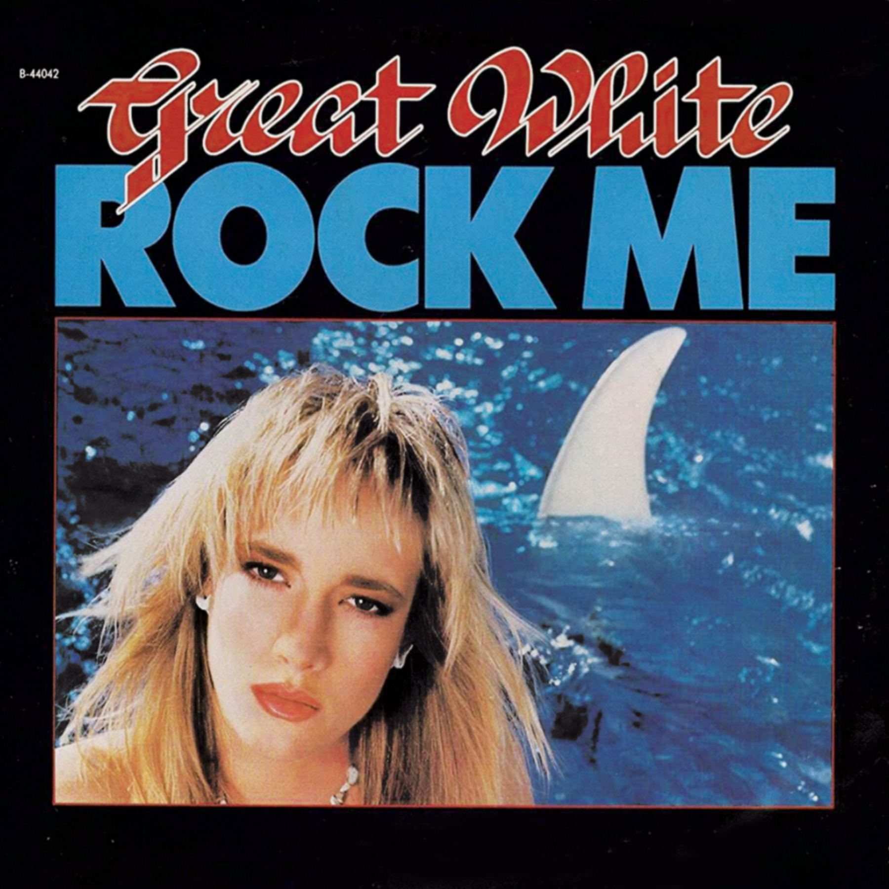
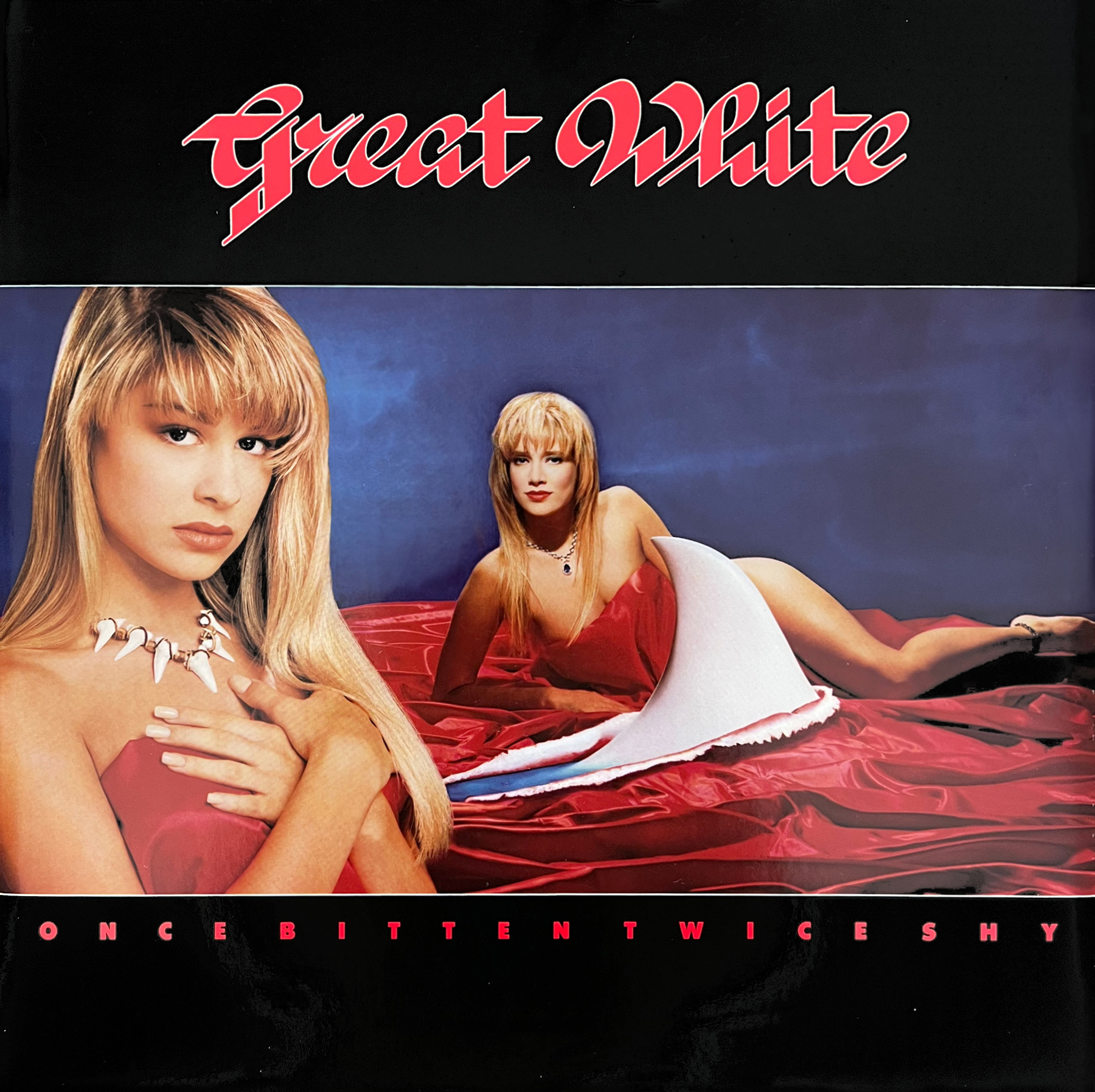
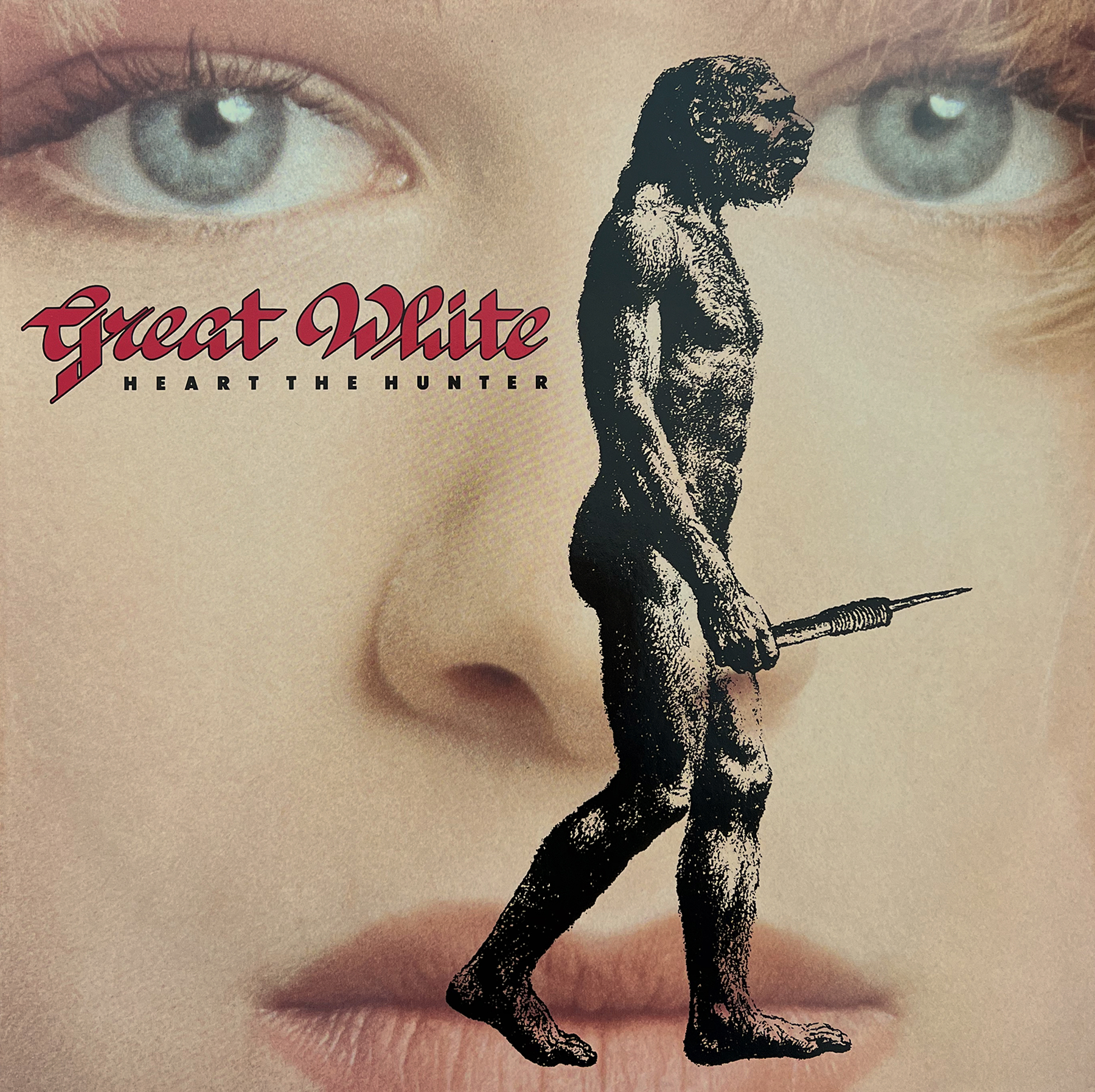
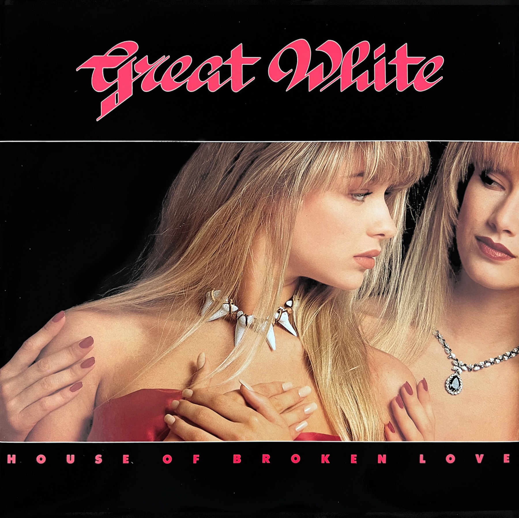
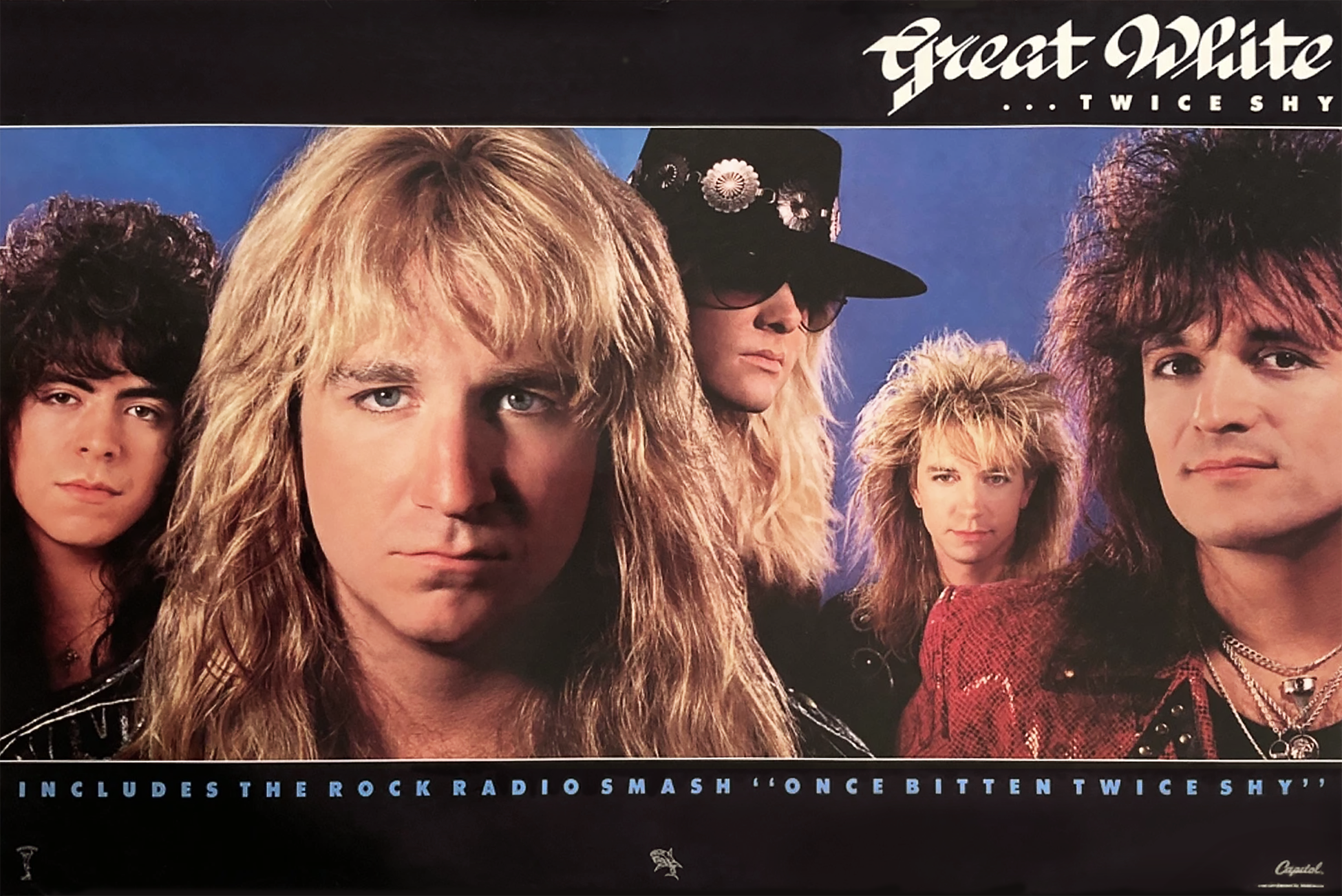
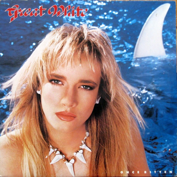
A couple of years back I featured John O’Brien’s cover art for April Wine’s 1984 album Animal Grace, as well as touching on a few other covers John created. Recently I reconnected with John to get his recollections of a classic pair of 80s albums by GREAT WHITE – 1987’s Once Bitten, and 1989’s …Twice Shy. This was the band at their peak with hits and favorite cuts like “Rock Me”, “Lady Red Light”, “Heart The Hunter”, “Save Your Love”, and the hit singles – a cover of Ian Hunter’s “Once Bitten Twice Shy” and the ballad “Angel Song”. Once Bitten would be a top 30 album in the US and Twice Shy making the top 10. I had these on cassette when they came out and played the hell out of them! I also recall that a few of these songs were in high rotation at any peeler back then. The late 80s were better than I thought, I guess.
Below John has provided details on these album covers that he worked on. John was also kind enough to provide images included. (Thanks to John & Alan Niven) *Check out the links below.
John: My responses mandate some additional memorable and illuminating recollections by Alan Niven (NIV) (Great White Manager, Writer, Producer)
You were at Capitol during the period of Great White’s Once Bitten and …Twice Shy albums.
I was at Capitol for the first album Once Bitten and due to Alan’s trust I worked on …Twice Shy after I left Capitol to form a company that designed packaging as well as creating Movie Advertising Key Art.
What/who was your intro to the band or Alan Niven?
Being on staff at Capitol the designers were assigned at random to projects by the Art Director at the time, Roy Kohara. We worked on a variety of artists on the roster who worked with the internal art department. One lucky dayI was assigned Great White. I remember Alan showing up in the art department at my office door one day with all his unique grace and charm…fortunately he trusted me.
NIV: Yeah …me being nosey … who is who and who actually does the work.
NIV: An internal art department is less expensive, and if one can form a relationship within the department one has a chance of doing better than if one hires, at great expense, outside ‘experts’ all full of their rationalities. You had a great energy. A sense of humor. That was enough for me.
Were you brought in to work on the cover well before the album was done?
Projects began after the titles of the albums were settled.
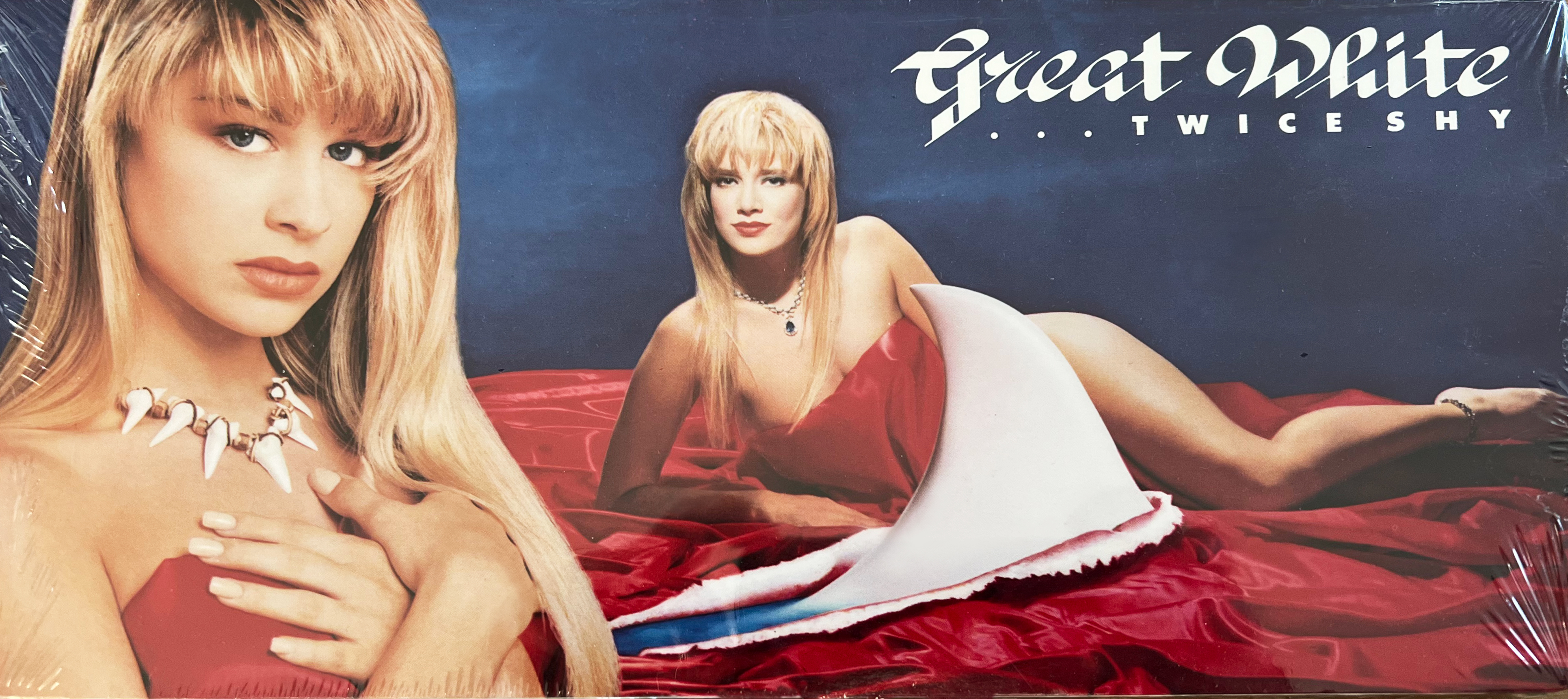
On Once Bitten you were credited with the concept and layout.So, does that mean the entire idea (the model posing in the water with the shark fin) yours’?And can you tell a bit about that whole concept / idea came from?
I was credited with cover concept and layout credit – but Alan was specific with the idea of having a beautiful woman (Traci) with the specific direction of the primal necklace to be constructed and worn. I followed Alans direction and submitted the concept utilizing the model, water and shark fin background.
NIV: Yeah. Much of the album material was about dysfunctional relationships that were mostly formed by primal urges.
How was that first covered achieved? Was it one photo or a couple overlayed?
Once Bitten cover was shot in camera. The photographer was known for his talent in composing and capturing images, lighting and mood. Photographer Ron Slenzak, 3 years previously shot Purple Rain Poster art.
To find Traci (Cover Model) we had a well attended open casting call held in the Tower conference room to search for the specific representative we needed for the cover.
NIV: Traci came to the casting at the Tower. All were dressed. No swim suits. We are, after all, gentlemen.
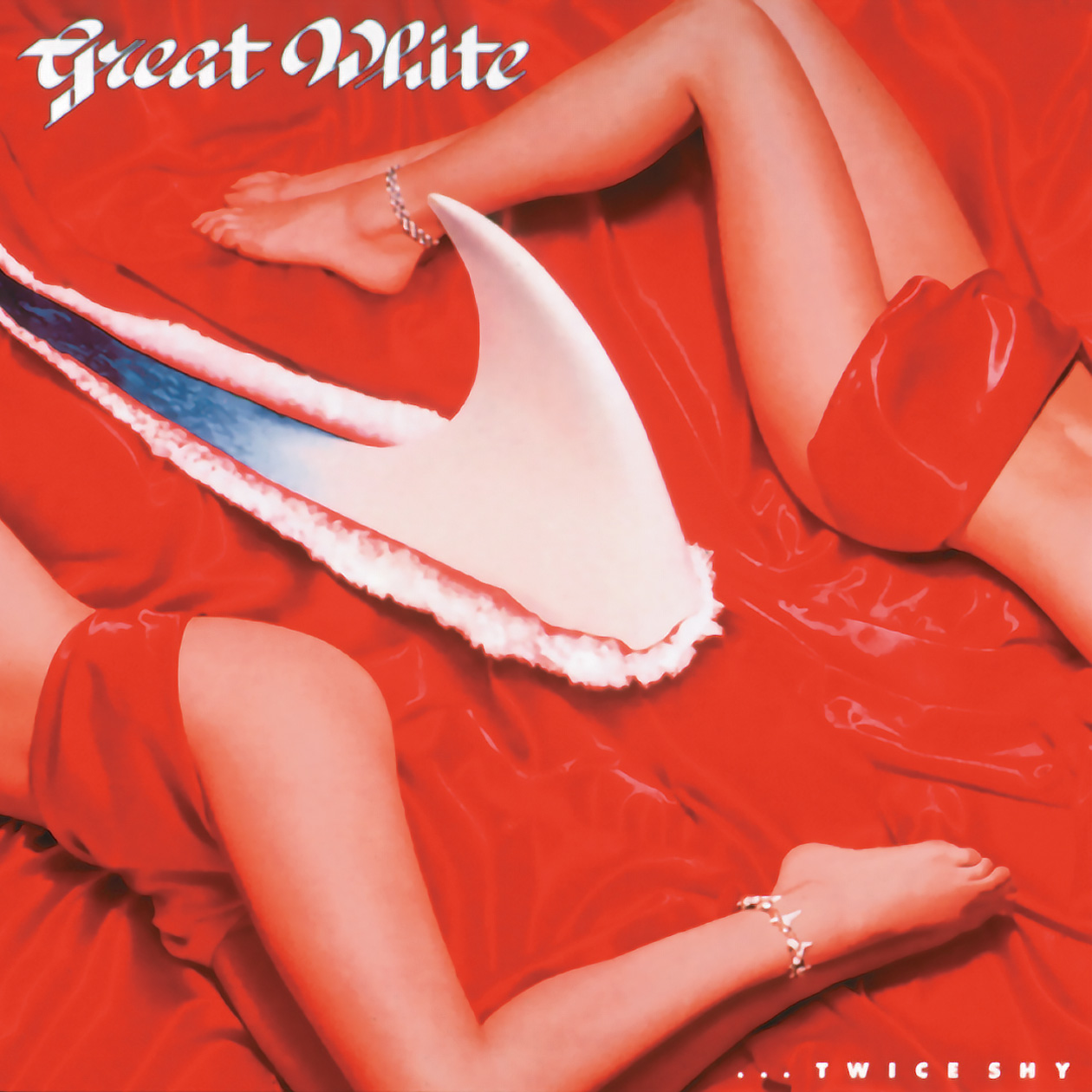
With …Twice Shy, were you well aware ahead of time that they’d be using that title?
I was made aware after the title was chosen, before the concept for the cover began. Alan always had marketing in mind when working his projects, his choice of covering Ian Hunters song “Once Bitten, Twice Shy” on the album seemed like a great marketing idea.
NIV: The idea was to have a link between the first Capitol album and the next. There was no guarantee that Once would be a best seller, and having the titles link might help in the marketing of Twice Shy. Notice, “OBTS” was the last track on side two of TS and was there to facilitate the marketing connection. Of course, it helped that it’s a great song and ours was a definitive version. The fact it sold a mill as a single makes it debatable whether it was good for the long term or not.
On …Twice Shy, you were credited with art direction/design, and Alan Niven was credited with the concept. Can you describe the idea behind this one?
…Twice Shy was the genesis of wanting two girls on the cover representing the concept. I thought a more surreal landscape would be interesting, rather than a literal version of water, with the red satin and the shark fin ripping threw it. We did a vast coverage of images, from singles to combinations anticipating usage on multiple applications. Douglas Hyun was the photographer and was tasked with the multitude of coverage as well as constructing the set with red satin and the fabricated shark fin ripping through the fabric. A long fun day and night. With various combinations of images possible, that were used in montages and in all cases the water was added to the rip by retouching.
The new girl Bobbie, showed up at my new office in Burbank one day, pre chosen for review… No recollection of her origin, but she fit the bill.
NIV:Twice Shy? Now two girls. One sophisticated, the other primal. It’s a comment about the nature of LA relationships – about The Sophisticate teaching The Primal the art of manipulation. As Zsa Zsa said “I am a good housekeeper. Every time I divorce I keep the house.” And the jewels.
There were a lot of similarities between these 2 albums – musically, the title connection, and the covers – such as with the back cover lettering and lay out. Was that back cover layout and lettering idea yours?
Musically the band had further developed, and the title I was given was an obvious extension and connection. I designed the first album typography to define that specific project. I continued on the with the second album as it was a stylistic connection of the previous. As the two were related, the typographical treatments seemed appropriate.
The similarities between the 2 are obviously deliberate, making a fine pair of albums (though they didn’t use the same model), but you weren’t around for the next album (Hooked) even though it shared a bit of similarity on the front. Is that because you’d left Capitol or just weren’t asked? (The 3 albums, to me, are the highlights in the band’s catalogue)
Once Bitten and …Twice Shy are obviously similar due to a title “continuation” and the concept of the 2 different girls on the cover, Alan’s vision of the symbolic relationship of the two. The first model, Tracy was used on both, firstly with the shark tooth jewelry and secondarily with the emerald jewelry, and Bobbie now added with the same shark jewelry. As Alan previously stated “The Sophisticate teaching The Primal the art of manipulation”.
I was not involved with Hooked as another Art Director had joined Capitol and he utilized his contacts to create most appropriate art for the project.
Can you talk about the extra pieces that you would’ve designed for the Once Bitten and …Twice Shy period, such as promo posters, adverts, and the various singles? (Were you responsible for all picture sleeve singles at home and overseas?)
Important to remember in those days packaging came in multiple formats; LP, CD, CD Long Box, and Cassette so all items designed in house. For fun I designed …Twice Shy CD with a double cover. If you flip the insert over you have a different version of the cover displaying both models in an alternate pose.
The photo of the band for …Twice Shy was composed of individual images and stripped together C Print and retouched. A more striking image of the band rather than a single posed image. It was certainly a more confrontational and direct image of Jack.
I was, as all in-house designers, responsible for all campaign art & design for domestic product; Ads, Promo Items, Singles, Posters, Marketing Materials for both projects for continuity. I do have more items for …Twice Shy for examples as it was a broader campaign designed for playing on the title, specific imagery and sizing, as well as to keep the project compelling.
In many cases, such as Great White, were you a fan of the music much? Was it something you would’ve been into at the time?
I was introduced to GW when I was assigned the project. Alan supplied a promo cassette of the songs for inspiration.
And if you recall, did you have any ‘favorite’ tracks from either of these albums or any kind of appearances or social calls with the band?
“Save Your Love” and “Rock Me” from Once Bitten and “Heart the Hunter” and “House of Broken Love” from …Twice Shy seemed to resonate with me.
My contact was with Alan on both projects. That seemed to keep me focused on my creative and deliverables. Any call, biz or social with Alan is memorable. I had no direct interaction with the band.
(Alan, thank you again for your additional responses. My memory needed a fact check.)
LINKS:
Get it direct: Alan Niven Discussing Origin of Great White Covers!
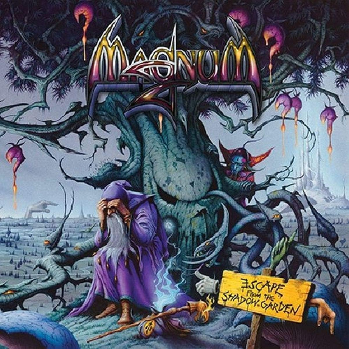
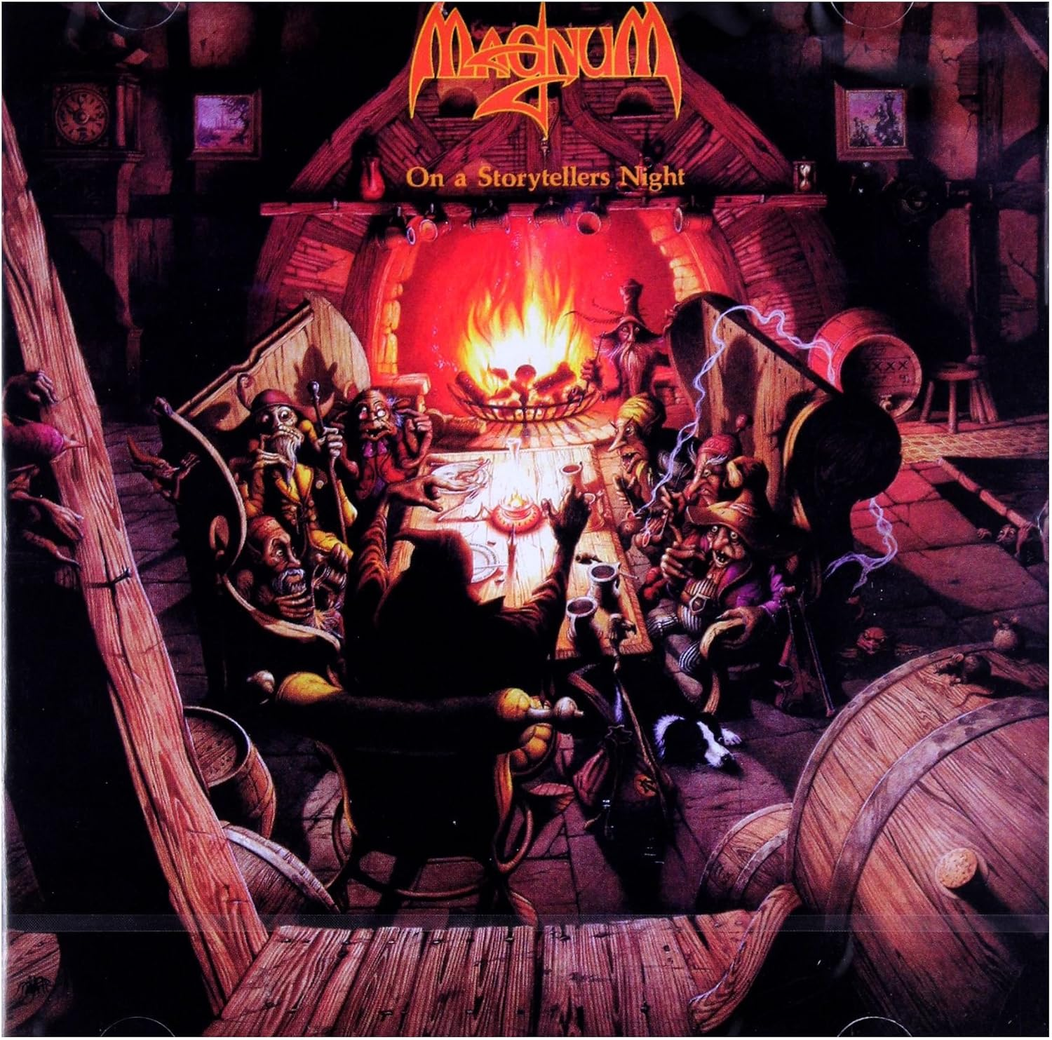
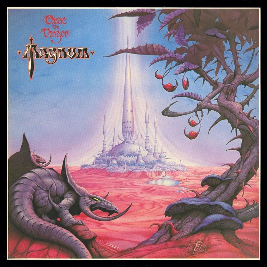
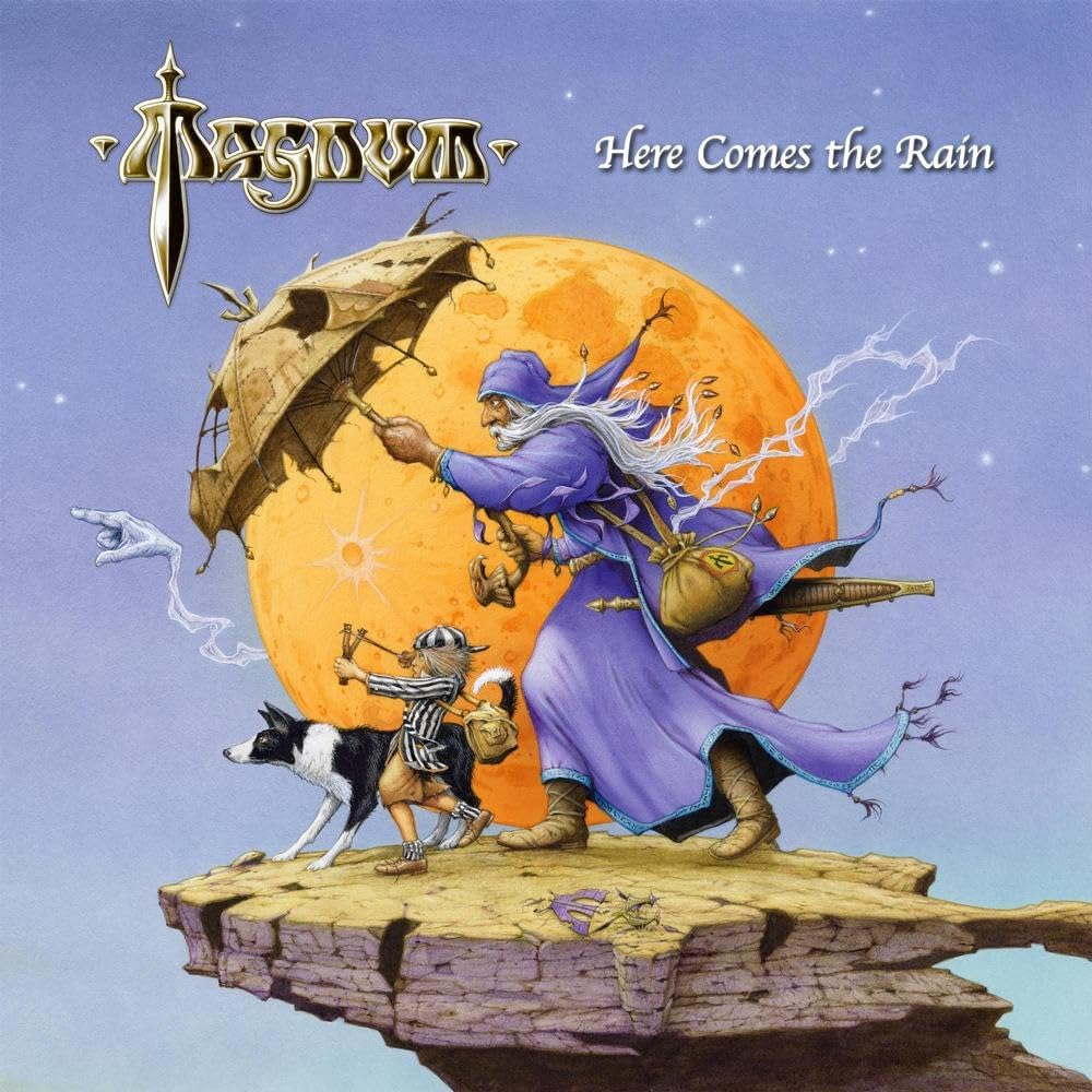
Legendary British rockers MAGNUM’s debut album was 1978’s Kingdom Of Madness. The band recorded throughout the 80s, took a break in the mid 90s, and returned in 2002. Aside from classic tracks like “Kingdom Of Madness”, “On A Storyteller’s Night”, “How Far Jerusalem”, “Days Of No Trust”, and many others, much of the band’s catalogue would become eye catching detailed works of art, created by Rodney Matthews, who started on the band’s fourth album Chase The Dragon, from 1982. He would do many others following that, particularly since the band returned in the early 2000s. Magnum’s last studio release was 2024’s Here Comes The Rain. The band’s guitarist & songwriter Tony Clarkin passed away just at the time of the album’s release, and the band took a long break. Before the year was out Magnum reformed to put on a number of shows paying tribute to Tony. Rodney Matthews also announced his retirement from creating artwork for album covers as well. Earlier this year Magnum released Live At KKs Steel Mill, recorded on the last tour with Tony Clarkin. Below I have selected 10 of my favorite Magnum album covers, mostly done by Rodney Matthews, but not all. I’ve left few explanations. Feel free to drop your own favorite Magnum covers in the comments!
I did not choose these based on my favorite Magnum albums, just the covers….(though the first 3 might happen to be in my top 5 Magnum albums).
Escape From Shadow Garden (2014)
Not sure what’s going on in many of these covers, usually a lot, with lots of details,
On A Storytellers Night (1985)
The first Magnum song I recall hearing way back would be the title song to this one. A fitting cover theme for the title.
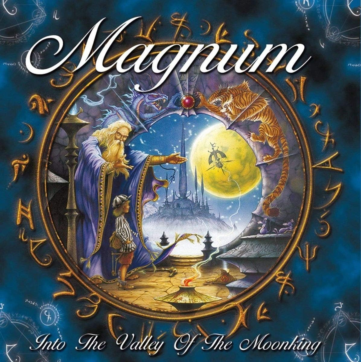
Into The Valley Of The Moonking (2009)
The album that really got me in to Magnum. Love the circle frame, like looking into a crystal ball.
Chase The Dragon (1982)
Again, the first Rodney Matthews Magnum cover, and easiest one to find in Canada, which most of the band’s catalogue not getting released here.
Here Comes The Rain (2024)
The band’s last studio album. Love the idea and the colors.
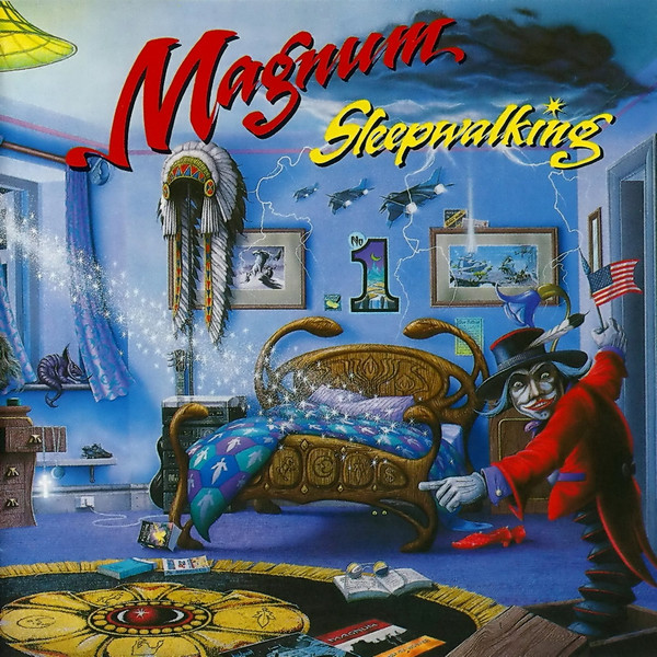
Sleepwalking (1992)
I really like this one. Very colorful, different, a few references to other Magnum albums. A US flag (and “Only In America” single), despite not getting a North American release.
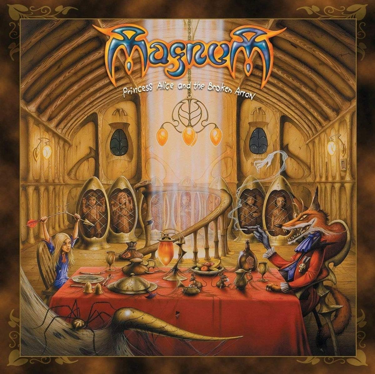
Princess Alice And The Broken Arrow (2007)
The first album of Magnum’s early 2000s return to feature Rodney Matthews work. Somewhat reminiscent if Storyteller’s Night.
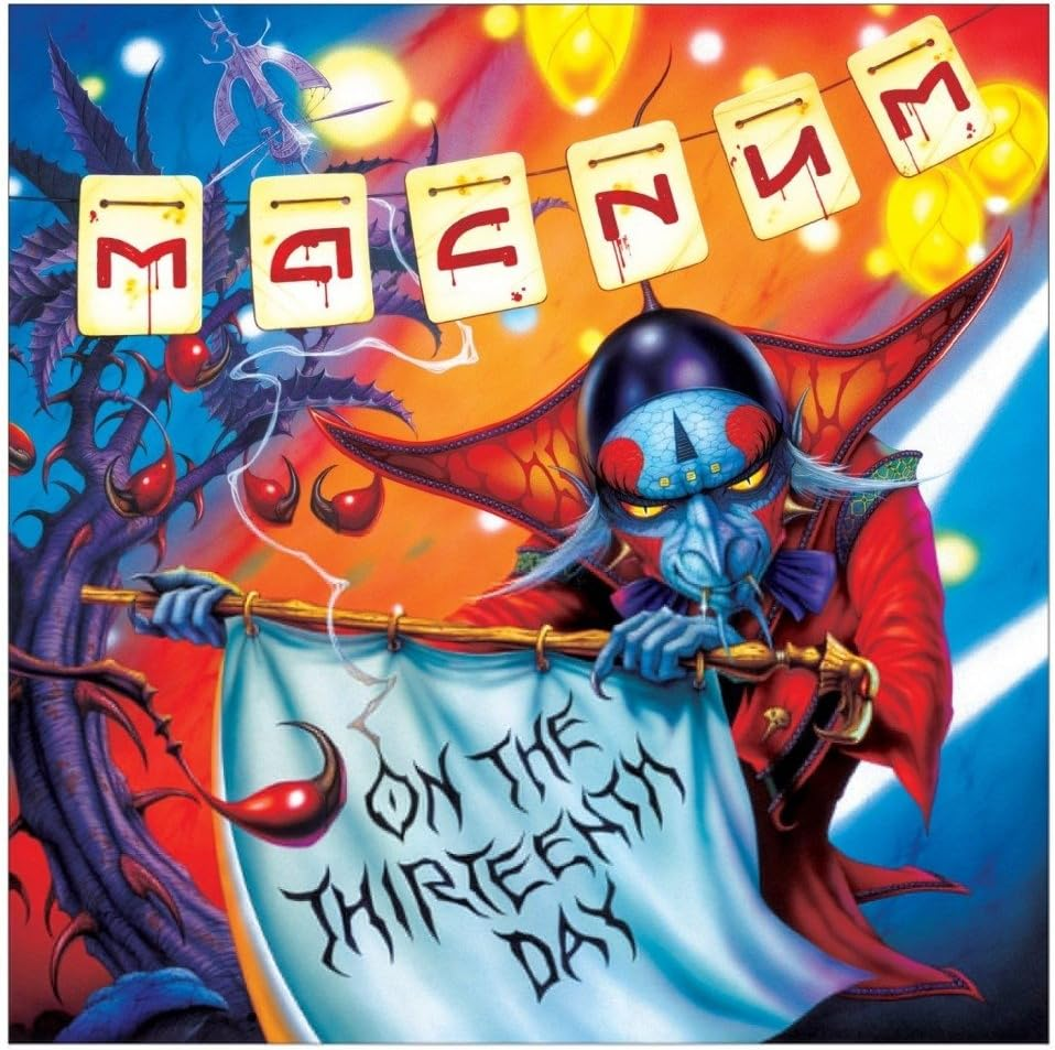
On The 13th Day (2012)
Just like this one for the colors, the lettering, and the flag holding the title.
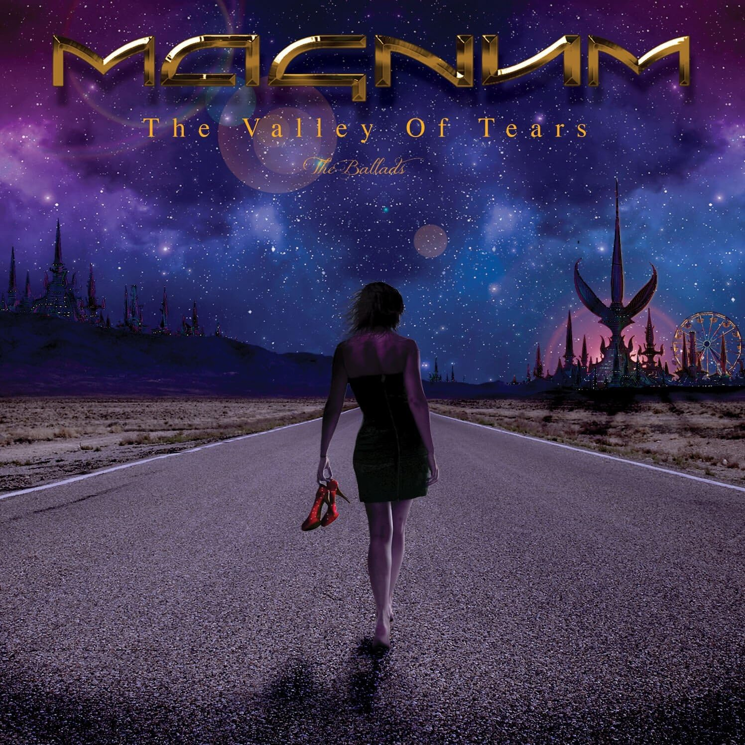
The Valley Of Tears (2017)
One of a few created by then-bass player Al Barrow. Love the concept and the colors in the the sky. Al also worked on a number of Magnum cover layouts, photos…..
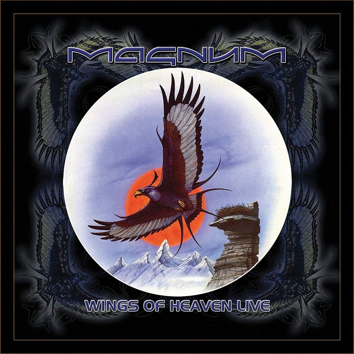
Wings Of Heaven Live (2008)
The bands live recording from their 2007 of Wings Of Heaven (anniversary) tour, so it retains a few aspects of the studio album cover, again using the circle .
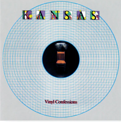
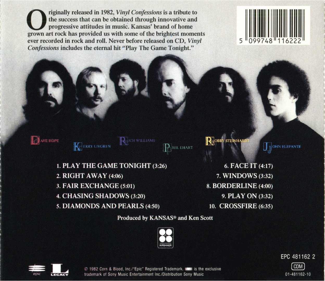
Andrew Barnum has worked on a number of different album covers over his career, and more recently having been checking out KANSAS’ 80s records, I wanted to find out more about 1982’s Vinyl Confessions. It was an album that saw a few changes for the band – singer, sound, and cover art! A very different cover than the band’s previous ones. Andrew gives us some great insight to the Vinyl Confessions artwork and period of the band, as well as a bit about other aspects of his career and covers he’s done. *Check out the links at the end, and the galleries of Andrew’s work.
How did working on the Kansas cover come about? Had you done many album covers prior to this? How did you get involved? And were you familiar with the band?
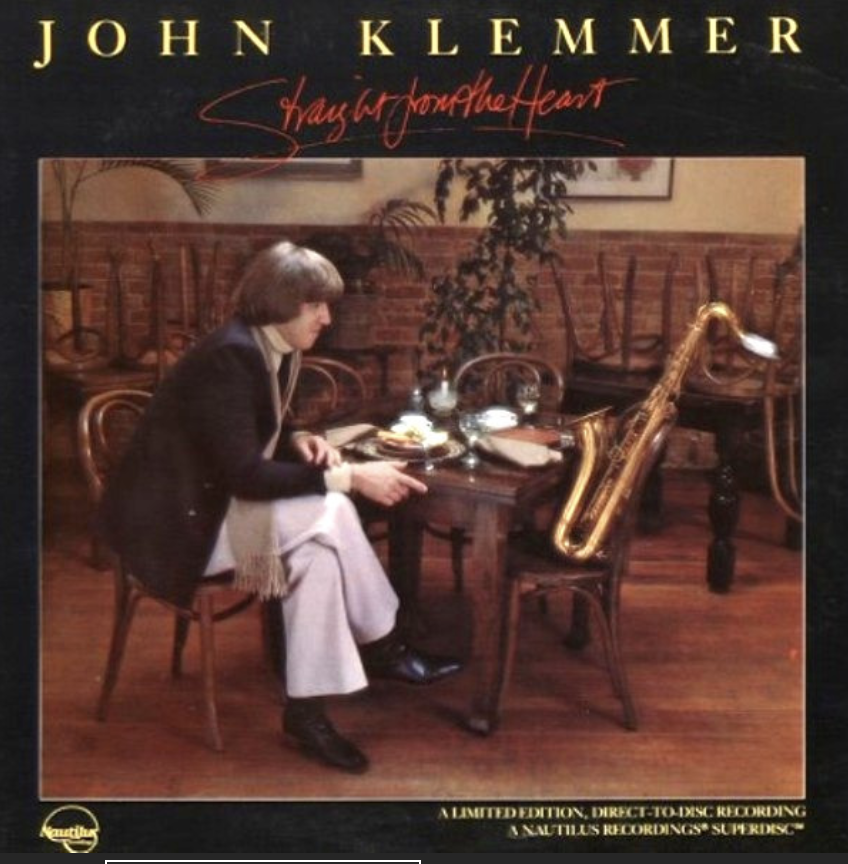
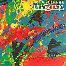
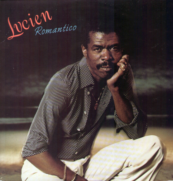
As an American born Australian, I returned to the USA from Sydney in 1977 as a freelance graphic designer, and aspiring singer-songwriter. Designing by day, performing music by night. After freelancing for 3 years, I landed a real job at a company called Print, Film and Tape in Burbank (Movies, Music, Arts) that lasted a year, which led to joining Tom Drennon. I can’t remember how it happened; Tom was all music business design work, from covers, to promo campaigns, and tour identity collateral. Here’s Tom’s covers: https://bit.ly/4mp2Gpw . I’d only done a few of album covers as a freelancer both by saxophonist John Klemmer (Brazilia, Straight to the heart) and jazz singer Jon Lucien. By 1980 I’d met my soulmate, art director, and music partner Lissa Mendelsohn and formed our post-punk band ‘Live Nude Girl.’ Our freelance designing was with Macy Lipman Music Marketing, and Larry Vallon Concert Promotions. I was familiar with Kansas by reputation only, and that Tom had done numerous covers for the band, and other Epic Records artists.
Can you explain the whole idea behind the cover, your contributions, how it was all put together?
This album was a monumental change for the band because a change of lead singer. Tom recounted after the concept meeting at the studio, that the band felt under intense scrutiny because of the line-up change, under a microscope so to speak. Tom’s key image idea was the interrogation chair. That began the process of designing a package that was looking at the band in minute detail during this re-invention. Hence the stripped back blue-print imagery. The design was also influenced by the 80s post-modern design shift that had begun in LA. The new cover was breaking with the past Kansas tradition of earthy, painted imagery. This was achieved by both the chair photo, and the striking B&W band photo, and primary colours in the logotype, and band names on the photo. Pre-digital, all the assets were hand drawn, typeset, and composed on full size paste-up boards.
Can you explain your technique used for this cover?
Drawn, or re-touched B&W bromide film elements (typesetting, image) pasted in position for CMYK print film colour separations. Very standard pre-digital print production. An assembly of visual assets.
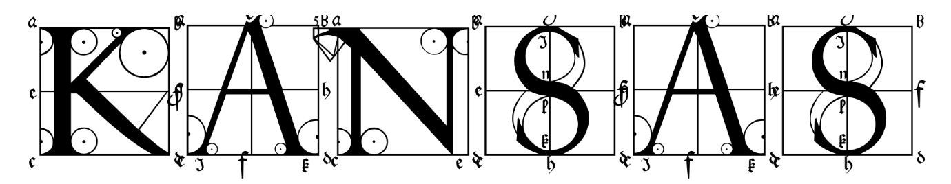
Did you also happen to do the lettering on the front cover? Any idea why the band’s logo (on all previous album covers) was not used?
The logo brief was to create something new for Kansas, while creating continuity with their classic forms on previous covers. This led to researching typefaces in the trusty (copyright free) reference of the time, Dover books. We found ‘the sixteenth-century German artist Albrecht Durer’s instructional treatise on the geometric construction of Roman capitals, with precise directions for each letter and general directions for Gothic capitals and miniscules, Of the Just Shaping of Lettersby Albrecht Dürer.’ (Google books) The roman titling we found which contained both capital and lowercase outlines served the purpose of detail, scrutiny, and classicism. We added the bright colour set within the letter forms.
Was Kansas a band you listened to? Any recall listening to this album?
Not really on our post-punk radar at the time. But fully aware of their impressive stature and sales.
Did you do any other album covers beyond Vinyl Confessions? And what do you do now?
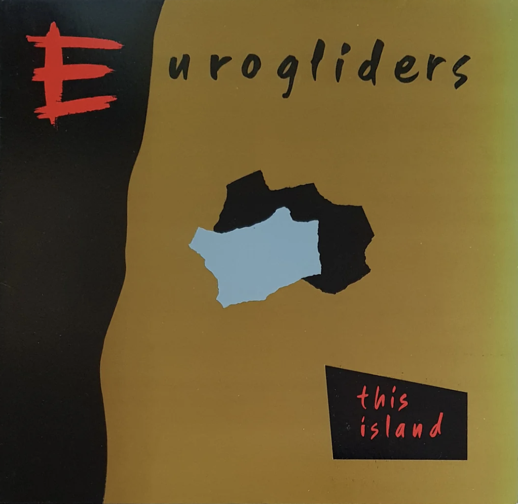
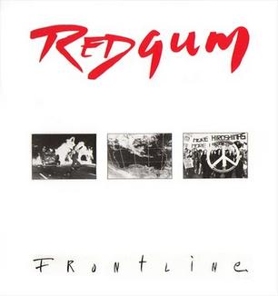
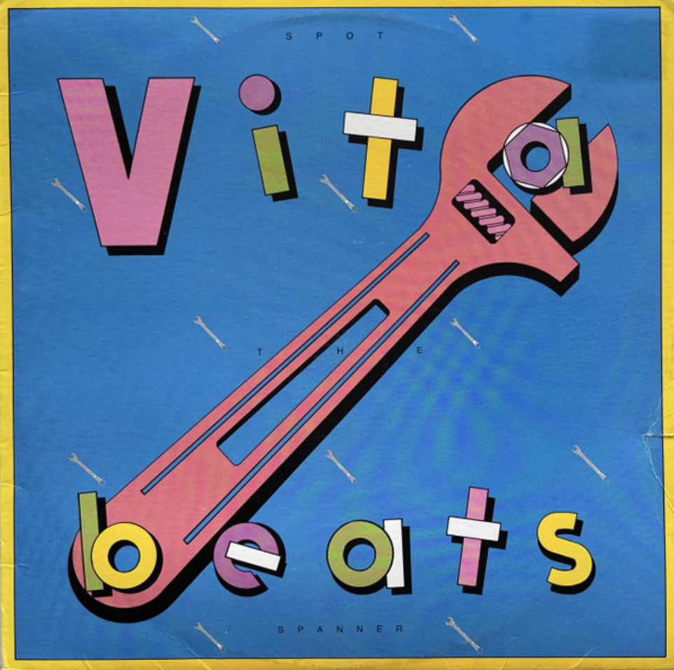
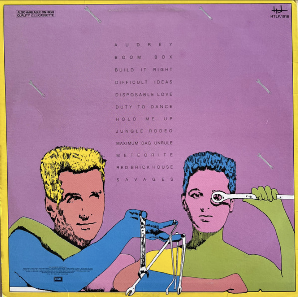
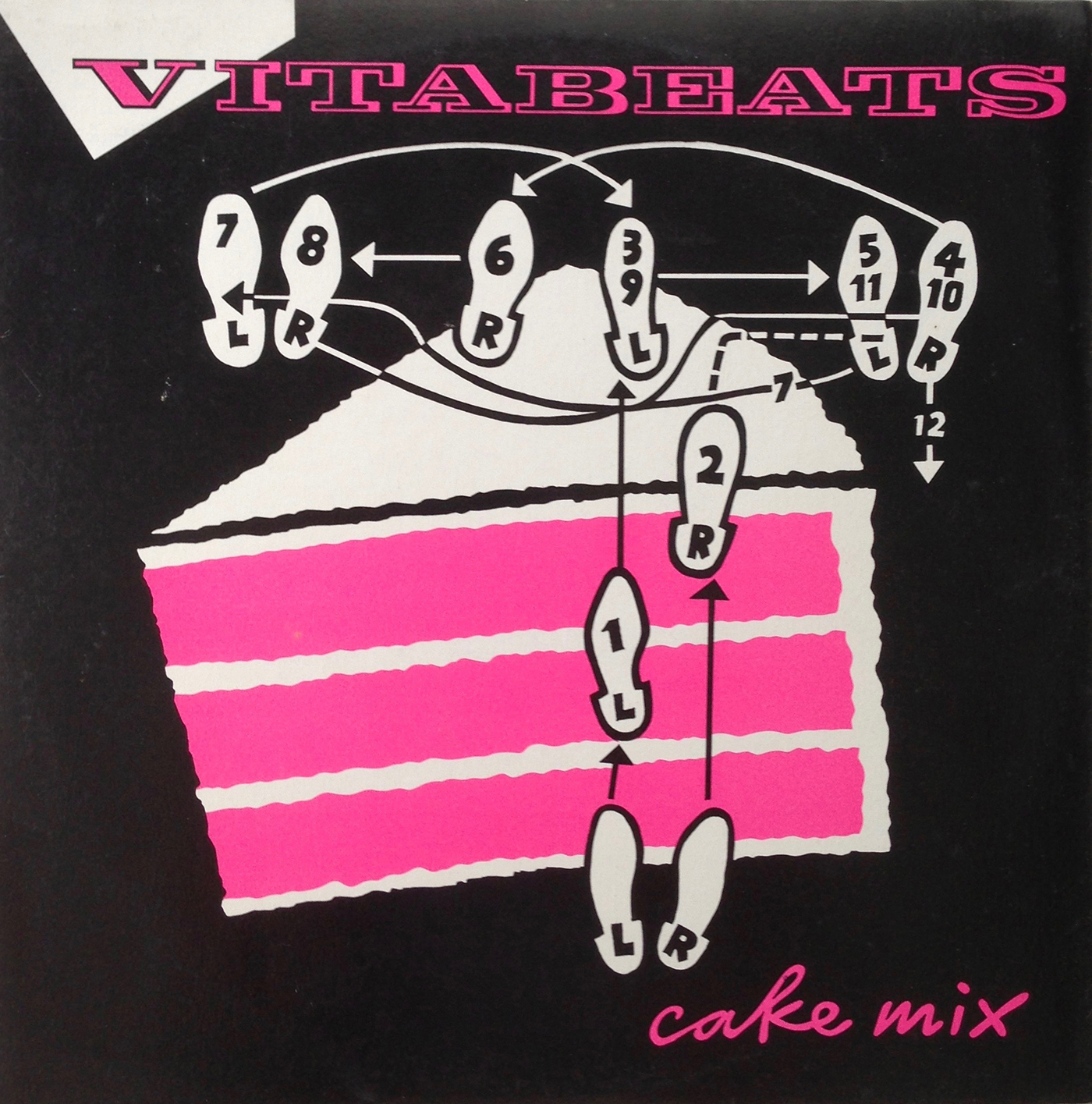
(Well, since then, in the art world) After Lissa and I were married in LA in 1981, all roads started leading back to Sydney after a honeymoon trip, we reconnected with design and music in Sydney which led to a new freelance life as A&L Barnum Design, and our ‘Live Nude Girl’ demos being heard by local producer Mark Moffat at Festival Records. By easter 1982 we’d sold up our chattels, and moved to Sydney. Again, design by day, and music by night, sometimes vice-versa.And a new band name for our new duo ‘Vitabeats.’We’ve designed covers for Inxs, Eurogliders, Redgum, Anne Kirkpatrick, Mary Jo Starr, Mark Callaghan (Gangajang) and Java Quartet. And Vitabeats and my 8 solo albums (see atbarnum.bandcamp). We are both exhibiting artists. Mexico City born Lissa’s Aus-Mex paintings, and my more conceptual minimalist works. barnumgroup.biz/art
Have you ever seen the Uriah Heep album cover for ‘Equator’ (1985)? (check it out)
I note the similarity to ‘Confessions.’ Also a progressive hard rock band re-defining itself with graphic impact for the mid 80s. The image looks a slice through the earth at the equator. Global warning anyone?
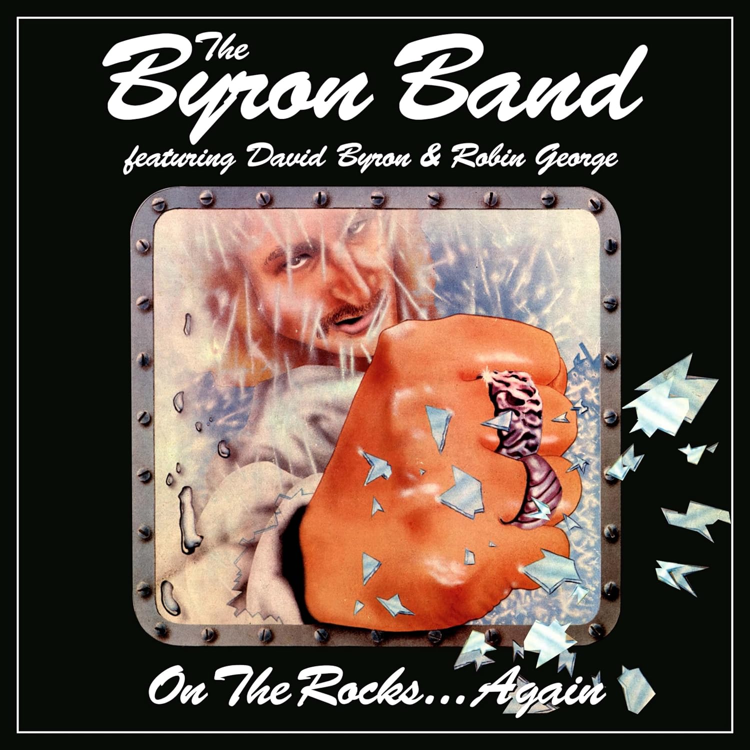
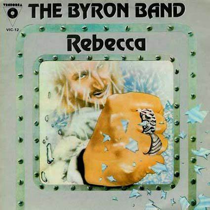
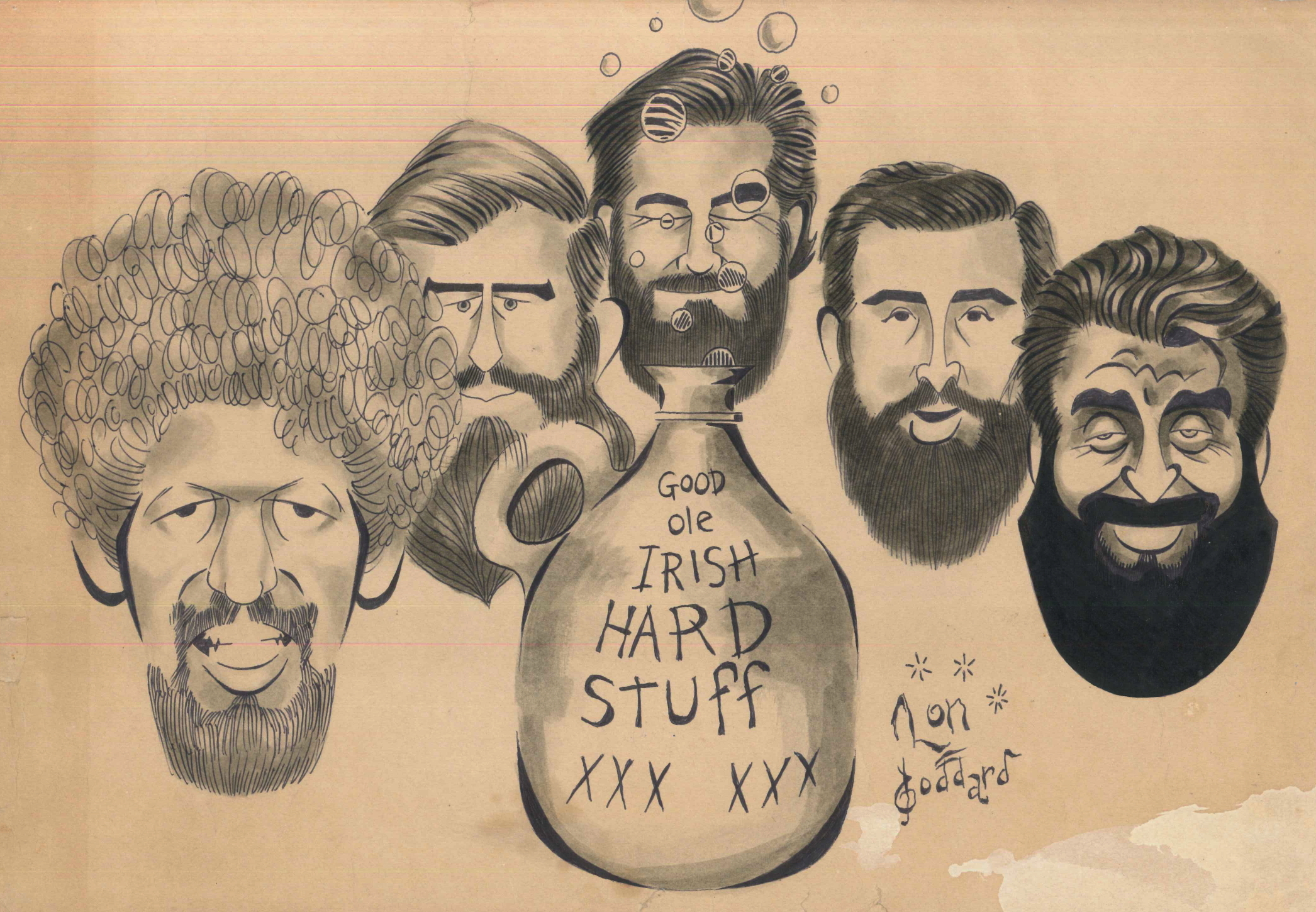
American artist LON GODDARD drew a number of album covers in the 70s and 80s,, one of which was the lone LP by the BYRON BAND ‘On The Rocks’, from 1981. this was the band lead by original URIAH HEEP singer David Byron (RIP) and featured a young guitarist and co-writer – Robin George (RIP), as well as former BADFINGER keyboard player Bob Jackson, bassist Roger Flavell (ex CHRISTIE), drummer John Shearer (Steve Hackett), and (sax player) Mel Collins . The album’s cover features a drawing of David, and came with a posted that featured a drawing of the band. On The Rocks didn’t fare so well, nor was it given a North American release. It is much loved by many fans of David Byron and robin George, however. The album has most recently been reissued as ‘On The Rocks…Again‘ via Cherry Red Records, as part of a 3 CD package, and featuring Goddard’s artwork again. Below Lon Goddard details his early days relocating to England, creating album covers, working at the record Mirror, and designing the Byron Band album cover.
How did you get in to a career as an illustrator and wind up in the UK for a good part of your career (Influences, jobs that took you there….)
• Left States at 17 in 1966, with a guitar on a whim, to accompany high school pal who had arranged a Drama course at Manchester University as a visiting student, intended to remain only for that summer and search for Donovan records. His music primarily inspired me to learn folk finger-picking Met him several times much later). Also enrolled in Manchester University studying English & American Literature. We hopped over to Paris for a month before school opening, as pal had been an exchange student and maintained friends in France.
Returning, became bored with University and hitched to London, went to address of Roy Harper, given to me by busker in Paris who said Harper put people up. He was right. Stayed, became friends with Roy, who first took me to Cousins, drew SOPHISTICATED BEGGAR art (always fair at cartoon caricature, via posters, helped many high school candidates achieve student offices) and played 2nd guitar on OCTOBER 12th and GOLDFISH. Picked up by Judith Piepe (who had helped Paul Simon kick-start) at Cousins, dossed at her Shadwell flat, but though she was very helpful, disagreed with her suggested plans for me to run a new folk club being started by a gay priest in St Martin’s In the Crypt. Instead, saw Melody Maker had cartoonist (the great Scots artist Jimmy Thompson, whom I later met) and took caricatures round to NME, RM, FAB 208, etc.. Record Mirror’s Peter Jones hired me as weekly cartoonist, followed by staff position as layout man (mentored by Norman Jopling), then became staff writer. With art examples, Peter and Norman accompanied me to the Home Office, where I was granted permanent Residency in UK. Denied dual citizenship by USA.
After 7-years, left RM in ’72 after being recommended for CBS Press Office by departing PR Mike O’Mahoney. From ’66 through to ’77, was RM staffer, Head of Press for CBS Records, editor of DISC, Head of Press for Phonogram Records.
When heady days of pop music began to wane, took previous cartoons round to art agents and was accepted by Andrew Archer Associates, becoming a commercial illustrator. Left Archer’s for Folio Artists & Illustrators Agents, remained there till stupidly emigrating to Aussie in ’83. After a year Down Under and failed attempts at residency, wondered where the Hell I was, returned to USA. Had been gone 25-years.
You worked at Record Mirror for some years. What all did that entail?
• Interviewing music artists, drawing artists, laying out pages, babying weekly paper through printers in Banbury, attending endless stream of concerts domestic and abroad, receptions, gatherings, etc.. An endless party.
How to you come to the task of creating the cover art for The Byron Band LP in 1981? (Connections at Creole, David Byron, etc…).
• Interviewed Byron for RM. He asked me to do the ROCKS cover art.
I still have the LP. Frankly, I thought it was a pretty good concept done very crudely by me.
Were you familiar with and/or have any past assignments involving David Byron (with Uriah Heep)?
• Only through RM interviews.
How did you approach the cover for On The Rocks? Was there any/much input from David, the band or management? Any inspirations?
• Figured ON THE ROCKS suggested ice, so submitted the idea of ‘freezing’ the band. Byron liked it. Sketched ideas, he watched and had input as ideas became visible. We set up a studio photo shoot (probablywith either John McKenzie or Alan Messer (from official RM photographer Dezo Hoffmann’s office), posed band in required positions, created airbrush illustrations at home art studio in St. Margarets.
Were you privy to hear the music ahead of time or hang with the band members while creating the cover-art or was it more so done with the help of photos to go from?
• Yes. In many cases, including this one, audio previews provided valuable mental pictures & ideas. However, as a music journalist, I had also accumulated extensive knowledge of most bands and singers, plus a giant record collection.
What exactly is happening on the front cover (with David appearing to punch through glass)?
• Busting through a freezer chamber window with his fist.
What was your art technique in creating the covers + poster (how was this all put on to canvas or paper?)
• Referenced metallic textures, sketched metal sections to LP size enlarged for later reduction to achieve finer detail; best to always work larger), posed band and Byron in photog’s studio, at home utilized projector to size photos of Byron & band into sketches on illustrator art board, rendered with inks by hand brush and airbrush.
Recall the poster that was included?
Yes indeed, the centerfold. The idea was to put them on ice. I was not good enough at airbrushing to achieve that effect.
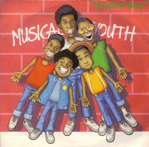
You’ve done a number of other covers. What would be your favorite or most recognizable covers? (Roy Harper, Hoyt Axton, Hard Meat, Musical Youth)
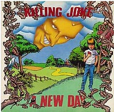
• Roy’s was the most memorable, becoming surprisingly iconic. I’m very proud of its place in history and it was his first. Getting a deal with a small company (Strike Records), he had asked me to draw him for the cover, having seen other sketches. Rendered on paper on his floor, where I slept with four or five other dossers, I was lucky he was pleased with it. Also did art for releases by The Dubliners, Cat Stevens, The Coasters, Killing Joke (second favorite)… maybe more.
Aside from the album covers, what else has your career entailed, and what are you up to these days?
• As a professional illustrator, I worked mostly for advertising agencies, through my agents FOLIO. Usually given a brief, the pay amount and a schedule, I turned out a great deal of work over those years. I was represented at Folio (still in business) by Richard (Dick) Jordan, with whom I am still in touch and saw only last year in Wales. Dick and I both moved from Andrew Archer to Folio and remained there for many years. He was also the manager and booker for Klook’s Kleek, so Dick had a strong musical background
These days, at age 77, I am a musician. Turned full circle from listening to folk records back in my hometown of Elk Grove, Californi(just south of Sacramento) and trying to figure out how they did finger-picking, to finally putting that ability to use. I have about a dozen gigs per month as a guitarist/vocalist.
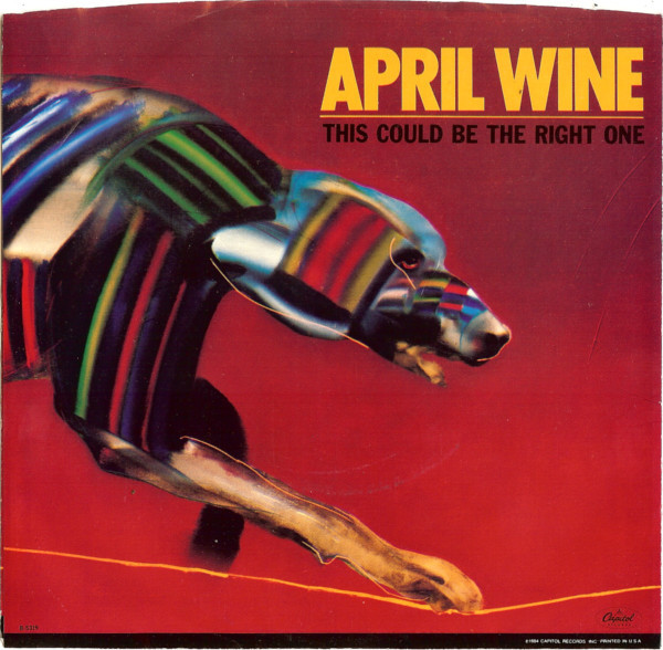
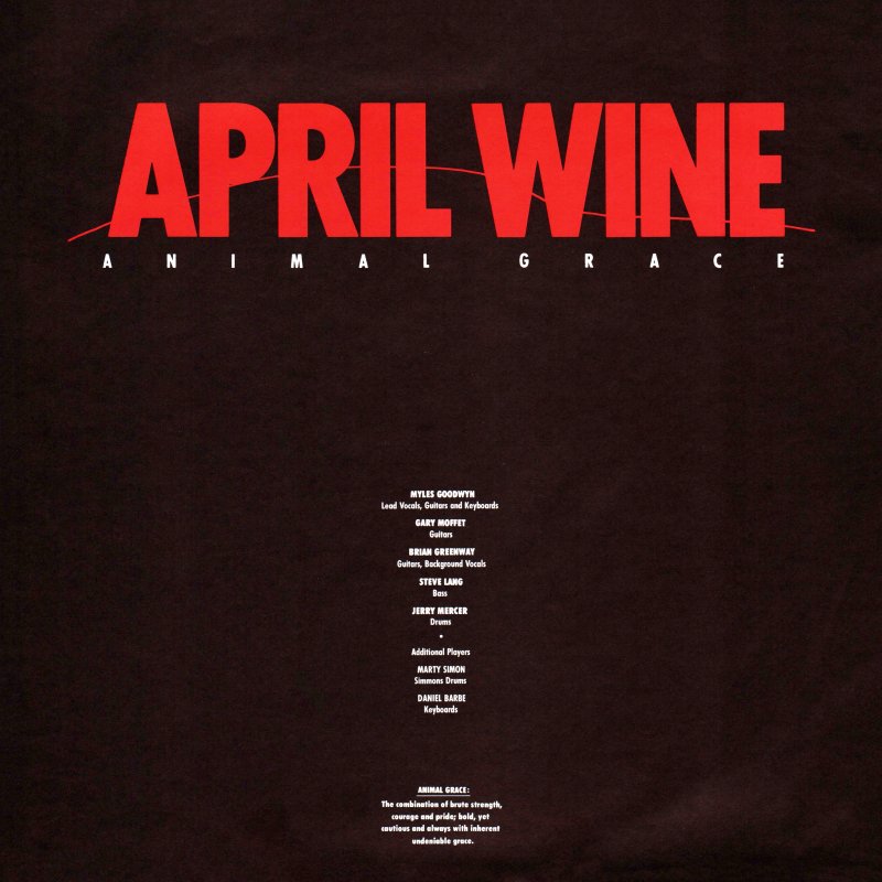
April Wine’s 1984 album Animal Grace was the band’s final album as the ‘classic’ 5-piece line-up. The band broke up after a farewell tour following Animal Grace’s release. The album saw a couple of singles, but clearly the band was not supporting it, playing only 1 song from it in their live set. Animal Grace would also be the first April Wine album cover not to be designed by Aquarius Records’ Bob Lemm – who had designed pretty much every cover since 1973, nor would it feature the band’s logo that had been used on every release since 1978. Instead American designer John O’Brien was given the task to create the follow up to 1982’s Powerplay. Like every April Wine cover, it was a completely new design, and new look, suitable for the times.. John O’Brien has done numerous album covers throughout his career, notably for Tina Turner, Billy Squier, and Great White’s 2 biggest releases. In this exchange John details coming up with and creating the cover for Animal Grace, as well as his background, and touches on a few other covers he did. I’ve included a few of John’s other covers, as well as links to his work at the end.
How did you get in to album cover art design? Can you give a bit of your background?
Growing up I always had a love for Album Cover art and music, it seemed to be the perfect creative vehicle – visual and sonic delivery, it stimulated my senses. I graduated from Cal State Fullerton in 1981 with a Masters in Art, with Design focus. I freelanced at various design studios that specialized in entertainment in Los Angles my last year of school, and continued up to1983 after graduation. After working and showing my portfolio for 2 years, I received a call from the Creative Director at EMI Records, Bill Burks that there was an opening at Capitol Records for a designer. He recommended me, I interviewed with the Art Director, Roy Kohara and received the position. From 1983-1989 I worked in the Art Department on all aspects of an assigned project, from Cover Deign, Advertising, Marketing to Promotional Materials. Depending on the specific project I was responsible for concepts, logo design, hiring outside illustrators, typographers and building the final mechanicals, as in those days they were built by hand.
Am I correct to assume you worked for Capitol Records (seeing most of your credits on Capitol), and is that how the April Wine cover came about?
Yes, from 1983-1989 as stated I worked on staff. After 1989 work with various labels. Being a staff designer projects required different approaches. Some had art attached, logos and cover art concepts supplied by the artist and management, others needed a full exploration. I was assigned the project which needed a cover concept for April Wine with the title Animal Grace. From this point I was responsible for coming up with ideas to represent the concept for presentation to artists, management and marketing.
Were you familiar with the band and/or their music?
I had not previously followed the band but was aware of their music.
You are credited with design, and there are (2) art directors credited – Can you tell me how much of the whole album package was your design – back, front, lettering…?
I cannot recall what transpired at the time that 2 Art Directors were credited, perhaps one was on vacation and the other filled in for presentations and sign off of final art approval and budget as that was the process. As the designer on this specific project I was responsible for the creative, but I did not have direct contact with the band or management.
I was responsible for completing all packaging for the project (logo, cover, back cover, insert) as well as any campaign ads for marketing and poster. All layouts and final mechanicals were done by me in house at Capitol.
As almost all previous April Wine covers were designed by Aquarius’ Bob Lemm – who also designed their logo, is that why the logo (from the band’s previous 4 albums was not used?
There was no mandatory that a previous logo be utilized. I selected a bold font and introduced a fine line to reflect the nature of the art, without competing with the art. The cleaner logo created did not battle the art work and maximized the visual impact of the artwork illustration.
Did you have much contact / input from the band (or specific members) management? and did you ever listen to the album?
On this project, I had no direct contact from the band or management. Communications filtered internally down from the Creative Director to Art Director to Designer.
Can you tell me a bit what inspired / influenced this cover piece, and how it was achieved?
While coming up with concepts I searched various illustration promotional pieces and periodicals as well, and found a captivating image by Marshall Arisman that fit the title with perfection. Bold and powerful, elegant and graceful, the image was compelling. At this point it was comped up with a few other ideas, but this was the strongest image.
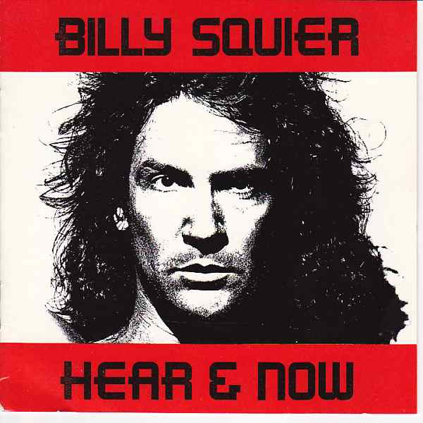
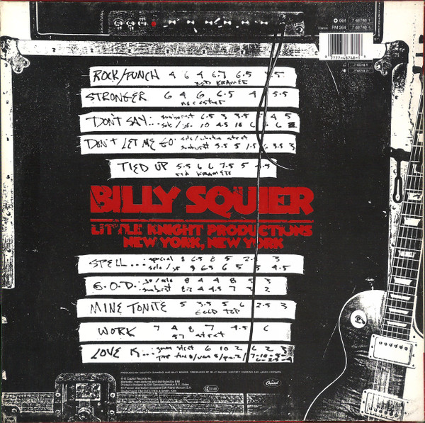
You also did Billy Squier’s Hear & Now album. Recall much from creating that?
In this case, I was assigned the project and it had very definitive parameters. Art elements were supplied specifically and indicated for the cover. Billy and the Art Director, Tommy Steele had a very clear concept of the desired look. The cover was built to specifications and I designed the rest of the package reflecting the look of the cover to follow the feel.
Any favorites and/or most successful album covers you’ve designed?
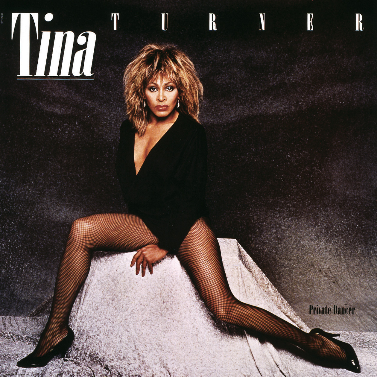
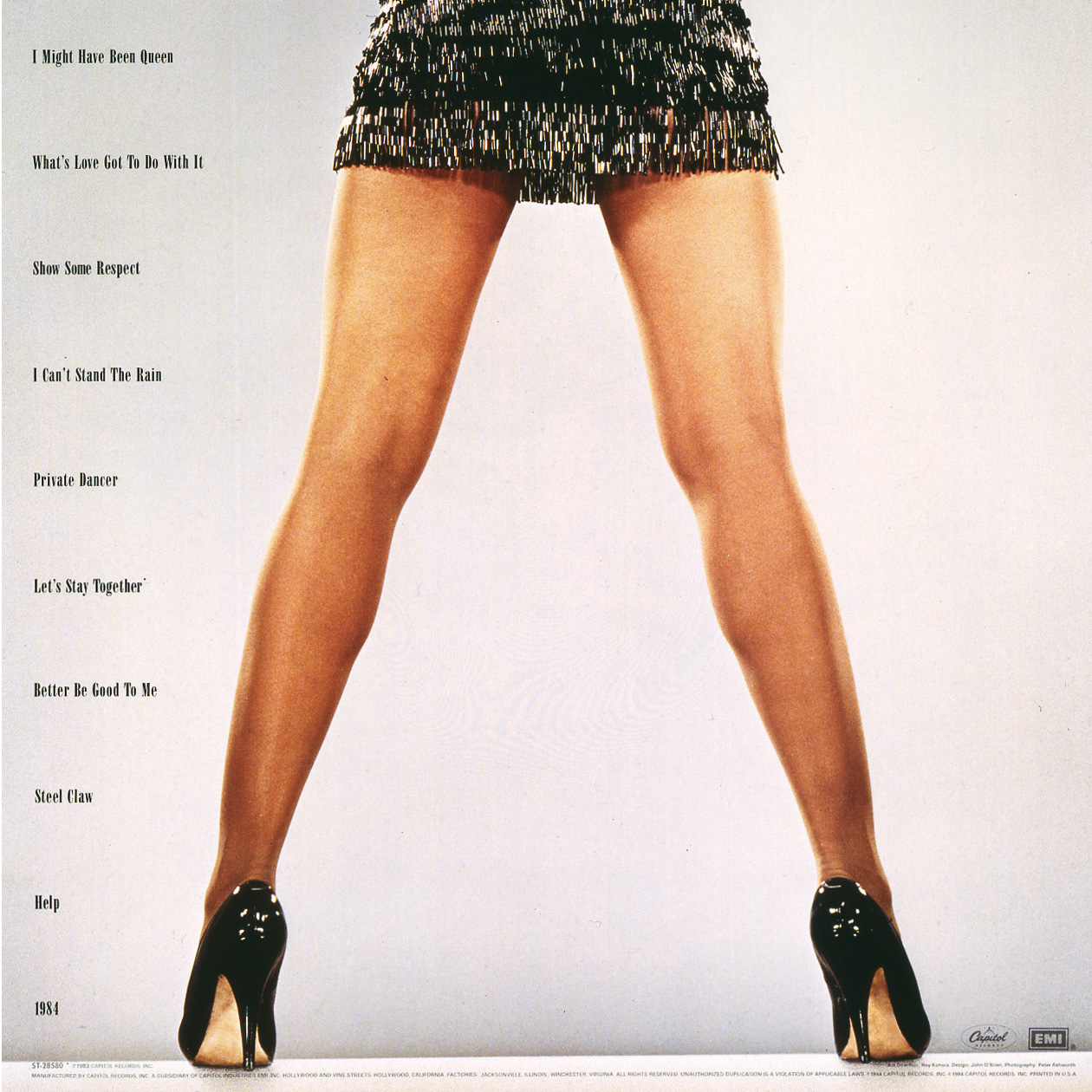
My favorite project was ‘Private Dancer’, by Tina Turner. I was going on vacation but cancelled it when the opportunity came up to work on this release. In this case I was involved with the Producer, John Carter and Management, Roger Davies on all aspects of the release. From coming up with the logo, all packaging including the double cover release – they needed one layout that worked with 2 separate cover images. I designed all domestic singles, advertising, marketing elements, standees, promotional items for over a year. A fantastic opportunity, amazing people… and Tina who had an undeniable presence that filled anywhere she was with the brightest light.
Another was the Great White project, ‘Once Bitten Twice Shy’ with Alan Niven. Another long inclusive creative project with many singles and advertising elements. A lot of fun with compelling visual elements with Alans inspiration.
Are you still creating any album covers? If not, what else have you been up to in the art world?
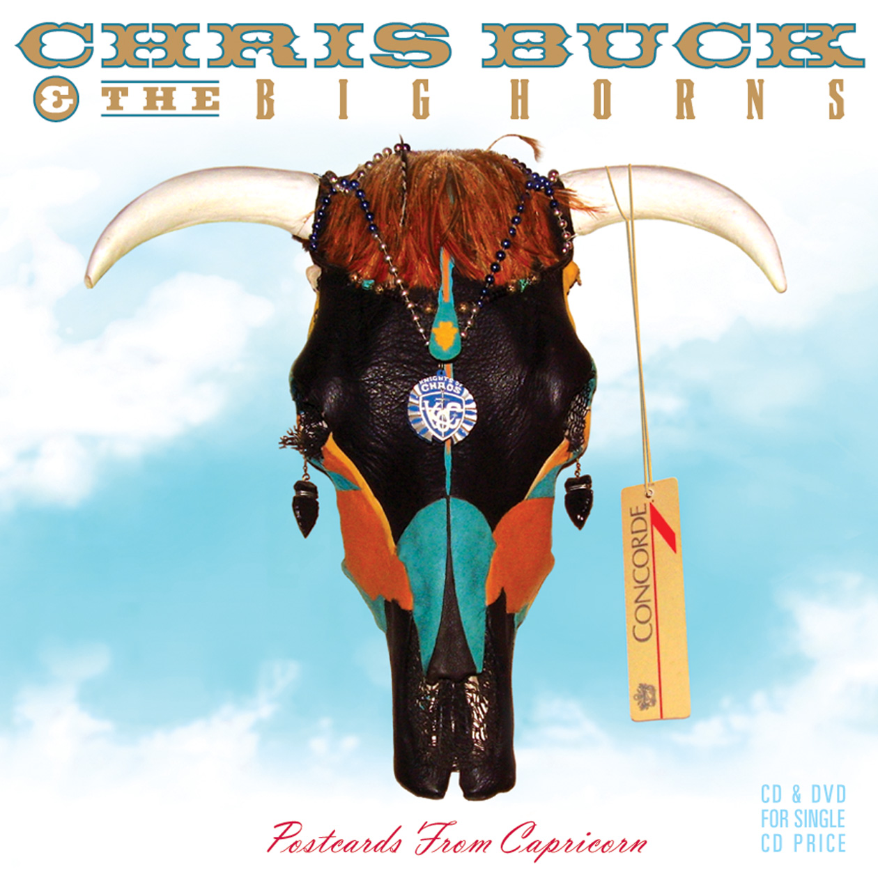
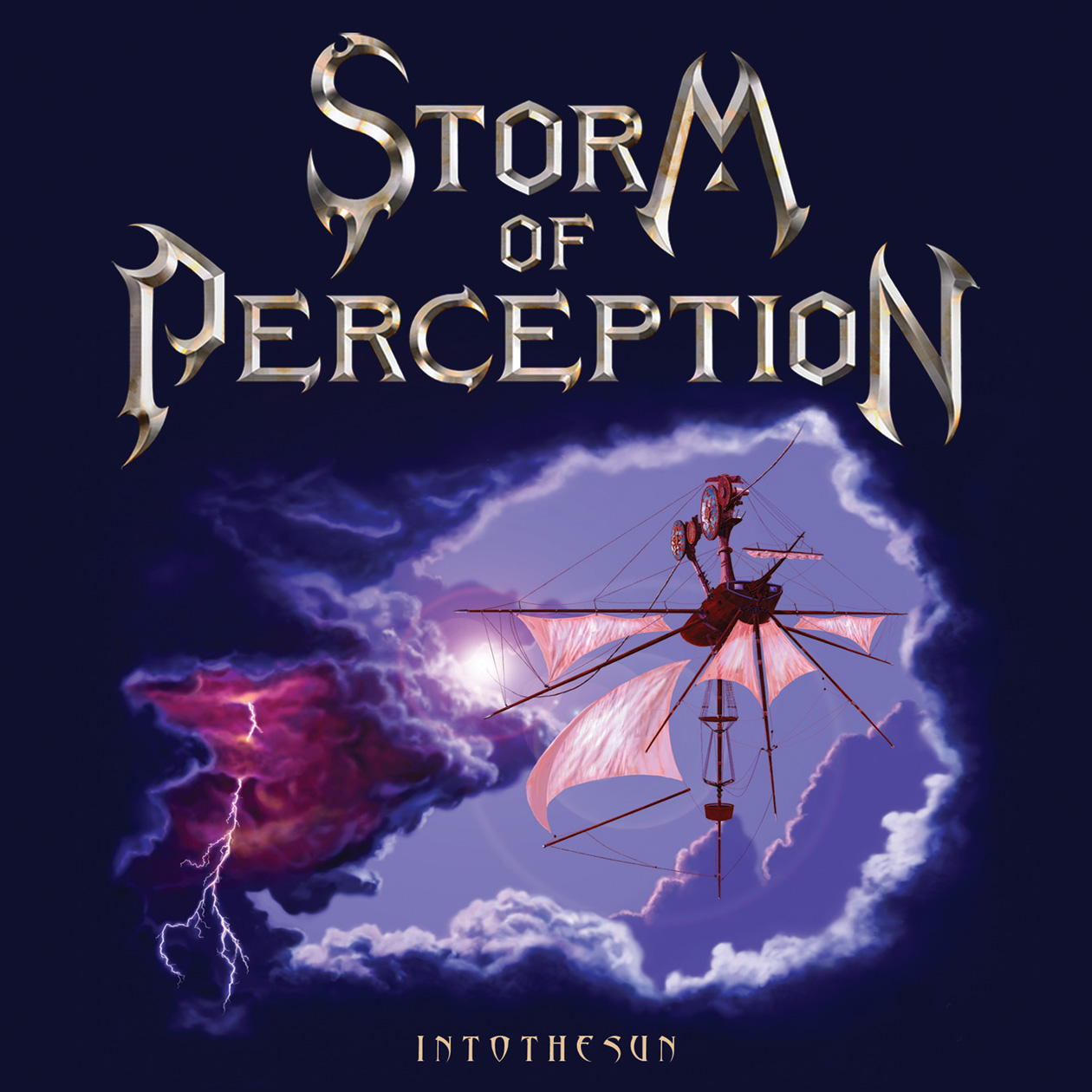
A few elaborate CD/DVD projects done for Alan Niven’s Tru-B-Dor Management a few years back, Storm of Perception and Chris Buck and The Big Horns. An album project for John Klages, Fabulous Twilight on Danbury Fair Records. A recently completed project for Felix Cavaliere (The Rascals), ‘Then And Now’. A fun project with a great musician and great management team. Hopefully a new one for Mark Farner’s American Band upcoming.
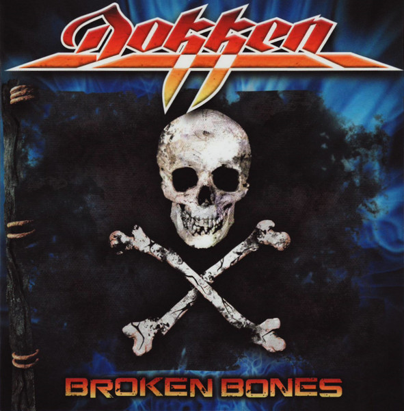
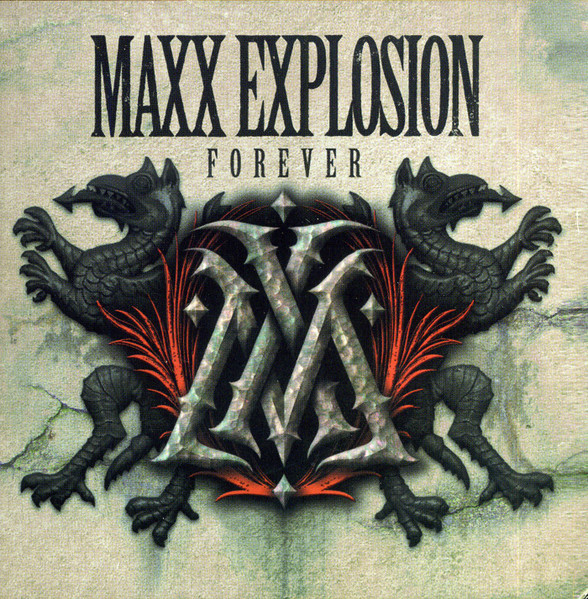
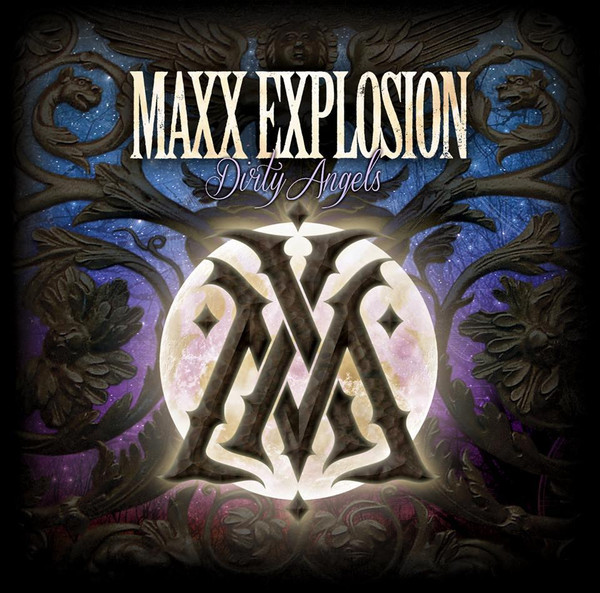
DOKKEN’s latest album Heaven Comes Down features the eye-catching cover art created by the band’s bass player Chris McCarvill. Chris has also designed the cover for the band’s 2012 album Broken Bones, as well as his other band Maxx Explosion. In our exchange below Chris details the album’s artwork, as well as his other art and covers he’s designed (also see links below).
You are known more so as a musician, and member of Dokken, but can you tell me a bit about your art work, how you got in to that, and what you do as far as professionally and as hobby/interest in it?
I’ve been a professional graphic artist for 30 years, mainly in screenprinting. I now co-own a screenprinting company, Savin Rock Printing. I’ve always been interested in art; my dad and younger brother are great artists, and my mother was pretty good too. I’m not trained or schooled; I just like it.
You’re credited with the cover art on the new (and previous) Dokken album. Can you tell how the album cover idea / inspiration for Heaven Comes Down came about? was the cover your idea / design, and/or input and suggestions from other bandmembers?
I had visited Don’s house in Beverly Hills in 2016 when we were playing the Whiskey, and he had an Asian wooden griffin statue that caught my attention. He said that was the first piece of art he had bought when the band had started making money. It’s not restored, it looks very old and it’s quite large. Dokken cover art features a phoenix sometimes and this piece seemed to just fit, it’s the right style, its heavy metal looking, but also artistic and classy. I’d mentioned to Don that the griffin was my vote for an album cover more than once.
That said, it’s in a very static, boring, standing position which is not exciting for an album cover. I looked at a lot of pictures of mainly lions jumping and based the dynamics on that but used the head, features, and details of the griffin.
Is there a story behind the cover in terms of a meaning relating to Dokken or any of the songs?
It’s more of a symbol of Don and how he rises in the face of many difficulties.
What all did you do on the Heaven Comes Down cover (as you are not the only one credited)? And can you explain a bit of how it was done (technique used, drawing?, computer?, lay out, etc…)
This started as a good old pencil sketch. I did 2 sketches. Don thought the first one was too skinny, so version 2 was more muscular. I decided to make most of the griffon vector, or object based, meaning I could move elements around as I figured there would be many changes – and there were. Illustrating it this way allowed me to move and re-proportion things without having to completely redraw, and I could use the objects as masks in photoshop, like how an airbrush artist uses stencils. So, I sketched it, did a lot of color work, then Hiro (I think he works with Silver Lining – our record label) did better hands than mine, and a couple other details. He also did an entirely different griffon, in different colors, but we ended up going with mine. I had thought the art was approved, Don liked it, and we were sent a final version that had been photoshopped with different colors and different backgrounds. I thought it looked great, though I don’t know who did that final coloring/layering. So, this cover was a bit of a group effort.
You’ve done a few other album covers, any you wish to touch on (or elaborate on a bit) and were particularly happy with?
I’m never super happy with my own work. Out of the few I’ve done I probably like the Maxx Explosion records. I’m sure you’ll see the Hugh Syme influence. I’ve never pursued art the way I’ve pursued music. I think I’m ok at it, but I’m definitely not in the same category as my influences.
Were you a fan of album covers growing up? any favorite album cover artists and a perhaps top 5-10 list of favorite album covers?
Oh yeah. Growing up for me was pre-internet, so album covers felt like a window into the world of the band. I liked Hugh Syme’s covers a lot, I had the Whitesnake 1987 album. I constantly wondered what the brass logo icon was or if it did something, like was it some sort of portal, or lock, or gateway? Hugh’s concrete and marble textures always gave the music a sort of classy mystery. His concepts are usually breathtaking as well (look at Dream Theater’s Distance Over Time). I love Doug Johnson’s Judas Priest covers (Screaming for Vengeance / Defenders of the Faith / Turbo). They have a glossy, stylized, almost surreal look that’s instantly recognizable. Hipgnosis also did great stuff like Black Sabbath’s Technical Ecstasy cover, Storm Thorgurson’s Pink Floyd Division Bell, Muse’s Absolution. I also like Mark Norton’s work with the Rolling Stones very much. Roger Dean’s fantasy landscapes always captured my imagination too.
As for the new Dokken album, any favorite songs and ones you look forward to playing live?
We haven’t played much of the record live yet, so I’m not super sure, but I like Just Like a Rose, Fugitive, and Gypsy. I’m not sure that we’ll ever do it, but I love the song, Santa Fe. Having known Don for a little while now I know he writes very sincerely and that one is so him.
California artist Spencer Caligiuri has created the artwork for Wings Of Steel’s debut EP as well as their fist full album Gates Of Twilight, released earlier this year. Both covers are fantastic and give the band a theme and cool logo from cover to cover. In this episode of Story Behind The Album Cover, Spencer Caligiuri details his art & early days, as well as a few of his favorite album covers, And his creating and work on the Wings Of Steel covers. WOS are fairly new hard-rock / metal band from LA, who will play big ’80s influenced rock, for fans of Whitesnake, Dokken, Michael Schenker Group, Great White, and numerous others. Check them out! For more on Spencer Caligiuri’s work, check out the links at the end, You can find a review and interview on Wings Of Steel elsewhere at this site.
What is your art background, and have you done any other album covers or artwork for bands?
Going back into the past, I’ve been an artist of some sort for as long as I can remember. I started by drawing of course. Doodling animals as a child, trying to copy exactly as they looked, encouraged by my mom, aunts and grandmother. My grandma was a landscape oil painter. I think seeing her paintings hanging around the house was something that made painting feel within reach, and not just something produced by the great masters. I continued this for all of childhood through highschool. I studied portrait and figure drawing late high school at a local art school before doing a brief, unsuccessful attempt at the Art Institute of CA for graphic/animation. This was stunted by my overwhelming urge to choose partying and drugs over getting serious about my future. But I got back on my feet, albeit taking me multiple years of falling on my face, and got very into writing and oil painting in 2009. I gravitated toward anything with water, and the weirder and more psychedelic the better. Painting was all I cared about until l found tattooing which is a long story in itself. But that is my life now. For the last 10 years I tattoo 5 days a week so most of my extracurricular artistic passions have taken a back seat.
I’ve done a few album covers. Buffalo Trance is an incredibly talented 3 piece progressive rock band from Ventura, CA. I grew up with these guys and they’ve been killing their respective instruments since we were in early high school. The other cover is a 36” X 36” physical oil painting I did for a San Diego reggae band called Burning Wave.
How did you get connected/involved with Wings Of Steel?
I started working with WOS through an email they sent me inquiring my help bringing their EP cover to life. I was instantly intrigued. these dudes knew exactly what they wanted and as soon as they sent me their demo I was fucking blown away. We instantly set up a meeting at the tattoo shop and we’re off and running. I really couldn’t believe two young musicians in their mid/early 20’s were writing music like this. The first track I heard was their self titled track “wings of steel.” As soon as I heard Parker’s guitar sound I knew I was in. if that wasn’t enough, Leo’s vocals and lyrics hit and I was instantly a fan, determined to be part of what they were channeling.
Can you tell me about the design for their new album — what inspired it, did anyone in the band offer ideas, etc..
Their new album “Gates of Twilight” was definitely riffing on the concept of the EP. the two stallions which would seem to be a recurring fixture of their image and representation of Leo and Parker. The dark and light, for sure present in their opposing dark and light hair. At least this is my interpretation. Leo and Parker both knew exactly what they wanted to see in this and were super clear on their thought process for it. I tried to bring what I had from the EP into this, yet incorporating the Gates of Twilight, represented by a towering staircase flanked by columns, and silhouetted by the heavens. I thought the standard wrought iron gate has been done so many times and might get lost in the background noise. There’s Some darker tones in this album as well, reflected in many of Leo’s lyrics and song titles, hence the apocalyptic landscape of collapse, fire, and decay. But still punctuated by the contrast of the ever-prevailing light. A true heaven and hell landscape and motif that will never die.
Did you hear the Wings Of Steel music beforehand, and did that have a part in the cover design?
When I started the concept for their EP they sent me their demo which I blasted constantly while drawing for that one. The same went for the full length. this time even more fueled after seeing them deliver such a powerful live performance. Their first ever as Wings of Steel. It absolutely drove my hand to bring the same fever, melodies and aggression their music does.
Can you tell me a few of your own favorite albums and album covers? bands and album artists you liked? (maybe a short list of each)
Oh boy, this is a tough one. A tough question for anyone who loves music especially with so much easily at our fingertips now.
Let’s start with Tool. One of the first bands that helped me discover music in my formative years of the mid/early 90’s. Still all of them making my list of favorite albums and covers to this day.
Both of these albums have a completely interactive covers or jewel cases. Aenima was like a hologram when you moved it the eyeballs would waver in and out.
The Lateralus cover was composed of like 6 clear pages that you could scroll through to see the individual layers, that when it was fully closed you could see the full image here.
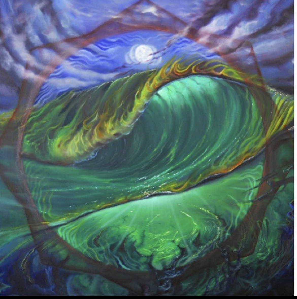
King Gizzard and the Lizard Wizard: Nonagon Infinity, All them Witches: Baker’s Dozen
Any other album covers or projects you’re currently working on and links you’d like to share?
I am a full time Tattooer and oil painter. You can find Me on Instagram at @artofspencer @artofspencerfinearts and artofspencer.com
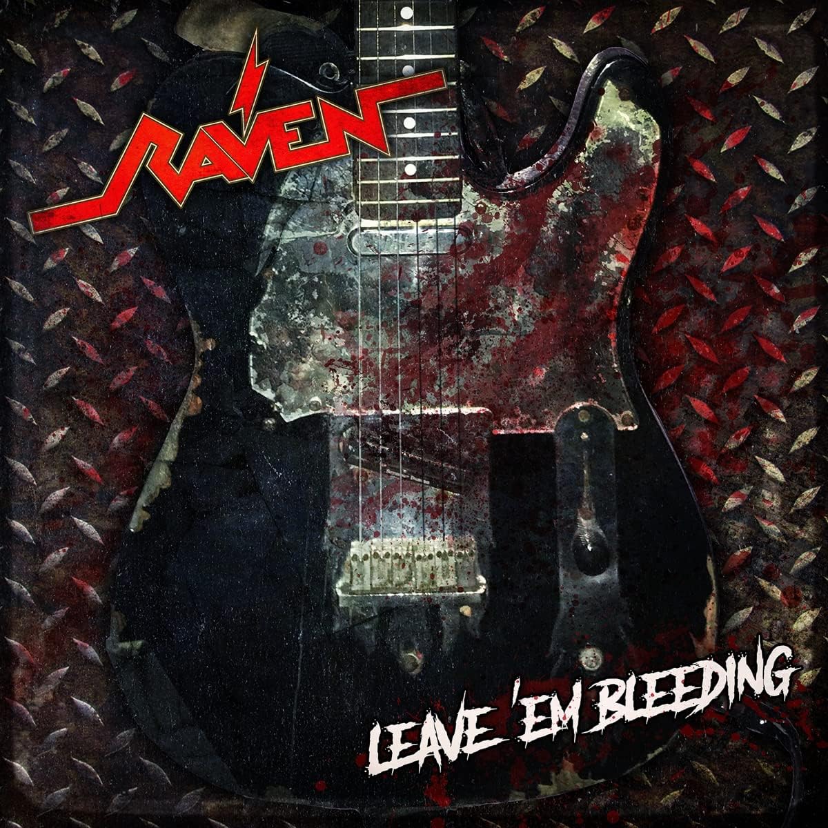
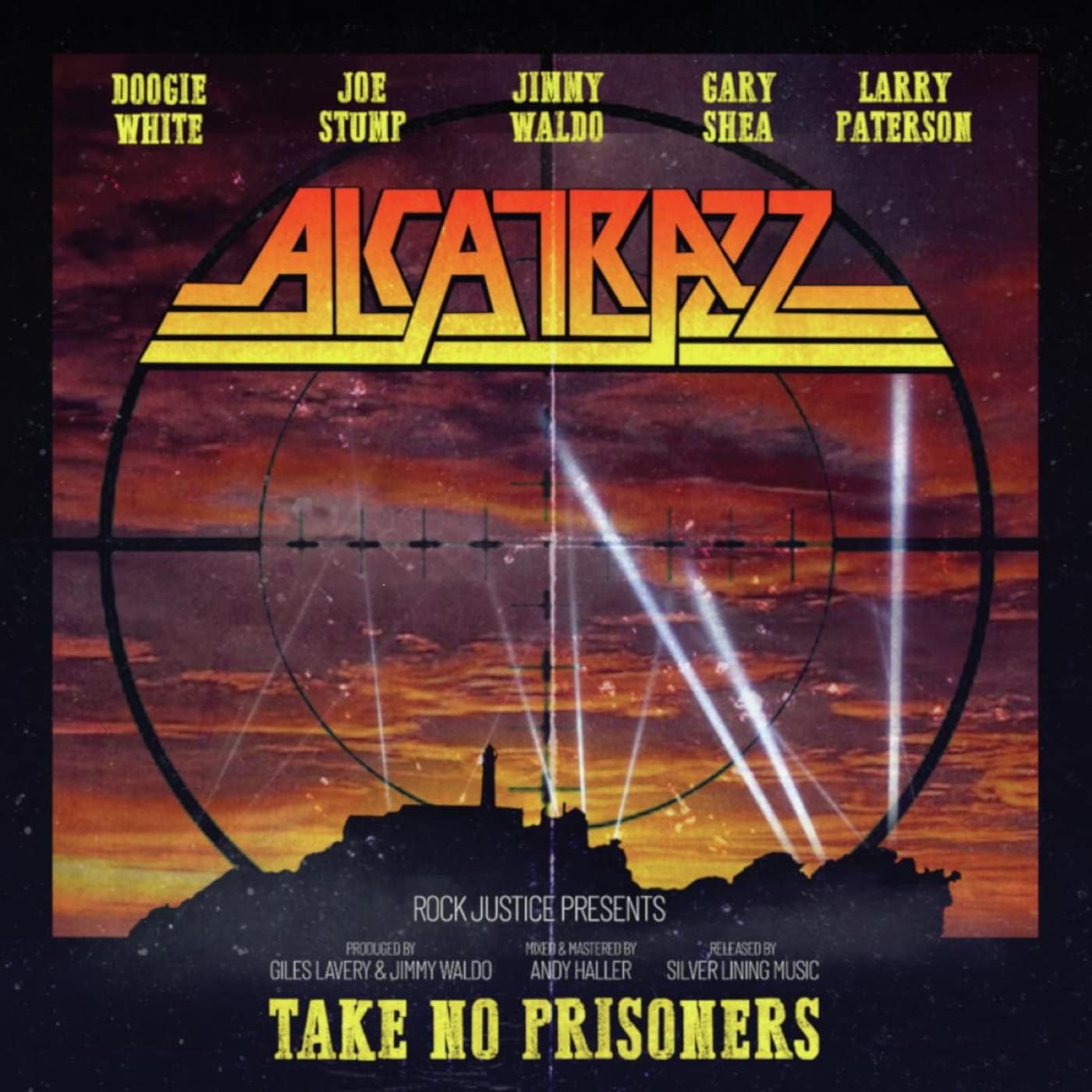
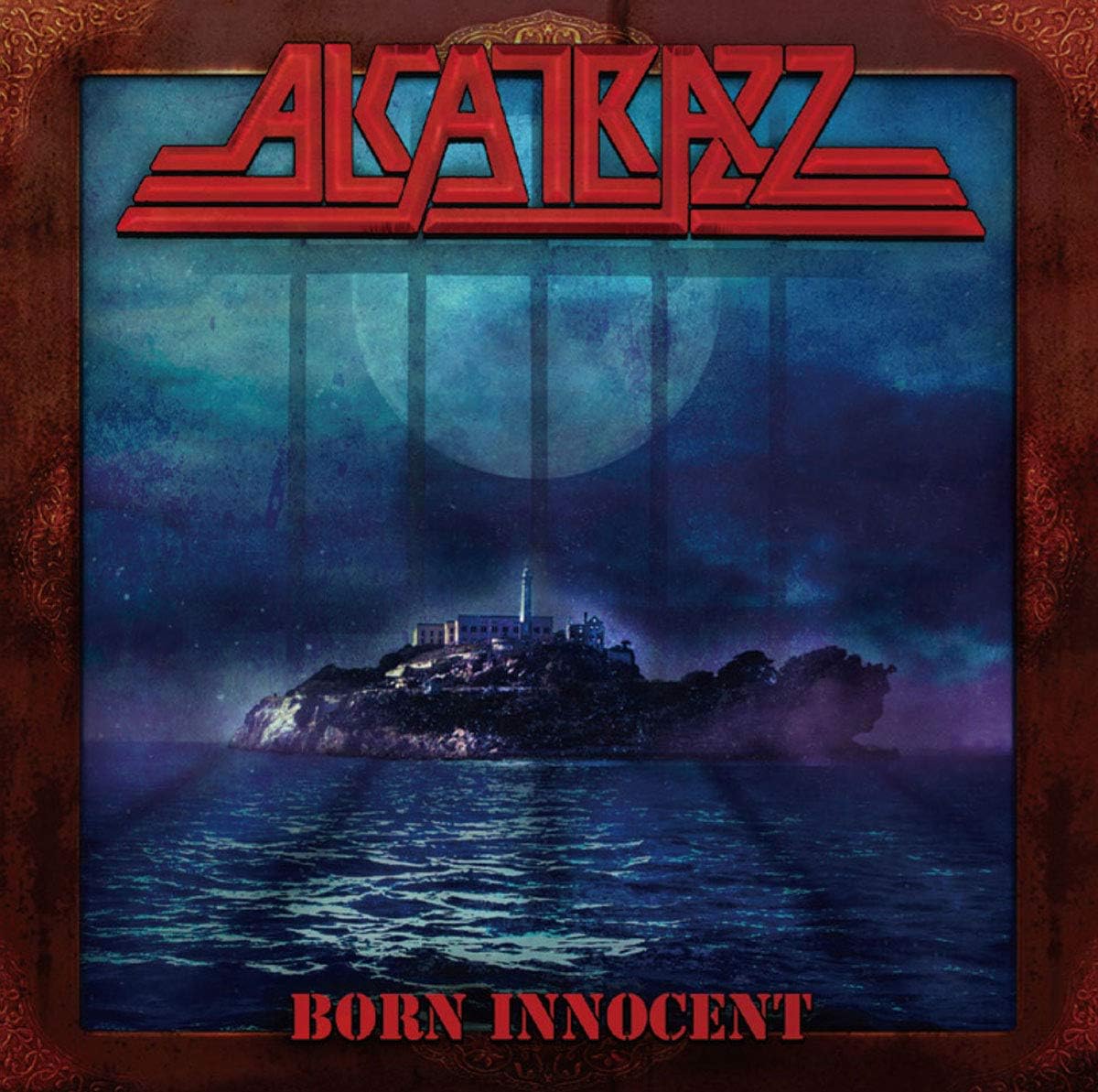
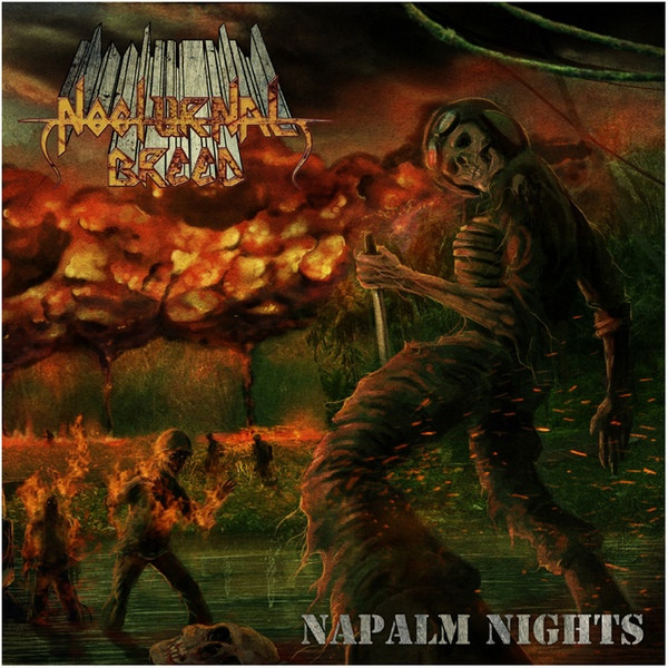
In this latest post of Story Behind The Album Cover, artist Andrej Bartulović (All Things Rotten) discusses the cover art for the brand new RAVEN album All Hell’s Breaking Loose. Andrej has done numerous album covers for the likes of Mortis, Nocturnal Breed, and the latest from Alcatrazz! Enjoy the read, and check out the links below for more on Andrej Bartulović’s work.
First, can you give me a bit of background on yourself, how you got into art (different media’s) and in particular, album art?
I got into art while I was practically a kid. Got more involved into band stuff in high school and started working for bands around 2000. – the great time of MySpace. Awesome times!
Do you have favorite artists, and particular rock album artists, any favorite album covers (by other artists) from your youth?
Always loved Ed Repka, we all grew up with his covers. But artists I admired were regular metal fanboy list artists, starting with Giger then Cappullo. Grew up with Italian comics, not American. Dylan Dog was my fave comic and for many years Corrado Roi was my fave artist back then. Today I worship Riccardo Federici, an absolute beast and God (for me at least).
You’ve done the latest Raven album (did you happen to do the previous one?) Can you tell me a bit about your connection to the band?
If you are referring to “Metal City” as the previous one, then no. I didn’t do that. I did their “Leave ’em Bleeding” EP. I started working for the band years before on some shirts. I think Mike Heller just posted on Facebook that he needed artsy/graphic guy and I answered. He checked my page and I think that’s how it all started, that was years before. Working with Mike since. We toss ideas around, I do sketches, brothers are deciding is it a go or no. They’re all cool guys. I’m honored for a chance to work with them.
What inspired the whole idea and drawing for the All Hell’s Breaking Loose cover? Were there ideas put forth from the band or drawn from the music?
I think the idea came from the album directly, it’s actually all hell’s breaking loose on that record. It’s mayhem of an album (in a good way). Guys wanted madness, monsters, basically Metal City on steroids on steroids on steroids (yes, I wrote that 3 times haha).
All Hell’s Breaking Loose – back covercompilation release from 2022
Can you detail how you created the artwork for AHBL – techniques, materials,… It is a very detailed piece. Excellent
Thank you for your kind words, appreciated! It was hand drawn on tablet, colored and textured too. There were many changes concerning poses and faces, kinda tricky to pull those out. I used reference photos, of course. Monsters were the easy part haha. Also drew the logo by hand to fit the aesthetics of the cover and get more comic book feel. And yes, would use this opportunity (thank you again) to say loud and not so proud – bass guitar has 2 extra tuning machines. It’s a honest mistake we’ve all overseen. Super weird! But we were busy adding all those laser spiders. So yeah, shit does happen but I think it doesn’t ruin anything, just adding bit of charm.
Anything else you can tell about this cover, and how well it turned out?
The answer is below the previous answer, basically. But I’m happy how it turned out, guys love it and people seem to dig it too. So it’s win-win-win.
You’ve done a number of other covers, notably the last 2 Alcatrazz albums. What are some of your favorite covers you designed, with a line or 2 about them?
Yes, I did the last 2 Alcatrazz covers, gotta thanks to Giles (for the opportunity and trust) and Silver Lining Music for patience. Some of my faves? Bah, I always think the last thing is the best thing. I’m super critical about stuff I do so I really can’t decide about faves. I like the last Nocturnal Breed stuff I did.
What sort of music do you listen to? And any favorite tracks from the new Raven album?
At this exact moment as I write this I have Dissection playing through the speakers. It’s usually death and black metal, but I also love Arjen Lucassen stuff too… weird heavy stuff like Lost Horizon, Laibach, EMF, ABBA…hahah. Last few years I’m mad about video game soundtracks… nostalgia all the way. My fave Raven track from the new album would proly be “The Far Side”, but the whole album is absolute batshit crazy and young bands should take some notes.
What other projects are you working on (music related or otherwise)?
Just finished some book cover illustrations; but generally it’s more or less about music – shirt designs, banners, whatever the band needs. But whenever someone needs any art done I’m around, like a sleazy weirdo hiding in the bushes.
Michael Inns is a British rock photographer, album designer, and illustrator, who has worked on many great albums and with many legendary musicians over the past few decades. He has also been a part of a number of album art projects with Roger Dean. Along with Karen Gladwell, Mike began Mixed Images Ltd – creating cover art, album layouts, press photos… In this exchange Michael details the beginnings of his career and getting to work with Roger Dean, his work and friendship with the late John Wetton, as well as discuss a number of projects and album covers he created and was a part of. Sadly, Karen Gladwell passed in October of 2019 (RIP), and I’ve included a video Michael created as a tribute to her, set to John Wetton’s classic ballad “After All” – below.
Michael Inns, photo- John PriceKaren Gladwell
Can you give me a bit of background as to how you got into the rock end of art and photography?
I was a rather reclusive individual struggling for survival at a boys’ Public School in England. I discovered a small darkroom hidden in the basement of one of the school’s art centers. I was interested in photography, so this was my home for the remaining time at school. Photojournalist Penny Tweedie arrived at the school to cover an assignment, I met her, and she was the ‘coolest’ person on the planet – that’s what I wanted to do. I followed her work, inspired by the art of photojournalism which led on to following the work of Don McCullin.
School really wasn’t the place to be, so I managed to take the opportunity to take up a course in Design / Photography for three years. My roommate greeted me wearing a ‘YES’ tee shirt which introduced me to YES and the work of Roger Dean. Roger was the new inspirational ‘cool’ for me and YES became my favourite band. It was the 70’s and Roger ruled supreme as a guiding light to the world of graphics. I remember ‘Relayer’ coming out and seeing the band play the album live in Leicester with Roger’s stage sets and lighting.
After leaving Art College I lived with like-minded British author Freda Warrington and tried to find a way into album design. I remember sending my portfolio to Kate Bush and Jon Anderson. I carried on working as a designer for a local PR company until I eventually left to start ‘Mixed Images’ with my long-term best friend and business partner Karen Gladwell. Karen has been by my side throughout and is a huge part of everything we achieved as well as giving her loyal support and friendship to all the artists we have worked with.
Katrina LeskanichRobert John GodfreyRod Argent & Colin BlundstoneRod ArgentSteve Stewart
It was at a local ENID gig where I met Robert John Godfrey and Steve Stewart and spent the next few years spending time at their recording studios in Suffolk. I really began my studio photographic sessions with the ENID. It was then that I bumped into Rob Ayling who was at the time managing the band. Rob later introduced me to Dave Stewart, John Wetton and Geoffrey Downes. Around that time Steve Stewart asked me if I could work with Katrina and the Waves on photoshoots, album designs and pop videos. It was a really creative time which developed into a long-term friendship with Katrina and Kimberly Rew. I received a call from promoter Dave Hill soon after to work for Rod Argent and Colin Blunstone.
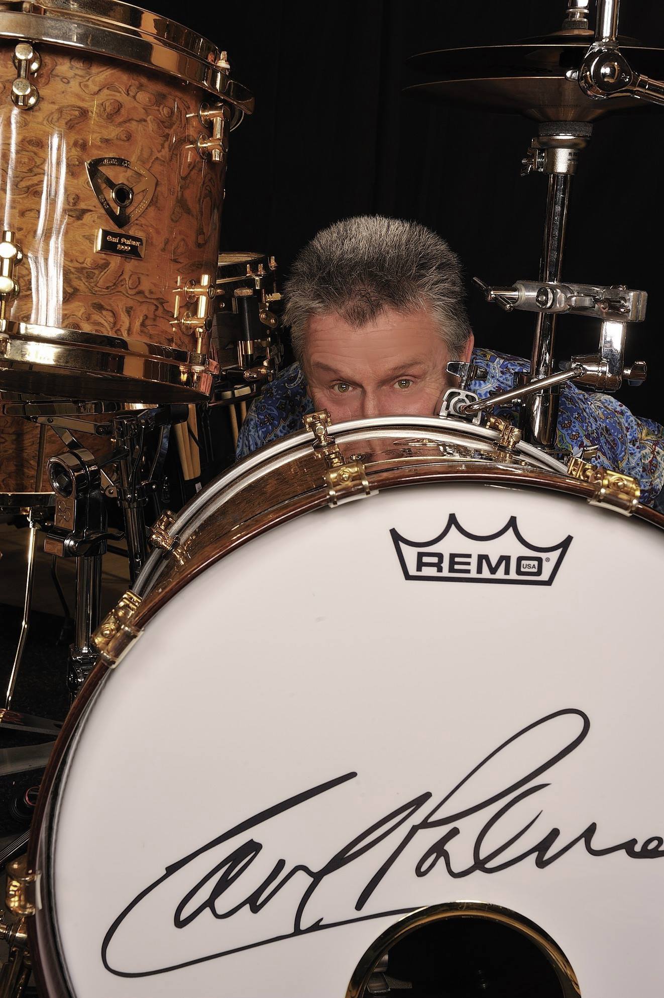
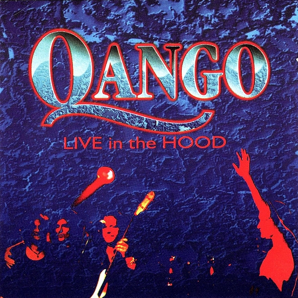
I had developed a close friendship with John Wetton and Richard Palmer-James. One day John called me and asked me to meet him at a nearby studio owned by Martin Darvill where they were having a meeting to discuss the formation of ‘Qango’ a spinoff of ASIA. I remember arriving with Karen to meet for the first time, Carl Palmer wandering around the car park waiting. The Qango project led me to forging long term friendships with most of the musicians I now currently work with.
Michael w/ Roger Dean, photo- John PriceKaren w/ RogerMartin Darvill, Karen, John W.
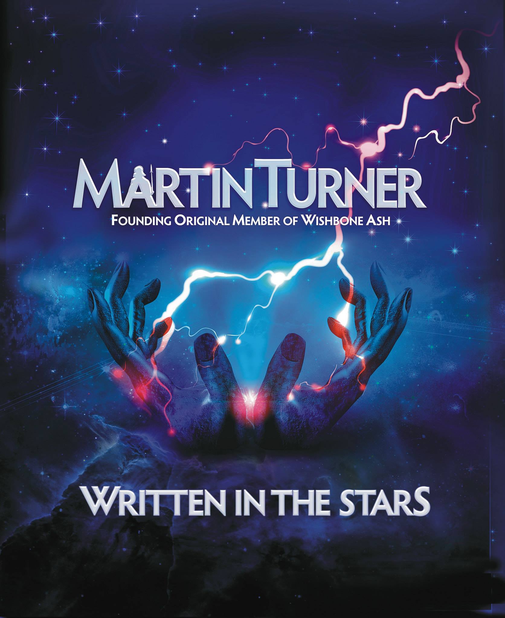
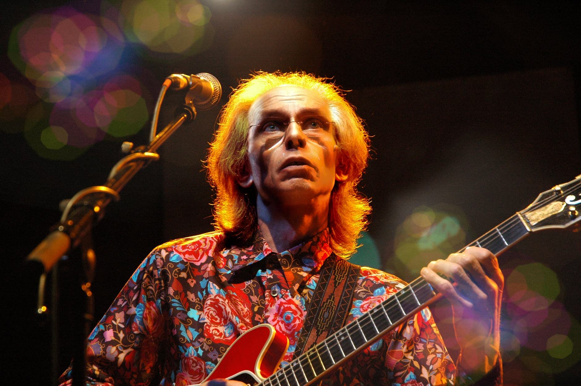
My friendship and admiration for Martin Darvill grew. Martin asked me to work on a photoshoot with Martin Turner as well as Sonja Kristina and Focus. I used to pack my entire studio light system and set up in the basements of various theatres for some of the bands. Other times they would come to me at my studio in Hertfordshire or I would set up at Martin’s recording studio in Buckinghamshire.
Martin Darvill is an extremely skillful and highly regarded manager who gave his time and experience to help artists like Martin Turner, Focus and many others in reformation projects. Martin notably managed to succeed in getting Steve Howe, Geoffrey Downes, John Wetton and Carl Palmer around the same table to discuss the reformation of the original ASIA.
I later met up with Dave Roberts – who brought together many great bands for his Cambridge Rock Festivals. I had many wonderful weekends working alongside my inspirational friend and rock photographer John Price.
Martin TurnerSonja KristinaThis Van Leer
Whilst the photoshoots were taking up a huge amount of time, I also worked on producing the artworks the various albums released by Martin’s company QEDG.
Martin asked Roger Dean if he would be happy for me to work on the various ASIA projects. Roger agreed. For me it was the most daunting assignment so far. Whilst I worked with many big names in the music business, I would never be judged on my ability to play. When it came to Roger – he was the person who defined my future path in the world of graphics. Over the years Roger has introduced me to some really great musicians.
I have now spent over 15 years working for Roger – where his generosity of spirit has nurtured my understanding of his techniques and work. Constantly juggling an ever-growing array of projects – Roger seems to me like a man who never sleeps.
You’ve done a lot of work [photos, art, layout…] on a number of Asia, John Wetton [and related] releases. Can you give me a bit of insight into some of your work with John, Geoff, and Asia? (Any details or insight to a few specific covers that you had a hand in via art, layout or photos)
I met John Wetton for the first time on a photoshoot with Phil Manzenera at his Gallery Studios. John was in the final stages of production for “Arkangel” with Billy Liesegang. I wasn’t working on the designs – just a few PR shots for the re-release of two ‘Wetton Manzenera’ albums. It was after ‘Arkangel’ that John asked me to work on all his new studio albums.
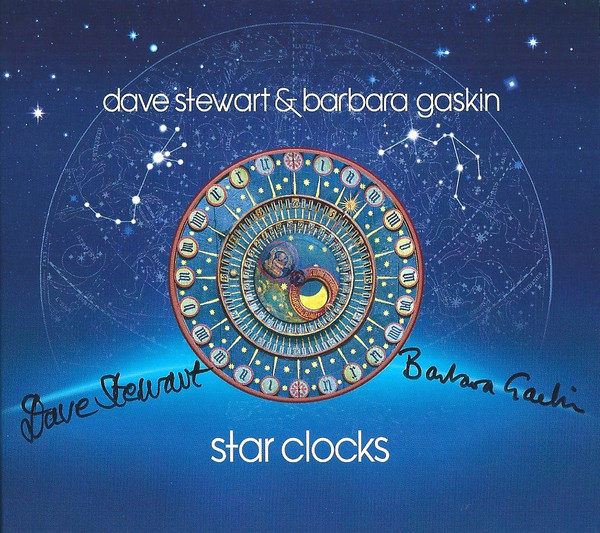
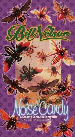
At the same time, I also remember I was working with Bill Nelson’s “Noise Candy”, Katrina Leskanich, Gordon Haskell and Dave Stewart / Barbara Gaskin.
I remember that most of the albums I worked on were for John, Geoffrey, Carl and ASIA including photoshoots for albums and PR. For the album artworks – Roger Dean is the default artist for QEDG projects such as ASIA, DBA and FOCUS.
Carl PalmerGeoff DownesJohn WettonSteve Howe
I was already working with Geoffrey Downes before I met John, so I ended up working on every iCon – Wetton Downes project too. We wrote it as iCon because at the time there was a new product on the market called an iPad and thought it might be a more distinctive layout.
John Wetton would just call me to invite me on our next journey together. Another album design. John always knew the direction he wanted to travel but he only knew the destination when we reached it. It was always fun and took us in unexpected directions. John’s dry sense of humor and deep laugh was a constant welcome companion.
Most of our collaborations were driven by John’s spark of imagination. The cover art was the most important to get right. John would send me the lyrics and a stack of images that defined the essence of each track. I remember seeing a mobile phone for “Finger On The Trigger” and hadn’t realized the track was about a war of love and sending a text message.
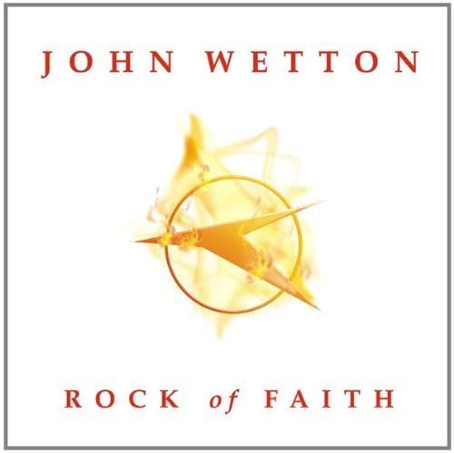
I remember the cover of “Rock Of Faith” – we were sitting in Clive Nolan’s studio in Virginia Water with Martin Darvill – I gave John my notebook for his page-by-page notes. He was overdubbing the bass on “Take Me To The Waterline” at the time so there were a series of squiggles to denote the pages. When I got back to the studio, I thought the squiggle for the cover had a Star Trek feel and had something going for it – so I drew it up. I noticed later John had a silver pendant made up with shape of the cover image.
Because of Martin Darvill’s heavy involvement with Roger Dean, the ‘Downes Braide Association’ engaged with Roger to work on ‘DBA – “Skyscraper Souls”.
We were in Bournemouth on a cold February day I was with Karen – I remember Roger Dean showing me the proposed cover painting for “Skyscraper Souls” which was in the boot of his car. The painting was wonderful – It was a truly sad day – we were attending John Wetton’s funeral.
Can you give me some insight and stories in to some of the covers you created an or had a hand in – Bernie Shaw / Dale Collins – Too Much Information (where did the album’s image[s] come from? And who came up with the cover concept?)
I had a call from QEDG and asked if I could work on Bernie Shaw / Dale Collins – “Too Much Information”. I think it was Bernie who had already chosen the cover image of a solitary metal sculpture on a snowy mountain. I only had the one image to work with so I tried to find more sculpture images that would help me to create the rest of the artworks.
I found “The Statue of Love” by Tamara Kvesitadze that commemorates the 1937 novel “Ali and Nino” about the love of a Muslim Azerbaijani boy and Christian Georgian princess. The remarkable moving statue became the narrative throughout the booklet.
Another project that we felt required a narrative throughout was a project for Tony Kaye called “End Of Innocence”. Roger Dean had already created a unique cover painting. The album was a personal reflection on 9-11. It was an amazing concept with the piece starting the night before the attacks and follows the events through the following day and on to the aftermath.
We decided to colorize Roger’s painting for the interior taking the narrative from the calm blues of ‘innocence’ to the reds and blacks of the disaster through to warm yellows representing a ‘new beginning’.
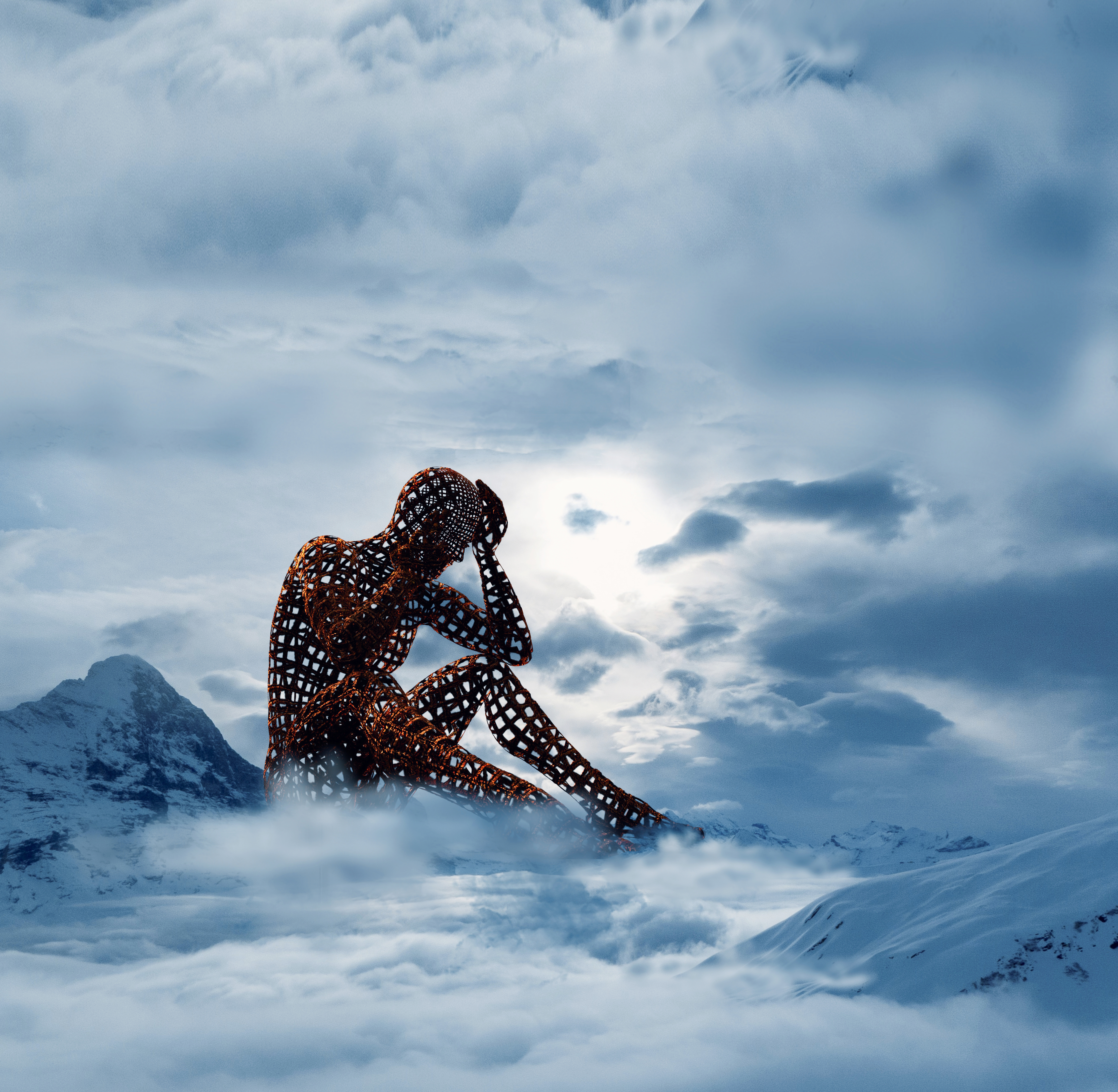
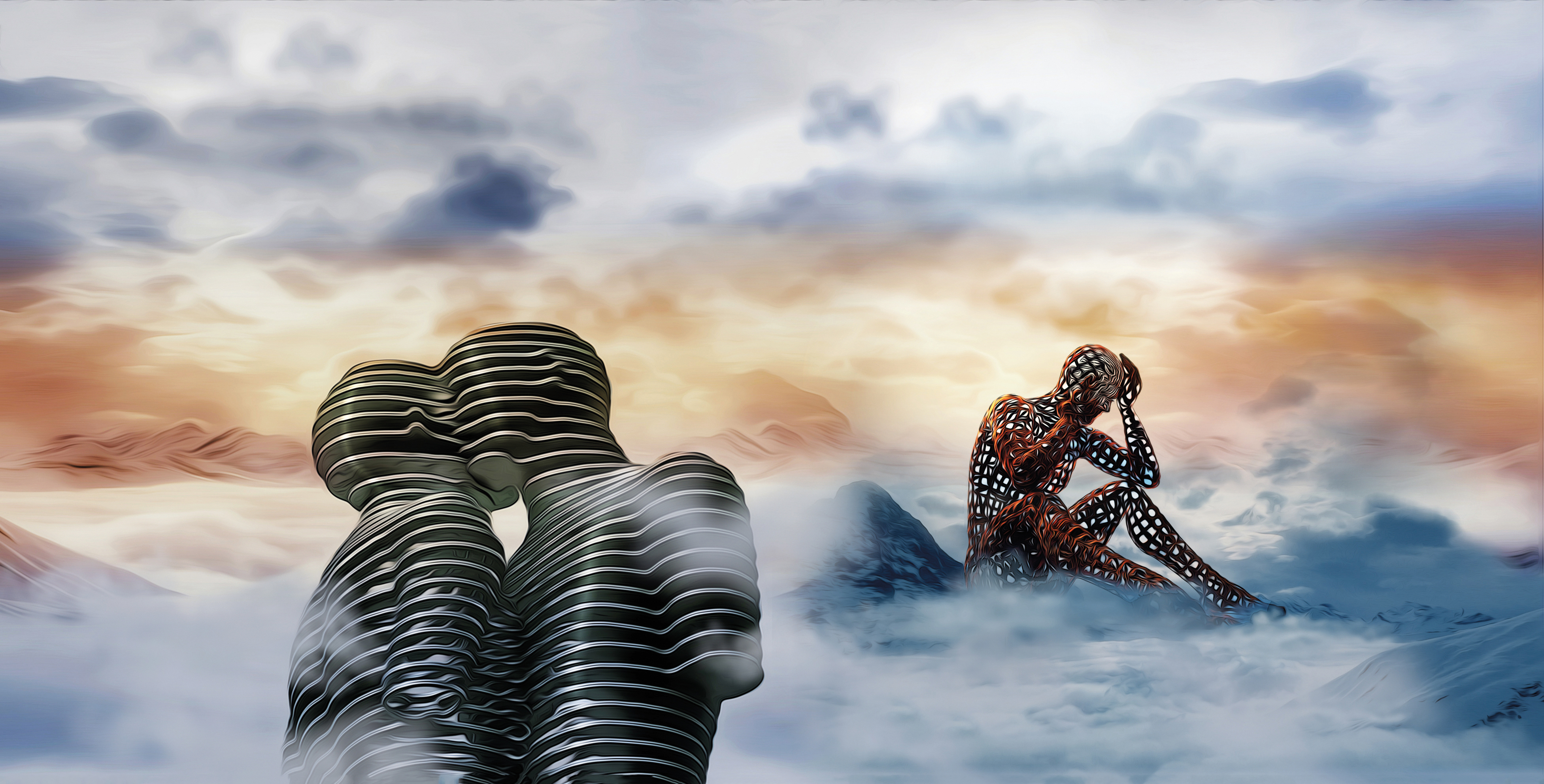
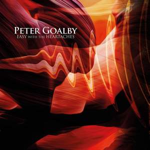
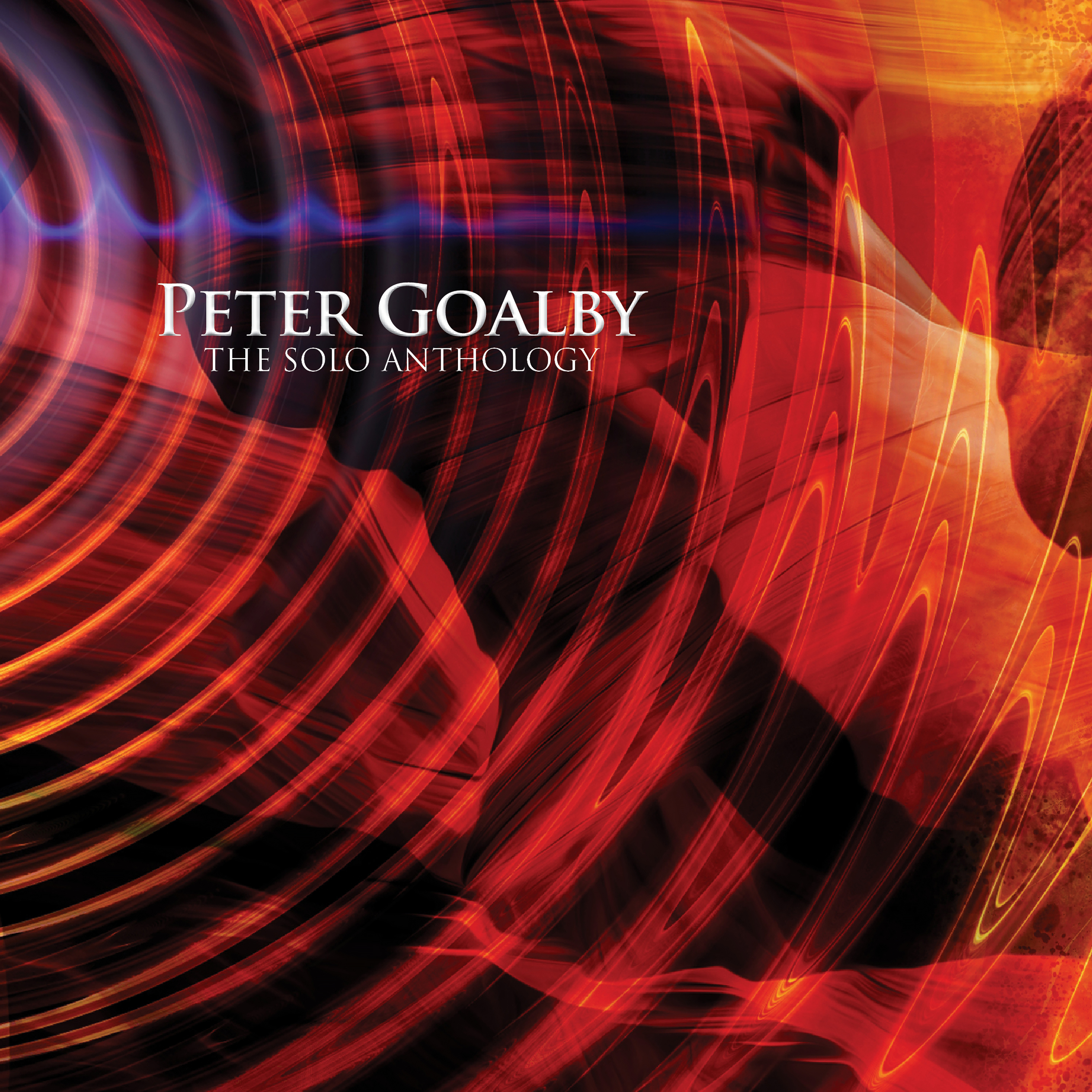
Peter Goalby – Easy With The Heartaches, I Will Come Runnin’ (where did these cover ideas come from? were you familiar with Peter’s work? and was it any different creating cover art for an archived release where there may be no artist photos, or the artist is no longer active?)
I had already been working for Uriah Heep, Phil Lanzon and Ken Hensley on new projects and releases, so I knew of Peter Goalby but had never heard Peter’s solo work. I was asked if I could create a cover for Peter’s re-release of solo albums. The brief was that this should be four completely different covers that could be combined together to create one single image. The concept was difficult enough without even beginning to visualize the production. I decided to use very bold abstract images for each of the individual releases and blend them together to create a single landscape image. I then added more layers across the whole images which were depictions that represented ‘sound’ waves.
If I have a project that is a completely blank canvas with no logo, no images and no music to work from – the only way forward is to create something that is interesting and bold.
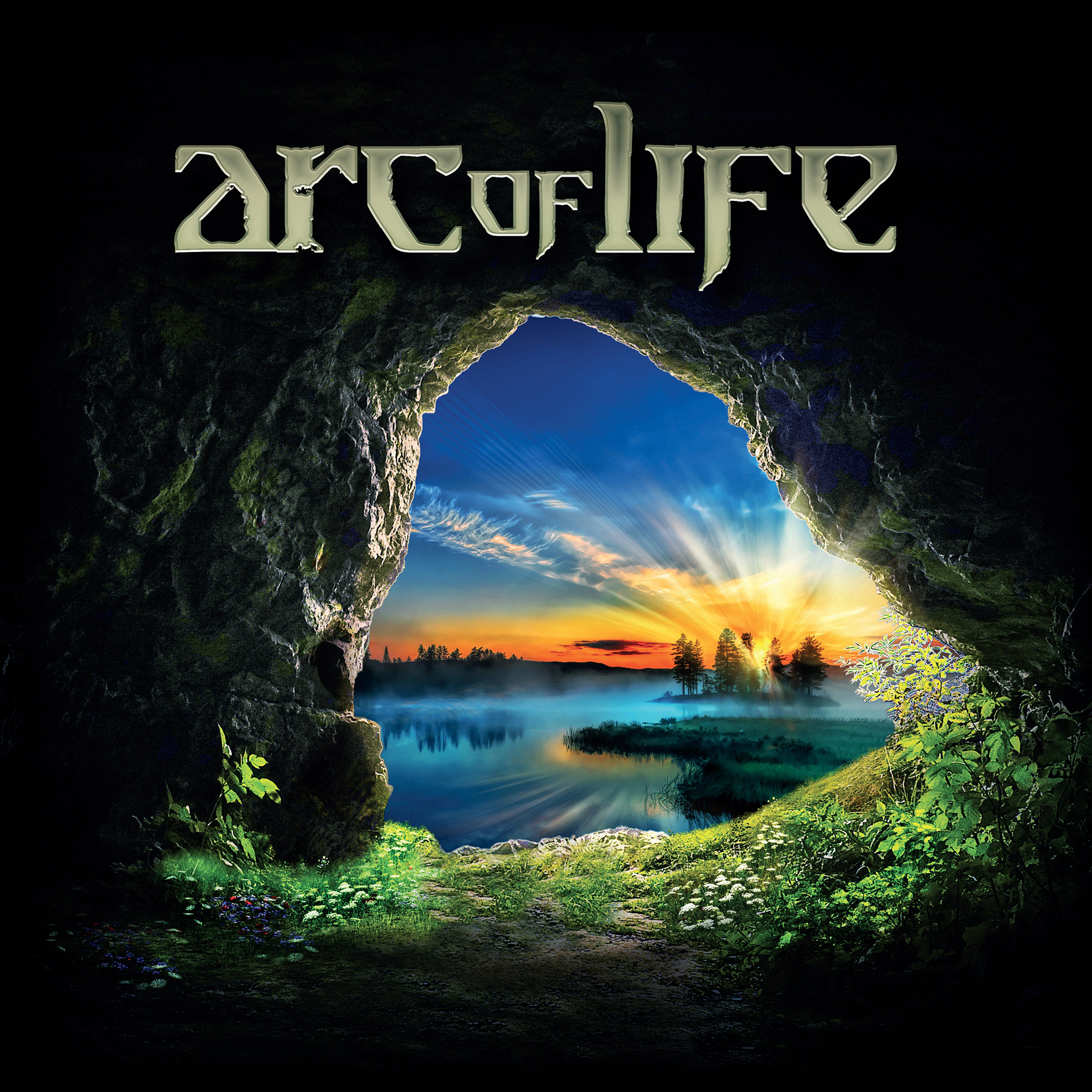
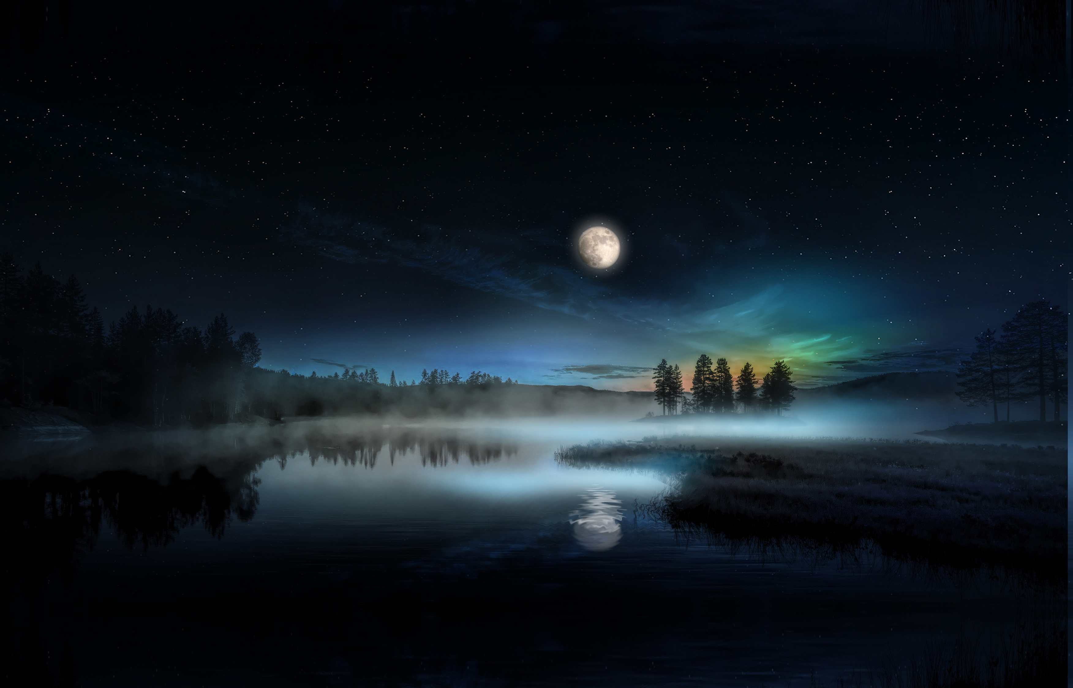
Arc Of Life album, featuring YES members
“Arc of Life” for me started with a call from Martin Darvill. Billy Sherwood had got a band together during the Pandemic. These days there is such a long lead time on some of the production processes most artists get very little notice for these urgent projects. Billy was really specific and had a clear idea about what he wanted to see on the cover and for that matter the back cover too. It was a very clear and clever idea with the cover and back cover portraying the same scene – the cover daytime and the back cover night-time reflecting the ‘Arc of Life’.
Although I have worked with most of the members of YES over the years as well as Roger, I don’t actually work on any current YES projects other than maybe the admats for the tours. The ‘go to’ designers (other than Roger) are the well respected, Doug and Glenn Gottlieb who have a history with YES dating back to the 70’s.
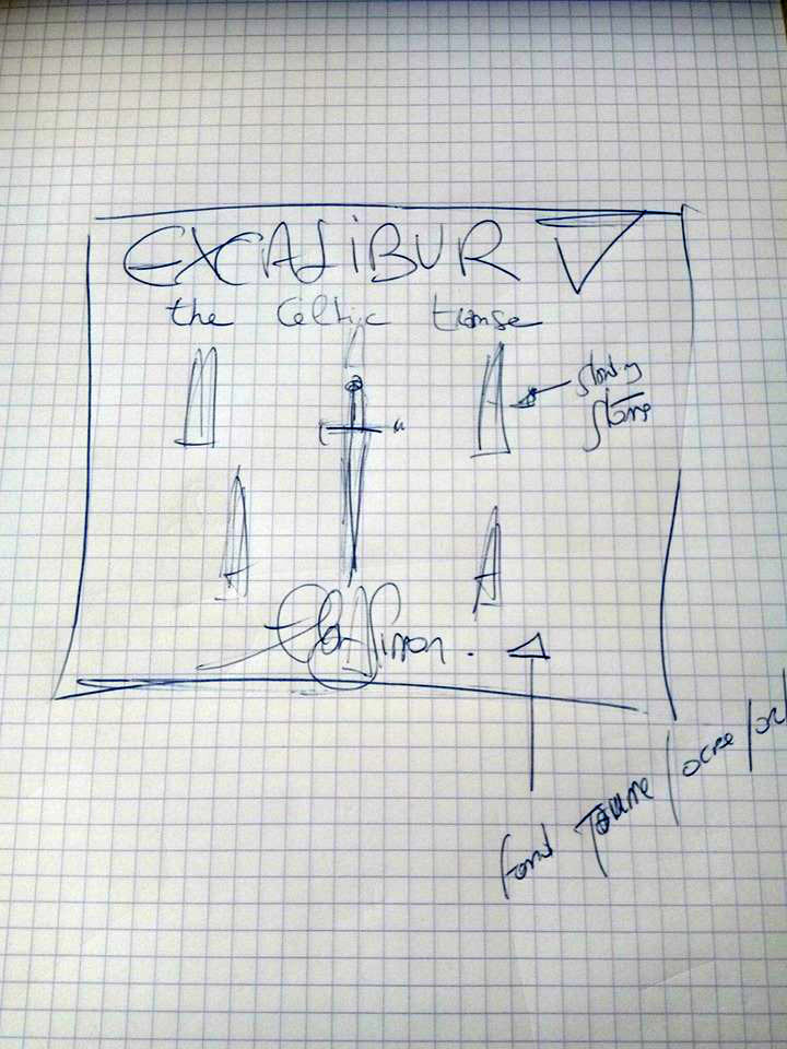
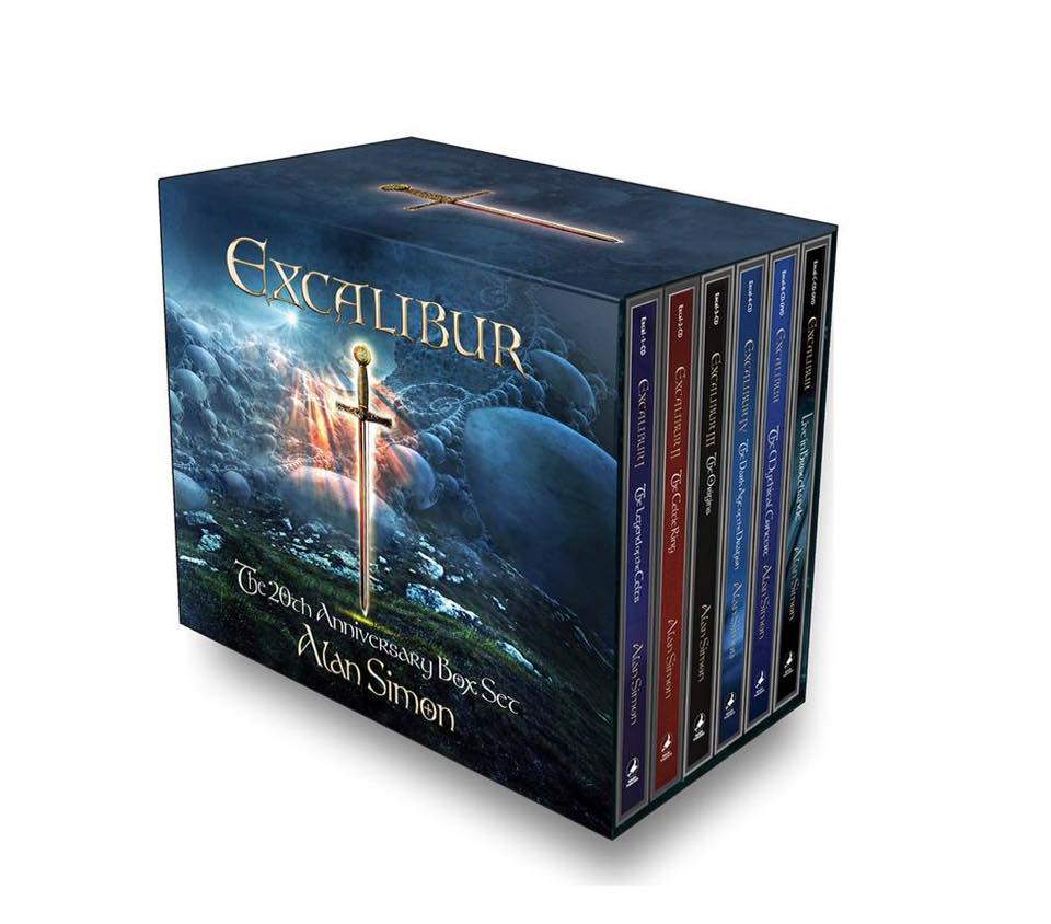
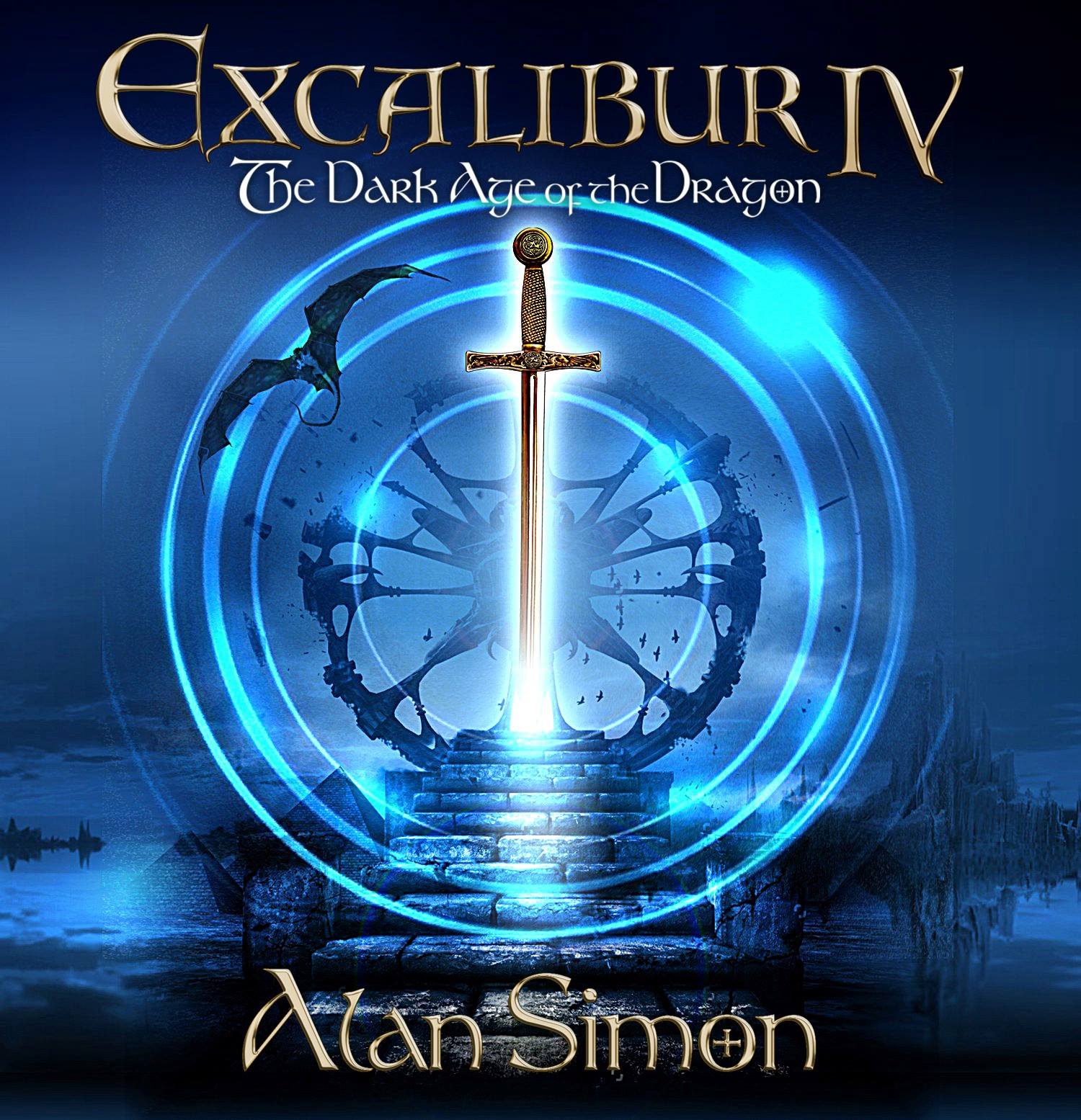
Alan Simon’s Excalibur IV [from 2017] (and Did you happen to create Alan Simon’s Excalibur V cover that came out late last year? (if so, any insight on that?)
I created the cover for Excalibur IV as well as the latest Excalibur V. In all I think I have created around seven album artworks for Alan and a series of rereleases. Alan is very clear about what he wants to achieve from concept to production. It is a very similar working relationship to working with John Wetton. Alan sends me a whole batch of his own photographic images which we use throughout the artworks. Alan is a very talented artist, photographer, composer, musician and film maker. Another individual that never sleeps.
The cover for “The Dark Age of the Dragon” evolved from the existing artworks in the Excalibur series. The circle is always a key element. Although “Excalibur V” visually doesn’t immediately stand out as a circle – the subject actually is a stone circle. The original concept for the cover came from a rough sketch Alan sent me a few years ago.
What would be a couple of your own favorite projects you’ve been a part of?
Each project has it’s own charm.
I have created all the album artworks for Dave Stewart and Barbara Gaskin over the past 20 years. Dave sets the bar on creativity and constantly raises it a notch every time we exchange thoughts. Like with Roger, the initial brief is always achievable – but is constantly evolving to a higher level and just when you think you’ve made it . . . those are probably the best projects to work on.
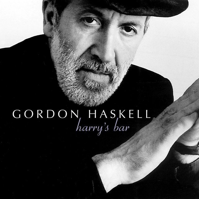
I worked with Gordon Haskell on “Harry’s Bar” from which the single “How Wonderful You Are” was released and became the Christmas number 2 in 2001. The cover image of the album came about in February 2001 when Gordon turned up at my home by surprise along with a studio copy of “Harrys Bar”. We played the first track but Gordon was dissatisfied with the quality, abandoned the CD and proceeded to pick up one of my guitars and perform some of the tracks ‘live’. Gordon wanted an idea of the style of cover photograph he should have on the cover of the album. We were sitting in my dinning room at the time – I had about ten frames left on my film camera – so I took a series of ideas and sent them to him. One of the shots became the cover image.
Working with Katrina and the Waves was another interesting period. I had been working with Katrina for a few years – helping produce album artworks and pop videos. I was asked to work on a version of ‘Walking on Sunshine’ for GMTV. Soon after I got a call to work on a new single “Love Shine A Light” written and produced by Kimberley Rew. The song was put forward for the “Great British Song Contest” and went on win Eurovision 1997. The cover was actually created from a cartoon sketch supplied by Kimberley.
Bill NelsonBen Poole
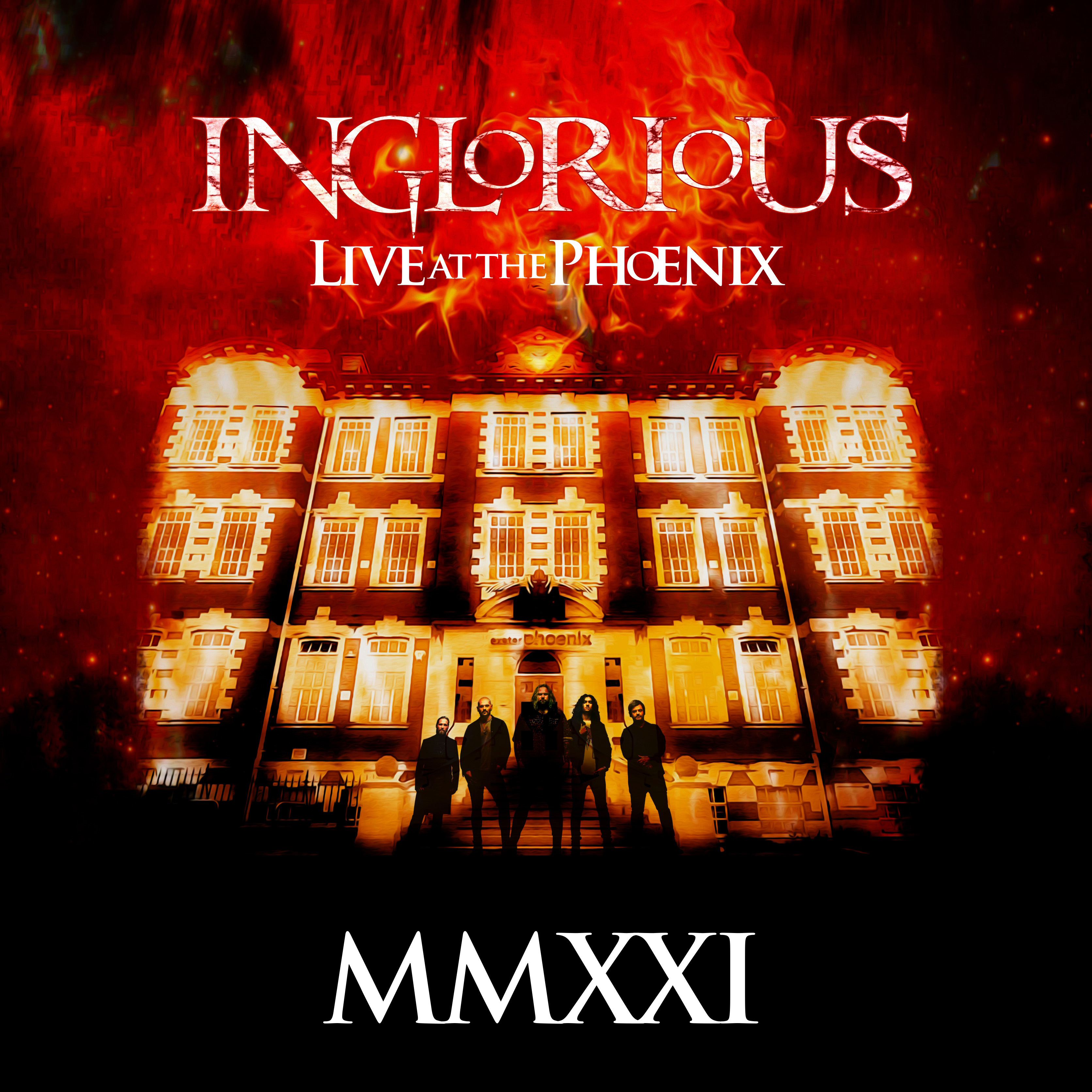
Recent projects include – photoshoots for Blues Guitarist Ben Poole and two album projects from QEDG for Nathan James, Inglorious.